Hey! It looks like you're new here. You might want to check out the introduction.
Show rules for this event
Insightful commentary into the way the education system fails some students who aren't able to keep up and are left behind rather than given the help they needed.
You know, if you'd pasted a pony in a shirt over that guy, I would've given you a top three spot.
>>Moosetasm
I suspected this one might be yours, but I didn't get around to formally guessing due to the site disruption. You seem to relish writing a cake-obsessed Celestia, which this had shades of. The real "tell" for me, though, was your comment about the Bush incident (>>Moosetasm). It stood out as looking like you were responding to FOME without leaving a review, which... while not unheard of, seemed at least suspicious. :-p
I'm otherwise quite awful at the author guessing game, though. Like I'm somewhat confident that I can pick out georg's finalist entry this time, but that's about it!
>>CoffeeMinion
I left a few comments that weren’t reviews on other stories to throw off the scent. :raritywink:
And... I think I know which is you, you also have a few tells. I look forward to knowing if it’s you come Friday.
I left a few comments that weren’t reviews on other stories to throw off the scent. :raritywink:
And... I think I know which is you, you also have a few tells. I look forward to knowing if it’s you come Friday.

Let’s review some Artz! The task is made easier in some ways, and complicated in others, as someone (possibly more than one) has illustrated All The Artz. Some of my reviews may thus seem repetitive, but I will do my best. Here we go!
With this work, It’s fortunate that we have the story to go by, as not much sense can be made from the scribbly image. Under the confusion, we have Spike’s disembodied head and hand, and a line and a dot to represent a needle. This image (and the others of its caliber) betray a certain hastiness on the part of the artist, probably necessitated by the heroic scope of the task they undertook. But I am not judging the artist here on the full scope of their works for this round, but the merits of this piece only.
The thumb does look rather like a digit, but the scribbly lines atop it make me think of an old person’s finger and not that of a young dragon. If a line isn’t doing anything in your drawing, it shouldn’t be there, as it will at best detract from the important lines and at worst mislead the viewer in interpreting the work. The rest of Spike’s fingers are rudimentary and don’t help.The crossing lines on Spike’s head also distract the reader from realizing it’s a head of anything at all, much less Spike.
Artist, if you’d cleaned up what you have here a trifle, you’d have had a workable piece, perhaps mid tier. As it stands, it’s going to rank very low on my slate. This is part of the trade off of quality and quantity. But thanks for trying!
They hated Grisweilda because she told them the truth…
Thanks to the Artist for the Magic 8-Ball, and the turban that helpfully prints its proclamations on its side for easy comprehension. The image as a whole seems a bit flat; I think that some of the contrast of that Hash-dream curtain should be toned down, and the contrast enhanced on the table and figure. I like how her hand-claws came out; they’re just birdy enough.
Overall, this is a fun image. I’m putting it in my upper-mid tier.
It looks like he’s holding... something. But I only get a vague impression of cloth. That could have gone a long way towards relating it more to the story.
This captures the characters, but a more downward angle on twilight would have implied more to her depressed state, as well as if we could see tears or something else.
I'm automatically going to like this one just because it's for my story. Thank you so much for giving every entry a piece!
I think the use of perspective here is grand. Despite the simple arrangement of the items in view, you can clearly tell where everything is in space. And plus, I can't help but to giggle and think that this is 1st person Celestia, who's laying face-on-the-floor.
It's also really easy to distinguish the shapes from one another, despite the sketchiness. For instance, Celestia's hoof remains distinct from her glass. How you managed that, I have no damn clue. Nice stuff!
The lines are deceptively simple, but the facial expression that's conveyed is strong and is also pure gold. It's got a little bit of a Warner Brothers or Looney Tunes cartoon feel to me, with the simplified yet expressively exaggerated eyes. Liked it very much!
Very nice:
But I'll echo >>Haze's suggestion of more physical descriptions. Give each paragraph a very specific, very concrete image of Rarity doing something: plucking a single stray leaf from one of the roses attached to the bower covering the path she's going to be walking along and like that. This will help ground the piece and more importantly for my feeble little brain, will tell me right away whose POV we're in. As it is right now, the first five paragraphs are being told to me by an invisible floating eyeball. A very erudite invisible floating eyeball, sure, but since this is Rarity's wedding, I can't imagine she would allow anyone else to be the POV character for it.
One other thing that I'll just throw out there 'cause it's probably too broad for what you're doing, but maybe Rainbow comes crashing in with a rain cloud trailing after her and soaks the whole wedding party, thereby making the occasion even more perfect? Just a thought... :)
Mike
Wow, I am really awed that you managed to put this together within the drawing period. Splendid goddamn work with the shades and colors. The sunlight feels warm, and Applejack feels even warmer. I'm also a fan of your pony-style—personally I love it when artists get just a little more horsey than the show's style. A very impressive piece no matter which way I slice it (pun intended!).
The poses are really strong here, and manage to convey who the characters are beyond AJ's hat and Starlight's mane. I really like the open spaces as well—the whitespace really gives the piece room to breathe and conveys an entirely different sense of tone. This is probably the piece I most wish you had time to make a finished work out of, because it has so much to gain from having a fleshed out sky and background. Nevertheless, you pull off a heck of a lot with what you've got here.
Was she smoking?
*rereads*
She wasn’t smoking!
Wait... is this the giant chip on her shoulder?
Hrmmm...
*rereads*
She wasn’t smoking!
Wait... is this the giant chip on her shoulder?
Hrmmm...
Different colors/thicknesses/stroke directions for different universes is a clever idea! Very well done, and I loved Trixie's expression as well! Something about it is so wonderfully smug, despite her closed eyes and brows being just a line each. A very cool piece overall!
The emotions are very clear, the two main characters are shown. Hello, top contender for this artist. :rainbowkiss:
I like how you've conveyed Spike's posture; it's strikingly clear despite the back angle and the distance in perspective. I'll be honest and say that the door kinda juts out from the rest of the scene, but I'm not sure why. Maybe the lines are too clean, compared to the swishing lines of the ravine or the wispy lines in Spike's spines. But then again, it's probably your intention for the door to stick out, after all. :P
I like the set-up:
But when addressed to someone like me who's largely unfamiliar with the ins-n-outs of how computers work, the punchline might as well have been "No soap, radio!" Still, I can see from the comments that folks are groaning appropriately, so I can only assume the story's having the desired effect.
Mike
>>Zaid Val'Roa
This is about how public school seems to work nowadays.
The emotion is showing on his face, the colors are right.
This is about how public school seems to work nowadays.
The emotion is showing on his face, the colors are right.
This captures the essence of the story. I don’t know if it would work for the cover, because, all the spoilers. But it does capture the feeling I got when I read the final lines.
Okay, it got half a laugh (a huff, really) out of me, so I think it does its job. The backwards letters were implemented well; they still allowed the text to be instantly recognizable while still being egregious errors that highlight the absurdity.
Sadness, check.
Pankamena hairstyle instead of foof hair, check.
I guess the only things seemingly out of place are the wiggly lines at the top...
Pankamena hairstyle instead of foof hair, check.
I guess the only things seemingly out of place are the wiggly lines at the top...
I have no idea how you managed to convey the specific look of frilly/whooshing/spiraling icing so well. (Is there an actual word for this? Help!) Going more abstract for this fic was a good call, I think. It captures the tone of the story without resorting to showing sad faces, which can sometimes feel cheap. And I love how each cupcake is different, from their shape, to their pleat, to the icing and the toppings. Nice!
I think this is well drawn, but it doesn’t fully capture the two characters that the story ends up being about. They seem far too neutral in expression as well, and we know that they are anything but that in the story.
For a second, I thought Twilight was in the helmet, rather than being a reflection on the visor. I think it's because the two lines that depict her neck do end at about the same spot as where the shading lines of the visor end. I hope I'm making sense!
But I have to agree with the other reviewers that her face is perfect. It was an inspired touch to have her mouth dangling out of her face and having her eyes be ever so slightly different shapes. It feels viscerally silly.
But I have to agree with the other reviewers that her face is perfect. It was an inspired touch to have her mouth dangling out of her face and having her eyes be ever so slightly different shapes. It feels viscerally silly.
Well, Lightning Dust sure looked pissed off and drunk. You hit the nail on the head for catching the story feel.
I like how she’s ‘seen some shit’. I’ts portrayed perfectly by the cigarette.
Keep drawin ;)
Keep drawin ;)
You somehow managed to capture that facial expression halfway between irritation and dawning realization that the person you’re talking about... Is. Right. There.
I love parodies, and this is a great aping of an old-style magazine cartoon. One issue - the highlights and colors should not be brighter than the medium they are printed on, and you are emulating yellowed paper here. Just something to keep in mind.
Other than that, good show. This will be an upper tier piece for me.
Other than that, good show. This will be an upper tier piece for me.
This is one of my favorites this time around.
The black and white art is great for this type of picture.
The way that it looks like he’s just floating endlessly in space is perfectly portrayed.
The anatomy of the pony is really good, too.
My only complaint is the stars. If those are supposed to be the spaceships try to make them have somewhat of an outline. If they’re stars you can put millions of dots or one or two. It creates an empty/endless feel to space.
Great job artist. :D
Heh, this fits really well with the story. You can feel how little Ocellus cares, and the casual cigarette thrown in really hits things home. Big blank eyes have never been more expressive of existential ennui.
Good rendition of Pinkie, she looks worried. The background... maybe wasn’t necessary... maybe? It kind of detracts from the shadows, which I think are some of the strongest parts of this image, or any image dealing with sadness.
>>Zaid Val'Roa
>>Moosetasm
I fully agree with both of you two.
This picture perfectly portrays his struggles and his innermost demons swirling around him. Absolutely brilliant use of contrast and shading.
This art is the closest art can come to perfect.
>>Moosetasm
I fully agree with both of you two.
This picture perfectly portrays his struggles and his innermost demons swirling around him. Absolutely brilliant use of contrast and shading.
This art is the closest art can come to perfect.
Genre: Swapsies
Thoughts: I don't get it. Or I almost don't get it. it took reading through all the comments and puzzling it out for a while before I realized the ctrl-Z thing, which I'll grant is pretty droll, if (IMO) a bit easy to miss. For the life of me, though, I still can't figure out what Applejack has to do with it.
Unless... Apple computers? But that works on Windows... I dunno.
The opener with Rarity crashing in with wings, though? That's good stuff. That's attention-grabbing. That showed a strong level of intensity and fun that kinda didn't sustain throughout. But overall this feels like a good start to a very silly story.
Tier: Almost There
“Ok Daring Do, don’t forget to pack your angry eyes!”
This reminds me of Mr. Potato Head. In a good way. I don’t know, I just found it funny.
This reminds me of Mr. Potato Head. In a good way. I don’t know, I just found it funny.
Despite not being in the EQG style... you captured the EQG look... if that makes any sense.
This art is sooo good. I know some people consider black and white ‘unfinished art’ but in this case it doesn’t feel like this should have color.
As an artist I can safely say this probably took you 1+ hours. Creating every line of her mane really paid off in the end.
My only criticism is her tail, and that’s just nitpicking. Since she’s laying down it should be on the ground with her.
This is a top top tier entry. Great work.
As an artist I can safely say this probably took you 1+ hours. Creating every line of her mane really paid off in the end.
My only criticism is her tail, and that’s just nitpicking. Since she’s laying down it should be on the ground with her.
This is a top top tier entry. Great work.
>>Anon Y Mous
*Looks back*
Sigh. That’s what I get for insta replying without looking through the 400 other posts.
Speaking of 400 other posts...
O_O the art, so... much... art.
*Looks back*
Sigh. That’s what I get for insta replying without looking through the 400 other posts.
Speaking of 400 other posts...
O_O the art, so... much... art.
I agree with >>Moosetasm. If this is ‘the calm before the storm’ then they should both have wide smiles reaching their eyes.
Otherwise, I like the style that twilight was drawn in and her big eyes.
Keep up the good work, artist. ;3
Otherwise, I like the style that twilight was drawn in and her big eyes.
Keep up the good work, artist. ;3
I like the inversion of colors, here. I do think we could use a little more blackspace(?) to really emphasize the emptiness, but I think you're still conveying the idea just fine. The white specs do feel like they have some kind of significance, which makes the piece as a whole feel less lonely. If they're stars, I agree with >>Anon Y Mous that there should be more of them to make the background uniform. But if they're the spaceships, I think they need to be smaller and further away from the main character. Maybe even put the pony in a corner, or something, just to emphasize the distance.
She seems a bit more worried in the picture than she does in the story. She seems maybe the way old Rarity would be if stupid sexy nekked sweaty RD showed up at her wedding.
I love the Sci-Twi side-eye. I would have really liked to see a pony banging against the glass though.
I know you were trying to show her making coin angels...
This looks like the aftermath of when the king sends the guards to kill her.
Which, in the spirit of this story, still works.
This looks like the aftermath of when the king sends the guards to kill her.
Which, in the spirit of this story, still works.
Starlight has a bit of a case of the "blob-body" going on, and Applejack's right side is also looking a little melt-y, and I think the perspective on the sink is tilted too high.
But those are really the only complaints I have about an otherwise pretty, pretty piece. The details in the manes and the cake and the faces—Good god damn, those faces; they're so warm and friendly—make everything come together. But the standout is the colours, I think, and the sort of almost-blotchy style that's been used to paint this. It's all these things that I've described that makes this piece stand out from all the other entries. Great work!
But those are really the only complaints I have about an otherwise pretty, pretty piece. The details in the manes and the cake and the faces—Good god damn, those faces; they're so warm and friendly—make everything come together. But the standout is the colours, I think, and the sort of almost-blotchy style that's been used to paint this. It's all these things that I've described that makes this piece stand out from all the other entries. Great work!
Cue Vulcan mating ritual combat music.
I love this picture.
Edit:
Twilight... hiding in the corner... with that face. I just noticed it, an hour and a half after I first looked... and I can’t stop laughing.
I love this picture.
Edit:
Twilight... hiding in the corner... with that face. I just noticed it, an hour and a half after I first looked... and I can’t stop laughing.
Bedroom eyes Cadence... bottle...
Ahem...
The shading is done well, the lines are clean and there is obviously a lot of work put into it.
Ahem...
The shading is done well, the lines are clean and there is obviously a lot of work put into it.
This definitely captures Spike and Spike’s feeling for this story... But I want to see a wide eyed obsessed Twilight pointing at the screen.
No one else said it yet?
OBJECTION!
This is well drawn, has a hilarious caption, and the scene, while not really part of the story, is just silly.
OBJECTION!
This is well drawn, has a hilarious caption, and the scene, while not really part of the story, is just silly.
This is nice, the dragon seems suitably terrifying, though I think either the pony could have been smaller, or the eye much larger. The eye that’s larger than you is a staple in the whole “wow this thing is big” genre.
This piece is… odd. Twilight is drawn well, if a bit noodly. But I did a double take at the wings. My first thought was “Those aren’t attached right.”
On reflection, Artist, I think you mean the wings to be there as a symbol, either for Celestia’s comforting advice or Twilight’s apprehensions about Alicornhood. But it still looks as if you meant the wings to be attached to her, and if so, they are growing out of one side of her body. You should make it clearer that they are separate, partly by raising the join point from behind Twilight, and perhaps through use of color. (If meant to be Celestia’s wings, making them white would help to differentiate them.)
Her head and expression are great, and the feathers on the wings are well done with the right amount of detail and suggestion. Line work and shading are well done.This will not go to the top of my slate, but I appreciate the effort you put into the piece, Artist.
I hate to say this, but they look like they’re eating at a restaurant and that they’re annoyed at how loud the people behind them are.
Maybe sweat drops? Or angle the eyebrows down on the sides? They really should look terrified.
Maybe sweat drops? Or angle the eyebrows down on the sides? They really should look terrified.
Even though I did not go with my typical “All your cake are belong to Celestia” setup, I am horribly, horribly, biased towards loving this picture, and will steal it when I publish.
The Perfect Day: A Retrospective: Retrospective
Whew, I almost feel like I can take the first stanza of this story and apply it to this response (though a five-out-of-eight might be a bit too generous in this case). First off, I'm humbled and grateful to everybody who took the time to read and review this schlock.
Alrighty, time for some damage control!
>>FanOfMostEverything
It is pretty surprising we managed to get two poetry entries in this round. Upon seeing the other poem, I was so glad somebody had decided to join me in this little corner of insanity so that we could huddle together and watch our entries smolder away beneath the comments.
But why did it have to be a poem to begin with? Simple answer: I woke up that Saturday morning with a fragment of a rhyme in my head, and the rest of the poem blossomed out of it. Simpler answer: It didn't have to be a poem, but I had fun making it. Maybe I had a little too much fun letting Dr. Seuss take the wheel on certain lines, while others felt like yanking prosaic teeth out of my mouth. I put so much focus on forcing the rhymes to work that the story fell to the wayside, ultimately relying too heavily on source material, as >>Pascoite can attest. Glad to know some bits of it were still fun to you!
>>BlueChameleonVI
Ah, my fellow experimental poet! Glad you stopped by to offer your thoughts. You're correct in that this rhyme scheme seems ill-fitted to this story, and unfortunately I don't have a great justification for it. Once again, I wanted to try something that was unfamiliar to me (as you seem to have done as well). I wanted something with a bounce, and spent so much time wondering if I could that I didn't stop to think whether I should, to vaguely quote Jeff Goldblum. Though I'm sure somebody has used this scheme before, I've never seen it.
For the story, I wanted to use the Canterlot Wedding as a framing device to layer in a new, unique perspective from Chrys, displaying her as at once both the grouchy ruler and oddly-devoted mother. But, as the poem took over, I began to lean too heavily on known material for support, leaving only scraps of the originality I wanted to include.
If I send it through the wringer again, these are the two main issues that will be ironed out, though I somewhat doubt that it'll retain its poetic form. As I think we both learned, poetry can be a testy endeavor. Thanks for sharing in its struggle with me!
>>Trick_Question
Yup. Definitely agree with the length being an issue. It was right on the border of my patience at 4 a.m., that's for sure!
>>No_Raisin
So...
When I saw your first comment, I kinda shrugged it off. It's difficult to win over somebody's tastes on an experiment. But I wholly appreciate the brutal honesty that came with it.
I'm also glad you decided to come back for a re-review to let me know that you didn't hold some deep, personal grudge against me for the monster that I'd created.
The bits where you see where Chrysalis' characterization get pushed is, I believe, where I tried bending the story so that it became something other than a rehash. It wasn't very tactful, I'll grant you, and it tread over her character unceremoniously in spots. If I remake this in the future, I'm going to push those elements further as an alternate-universe version of Chrysalis, because I had an awful lot of fun imagining her that way.
You also noticed certain rhymes were fractured and jarring, which I'll chock up to being a product of the unorthodox rhyme scheme I attempted to use. If you saw the rougher cut of this, you'd be pulling your hair out; I had contorted words to the point where they were practically licking their own backsides.
>>CoffeeMinion
Hey, I'm glad you got an overall positive vibe from this little ditty! Your concerns are warranted, and likely addressed in the previous replies.
Thanks again for stopping by to read and comment, all of you! Some might say it was ill-advised to post this story to the write-off at all, but there are always so many helpful people like you to offer constructive feedback and help folks develop their techniques. The hope is with each new failure, there's the prospect of a new success. I may not try poetry again for a while (though I might slip in a smaller dose) but this was a delight nonetheless!
(Oh, and the art piece that this inspired pretty much made the whole experiment worthwhile on its own. Major props to the artist!)
I think the guy on the sop box needs to be the focus, not the bored listener.
You do capture the listener’s boredom, but I want to see the barkers fire, or better yet, his crushed spirit. (That second one is hard, but I think I’ve seen some more of your work here where you portrayed rarely captured emotions.)
You do capture the listener’s boredom, but I want to see the barkers fire, or better yet, his crushed spirit. (That second one is hard, but I think I’ve seen some more of your work here where you portrayed rarely captured emotions.)
I like this scene going on here. It's a traditional knife fight. Though it's a bit different from it's story depiction, it, in and of itself, is a neat idea. The tied up hooves is a good touch.
Sunset's pose is super well done here! The anatomy is good overall. I also like the very simple expressions of malice.
The big oval shadow at the bottom seems slightly out of place for me. It might be how the lineart was done for the girls vs the very clean edge of the shadow. It might have tied into the picture better if the shadow was drawn in a different way.
Nice picture, all in all!
I love that, while this does not capture a scene from the story, it captures the essence of the story. Very nice.
I like the sketchiness of this picture. I think it fits the mood. The point of view is pretty good too.
The drawing might benefit from some hatching of some kind. The mood can be conveyed better if there was a shadow. I also think the perspective would make more sense if the surface that the glasses were resting on was more leveled.
Nice, though. It's good work.
The drawing might benefit from some hatching of some kind. The mood can be conveyed better if there was a shadow. I also think the perspective would make more sense if the surface that the glasses were resting on was more leveled.
Nice, though. It's good work.
This is very well drawn. I feel like she should have a blanket too, like victims saved from a burning building or whatnot. And there should be a bit more trauma in those eyes, remember (and say this to yourself in the voice from the epic Wub time video): Princess... *sigh* of Wubs.
I find the concept hilarious... but the picture actually triggers my stomach. I know it doesn’t really look like it, but it conceptually reminds me of it. High ranking, at the cost of extreme queasiness.
This is very cute.
The medium used here, (I'm going to assume it's a marker, maybe brush tipped? A Tombow? Artistloft?) is used well on certain portions. I can see the change in lineweight in the hair and her hoof.
One thing though, the part that should be more of a major subject in the image, is the horn. Her horn here is somewhat easy to miss with a glance. If it were larger and maybe if the focus of the image was oriented differently, it would be more prominent. Otherwise it's hard to understand what the image is 'about.'
The image is very cute though.
Ok, they seem... creepy here... which is appropriate to the fic. Cutie-Mark-Crusader 1984! ... ... Yay!
My loser sister comes up to me with a chessboard.
“What you want me to do with this? Play it?”
I threw it on the ground.
Yes, this picture reminds me of the Lonely Island.
“What you want me to do with this? Play it?”
I threw it on the ground.
Yes, this picture reminds me of the Lonely Island.
This screams “tee hee.”
I definitely want to see the bottle or maybe a hoof rubbing something in... to the wing.
I definitely want to see the bottle or maybe a hoof rubbing something in... to the wing.
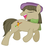
I’ve thankfully never been so despondent and drunk that two of my limbs spawned on the same side of my body. The lines are good, the shading is good... but she has both wings growing out of her left barrel.
Edit: I’ve done this myself many times, drawn the main body but then realized that I missed wings/limbs in front. The only way I’ve been able to salvage pieces like that is to draw the wing in front anyway and try to use the barrel outline as a line of feathers. Or part of a thicker feather line.
Edit: I’ve done this myself many times, drawn the main body but then realized that I missed wings/limbs in front. The only way I’ve been able to salvage pieces like that is to draw the wing in front anyway and try to use the barrel outline as a line of feathers. Or part of a thicker feather line.
Oh wow, I was so caught up in writing art reviews that I forgot to do my own retro. Somebody, hit the lights and the pyrotechnics! We're going live now!
Retrospective: Nothing Good Happens After 2 A.M.
Okay, I am a bit disappointed that this didn't make it, but definitely not surprised given the general direction of the reviews. I think a lot of the problem is that the hook probably comes across more strongly than I intended. It was supposed to be mostly jocular, but a lot of readers seemed to take it as mean-spirited from Twilight and/or Spike. Which is totally understandable. I meant for the opening to turn heads—I guess I just overdid it.
Still, had a bunch of fun writing this!
>>Zaid Val'Roa
Yeah, this was actually the first minific I've written in a long time that significantly overshot the word count. I've been getting pretty good at guesstimating a first draft at 700-800 words, but this one was poised to hit 900+. So the ending did get a tad smushed. Happy you enjoyed the story!
>>No_Raisin
For point 1, I thought I would use Celestia's perspective to make more observations about Twilight than I actually ended up doing. I think there ended up being only one direct statement about Twilight. Two if you squint. You're totally right that I should have taken advantage of the first-person more.
2, you're on point. Like I said to Zaid, the ending did get smushed due to wordcount, and I kinda had to hurry through Twilight's lesson-learning.
As for 3, I am never going to figure out how to cuss in a ponyfic. I remember all the ways back, Summer Island caught a bit of heat for using real-life swears, so I thought I'd ponify it this time around. It's a bit of a balancing act, I know, so hopefully I'll get it closer to feeling right next time.
Thanks for your thoughts!
>>FanOfMostEverything
100% agree with your statement that Twilight's character arc feels shallow and rushed. And Luna would totally bring mead. She's an old-fashioned girl. :B
>>Trick_Question
I wish I could say that she's drinking so much because of Alicorn immortality, but truthfully, I think I just lost count of how many drinks I made Twilight gulp down. Yeah, I was having too much fun writing, and I got sloppy. :derpytongue:
>>BlueChameleonVI
I definitely see where you're coming from. I'm trying to use adult themes with the drinking and the dating, but I've got kid-gloves on the language. It's a tonal dissonance, and you've got grounds to complain. Like I said to Raisin, pony-swearing is apparently a hit-or-miss sort of deal with me, so I'm still trying to figure out what I can get away with.
As for Spike, I was hoping that Twilight's "teenager" line would give the impression that he was older and rowdier. In any case, it definitely wasn't supposed to come across as mean-spirited, so I probably dropped the ball somewhere.
Thanks for your observations!
>>CoffeeMinion
See my response to Trick for why Twilight is apparently a part-time beer keg.
As for her stallion problems, I'm trying to go for a sense that ponies are basically freaking out (positively and negatively) over her princess-ness too much to genuinely date her. Like, being nervous messes, or being over-excited. I really didn't want to spell it out, because I don't think that's how emotionally hurt people talk, but I understand if you had trouble parsing out the idea. It would probably have been a better idea to err on the side of clarity rather than subtlety in this case.
Thank you for your thoughts!
>>Moosetasm
Yeah, that letter wasn't supposed to come across as angry or hurtful. In my mind, it was kinda silly and more of an excuse for Celestia to meet with Twilight and talk. Celestia's drinking is supposed to be in solidarity, and not a personal thing. I think I can definitely stand to make that clearer that she's enjoying the drinks because of her company. I've definitely got some work to do to clean up the tone.
>>axxuy
>>Trick_Question
>>No_Raisin
Okay, for some reason, all of my stories come out of my head in present tense, and I need to consciously take effort to transcribe them into past tense. In this very story, I think I caught and edited about five or six sentences I originally wrote in present tense. I have no idea why I think my fics in present tense, but yeah, it slips sometimes. I think like half of my writeoff entries have at least one tense error in them. I think in this case, I finished up writing really late, so I was just eager to get the last sentence out of my system and be done with it, and I forgot to check its tense. Blugh!
Retrospective: Nothing Good Happens After 2 A.M.
Okay, I am a bit disappointed that this didn't make it, but definitely not surprised given the general direction of the reviews. I think a lot of the problem is that the hook probably comes across more strongly than I intended. It was supposed to be mostly jocular, but a lot of readers seemed to take it as mean-spirited from Twilight and/or Spike. Which is totally understandable. I meant for the opening to turn heads—I guess I just overdid it.
Still, had a bunch of fun writing this!
>>Zaid Val'Roa
Yeah, this was actually the first minific I've written in a long time that significantly overshot the word count. I've been getting pretty good at guesstimating a first draft at 700-800 words, but this one was poised to hit 900+. So the ending did get a tad smushed. Happy you enjoyed the story!
>>No_Raisin
For point 1, I thought I would use Celestia's perspective to make more observations about Twilight than I actually ended up doing. I think there ended up being only one direct statement about Twilight. Two if you squint. You're totally right that I should have taken advantage of the first-person more.
2, you're on point. Like I said to Zaid, the ending did get smushed due to wordcount, and I kinda had to hurry through Twilight's lesson-learning.
As for 3, I am never going to figure out how to cuss in a ponyfic. I remember all the ways back, Summer Island caught a bit of heat for using real-life swears, so I thought I'd ponify it this time around. It's a bit of a balancing act, I know, so hopefully I'll get it closer to feeling right next time.
Thanks for your thoughts!
>>FanOfMostEverything
100% agree with your statement that Twilight's character arc feels shallow and rushed. And Luna would totally bring mead. She's an old-fashioned girl. :B
>>Trick_Question
I wish I could say that she's drinking so much because of Alicorn immortality, but truthfully, I think I just lost count of how many drinks I made Twilight gulp down. Yeah, I was having too much fun writing, and I got sloppy. :derpytongue:
>>BlueChameleonVI
I definitely see where you're coming from. I'm trying to use adult themes with the drinking and the dating, but I've got kid-gloves on the language. It's a tonal dissonance, and you've got grounds to complain. Like I said to Raisin, pony-swearing is apparently a hit-or-miss sort of deal with me, so I'm still trying to figure out what I can get away with.
As for Spike, I was hoping that Twilight's "teenager" line would give the impression that he was older and rowdier. In any case, it definitely wasn't supposed to come across as mean-spirited, so I probably dropped the ball somewhere.
Thanks for your observations!
>>CoffeeMinion
See my response to Trick for why Twilight is apparently a part-time beer keg.
As for her stallion problems, I'm trying to go for a sense that ponies are basically freaking out (positively and negatively) over her princess-ness too much to genuinely date her. Like, being nervous messes, or being over-excited. I really didn't want to spell it out, because I don't think that's how emotionally hurt people talk, but I understand if you had trouble parsing out the idea. It would probably have been a better idea to err on the side of clarity rather than subtlety in this case.
Thank you for your thoughts!
>>Moosetasm
Yeah, that letter wasn't supposed to come across as angry or hurtful. In my mind, it was kinda silly and more of an excuse for Celestia to meet with Twilight and talk. Celestia's drinking is supposed to be in solidarity, and not a personal thing. I think I can definitely stand to make that clearer that she's enjoying the drinks because of her company. I've definitely got some work to do to clean up the tone.
>>axxuy
>>Trick_Question
>>No_Raisin
...although you did change tenses a couple times.
Why is the last sentence present tense?
The last line shifts to present tense for no obvious reason.
Okay, for some reason, all of my stories come out of my head in present tense, and I need to consciously take effort to transcribe them into past tense. In this very story, I think I caught and edited about five or six sentences I originally wrote in present tense. I have no idea why I think my fics in present tense, but yeah, it slips sometimes. I think like half of my writeoff entries have at least one tense error in them. I think in this case, I finished up writing really late, so I was just eager to get the last sentence out of my system and be done with it, and I forgot to check its tense. Blugh!
This is a well put together piece! The shot is framed well, there's cool contrasts, and the cake looks really well drawn.
I'm going to try to avoid restating what other people have already said.
Starlight's profile is well drawn and the colors of their coats are well rendered. There's like a blue reflected light that comes off of the cake that would suggest it's coming from Starlight. It just shows there's a good deal of atmospheric harmony. The fur on Applejack's hooves are a nice touch. The linework and brush shape you use is very painterly, which complements your style of blending.
One thing, (which might come off as a nitpick, but bare with me) is the sink isn't just a bit askew, but it's kinda misplaced. At least it seems so. Kitchen sink edges aren't normally flush with the edges of the counters they're built into. Also, the cabinets and most of the counter feels too straight. Like, the edges are too clean. It doesn't fit well with the painterly style, though it's pretty fine.The sunlight, which is rendered well, draws the eye from that information anyway. Preserving the opacity and adding light on the table's lines was a good touch, and it might have looked nice on the girls too.
This is a real good one. Very well done!
The sketchy style here's nice, but I think it hinders the mood as well as the form.
I like the cloud shape.
Applejack is specifically difficult to understand because it's hard to see her form. There's no negative space around her limbs that help me quickly discern what she looks like. The medium here looks like BIC pen, so I understand what can and cannot be done. It's nice to have a free and loose drawing session, though.
This is a neat drawing. The ideas that are implemented here are interesting and fit with the story it's based on.
It's a little mishmash-y though. The red-blue-green by itself with the black would be a bit more successful if it was in color order, maybe. (RGB, or BGR) I'm not sure. Very neat, though.
It's a little mishmash-y though. The red-blue-green by itself with the black would be a bit more successful if it was in color order, maybe. (RGB, or BGR) I'm not sure. Very neat, though.