Hey! It looks like you're new here. You might want to check out the introduction.
Show rules for this event
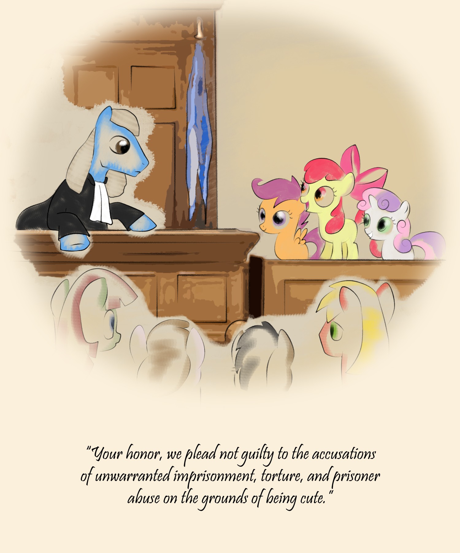
The Town of Ponyville v. Cutie Mark Guidance Services, Ltd.

Fics
The style of this one is very apt for a court case. I'm a fan of the comedic caption too. And nice little cameos for Twilight and Big Mac down below (who are the middle two, though?).
Well-designed and well-executed.
Well-designed and well-executed.
I love parodies, and this is a great aping of an old-style magazine cartoon. One issue - the highlights and colors should not be brighter than the medium they are printed on, and you are emulating yellowed paper here. Just something to keep in mind.
Other than that, good show. This will be an upper tier piece for me.
Other than that, good show. This will be an upper tier piece for me.
This is when they break into song and dance, ending with a resounding "Not guilty!" from the judge.
This gets one last Honorable Mention from me, in the Best New Yorker/Family Circle category. We need more of this kind of thing in the Writeoff art competitions!
>>BlueChameleonVI
Lack of horn and coloration makes me think it's Blossomforth on the left. Ones in the middle look like Filthy Rich and Featherweight to me?
Anyways, I thought this was a hoot. It's a nice contrast to the story, and I think making it in the style of a courtroom sketch was really clever and inspired. I also really like the detail you put into the woodwork of the stands/bench. One little thing that does strike me as odd, though, is how the whites of everypony's eyes aren't colored in and are the same as the background. For a lot of ponies, it isn't a huge deal, but for the CMC themselves since they're in the center where the background's darker, it struck me as creepy-looking, especially AB for some reason.
This is my favorite, and I want it to win.
It has a clear idea and it's a very good idea. I adore how the crusaders pop from the rest of the image .
The only concerns I have are the fact that the most of the lines in this image seem well defined except the judge's hair. This kinda suggests that most of the elements in this picture were heavily referenced. The Crusaders specifically look like vectors I've seen. I'd say this is fine though. I'd also say that trying to emulate the traditional mediums of courtroom sketches isn't completely successful here. The jury and the judge are separated from the furniture in in a way that might have been done more successfully with the same blending that's used in the Judge's coat. (The fur, not the clothes.)
But overall, yeah, this is a really good image. I love it!