Hey! It looks like you're new here. You might want to check out the introduction.
Show rules for this event


This piece is… odd. Twilight is drawn well, if a bit noodly. But I did a double take at the wings. My first thought was “Those aren’t attached right.”
On reflection, Artist, I think you mean the wings to be there as a symbol, either for Celestia’s comforting advice or Twilight’s apprehensions about Alicornhood. But it still looks as if you meant the wings to be attached to her, and if so, they are growing out of one side of her body. You should make it clearer that they are separate, partly by raising the join point from behind Twilight, and perhaps through use of color. (If meant to be Celestia’s wings, making them white would help to differentiate them.)
Her head and expression are great, and the feathers on the wings are well done with the right amount of detail and suggestion. Line work and shading are well done.This will not go to the top of my slate, but I appreciate the effort you put into the piece, Artist.
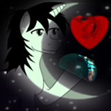
I’ve thankfully never been so despondent and drunk that two of my limbs spawned on the same side of my body. The lines are good, the shading is good... but she has both wings growing out of her left barrel.
Edit: I’ve done this myself many times, drawn the main body but then realized that I missed wings/limbs in front. The only way I’ve been able to salvage pieces like that is to draw the wing in front anyway and try to use the barrel outline as a line of feathers. Or part of a thicker feather line.
Edit: I’ve done this myself many times, drawn the main body but then realized that I missed wings/limbs in front. The only way I’ve been able to salvage pieces like that is to draw the wing in front anyway and try to use the barrel outline as a line of feathers. Or part of a thicker feather line.
Oooo, this piece is neat.
I'll skip any thoughts I had about the wings, as the other two have pretty much already stated my major concerns.
The color choice makes this drawing feel depressing, which is a good thing. It hits the emotion you drew Twilight having. I feel like I can see some sparkles in her tears too? That might be how you captured the image, or maybe you used a glitter pen or something? Interesting and subtle. I kinda like how lithe Twilight appears here. However, it feels as though her forelegs are placed incorrectly. This could very well be a style choice, however, as it doesn't necessarily look wrong.
I've just noticed that Twilight's mark is missing. That might be intentional, though.
Overall, I think this drawing does what it's set out to do and is really good. Nice work! If the wings aren't meant to be attached, then my thoughts align with GroaningGreyAgony
Biased as all hell here, but I loved it! Thank you for drawing it, artist!
I'm of the camp that the wings are meant to look like a separate entity from Twilight. The size and shape of them are almost alien in how they overshadow Twilight's silhouette. And I would not have noticed the glitter/sparkles in her tears if >>Roseluck hadn't pointed it out, but I'm loving it now that I see it. In terms of nitpicks, I know you're trying to match the curve of Twilight's neck to the curve of the wing on the right side, but her neck does feel a little long if you look at it a certain way. But like I said, I'm already loving this one.
I'm of the camp that the wings are meant to look like a separate entity from Twilight. The size and shape of them are almost alien in how they overshadow Twilight's silhouette. And I would not have noticed the glitter/sparkles in her tears if >>Roseluck hadn't pointed it out, but I'm loving it now that I see it. In terms of nitpicks, I know you're trying to match the curve of Twilight's neck to the curve of the wing on the right side, but her neck does feel a little long if you look at it a certain way. But like I said, I'm already loving this one.