Hey! It looks like you're new here. You might want to check out the introduction.
Show rules for this event
Let’s review some Artz! The task is made easier in some ways, and complicated in others, as someone (possibly more than one) has illustrated All The Artz. Some of my reviews may thus seem repetitive, but I will do my best. Here we go!
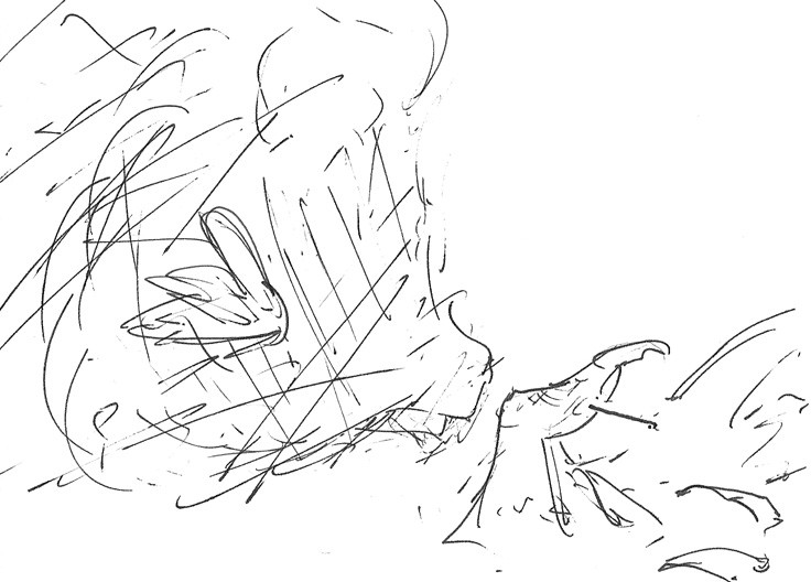
With this work, It’s fortunate that we have the story to go by, as not much sense can be made from the scribbly image. Under the confusion, we have Spike’s disembodied head and hand, and a line and a dot to represent a needle. This image (and the others of its caliber) betray a certain hastiness on the part of the artist, probably necessitated by the heroic scope of the task they undertook. But I am not judging the artist here on the full scope of their works for this round, but the merits of this piece only.
The thumb does look rather like a digit, but the scribbly lines atop it make me think of an old person’s finger and not that of a young dragon. If a line isn’t doing anything in your drawing, it shouldn’t be there, as it will at best detract from the important lines and at worst mislead the viewer in interpreting the work. The rest of Spike’s fingers are rudimentary and don’t help.The crossing lines on Spike’s head also distract the reader from realizing it’s a head of anything at all, much less Spike.
Artist, if you’d cleaned up what you have here a trifle, you’d have had a workable piece, perhaps mid tier. As it stands, it’s going to rank very low on my slate. This is part of the trade off of quality and quantity. But thanks for trying!
I love how you've made his fingers/claws look more monstrous and dangerous. It really compliments the fic very well. And I also really like how we can't see Spike's eyes. Being denied that basic level of intimacy with the character is very effective in making him seem isolated. Great work!
