Hey! It looks like you're new here. You might want to check out the introduction.
Show rules for this event
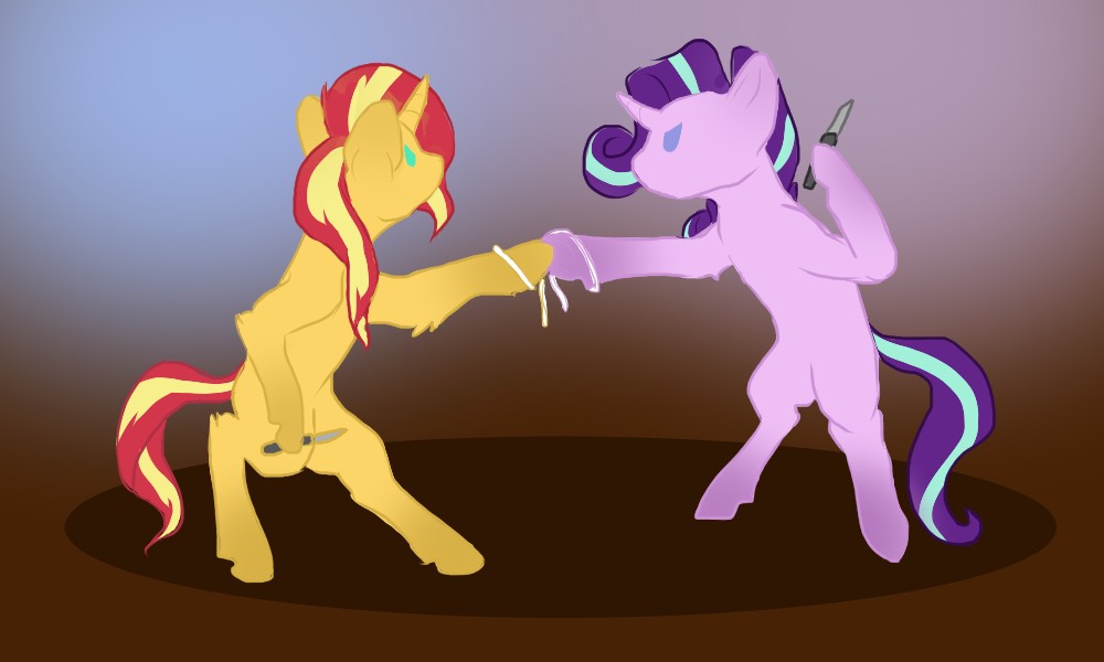
I like this scene going on here. It's a traditional knife fight. Though it's a bit different from it's story depiction, it, in and of itself, is a neat idea. The tied up hooves is a good touch.
Sunset's pose is super well done here! The anatomy is good overall. I also like the very simple expressions of malice.
The big oval shadow at the bottom seems slightly out of place for me. It might be how the lineart was done for the girls vs the very clean edge of the shadow. It might have tied into the picture better if the shadow was drawn in a different way.
Nice picture, all in all!
I like how Sunset's coat is a little shaggier than Starlight's. And I usually find it super awkward when I see ponies on two legs, but made it look like they're not about to tumble over at any moment. NIce!
Personally, though, I have a little bit of trouble with their eyes. Something about their shape or position strikes me odd, and I keep feeling like they look like closed eyelids rather than angry-eyes. But since I'm not an art person, I'm really not sure why that is. Still, it's only a nitpick.
Personally, though, I have a little bit of trouble with their eyes. Something about their shape or position strikes me odd, and I keep feeling like they look like closed eyelids rather than angry-eyes. But since I'm not an art person, I'm really not sure why that is. Still, it's only a nitpick.
“We settle this… Earth pony style.”
Good expressions. Postures are a little off-looking. Color is decent. This picture tells a story well. Thanks, Artist!
Good expressions. Postures are a little off-looking. Color is decent. This picture tells a story well. Thanks, Artist!
Well ! I apparently never got around to commenting here !
I really dig the poses you chose, they are nice n dynamic. Also making the hooves a lil more horsey than the show, really nice!
I honestly feel like the lining style works for this, but i do agree with Bach in that the eyes are a little odd. I think if you had done them in a different style perhaps your intentions with them would've been a little clearer.
Overall, nice ! I wish it had seen a higher placing in the final !
