Hey! It looks like you're new here. You might want to check out the introduction.
Show rules for this event
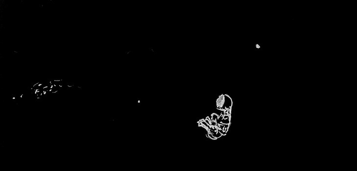

This is one of my favorites this time around.
The black and white art is great for this type of picture.
The way that it looks like he’s just floating endlessly in space is perfectly portrayed.
The anatomy of the pony is really good, too.
My only complaint is the stars. If those are supposed to be the spaceships try to make them have somewhat of an outline. If they’re stars you can put millions of dots or one or two. It creates an empty/endless feel to space.
Great job artist. :D

I like the inversion of colors, here. I do think we could use a little more blackspace(?) to really emphasize the emptiness, but I think you're still conveying the idea just fine. The white specs do feel like they have some kind of significance, which makes the piece as a whole feel less lonely. If they're stars, I agree with >>Anon Y Mous that there should be more of them to make the background uniform. But if they're the spaceships, I think they need to be smaller and further away from the main character. Maybe even put the pony in a corner, or something, just to emphasize the distance.

Knowing the story, I can take a stab at what this is. Without that information, I’d guess a space scene, and quickly pass it by as there’s no detail to make me take any interest in the drawing. The pony in a suit is rudimentary and scribbly, and the stars are just a desultory few points. I must disagree with other critics; I find little merit in this doodle.