Hey! It looks like you're new here. You might want to check out the introduction.
Show rules for this event
I really like Cadance's face, here, and the easy way her mane flows over her Head and Shoulders (TM). There's a bunch of little details I liked as well, like the tuffs of fur on her ears or the work you did on her feathers. Really nice!
Maybe I'm being silly, but that strikes me as an awfully odd way to hold a bottle--it looks precariously balanced. And it's also a little strange that we can't see her back legs or her tail, even if the angle is straight-on.
Still, really liked it as a whole, despite my couple of nitpicks.
Maybe I'm being silly, but that strikes me as an awfully odd way to hold a bottle--it looks precariously balanced. And it's also a little strange that we can't see her back legs or her tail, even if the angle is straight-on.
Still, really liked it as a whole, despite my couple of nitpicks.
I really like how the anti-shading makes the projector's beam really pop out. It's also really neat how it makes Spike's torso lose detail, as if the light is too bright to see clearly by in the dark room. I do have to echo >>Moosetasm in that I wish we could see Twilight, since the story is really about her. But this is a really neat snapshot, nonetheless.
>>BlueChameleonVI
Lack of horn and coloration makes me think it's Blossomforth on the left. Ones in the middle look like Filthy Rich and Featherweight to me?
Anyways, I thought this was a hoot. It's a nice contrast to the story, and I think making it in the style of a courtroom sketch was really clever and inspired. I also really like the detail you put into the woodwork of the stands/bench. One little thing that does strike me as odd, though, is how the whites of everypony's eyes aren't colored in and are the same as the background. For a lot of ponies, it isn't a huge deal, but for the CMC themselves since they're in the center where the background's darker, it struck me as creepy-looking, especially AB for some reason.
Hey guys! It's been a great Writeoff, but some stories are behind on review counts.
Can we get all the finalists up to 10 reviews before tomorrow?
Can we get all the finalists up to 10 reviews before tomorrow?
The hat really is a great touch, as is Chryssi's long-suffering look. I do think her wings are a little sketchy (well, sketchier than the rest), as It took me a second glance to realize that they weren't part of her mane.
First you see the pony, then you see the eye, then you see the teeth. This is really well-composed, and iot uses the different brush thicknesses to great effect. Nicely done!
Not sure if you meant for this to be funny, but it's got such a grand and over-the-top tone that I couldn't help but giggle. Fits the story very well, in my opinion. Again, really cool work with shading, especially how you differentiated Opal's silhouette from her shadow.
Agreeing with >>Moosetasm that their expressions don't quite match the tone of the scene in the story. I'll also note that Mr. Lefty seems to have a lot more detail to his face than Sir Righty. For both of them, though, it's hard to tell where their shoulders/legs are, since the robes look a little blobby to me. I really like you sneaking in Discord's claw, though. That's a great touch!
Thank you so much for the art!! I'm kinda glad you decided to draw one of the coconut drinks, since that was probably the bit that I enjoyed writing the most. :)
I do like that you left the inside of the coconut white, for the flesh. But this white does wash out against the background, which is the same color (or almost the same; can't quite tell). I'd suggest giving the background a yellow or orange tinge, to contrast with the blue and pink and help the white pop out.
I do like that you left the inside of the coconut white, for the flesh. But this white does wash out against the background, which is the same color (or almost the same; can't quite tell). I'd suggest giving the background a yellow or orange tinge, to contrast with the blue and pink and help the white pop out.
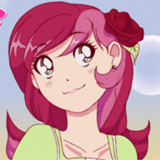
I love how her smile is only at the corners of her mouth, as if she's trying to suppress it. Would have loved to see her wings as well, but I do think her face alone is enough to sell the piece. Also, a random thought: until I saw this picture, I never really realized that Celestia wears her crown behind her horn, rather than over it.
This struck me as kind of funny, with Throwback looking a bit like a cawing rooster back there. And while that's fine and dandy, it does break away from the mood of the original story a bit. It's also a little hard to tell what's going on in the background, with all those lines thatdon't really makes shakes on the right and left sides.
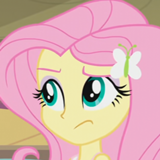
Basically all your expressions (including this one) are freakin' on-point. The frustration on her face is absolutely palpable. My one complaint, is that her horn might need to be a bit longer. As it is, it doesn't even poke out of her mane, and it gives her profile a bit of an odd silhouette.
I very much liked this fic; in fact, I ranked it 7th out of 39th this round. It portrays very capably a tension characterized by "insecurities eating away at oneself," with an additional look into how it impacts Spike. Particularly, I like that this tension is simply thrust into the fore from the get-go, and ends without any significant resolution; this aptly gives the impression that these insecurities have been pernicious for a long time now, that Spike realizes this, and that Twilight is going to suffer from them for a while longer until she directly confronts them herself (Spike did all he could, but Twilight herself needs to see the light). This presentation is, in my opinion, superior to an alternative where the tension is gradually introduced, clearly climaxes, and is resolved (in positive or negative fashion) with a neat little bow, all in artificial manner.
As for critique, I might nitpick and say that the narration sometimes loses focus or wastes time on irrelevant things, e.g. "a recent Golden Oak acquisition," "giving Spike a rare opportunity to be taller than her for a change" (the comic relief also seems to be a defect here), "as though she were capable of delivering any other kind." I also agree with Coffee, that the "viper's nest" comment paints with slightly too dark a brush.
I might also wonder if the story could pack just a little more of a punch, by connecting Twilight's anxieties with something deeper (her new status as Princess is a good start). But as it stands, this story is still a very quality, sober portrait of Twilight's darker side.
This is definitely one of my personal favorites from this round. I just love the contrasts here between the two ponies, from their colors, to their postures, to their expressions. It's great how Raindrops is being cute as heck while Wind Shear is almost disturbing to look at, with the individually outlined teeth and the vein throb. And I do like the subtle yellow sheen on Raindrop's mane; it really warms up the piece and makes it feel sunnier. If I had to lodge a complaint, I'd say that Wind Sheer looks like he might have some giraffe blood in him, with the way we can't even see where his shoulders begin. But that does add to his ridiculousness, doesn't it?
The way that you've got lines radiating out from the corners of the window made me think that this perspective was from the inside of an oven or a box. It's a little odd, but I definitely liked the piece more when I started noticing the things like their manes, or Flutter's expressive eyes. Compared to your other entries, this one does feel a little muted in tone/intensity, but that might just be from the subject matter.
This is a cute one! The sketch by itself is nice. I think darkening the lines of the mug and maybe adding something like a handle to distinguish it as a mug would help the image overall. Also, at the angle she's holding the mug to her face, she doesn't seem to be drinking from it. This is fine if it's not what you were going for; she could just be holding it up to cover her mouth.
She's very cute, though. I like her eyes in this image.
She's very cute, though. I like her eyes in this image.
I haven't really got much to add from the previous commenters: I agree the voicing is inconsistent in how formal and informal it can be, the implied parallels between Lightning and Wind Rider are duly noted but nothing's explicitly concluded from it, and the last line does work as a twist but feels a bit strained (a side-effect no doubt of the formal-informal issue) and leaves unsatisfied questions about this encounter and what Lightning Dust's attitude is.
That said, I still liked it. Considering how obvious the parallels are, it's surprisingly rare to find Wind Rider and Lightning Dust in the same fic, much less given equivalent focus. More to the point, I did like the informal language - very fitting - and the grim, matter-of-fact delivery serves the subject matter well (up until the ending, when its sparseness and lack of clear emotion starts to count against it). I'm personally not a fan of the Teenage-isms; it's not egregious, all things considered, but this could easily be rewritten without them and it might actually improve.
The overall emotion and attitude is weak - I think you were going for an open ending, and for me it weakens rather than strengthens the underlying point - but I did like how Lightning described her revulsion of Wind RIder. If that had been emphasized more, and the parallels explored more, I could easily see this as a solid entry, maybe even as a top contender. What this fic needs is a sense of closure. Right now, it's a starter premise, detailing interesting facts and reactions, but it doesn't change Lightning as a result, at least not in a way that's obvious. I think the main question here is: What's Lightning Dust's point? What did she learn from this? How has this altered her worldview? You seem to come close to answers with the Rainbow Dash reveal, but there's just not enough information to tell one way or the other where Lightning's going with this.
I do like the overall tragic psychological horror style here. What I think it needed was a definite conclusion, and some indication that Lightning isn't just beginning to make connections but is exploring them too. Like many other fics here, a tighter and more definite ending would have worked wonders for this one in my mind.
Also, sorry for leaving this to the last minute. I'd planned to tackle this sooner and complete my slate. Just didn't get around to it, that's all.
>>CoffeeMinion
I've reviewed them all now, so I've played my part, CM. That said, I don't think I'll ever try reviewing like that again. Too many fics. :( Anyway, I should've finished this sooner, but I haven't been 100% the last few days. Nothing serious, but enough to keep me occupied.
I've reviewed them all now, so I've played my part, CM. That said, I don't think I'll ever try reviewing like that again. Too many fics. :( Anyway, I should've finished this sooner, but I haven't been 100% the last few days. Nothing serious, but enough to keep me occupied.
This is a pretty alright drawing too! I went and read the story this one belongs to and I can say you definitely depicted Wind Sheer the way I imagined him. You gave him the aviators that were described in the story, but i also see you've added a hat, which suits the character. Raindrop's expression is adorable.
Some things I noticed though: You added light shading to Wind Sheer's teeth, which is nice, but neglected to shade the tongue. This is in the same area, and should be treated the same. It kinda looks out of place without it, and there's inconsistencies like this in other places too. The rain cloud seems more bubbly than it does gaseous. You can fix this maybe by applying a more uniform and diffused light over the whole cloud. I can also tell that you're using photoshop/gimp/Sai etc's lighting layer function or whatever. (Haha, I actually don't know if Gimp has this?) The light you used somewhat liberally over Raindrops covers her left eye, and makes it appear as a different color. (Unless her right eye is the one off color?) The lines are also somewhat messy in some areas, such as Wind Sheer's collar and neck, which doesn't suit the style you were going for.
ALL IN ALL I think this is a really good drawing, but you just need a bit more focus on shadow choice and placement as well as more time spent of making the lines neater. The concept of the picture itself is pretty good.
This sketch, by itself, doesn't immediately seem to relate to the story. Moosetasm had a good point. Judging this just as a drawing of Cadence, I'd say she's adorable. Her wing, however, seems somewhat odd and kinda small. It's an anatomy nit pick. I have a few anatomy nit picks, like how the headshape looks, the hoof, the ear placement, but the anatomy isn't really important here I suppose. It's not a major focus of the drawing.
Cute picture, overall.
Cute picture, overall.
Oooo, this piece is neat.
I'll skip any thoughts I had about the wings, as the other two have pretty much already stated my major concerns.
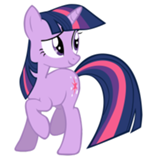
The color choice makes this drawing feel depressing, which is a good thing. It hits the emotion you drew Twilight having. I feel like I can see some sparkles in her tears too? That might be how you captured the image, or maybe you used a glitter pen or something? Interesting and subtle. I kinda like how lithe Twilight appears here. However, it feels as though her forelegs are placed incorrectly. This could very well be a style choice, however, as it doesn't necessarily look wrong.
I've just noticed that Twilight's mark is missing. That might be intentional, though.
Overall, I think this drawing does what it's set out to do and is really good. Nice work! If the wings aren't meant to be attached, then my thoughts align with GroaningGreyAgony
I'll skip any thoughts I had about the wings, as the other two have pretty much already stated my major concerns.
The color choice makes this drawing feel depressing, which is a good thing. It hits the emotion you drew Twilight having. I feel like I can see some sparkles in her tears too? That might be how you captured the image, or maybe you used a glitter pen or something? Interesting and subtle. I kinda like how lithe Twilight appears here. However, it feels as though her forelegs are placed incorrectly. This could very well be a style choice, however, as it doesn't necessarily look wrong.
I've just noticed that Twilight's mark is missing. That might be intentional, though.
Overall, I think this drawing does what it's set out to do and is really good. Nice work! If the wings aren't meant to be attached, then my thoughts align with GroaningGreyAgony
>>Trick_Question
I figured. I'm not saying they should be closer, but they should have a different orientation within the canvas. A slightly more dynamic angle or something. Maybe if the POV was changed so they weren't level with each other. The cupcake on the right actually does appear to be a bit higher. If this effect were exaggerated a bit more, it'd be more successful.
I should have made myself more clear in the beginning, whoopsie!
This drawing definitely gives a foreboding feeling. It's very simple, but effective in that. The light would suggest Opal is standing in a doorway, and I'm not sure if making the edges of the light straighter would help or hinder this drawing. One thing that I definitely think would help just a bit is adding more negative space on the floor so that it's Opal that casts the most shadow. This is, however, unnecessary. The image is fine as is.
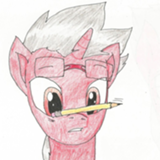
This is an interesting pencil drawing. I think it's pretty well done. I like the crosshatching on her wings and in her mane. Her expression is really well done, and I think the wings themselves are very well drawn. Her horn, I'd say, is really well done. It takes full advantage of the medium, I'd say.
Some things though: the shadow around her body doesn't seem to have a definite light source. The shadow on her right leg would indicate a light source from the front-left of the image, where her wings indicate a light source from above Cadence. Her ears and left hoof show a right-oriented light source. We could say the light is coming from in front of her, but this doesn't work with the shadow on the bottle. The bottle, also, seems kinda small. This could make a lot of sense logically (Cadence might be much larger than a human, so the bottle will seem this big compared to her, or, the hot wing sauce could just be in a very small bottle) but it doesn't do the image justice, as it's a major subject. One last thing: I think the image could use something to suggest the rest of Cadence's body is present. Adding just a few lines to show her tail or her hind legs would help. They're not 100% necessary, but without them, I can't help but notice they're not there.
I really like this drawing, and my few concerns are minor. Very well done!
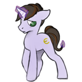
Nuts. I should've given this an Honorable Mention as well, in the Sexy Mischievous Wink category.
--And she's not even winking!!!
--And she's not even winking!!!
This is my favorite, and I want it to win.
It has a clear idea and it's a very good idea. I adore how the crusaders pop from the rest of the image .
The only concerns I have are the fact that the most of the lines in this image seem well defined except the judge's hair. This kinda suggests that most of the elements in this picture were heavily referenced. The Crusaders specifically look like vectors I've seen. I'd say this is fine though. I'd also say that trying to emulate the traditional mediums of courtroom sketches isn't completely successful here. The jury and the judge are separated from the furniture in in a way that might have been done more successfully with the same blending that's used in the Judge's coat. (The fur, not the clothes.)
But overall, yeah, this is a really good image. I love it!
I like how Sunset's coat is a little shaggier than Starlight's. And I usually find it super awkward when I see ponies on two legs, but made it look like they're not about to tumble over at any moment. NIce!
Personally, though, I have a little bit of trouble with their eyes. Something about their shape or position strikes me odd, and I keep feeling like they look like closed eyelids rather than angry-eyes. But since I'm not an art person, I'm really not sure why that is. Still, it's only a nitpick.
Personally, though, I have a little bit of trouble with their eyes. Something about their shape or position strikes me odd, and I keep feeling like they look like closed eyelids rather than angry-eyes. But since I'm not an art person, I'm really not sure why that is. Still, it's only a nitpick.
I love how you've made his fingers/claws look more monstrous and dangerous. It really compliments the fic very well. And I also really like how we can't see Spike's eyes. Being denied that basic level of intimacy with the character is very effective in making him seem isolated. Great work!
This is definitely looks like your most refined piece, and I really like it! I love the details in her eyes, and I love her horsey little ears. Very nice stuff!
The splashes of color and the random spread of foods really evokes the idea of vomit, but in a totally upbeat way. This piece is definitely on art cocaine. Personally, it's not my cup of tea, but nice work dialing it up to 11 and tearing off the knob. I'm not sure I understand the title or mouseover text, though.
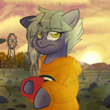
It's a little difficult to tell what's going on in his room. I see a door and a bookshelf, but the other items are not so clear. Is the square to the right of Sunburst's head a window or a painting? And the thing to his left might be a the head of his bed, or a desk.
I like the feeling of stress that this evokes, with the wavy lines at the edges squeezing down on the scene claustrophobically. But Sunburst himself does feel a little messy, especially the lower half of his body.
I like the feeling of stress that this evokes, with the wavy lines at the edges squeezing down on the scene claustrophobically. But Sunburst himself does feel a little messy, especially the lower half of his body.
I love their little business suits. It's the perfect blend of cute and off-putting to see a little child-pony wearing one. Apple Bloom's eyes are great, and as for Sweetie Belle, I'll quote the girl herself and say "I really like her mane!".
I think you knew you were drawing a kinda dumb piece. And I'm pretty sure this comes across as magnificently dumb as you intended. The exaggerated eyebrows are a great touch!
I thought for sure it would be a degree in Friendship Studies, because PhD's in Studies majors make the best mail clerks and baristas.

I like the effect of the oblique lighting source showing the texture of the paper. I feel that to make this work best, the lines of the drawing should have stronger contrast. As suggested, coloring, along with adding thicker lines around the outside of objects, could help. I’m classing this as a mid tier piece.
Something outside the story that is canon to the cartoon now. Phoenix feathers can cause deafness, and both of them have been exposed here. (snerk)
"Thank you, Rairity! It's very nice!"
"Oh, it's too hot and I should get you some ice? I'll be right back."
"How am I supposed to scratch your back if you leave?"
"You want me to get a sieve too, Spike?"
"Thank you, Rairity! It's very nice!"
"Oh, it's too hot and I should get you some ice? I'll be right back."
"How am I supposed to scratch your back if you leave?"
"You want me to get a sieve too, Spike?"
I’d like to approach this as an abstract piece, but it lacks cohesion. Abstract pieces are not just random scribbles, and this just looks like a scribble that’s been dotted with the fill tool in MS Paint.
I mean, I hear you. “Hey, some other artist drew vomit! Why can’t I draw a fart?” The difference is in detail and intent. I’am afraid that this piece will go low on my slate.
I mean, I hear you. “Hey, some other artist drew vomit! Why can’t I draw a fart?” The difference is in detail and intent. I’am afraid that this piece will go low on my slate.
Characters are recognizable, expressions are decent. Still a bit scribbly for my taste. It would have been nice if you’d had the time to polish it a bit more.
Good on expressions, Artist; you clearly have experience in drawing ponies. Bad on polish. I’m going to be saying this about a lot of this artist’s entries.
Knowing the story, I can take a stab at what this is. Without that information, I’d guess a space scene, and quickly pass it by as there’s no detail to make me take any interest in the drawing. The pony in a suit is rudimentary and scribbly, and the stars are just a desultory few points. I must disagree with other critics; I find little merit in this doodle.
You’ve got a really cute little Twily face there, artist. If you’d smoothed out the helmet a bit and polished the whole, you’d have a top contender.
Dragon in the background is well done. Pony being scribbly dampens the effect. Artist, I wish you’d picked just a few of these ideas and finished them properly.
“Well, don’t just sit there, boy. You punched that hole in the ceiling; you fix it.”
Another piece that lacks too much detail to tell a real story. We can barely tell where the characters are, and their expressions can convey any number of things.
Another piece that lacks too much detail to tell a real story. We can barely tell where the characters are, and their expressions can convey any number of things.
Good job, Artist. Great expressions, neat clean lines, good coloring job, funny scene. A definite top tier piece.
Again, one part of the drawing done very well (really adorable expression on Twilight), rest of image unfinished. That’s the trouble with scribbles.
Lacking the story, this image is barely recognizable as anything. Maybe a carrot patch surrounded by donuts.
I wouldn’t have gotten this image without the story. I admit it’s not an easy story to illustrate.
Woot. Great job, artist. Lovely expressions, clean lines, good contrast and coloring, and a cake I’d actually eat. You’ll get a medal for this.
Good expression and conveys part of the story without struggle. Again, I wish you’d finished it. Now we know where all the color in 37th View comes from.
Another first draft. It doesn’t catch my eye enough to make me want to figure out what it’s trying to convey.
Yay! I got some art for my story. True, it’s because everyone got art, but hey, things can always go better. Speaking of which…
Yeah. I’m not going to demand that someone put their full inspiration and skill into portraying an anti-story about a giant space cabbage, but… Oh well.
Yeah. I’m not going to demand that someone put their full inspiration and skill into portraying an anti-story about a giant space cabbage, but… Oh well.
This is definitely cute, but unfortunately it didn't really grab me. It does come across as a little static to me. Maybe the other two reviewers are on to something, about how the picture doesn't show the hot sauce or its effects. Still, I definitely don't dislike it.
Illustrates a basic idea. Protip - if you hold down the shift key while drawing in MS Paint, it makes a straight line.That would have cleaned up the sides of the bottle for you.
Biased as all hell here, but I loved it! Thank you for drawing it, artist!
I'm of the camp that the wings are meant to look like a separate entity from Twilight. The size and shape of them are almost alien in how they overshadow Twilight's silhouette. And I would not have noticed the glitter/sparkles in her tears if >>Roseluck hadn't pointed it out, but I'm loving it now that I see it. In terms of nitpicks, I know you're trying to match the curve of Twilight's neck to the curve of the wing on the right side, but her neck does feel a little long if you look at it a certain way. But like I said, I'm already loving this one.
I'm of the camp that the wings are meant to look like a separate entity from Twilight. The size and shape of them are almost alien in how they overshadow Twilight's silhouette. And I would not have noticed the glitter/sparkles in her tears if >>Roseluck hadn't pointed it out, but I'm loving it now that I see it. In terms of nitpicks, I know you're trying to match the curve of Twilight's neck to the curve of the wing on the right side, but her neck does feel a little long if you look at it a certain way. But like I said, I'm already loving this one.
Ah, what nice pencil work, and what a lovely expression. I love her wings and her eyes, and that understated bottle of hot sauce. This will go high on my slate, there to struggle against its true competition.
.... And it looks like I somehow missed two of the art entries, so here we go:
You do a really good job with eyes, artist, and this is no exception. The thing is, I'm having the same issue that I had with your piece for Unexpected Results in that the lack of a nose on PInkie is really rubbing on me oddly. And I would have loved to see the burning wreckage too, to be honest. :P
You do a really good job with eyes, artist, and this is no exception. The thing is, I'm having the same issue that I had with your piece for Unexpected Results in that the lack of a nose on PInkie is really rubbing on me oddly. And I would have loved to see the burning wreckage too, to be honest. :P
“Fluttershy, how do you get your oven so clean?”
“I… I take it out in the rain, and ask it politely.”
“I… I take it out in the rain, and ask it politely.”
This is a bit too raw and random. Again, lacking context from the story, I wouldn’t be clear on whether this is even a figure.
I'm not as clear as what you wanted to do with this one. I can usually see your intent in these sketches, but outside of Rarity obviously having a stressed expression, there's not a lot of support for the mood. I think this is an experimental piece... the brush strokes do look like watercolors or something like that, to my untrained eye. It's definitely cool that you've tried using a different medium, but it does have the unfortunate effect of making Rarity's hair look a bit spaghetti-ish.
A simple doodle. The umbrella stem blends into the coconut. I’ve not much else to say.
A decent attempt at a dark room scene. Spike and the projector are recognizable. The lines are hasty, but they aren’t just scribbles that loosely try to corral an object; they form the hatching that adds depth to the scene.
I should refrain from reviewing a few pieces to make it harder to guess which one is mine. So, uh, I abstain from reviewing this one.
Great expression in the foreground. In the background, a three-fingered monster tries to hold up a piccolo.
Cute expression and pose; half assed wings.
If it seems like I’m being terse with some of these reviews, please consider them to be reflecting the Artist’s approach to this round.
If it seems like I’m being terse with some of these reviews, please consider them to be reflecting the Artist’s approach to this round.
Nice expressions, decent coloring and poses,and little WTF Twily in the corner adds the right touch of whimsy. This is a good workmanlike job, Artist, and I will put it in the upper tiers.
In this image, Artist, your scribble style works for you. The lines that are needed to give comprehension are clean, and everything in the image is recognizable as what it’s supposed to be. Decent job here.
“We settle this… Earth pony style.”
Good expressions. Postures are a little off-looking. Color is decent. This picture tells a story well. Thanks, Artist!
Good expressions. Postures are a little off-looking. Color is decent. This picture tells a story well. Thanks, Artist!
“Excuse me, Ma’am, do you have a moment to talk about Twilight Sparkle the Redeemer?”
The drawing is a bit rough, but has a good D’aww factor.
The drawing is a bit rough, but has a good D’aww factor.
Cute and competently executed. Scribbling kept to a discrete minimum, though you could have put more detail in her hair. You have talent when you choose to display it, Artist.
A nice little simple sketch. The Artist is in command of the lines here, instead of just tossing them around and hoping the right line will fall in the middle somewhere.
The expression is what sells this piece. The background is just too slapdash to carry much weight.
A good example of what can be done with hatching alone, when you don’t scribble with it.
Did anypony ask for some...
...no? Well, I got stuck dealing with middle-of-the-night server issues, and just happened to have Inkscape handy while I reboot things...
(1) Trouble Brewing
(2) In Space, Nopony Can Hear If You've A Moment To Talk
(3) Offensively Hot
(4) I Asked For Their Strongest. They Brought Me This.
Art Mashups?!
...no? Well, I got stuck dealing with middle-of-the-night server issues, and just happened to have Inkscape handy while I reboot things...
(1) Trouble Brewing
(2) In Space, Nopony Can Hear If You've A Moment To Talk
(3) Offensively Hot
(4) I Asked For Their Strongest. They Brought Me This.
>>CoffeeMinion
You all started Art Mashups without me? This shall not stand!
Peer Pressure
To the Victor Belong the Spoils
You all started Art Mashups without me? This shall not stand!
Peer Pressure
To the Victor Belong the Spoils