Hey! It looks like you're new here. You might want to check out the introduction.
Show rules for this event
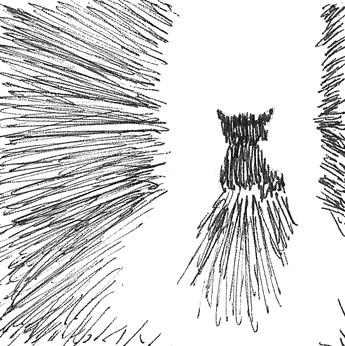
Not sure if you meant for this to be funny, but it's got such a grand and over-the-top tone that I couldn't help but giggle. Fits the story very well, in my opinion. Again, really cool work with shading, especially how you differentiated Opal's silhouette from her shadow.
This drawing definitely gives a foreboding feeling. It's very simple, but effective in that. The light would suggest Opal is standing in a doorway, and I'm not sure if making the edges of the light straighter would help or hinder this drawing. One thing that I definitely think would help just a bit is adding more negative space on the floor so that it's Opal that casts the most shadow. This is, however, unnecessary. The image is fine as is.
A good example of what can be done with hatching alone, when you don’t scribble with it.
