Hey! It looks like you're new here. You might want to check out the introduction.
Show rules for this event
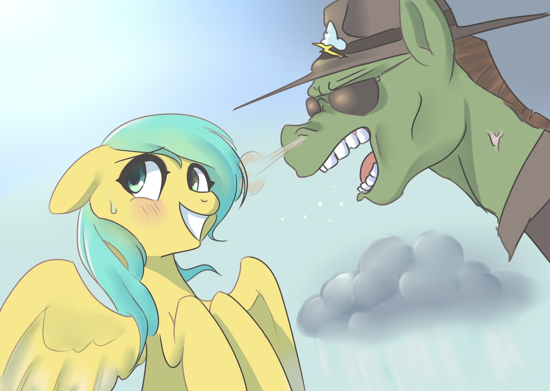
This one doesn’t have as many comments as I expected. It’s a well composed piece!!
It seems that you have a skill and know how to draw ponies, artist. Props to you. The color scheme is pleasing to the eye and the lines are clean.
Tips to make the image pop out more is if you put a dark background against the light pony and the light background against the dark one it makes the image stand out in a good way.
The rain cloud is perfectly done. I love that you took some time to paint it, and paint it well. The rain coming from it is great, too.
My minor complaint is the huff coming out of his nose. It overlaps Raindrops in not a good way. In my personal opinion it would look better if you removed it.
My review would be longer but I’m stuck with only my phone on vacation.
Keep drawing ;)
This is definitely one of my personal favorites from this round. I just love the contrasts here between the two ponies, from their colors, to their postures, to their expressions. It's great how Raindrops is being cute as heck while Wind Shear is almost disturbing to look at, with the individually outlined teeth and the vein throb. And I do like the subtle yellow sheen on Raindrop's mane; it really warms up the piece and makes it feel sunnier. If I had to lodge a complaint, I'd say that Wind Sheer looks like he might have some giraffe blood in him, with the way we can't even see where his shoulders begin. But that does add to his ridiculousness, doesn't it?
This is a pretty alright drawing too! I went and read the story this one belongs to and I can say you definitely depicted Wind Sheer the way I imagined him. You gave him the aviators that were described in the story, but i also see you've added a hat, which suits the character. Raindrop's expression is adorable.
Some things I noticed though: You added light shading to Wind Sheer's teeth, which is nice, but neglected to shade the tongue. This is in the same area, and should be treated the same. It kinda looks out of place without it, and there's inconsistencies like this in other places too. The rain cloud seems more bubbly than it does gaseous. You can fix this maybe by applying a more uniform and diffused light over the whole cloud. I can also tell that you're using photoshop/gimp/Sai etc's lighting layer function or whatever. (Haha, I actually don't know if Gimp has this?) The light you used somewhat liberally over Raindrops covers her left eye, and makes it appear as a different color. (Unless her right eye is the one off color?) The lines are also somewhat messy in some areas, such as Wind Sheer's collar and neck, which doesn't suit the style you were going for.
ALL IN ALL I think this is a really good drawing, but you just need a bit more focus on shadow choice and placement as well as more time spent of making the lines neater. The concept of the picture itself is pretty good.
Good job, Artist. Great expressions, neat clean lines, good coloring job, funny scene. A definite top tier piece.
>>Zaid Val'Roa
Agreed. Congratulations, >>Roseluck, and I hope you come back to do more, because this was delightful.
Agreed. Congratulations, >>Roseluck, and I hope you come back to do more, because this was delightful.
