Hey! It looks like you're new here. You might want to check out the introduction.
Show rules for this event
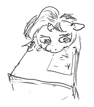
This one's got a cleaner look to it than the other sketches, and I like the extra details it affords to Sunset's mane and tears.. Sunset's face strikes me a s a little too wide for her snout to me, though. And it took me a second to realize that she was seated at her desk; I almost mistook her desk for her body. I doing something like showing her hooves or more of her torso might make it easier to get a sense of her posture.
My reaction to this picture was, "Aw..."
And I showed it to two of my friends who had also read the story and they said, "Aw..."
The expression is done so well and it captures such... "Aw..."
Thank you for this sketch and for all you hard work, Haze!
And I showed it to two of my friends who had also read the story and they said, "Aw..."
The expression is done so well and it captures such... "Aw..."
Thank you for this sketch and for all you hard work, Haze!
