Hey! It looks like you're new here. You might want to check out the introduction.
Show rules for this event
For the record, my first drawing was going to be Pinkie's legs clambering up a sooty fireplace after she's played Santa Stone. :pinkiehappy:

A unicorn exploring a beaten down tower or some sort of piece to a castle ruins. It's lovely. And the shade art style is something to behold. While it lacks some detail it stills a solid expression and meaning making this one easy to work with. Well done by the way in explaining what is going on in your mind. It neither confuses us or baffles us with what it brings to the table. My only advice is try silhouette art pieces. Try making blotch style arts some puddles of ink and paint go a long way and I believe you can express yourself best by shaping these pools into a defined shape and size. Rather than the obvious detailed and pretty artwork most will tend to try to pull off.
Pinkie no! When somebody wants you burned away and dead you stay dead! No Pinkie no nooooo!
Makes sense she could just go "Look at me rise from my ashes!" Nero Pinkie Pie already jeez. This would be pretty funny if it wasn't morbid to begin with. Death is not cool, resurrection eh kinda midway. An overpowered cutie reconstructing her booty? Go on you have my attention.
Simple piece and easy to work with. Not at all mind blowing but a well done entry.
This would be aesthetically much more pleasing if the few anatomical errors were fixed. Things with small detail were obviously given proper treatment, such as the rings, but the whole of Sunset is just lacking. Though, if the feeling of ugliness was supposed to come off as that's what happens with envy and pride, I'd be a bit more forgiving. But, since I don't know if that's the case, I simply don't know.
So Celestia is given a gift by her pet Filomina. And ends up smoking a blunt after the rebirth cycle of said majestic bird' resurrection. I am not amused. You could have turned this panel into one where Filomina goes evil in this current life time and boom. Instant story when the Princess of the sun summons up Filomina old caretaker to track and contain her. The timid pony of kindness "Fluttershy" this would have made a great short but. We get a blunt. So to be blunt about the blunt while the Princess here takes a toke of not organic green but of cremated bird s###, I will say this. I didn't need to see this. And I don't wanna write about it. You give me nothing in return except for 5 seconds of a smile and confusion for the next 30 minutes. What were you trying to share here? Your sense of comedy? That you can be funny? Maybe you're running up for a cartoon panel for a newspaper. I have no idea but I did not enjoy this one.
Aahhhh hhmmm! AAAAAAHHHHHHHHH! *whines* my childhood. *Rolls over and gasps for air.* I can't breath I can't.....oh my goodness..I'm panicking! I'm panicking! *Pulls out a scroll and quills and frantically writes.*
A pheonix dies and still provides usefulness after death. I like it.
But don't you think that this kind of inspiration for the writer is too linear? Heck, putting it in a comic form basically tells the entire story one could potentially write by itself. Only good way for someone to pull this off as inspiration would be to have it as a twist. And since the twist is already explained here, you'd have to do a double twist, a twist inside of a twist, so then people will be twisted just enough.
Or maybe I'm thinking too much from this... Overall decent, slightly funny.
Is this about bad pony OC's? Well I'm glad I'm an earth pony then. Granted a recolored 63 flipped trap of a pony but it expresses me. Makes me question if my ponysona is whack or not. Hm. Should make a blonde version of this pony and name it Floppy Twinkie.
Come on guys. It's a flower pony named Lilly. Only one of those three girls would know that growth tip and make a giant flower.
I'd probably be a bit biased, since cyclopses do intrigue me a lot more than what it would do for the average person, but I do have to say that this is quite visually appealing. What it stands for exactly can be very open ended indeed for the writers and viewers of the piece--to the point in which it would probably harm it more than anything--but it's still pretty solid overall.
Would make for a pretty decently well-done horror story and crossover, if done right. This has a lot of potential going for it.
I like how the A's get denser (or at least bolded) in the middle to make it darker. I'm not sure why the CR and the LS are so much bigger though, especially since the YST is the same size as the A's.
My biggest problem with this is that the text makes it look like Sombra should be screaming it in anger. But the eyes give me more of a hissing vibe (possibly because I think that's what he did on the show). I think it would match better if the text was more like "CRYYYYYYYSSSSSSTAAAAAALSSSSSS."
My biggest problem with this is that the text makes it look like Sombra should be screaming it in anger. But the eyes give me more of a hissing vibe (possibly because I think that's what he did on the show). I think it would match better if the text was more like "CRYYYYYYYSSSSSSTAAAAAALSSSSSS."
Simple and thought-provoking, yes, but I can't come to a conclusion as to how to make this a proper and interesting concept within my own mind. Maybe it's just me, and someone else can think up one pretty easily, but I'm left with nothing.

This art style seems very familiar to me, but I can't remember who it might be.
I also feel like I should recognize that pony, but I don't.
Even after looking at some pictures of horse skeletons, I don't really know what's going on with those legs. I think it's missing a few bones on the one that we can see fully. Then again, that could be a plot hook for someone.
And are those ponies supposed to be anthro? If so, maybe you should make that a bit more clear (the position of the left arm seems a bit off, for example). If not, maybe you should make that a bit more clear (the fact that they're both upright and the glove both suggest anthro to me). And if you were trying to be ambiguous...good job.
(On that note, I can't recall ever seeing an anthro story in a writeoff. Huh.)
This is cute, and I like the simplistic/unpolished look that others are complaining about. I think that it works well for this picture.
Ying-yang, prophecies and the unknown, fortold fortunes and daunting quests. Whoever accepts this artistic inspiration for their writing piece is going to have a field day. Amazingly done with both inspiring and visually pleasing.
This looks pretty nice... apart from that hardwood floor you found somewhere. The background is the ugliest part of this, and unfortunately bit is big and brown and there.
The page and the cutie mark effect are nice, though.
The page and the cutie mark effect are nice, though.
My biggest problem with this is the dirt underneath it doesn't quite look dirt enough at first glance, which can lead to a weird effect as you try to figure out which side the roof is on. Also, the reflection of the stars on the pony's helmet looks too much like an attempt to make it look curved/textured rather than clearly being the reflection of stars.
That said, this has nice composition and the planet in the background is great.
That said, this has nice composition and the planet in the background is great.
First time I looked at the image I had trouble deciphering what exactly it was, but then again, I'm not exactly familiar to ashtrays in my everyday life. Though the piece of encryption was still there.
I'm not really understanding what kind of mood you're attempting to put with your piece of art, honestly. With smoking, you'd typically see a very serious setting with very serious individuals inside a very seriously saturated area, since that's what's normally done with something that's supposed to give a serious feeling toward the viewers. With this, there is no shading nor is there any proper consideration with the background, that being a very, very bright yellow. I'd like to imagine a story with the set pieces given in the art, but whatever I try, it conflicts with the overall contrasting feeling the visual aspects of the image gives off. Yellow is a very goofy color, and maybe it could fit within dark humor (?), but even that would be a stretch for me.
I'm not really understanding what kind of mood you're attempting to put with your piece of art, honestly. With smoking, you'd typically see a very serious setting with very serious individuals inside a very seriously saturated area, since that's what's normally done with something that's supposed to give a serious feeling toward the viewers. With this, there is no shading nor is there any proper consideration with the background, that being a very, very bright yellow. I'd like to imagine a story with the set pieces given in the art, but whatever I try, it conflicts with the overall contrasting feeling the visual aspects of the image gives off. Yellow is a very goofy color, and maybe it could fit within dark humor (?), but even that would be a stretch for me.
I'm with >>Not_A_Hat; I didn't even see the pony in the middle at first. I'm also not sure what the stuff on the right (our right), inside the tower's cracked top, is supposed to be - stairs?
The colors are nice, though.
The colors are nice, though.
For this one, I feel the interpretation lies in the title, "Forged in the Fires of Friendship." Although fire has the ability to destroy, it also has the power to create, as in a forge. Which way is the fire going? It isn't. It merely exists as a boundary between Twilight and Rainbow. Perhaps this prompt could spawn a story of intense, consuming passion. Perhaps a story of mutual loss. Maybe even both simultaneously.
I spent several minutes staring at this picture trying to figure out two things: what is going on here, and was this actually made with one of those scratch-pad-things.
My first thought was that this was supposed to be the remains of a forest fire, or something along those lines (the title really pushed me towards that line of thought). Eventually, I figured out that it's just two ponies walking away from a campfire. Which leads me into my two problems with this picture. First, it's messy. I realize that at least part of the reason for that is the medium, but it still makes it hard to understand the piece. The second problem is that the title, prompt, and "action" draw attention to the campfire and ponies, but the piece is really a landscape, and those are just small details. I suppose you could argue that the campfire is an important part of the landscape, but it still feels like just a minor addition. But maybe that isn't really as big of a problem as I'm making it out to be.
Now as for the medium, I think this actually was made with one of those scratch things. If not, you really did a good job of simulating it. So if nothing else, I think you deserve points for experimenting with an unusual medium.
I don't think I've seen one of these scratch things since like 5th grade.
I'm with >>Not_A_Hat here to some extent, but I think my biggest problem with this is that it just feels kind of lazy. It isn't really evocative, it's just sort of a simple gag that didn't really do anything for me.
While it most certainly could use work on the visual aspects, that being the building could be more architecturally sound, like you could've taken an image from real life and drawn over that, an inspiration for this can be quite easily removed from the overall picture. Nicely done.
>>Trick_Question
Hey, Trick, don't give up! See if you can find a pic in the gallery that gives you a story idea, or maybe even fits with one of yours, and just go for it. We all love ya here.
Hey, Trick, don't give up! See if you can find a pic in the gallery that gives you a story idea, or maybe even fits with one of yours, and just go for it. We all love ya here.
While the text helps the joke, I have to admit that it is also what carries it - which raises the question of how much we want to reward art which is heavily reliant on text. The text isn't particularly well-integrated into the piece - it isn't something like "Ceci n'est pas une pipe", this is a label.
I was able to recognize Sunset easily enough, but I would have thought that Trixie was actually Rarity if it weren't for the caption. My only other complaint is that Sunset's hand is really distracting. I know that hands are hard to draw and all that, but it's still distracting.
But it's a very good piece all around, and will likely stay near the top of my slate.
But it's a very good piece all around, and will likely stay near the top of my slate.
Why didn't you actually just write the text on the gravestone?
That said, this is primarily an art contest, and almost all of the context for the image comes from the text, not the art. While there are ways of doing this cleverly (The Treachery of Images), here it feels less like a clever part of the image and more... well, most of what there is.
That said, this is primarily an art contest, and almost all of the context for the image comes from the text, not the art. While there are ways of doing this cleverly (The Treachery of Images), here it feels less like a clever part of the image and more... well, most of what there is.
>>Remedyfortheheart
I'm glad I'm not the only one who immediately thought "It's Lily Valley, of the Flower Trio!"
I'm glad I'm not the only one who immediately thought "It's Lily Valley, of the Flower Trio!"
While other people are making fun of this, I do have to say this isn't the worst-drawn piece of art in the contest and actually fits the prompt.
I'm curious how much of this was intentional and how much was accidental.
This actually ended up in the middle for me.
I'm curious how much of this was intentional and how much was accidental.
This actually ended up in the middle for me.
While there is something here (the cleverness of the use of the clustered letter As to represent a shadow in the middle), it wasn't clever enough to overcome the fact that this is clipart stuck on some text, and the As end up making the piece look extremely busy. I suspect that there's a better way of executing this - likely leaving more negative, unoccupied space and using the text more judiciously to form his smoke form.
With Out of the Shadow & Ashes, and I compare the two since they're basically visually the same, I said there that it's use of the cloud effect was masterfully put in and that it looked wonderful. Here, however, I'm inclined to say the opposite. While the cloud effect is nice to look at, it doesn't really add to the value of this photo, since it only makes the image more convoluted as a whole.
In Shadow and Ashes, the pony takes up around a third of the image, which makes a lot of negative space for a clear indication as to where to put the aesthetically pleasing effect. Here, however, the guard takes up more than four-fifths of the image. The effect is nice to use when the image is full of negative space, and when it's full of positive space, say when a character is close to the camera, it makes my eyes, at least for me, hard to decipher the entire image. Too much is going on within the piece, and with that, I would've preferred if you didn't overuse the cloud effect.
Ironically, however, I have to say that this most certainly is a good centerpiece that can be used to show off inspiration for a writer. While Shadow and Ashes may not have done that quite well, the royal duties of the guard is quite straight forward and easy to get an inspiration from. Overall, decent job.
Out of the Shadow & Ashes: https://writeoff.me/art/1446-Out-of-the-Shadows-Ashes
I like the skeleton. I like the poses.
I'm not a huge fan of the background, though; I'm not sure what it is supposed to be. I also feel like, while the pony's outfit is nice, I'm not super fond of the pony's actual flesh.
That said, this is going up near the top of my rankings.
I'm not a huge fan of the background, though; I'm not sure what it is supposed to be. I also feel like, while the pony's outfit is nice, I'm not super fond of the pony's actual flesh.
That said, this is going up near the top of my rankings.
This is definitely a different take on the prompt, so props there. And while this is obviously a simple drawing, it is actually done quite well. It also works well as a prompt.
All in all, well done.
All in all, well done.
The art here is fine, but it's not really doing anything else for me. It doesn't help that it took me a while to realize that Celestia wasn't the one who turned the ashes into a cigar, and that just seemed to troll-y for my taste.
But I think >>Not_A_Hat hit the nail on the head with this one. It really does feel like a commercial.
But I think >>Not_A_Hat hit the nail on the head with this one. It really does feel like a commercial.
I find this bucking hilarious.
I acknowledge that that may speak ill of me.
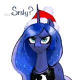
>>Morning Sun
I'm pretty sure it's Luna, but otherwise, that does seem to be it.
I acknowledge that that may speak ill of me.
>>Morning Sun
I'm pretty sure it's Luna, but otherwise, that does seem to be it.
I really love the yin-yang symbol here. I think that the smoke is great. I think that the incense burner is neat.
But the perspective on this piece bothers me a lot. The incense burner doesn't look like it is sitting on the yin-yang symbol, it looks like it is pasted on top of it due to the lack of shadows, and I'm not sure if the yin-yang symbol is supposed to be flat or if it is supposed to be a part of a bowl; if it is supposed to be a bowl, the symbols don't look like it, but the ring around the edges of the yin-yang symbol seem to imply depth to me. The bowl/incense look like they're a CG render, but the smoke looks hand drawn.
All in all, there's a lot of stuff here which, individually, is neat, but as a collective whole, feels like it isn't really coherent. The perspective clash bothers me a lot looking at this.
That said, I can think of a number of potential stories by looking at this, so this works pretty well as a prompt piece.
I would not have gotten the joke without >>GroaningGreyAgony.
I think the "Nah" is just there to give authors something extra to work with. If it was supposed to be anything other than that, I'm missing it.
The worst thing about this is that the alliteration in the title doesn't actually work.
This will probably end up somewhere in the middle of my slate.
EDIT: I forgot to mention that my other (admittedly very minor) problem with this is that I think you have a bit too much sky up at the top. It's fine on mobile, but on my computer, I get basically an entire screen of cloud.
Simple, but pretty effective; my biggest problem with this is that the dark blue on light blue, while it works, might have been better with more contrast?
I'm not really sure.
That said, this ended up high for me, so take that with a grain of salt; this worked pretty well and is actually a pretty solid prompt piece.
I'm not really sure.
That said, this ended up high for me, so take that with a grain of salt; this worked pretty well and is actually a pretty solid prompt piece.
I like the inverted colors here; it works well. Honestly, I didn't think I would end up rating this as well as it did - I'm not generally a big fan of abstract perspective like this - but it was pretty striking and it works reasonably well as a prompt for a story (there's a lot of options for what to do with the scene, but it gives you a decent starting point).
My two biggest problems with this is that it is really easy to lose the ponies at first glance and the smoke/sky interface isn't great.
My two biggest problems with this is that it is really easy to lose the ponies at first glance and the smoke/sky interface isn't great.
Perhaps a bit too neon for my tastes. And it seems a bit odd that her mane is shaded but her body isn't. And we should probably be able to see her tail. And even with the eye-bar-thing, I get more of a morph suit vibe than a robot vibe.
I do look forward to seeing what sort of stories this inspires though.
I do look forward to seeing what sort of stories this inspires though.
I like this as a prompt piece; it is pretty open to interpretation but gives you a place to start from.
As a piece of art, I like it - it is kind of simple, but it uses its iconic nature well - though I think you could have done the very edges of the feather a bit better. Making them look a bit more feathered would have been nice - maybe use the feathering tool next time? I think that's what it is called that lets you get sort of a fringe on something.
As a piece of art, I like it - it is kind of simple, but it uses its iconic nature well - though I think you could have done the very edges of the feather a bit better. Making them look a bit more feathered would have been nice - maybe use the feathering tool next time? I think that's what it is called that lets you get sort of a fringe on something.
I like this style of sketchy lines giving form to a smokey image. I'm not sure what the big gray blob in the middle is though.
>>GroaningGreyAgony
Hmmm...I like the idea of giving out a bunch of silly paper plate-style awards.
Hmmm...I like the idea of giving out a bunch of silly paper plate-style awards.
I seem to remember a distinct lack of flowers in the palace in the second episode, so I can only imagine things are going to end poorly for it.
But jokes aside, this is great.
But jokes aside, this is great.
Hah! Looks like we're not as predictable as you thought!
I can't argue with the caption. There's definitely some sort of symbolism here, and I look forward to seeing what the authors decide it is.
The biggest problem for me is that the perspective of the smoke and the wood/note don't match at all.
I can't argue with the caption. There's definitely some sort of symbolism here, and I look forward to seeing what the authors decide it is.
The biggest problem for me is that the perspective of the smoke and the wood/note don't match at all.
>>TitaniumDragon
That piece made me think of you, TD. The first thought I had when I saw it was "Twidash!" and I know you like the ship--you just put out a story about it! xD
That piece made me think of you, TD. The first thought I had when I saw it was "Twidash!" and I know you like the ship--you just put out a story about it! xD
I guess yellow isn't the worst color you could have used for a background.
This really doesn't leave me with much to say, but maybe someone will be inspired by it?
This really doesn't leave me with much to say, but maybe someone will be inspired by it?
The art is pretty good, though Scratch's head seems a bit off to me. As others have said, this really isn't a very original idea, and the connection to the prompt seems a bit tenuous. And it doesn't help that I got tired of OctaScratch years ago.
I think this would have benefited from putting more emphasis on the smoke and less on the burner/table. I think a darker background also would have been nice. This shade of gray looks like it's just there to be a background, whereas a black background, perhaps with a gradient coming out from the incense, could have given the impression of a dark room.
I realize that it was most likely intentional, but I am bothered a bit by the fact that the cutie marks are wrong.
>>Not_A_Hat
Is that even supposed to be a phoenix? The ear and horn make it look more like a unicorn to me.
I realize that it was most likely intentional, but I am bothered a bit by the fact that the cutie marks are wrong.
>>Not_A_Hat
Is that even supposed to be a phoenix? The ear and horn make it look more like a unicorn to me.
Is that supposed to be bone? I thought the idea was that Celestia is some sort of Terminator-esque robot with just some fake skin covering her body.
I'm not really sure what's going on with her neck, and that part of her mane blowing in front of her seems like it shouldn't be there.
But I think you did a decent enough job conveying the mood you wanted.
I'm not really sure what's going on with her neck, and that part of her mane blowing in front of her seems like it shouldn't be there.
But I think you did a decent enough job conveying the mood you wanted.
I suppose this gets a few points for being mostly show-accurate, but that oddly-shaped rock pile of ashes could use some work.
>>The_Letter_J
...man, I dunno. I kinda assumed it was a phoenix because the rightmost bit looks basically like a beak to me, and it fit the duality thing. I guess those twists of smoke could be a horn? I assumed the 'ear' was a crest of some sort, which is common on drawings of the phoenix. Philomena has one. If it's intended to be a pony of some sort, I can't make sense of the muzzle at all.
...man, I dunno. I kinda assumed it was a phoenix because the rightmost bit looks basically like a beak to me, and it fit the duality thing. I guess those twists of smoke could be a horn? I assumed the 'ear' was a crest of some sort, which is common on drawings of the phoenix. Philomena has one. If it's intended to be a pony of some sort, I can't make sense of the muzzle at all.
>>Morning Sun Huh, I guess it is royal guard armor. And the thing on top is the helmet plume? Yeah, that makes sense. I think a bit of color, maybe matching it to the star on the breastplate, would make that a lot clearer.
The title and caption really make me think that the guard here is supposed to be some sort of alternate Twilight or the personification of some part of her personality or something like that, but I'm not seeing any actual sign of that in the picture.
Also, that is a lot of blood on the guard's eye, I'm not sure what's going on with his mouth, and I think it would be better without the sketch lines.
On the plus side, I can see this inspiring some stories, and the art seems mostly good, just perhaps needing some more time.
Also, that is a lot of blood on the guard's eye, I'm not sure what's going on with his mouth, and I think it would be better without the sketch lines.
On the plus side, I can see this inspiring some stories, and the art seems mostly good, just perhaps needing some more time.
Hmmmm:
I looked at the pictures this morning and didn't get a single tingle of inspiration. So now I've come back 8 hours later, and still nothing. I'll try once more this evening, but I'm thinking I'll likely spend the weekend working on the next Currycombs chapter instead...
Mike
I looked at the pictures this morning and didn't get a single tingle of inspiration. So now I've come back 8 hours later, and still nothing. I'll try once more this evening, but I'm thinking I'll likely spend the weekend working on the next Currycombs chapter instead...
Mike
I am being coerced into saying that that house has a lot of extra space.
It's a good think >>Zaid Val'Roa pointed out that this is a movie reference, because I would have been even more confused without that context.
I'm pretty sure that fires and vacuums don't get along, unless that's supposed to be coming from the reentry into the atmosphere. But then shouldn't the pony be burning too?
Anyway, the art is good, I just have no idea what's going on.
Wouldn't it fit the prompt better if the arrows were going the other way?
This might be able to pass as the background for something, but I don't think it stands on its own very well.
This might be able to pass as the background for something, but I don't think it stands on its own very well.
That pony could really use some help standing out in there.
This piece doesn't impress me as much as some of the others, but it does seem like it would be easy to use as a prompt.
This piece doesn't impress me as much as some of the others, but it does seem like it would be easy to use as a prompt.
I can see this working well as a prompt for some people, and I can even imagine it being used as coverart for a fic. But as a standalone piece of art, it's not doing much for me. You should also fix up the edges of the feathers a bit. They keep alternating between too sharp and too fuzzy. I also think this might be a bit better without the smoke and ashes.
>>GroaningGreyAgony
I'm glad I'm not the only one who thought the fire looked like meteorites.
I like the style here, and I think that it works rather well, except for the meteorite bits.
I'm glad I'm not the only one who thought the fire looked like meteorites.
I like the style here, and I think that it works rather well, except for the meteorite bits.
I think I have to disagree with >>Kritten's comparison between this piece and Rise of a Soldier. On that piece, the smoke and sketch lines come together to create a great image. On this one, it seems like you just sketched some lines on top of a smoky picture. That picture does look great, but I don't think the sketch lines add as much to it as in Rise.
I do agree that this one seems to have less of a connection to the prompt and will probably be harder to write about.
I do agree that this one seems to have less of a connection to the prompt and will probably be harder to write about.
>>Baal Bunny
You not participating in the writeoff would be a bummer, Mike, but I would snap up a new Currycombs chapter SO FAST...
You not participating in the writeoff would be a bummer, Mike, but I would snap up a new Currycombs chapter SO FAST...
>>The_Letter_J
If you ask me, it looks like ashes coming together to form a pony. I like this one. It could inspire something really cool. I'm not so fond of Rise of a Soldier. That one looks messy and overbearing to me.
If you ask me, it looks like ashes coming together to form a pony. I like this one. It could inspire something really cool. I'm not so fond of Rise of a Soldier. That one looks messy and overbearing to me.

It took a little thinking, but I did pick out the arrow patterns angling down and away. But, as others have said, I cannot fathom what this is meant to represent, nor how it connects to the prompt. The dark/black bottom may suggest charred ashes in opposition to the hot fire/air of the orange on the top, but the arrows… The title is also uninformative and violates Title Case.
A pony investigating a destroyed turret? The walls appear paper-thin; the timbers/rubble inside does not look like timber of any fashion; if the light source is from a horn, why no horn—if from lantern, why so white; holes (in the paper-thin walls) are not sensible; stone pattern is lost on the left side; dual focus of main opening and rubble on right side makes intent difficult to follow; color palette is simple but effective (suggesting fire or sunset). Sound idea suffering in execution—adequate for prompt material, crude as 'art'.
Oh… Those are not mountains, but a multitude of the letter 'a'. Fairly clever, if very simple—could be tweaked to either further parody or something approaching a propaganda poster.
I am also troubled by the lack of space between 'l' and 'E'.
I am also troubled by the lack of space between 'l' and 'E'.
I largely agree with >>The_Letter_J
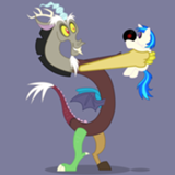
It is unclear whether the guard is guarding that Twilight, or if he has attacked her. His expression could be manic or driven. Did identify the weapon as a spear immediately (foreshortening!), even if the side/top is inexplicably wedge-shaped.
It is unclear whether the guard is guarding that Twilight, or if he has attacked her. His expression could be manic or driven. Did identify the weapon as a spear immediately (foreshortening!), even if the side/top is inexplicably wedge-shaped.
I love the style here. Great mix of color and sketchy lines. Mostly abstract but with just enough concrete imagery to help communicate a mood.
I will just add that it could have been made electronically, either white on a black background or color-inverted from normal black-on-white. The black substrate does help distinguish land from sky, but excepting that gimmick it's very rough as others have noted.
>>The_Letter_J
I think it's a wing folded back. Heck, if I had to guess who it is, I'd guess this is Thunderlane.
I think it's a wing folded back. Heck, if I had to guess who it is, I'd guess this is Thunderlane.
What >>The_Letter_J said.
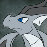
Unclear if that is flesh removed to expose bone or metal, plating over flesh, or both in different places. The inexplicable red glow on the lower right is evocative. Eye shape suggests malice, which is probably your intent?
Needs technical clean-up, but sound and interesting idea.
Unclear if that is flesh removed to expose bone or metal, plating over flesh, or both in different places. The inexplicable red glow on the lower right is evocative. Eye shape suggests malice, which is probably your intent?
Needs technical clean-up, but sound and interesting idea.
Humorous, clever, and definitely tells a story. Just… are you sure that's a pony and not a raccoon or something?
And, yes, the chimney does not visually agree with the roof slope.
And, yes, the chimney does not visually agree with the roof slope.
I like the perspective of the spear. I think the guard is protecting her and the struggle is internal; he wants to run but he's doing his duty, even though he's injured and has no chance against whatever took down Twilight. The only place I think the sketchy style works against the piece is on the guard's muzzle, which leaves his facial expression too ambiguous for my tastes.
This will echo many of the above, but this is just so cool that I can't not comment. :rainbowkiss:
The use of color here, coupled with the abstract and equally intense background is fantastic—makes me think somewhat of Tron, though that is clearly not the intended effect. I would like to draw special attention to the attenuation of the blue hue near the edges, suggesting almost a glowing vapor inside the body. The vibrant orange edges—even on the arm, no less—are very intriguing, and used very well to suggest depth and form. Related, the building blocks of pony physiology are there, but with a few odd discrepancies: the barrel seems very narrow, hind legs angled out unusually widely, forelegs (especially one raised) are disproportionately thick and perhaps oddly attached to the chest, and the face seems excessively 'flat', even by pony standards. (Yes, I am omitting the 'eye-bar' from my physiology divergence.) The manestyle definitely suggests Twilight. An absence of tail could be deliberate choice or oversight.
No clue what the intent behind the 'fireworks' are for, but then nothing here promises to make much sense anyway. The glow effect from same fireworks makes me think of degraded VCR recordings.
Even from what seems a scribbly mess, it is clear at a glance that this is Trixie, doing something with sparks, and excited/happy/malicious/all-of-the-above about it. While seeming to do everything wrong, this is among the more engaging pieces. Perhaps undeserving in the technical sense, this has landed itself at the top of my ballot. I am awed.
>>CoffeeMinion
Okay, I can see that. I think it makes his posture awkward, or at least unclear to me, but it probably is a wing.
Thunderlane's eyes are yellow, not green, and dark gray is one of the standard Royal Guard colors, so it's probably not meant to be any specific pony. But I certainly wouldn't hold that against anyone who decided to base their story on it being Thunderlane.
>>CoffeeMinion
The torc in panel 2 appears to have little lines suggesting it's Sunbutt's torc.
The torc in panel 2 appears to have little lines suggesting it's Sunbutt's torc.
There's fair critique to be given about things like the stick, yes, but conceptually? I do think this is one of the better pieces in terms of prompting potential story ideas. Like, a writer has a lot of pieces they can work with here, a lot of places they can take this, and that's good. Some of the pieces? They're, like, way more limited in what you can do. Open-ness is good. I do think that a bit more time spent on the basics would help the art quality, but yea. I like the core concept.
If I didn't already have an idea I love for another piece this would be among my considerations.
If I didn't already have an idea I love for another piece this would be among my considerations.

This is a simple piece, executed casually. The power comes from what it suggests about characters we know. It would be helpful to know if the fire were burning up or burning down, but the room for interpretation makes this a more valuable piece for the writers. I place this at upper mid tier for the concept.
Ah, a watercolor on decent paper! Shout out for traditional media. A nice perspective on an interesting subject, and a strong work.
While I appreciate the meta, I wish to give my favor and rankings to artists who put effort and deeper thought into their works, so this one goes in the lowest ranks.
This achieves some nice effects with a limited color palette. It’s obvious that it’s Trixie, but her legs and mark are not well defined. It’s expressive but a bit sloppy for my tastes. I’m putting it in the middle ranks.
This piece is smooth and crisply executed with vector art and 3D rendering. I agree that the background is rather bland and should at least be graded.
>>Not_A_Hat, I don’t think that’s supposed to be a bowl; I think the Artist would have dipped the perspective on the odd symbols if so, and the moonish mark would not have been visible. Perhaps it’s a sort of lidded container?
I’m in the unicorn club on what that thing on the left is, because of the horn, but perhaps the artist was trying to be ambiguous, or perhaps, was just blowing smoke. :)
Anyway, this is certainly an evocative piece that could spawn many stories, and I like the polish. This can go in my top tier.
>>Morning Sun
Hmm. I see that, but the face looks way more Luna to me.
I dunno. I'm not an art critic. :derpytongue2: This ranks pretty high for me on the strength of its cheeky humor. Dat face in the final panel is just classic.
Hmm. I see that, but the face looks way more Luna to me.
I dunno. I'm not an art critic. :derpytongue2: This ranks pretty high for me on the strength of its cheeky humor. Dat face in the final panel is just classic.

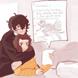
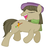
Really great. Octavia and Vinyl's expressions are both really well done, and I love the way you've drawn Vinyl's mane and tail—a shock of hair, for sure.
Easily my favorite picture of the contest—although I'm afraid I didn't interpret it exactly the way everyone else is... :P
Will be adding things to my slate until I can put this at the top.
Will be adding things to my slate until I can put this at the top.
I'm pretty sure I know who drew this, but I don't think I'm biased when I say this is lovely. I'm a big fan of your contrasts here—white against blue is a combo that's always been eye-catching and eye-pleasing to me. And that's not even mentioning Trixie's great smirk, or the way in which the entire piece seems to be connected in one swath of color.