Hey! It looks like you're new here. You might want to check out the introduction.
Show rules for this event
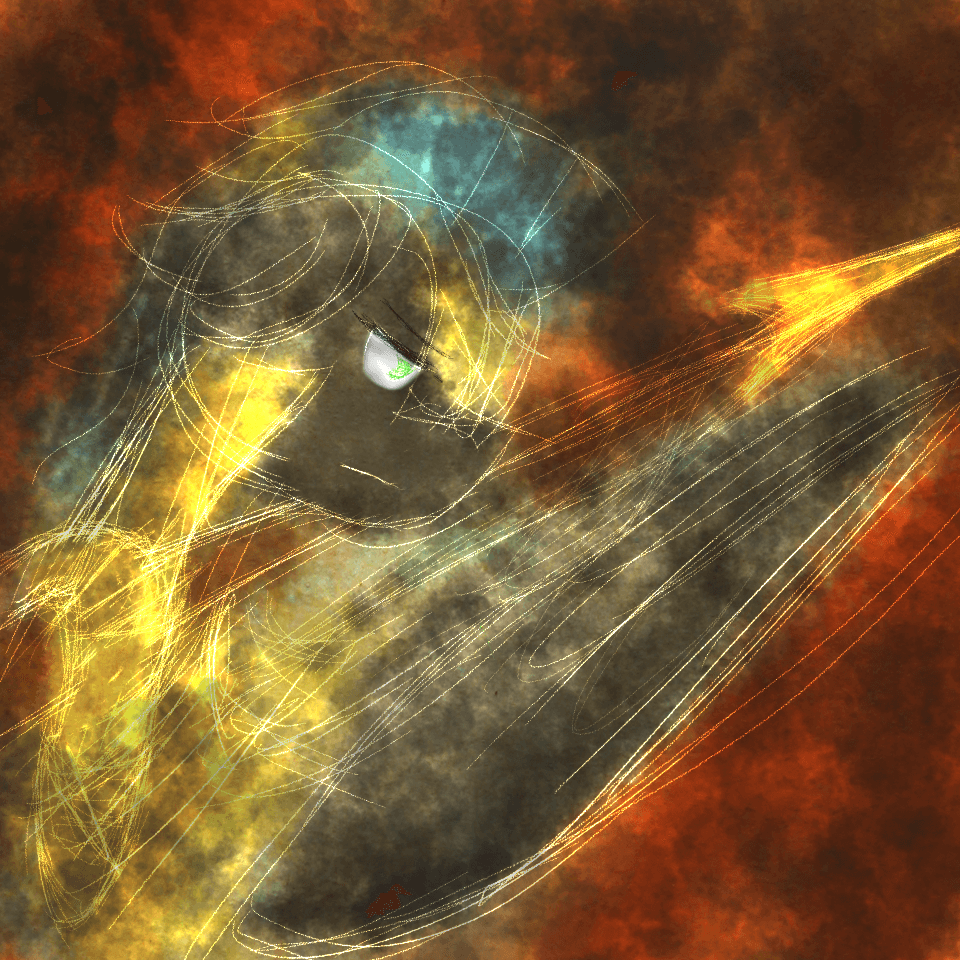
I feel like this would be a lot better without all those sketchy lines on top. Maybe I'd have liked them better if they were just used for emphasis... like around the wingtips or something? I tend to like 'clean' art, I guess, so maybe it's just a stylistic difference, but to me, this feels like a very simple picture with a bunch of added distraction.
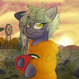
With Out of the Shadow & Ashes, and I compare the two since they're basically visually the same, I said there that it's use of the cloud effect was masterfully put in and that it looked wonderful. Here, however, I'm inclined to say the opposite. While the cloud effect is nice to look at, it doesn't really add to the value of this photo, since it only makes the image more convoluted as a whole.
In Shadow and Ashes, the pony takes up around a third of the image, which makes a lot of negative space for a clear indication as to where to put the aesthetically pleasing effect. Here, however, the guard takes up more than four-fifths of the image. The effect is nice to use when the image is full of negative space, and when it's full of positive space, say when a character is close to the camera, it makes my eyes, at least for me, hard to decipher the entire image. Too much is going on within the piece, and with that, I would've preferred if you didn't overuse the cloud effect.
Ironically, however, I have to say that this most certainly is a good centerpiece that can be used to show off inspiration for a writer. While Shadow and Ashes may not have done that quite well, the royal duties of the guard is quite straight forward and easy to get an inspiration from. Overall, decent job.
Out of the Shadow & Ashes: https://writeoff.me/art/1446-Out-of-the-Shadows-Ashes
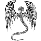
I like this style of sketchy lines giving form to a smokey image. I'm not sure what the big gray blob in the middle is though.
I love the style here. Great mix of color and sketchy lines. Mostly abstract but with just enough concrete imagery to help communicate a mood.
>>The_Letter_J
I think it's a wing folded back. Heck, if I had to guess who it is, I'd guess this is Thunderlane.
I think it's a wing folded back. Heck, if I had to guess who it is, I'd guess this is Thunderlane.
>>CoffeeMinion
Okay, I can see that. I think it makes his posture awkward, or at least unclear to me, but it probably is a wing.
Thunderlane's eyes are yellow, not green, and dark gray is one of the standard Royal Guard colors, so it's probably not meant to be any specific pony. But I certainly wouldn't hold that against anyone who decided to base their story on it being Thunderlane.
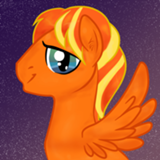
I love the colors in this one, and the composition is fine, too! The only think kinda odd is the sudden transition between golden neck and gray head.
>>The_Letter_J
>>CoffeeMinion
Yes, the grey blob is the wing and I apologize for the crud sketch. I mainly had the goal of presenting a art piece of prompt. I just lack the motivation to draw it out, but I'll most likely post a more polish style if there's another art contest later.
>>CoffeeMinion
Yes, the grey blob is the wing and I apologize for the crud sketch. I mainly had the goal of presenting a art piece of prompt. I just lack the motivation to draw it out, but I'll most likely post a more polish style if there's another art contest later.
>>CoffeeMinion
Thanks. ; )
This isn't my usual style, if you want, you could look up some of my art on my Tumblr or DeviantArt.
Thanks. ; )
This isn't my usual style, if you want, you could look up some of my art on my Tumblr or DeviantArt.