Hey! It looks like you're new here. You might want to check out the introduction.
Show rules for this event
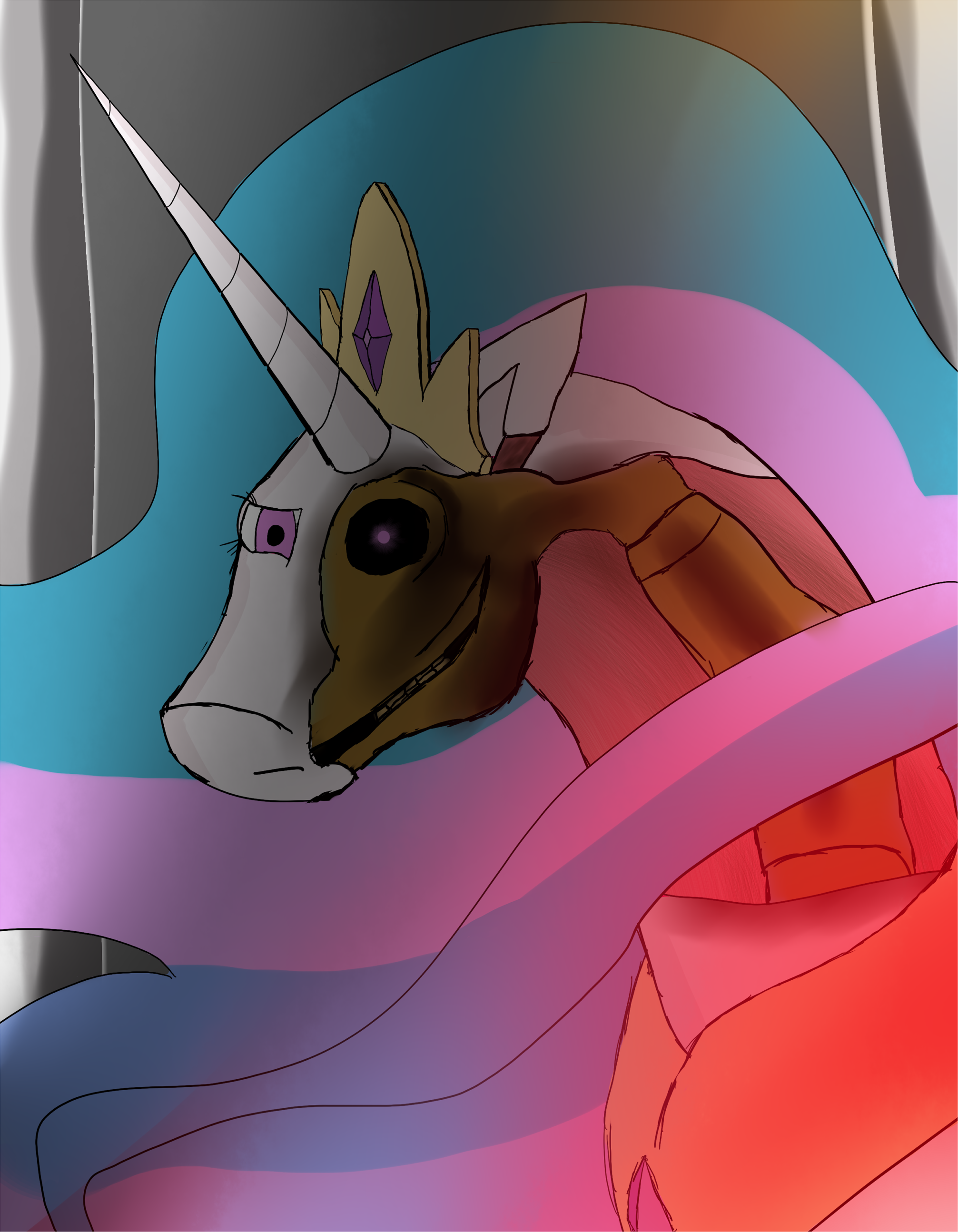
This is a good concept. It would be creepier and more effective if the Artist made a better effort to render an equine skeleton. (Google image search is your friend.) The jaw is a separate piece from the skull, for instance.
Aahhhh hhmmm! AAAAAAHHHHHHHHH! *whines* my childhood. *Rolls over and gasps for air.* I can't breath I can't.....oh my goodness..I'm panicking! I'm panicking! *Pulls out a scroll and quills and frantically writes.*
Is that supposed to be bone? I thought the idea was that Celestia is some sort of Terminator-esque robot with just some fake skin covering her body.
I'm not really sure what's going on with her neck, and that part of her mane blowing in front of her seems like it shouldn't be there.
But I think you did a decent enough job conveying the mood you wanted.
I'm not really sure what's going on with her neck, and that part of her mane blowing in front of her seems like it shouldn't be there.
But I think you did a decent enough job conveying the mood you wanted.
What >>The_Letter_J said.
Unclear if that is flesh removed to expose bone or metal, plating over flesh, or both in different places. The inexplicable red glow on the lower right is evocative. Eye shape suggests malice, which is probably your intent?
Needs technical clean-up, but sound and interesting idea.
Unclear if that is flesh removed to expose bone or metal, plating over flesh, or both in different places. The inexplicable red glow on the lower right is evocative. Eye shape suggests malice, which is probably your intent?
Needs technical clean-up, but sound and interesting idea.
