Hey! It looks like you're new here. You might want to check out the introduction.
Show rules for this event
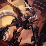
>>Haze
U w0t m8
nooo 'Es my OC
8/10 - IGN.com
(In all seriousness I'm glad to see straight up humor in the mix. I've no idea how to judge these but the laugh counts for something in my book.)
U w0t m8
nooo 'Es my OC
8/10 - IGN.com
(In all seriousness I'm glad to see straight up humor in the mix. I've no idea how to judge these but the laugh counts for something in my book.)
OMS! I LUV UR OC!!! Hes totally hot. Can I rite him intu my fic about my OC Sahdow? He wood be PURFECT with my editor's OC Enoby. She luvs dark and goffik characters with a deep backstry.
Unfortuntely I can't submit my crossover 2 da writeoffs becus DUMB rodger said we cant rite stories about our previus things. FUK U RODGER!!!
(I'm so sorry. I couldn't not comment on this one, not with an alias like this on my account.)
Unfortuntely I can't submit my crossover 2 da writeoffs becus DUMB rodger said we cant rite stories about our previus things. FUK U RODGER!!!
(I'm so sorry. I couldn't not comment on this one, not with an alias like this on my account.)

>>MLPmatthewl419
The ashes of a disaster in one’s relationship, perhaps? It is a bit tenuous. If Vinyl had burnt the cello, there’d be more of a connection.
Artist, I’ve seen the “Sorry Octy I [BLEEP]ed your cello” before, so I can’t give top scores for originality, but the pony figures and cello are rendered competently and expressively, if a bit roughly. (Is that wall made of rubber?)
I will call this an upper-mid tier effort. It’s cute but the lack of polish will tend to push it down on my slate.
Aww! This one should sweep the competition. :)
Seriously, this is okay for a draft and gets points for an original take on the concept. But it is a draft. The chimney doesn’t really seem to be attached to the roof, and the buildings in the background are rudimentary. The little pone has a cute look.
Mid tier, largely for lack of polish.
Seriously, this is okay for a draft and gets points for an original take on the concept. But it is a draft. The chimney doesn’t really seem to be attached to the roof, and the buildings in the background are rudimentary. The little pone has a cute look.
Mid tier, largely for lack of polish.

>>MLPmatthewl419 >>MLPmatthewl419 >>MLPmatthewl419 >>MLPmatthewl419 >>MLPmatthewl419
Generally speaking, it is encouraged in the writeoffs not to worry too much if you can't figure out how something is related to the prompt. Everyone's brains work slightly differently, and taking a prompt and running with it can lead people to all sorts of different places. While it is absolutely your right to use whatever criteria you wish to vote in the writeoffs, I would always recommend turning a blind eye to things that don't seem to be prompt relevant—just because you can't see the connection, doesn't mean the author/artist in question didn't have one in mind.
I expect this issue will probably be even more prevalent in art rounds, as striving for an original take on the subject matter might push you further than you might go from the prompt in a writing round.
(That said, the Shadow Ashes thing is a joke based on some discussion about watermarks in the discord server yesterday. It uses the prompt tangentially to make people smile. I wouldn't worry too much about it—we've had similar things in writing rounds before, and they usually just get a good laugh out of people before finishing near-last.)
>>MLPmatthewl419
"Rising from the Ashes" could also refer to the act of climbing back from a certain individual's hardships. Artists could've drawn with expectation of how the writer will perceive the artistic prompt. These only shape the setting/characters, after all, not the exact plot of the story.
"Rising from the Ashes" could also refer to the act of climbing back from a certain individual's hardships. Artists could've drawn with expectation of how the writer will perceive the artistic prompt. These only shape the setting/characters, after all, not the exact plot of the story.
Technosparkle? Did she fall into a video game?
Brassy, attention-grabbing colors and composition. Pony construction handled well, but a bit roughly. I have to use my imagination to make this link to the prompt–a digital resurrection?
Upper mid tier, I think.
Brassy, attention-grabbing colors and composition. Pony construction handled well, but a bit roughly. I have to use my imagination to make this link to the prompt–a digital resurrection?
Upper mid tier, I think.
Post by
Plerak
, deleted
Pinkie is rendered decently here; the pile of ashes is just barely a symbol. Still, it communicates a funny take on the prompt, so I will give it some credit. It’s not likely to be a top contender, with the other competition.
Ho-kay… Twilight’s mark is not a Star of David. And if the Artist hadn’t tried to show the whole length of the grave out of perspective, there would have been no need for the zoom in. Just show us the tombstone! The “here lies” language would clue us in.
Low tier, I am afraid.
Low tier, I am afraid.
>>GroaningGreyAgony
I would've also liked it had it read: "Here lies Twilight. She never scored."
I would've also liked it had it read: "Here lies Twilight. She never scored."
Artist, you should be using a better tool than MS Paint. You have talent.
There’s some clumsiness around the execution of lines, but the scene is well composed and evocative, and the grayscale execution sets the right mood. This will be an excellent story seed.
Strong. Upper tier for this one.
There’s some clumsiness around the execution of lines, but the scene is well composed and evocative, and the grayscale execution sets the right mood. This will be an excellent story seed.
Strong. Upper tier for this one.
Tenuous connection to prompt, and no connection to pone that I can detect. Looks like a screenshot of something.
This is a good concept. It would be creepier and more effective if the Artist made a better effort to render an equine skeleton. (Google image search is your friend.) The jaw is a separate piece from the skull, for instance.
The best laid plans of mice and mares gang aft ashtray.
This is a draft sketch, but it conveys its idea well enough. The unicorn head has signs of originality, though it lacks in detail.
Mid tier, I think.
This is a draft sketch, but it conveys its idea well enough. The unicorn head has signs of originality, though it lacks in detail.
Mid tier, I think.
I’m not quite sure what you were trying to convey here, Artist, and I will have to give it more thought. But this is a clever and well executed take on the prompt. Strong!
There is so much to say about this one. It will be tough but try to bear with me.
Let’s start talking about what it represents. We have a hoof holding a stick with a marshmallow on it above a rustic fire to roast it. According to the color of the hoof, I’m pretty sure it’s Rainbow Dash we are talking about right now. Also, there is no background.
So why Rainbow Dash would eat marshmallows? I mean, it’s a treat that sounds more Pinkie Pie than Rainbow Dash. Moreover, marshmallows are sweet, soft and they don’t taste strong. So why the tomboyish athletic pony we all love would want to eat something that looks like her complete opposite?
Well, according to the episode Applejack’s “day” off, we see Rainbow Dash has a soft side she doesn’t show easily and even tries to hide. I think the marshmallow symbolizes that. And because Rainbow Dash doesn’t show what she considers as a weakness, she tries to toughen it by roasting it.
See how the roasted side of the marshmallow is made of two lines? One black and one brown. The black one is her tough side, the mask she usually wears around her acquaintances. The brown one is her loyalty, a part of herself she has learned to understand and one she is able to show to her close friends. But deep down, she is a soft-hearted and that is the rest of the marshmallow. A pure white innocence and genuine affection she has for everypony.
That’s a deep piece we have here. It shows how people always wear a fake mask, one they got used to too much but also, how they try to reveal their true self by convoluted ways.
Another meaning to add to this masterpiece is how it talks about sexuality and gender.
“How?” you would ask. Just take a look at the stick Rainbow is holding. See how it is not straight? (You could argue that it was an mistake but do you really think such a wonderful piece would have room for mistakes? I don’t think so and neither should you). We are used to think Rainow as the embodiment of gayness because of her rainbow mane and tail but here it is an interesting way to represent that character’s aspect. Rainbow finally comes out and present herself (the marshmallow) to the eyes of society (the fire). Notice how society can only roast a little the marshmallow. The core of the treat is preserved, Rainbow Dash, because she knows how to choose her friends and acquaintances, and thus, can’t be harmed by society’s look.
Now, let’s talk about the full white background. As always, you could say that the author was lazy and didn’t want to add one but you’ll be wrong. The white usually symbolize purity and virginity. The experience Rainbow Dash is living is one of a pure. Even if the fire tries to corrupt it, it is only effective on the surface. As I said, the core is preserved. Whatever the meaning you get from this, the experience remains pure and untouched. It is a true thing, something people are always searching for and something Rainbow Dash has managed to found in one of the simplest thing you could do, roasting a marshmallow.
As you see, there is a lot of thing to say about what is in the art but there is also a lot to say about what isn’t in it.
It is important to mention that this activity is usually something you do with friends. You are all sat around the campfire, sharing stories, memories etc… But here, Rainbow Dash is alone. Moreover, we only have her hoof, not her whole body.
What we can say about that is that we aren’t defined by what we are but by what we do. That’s why we only have her hoof, it’s with this organ that a pony act on the world. It’s a good reminder that whoever you are, it’s by your action that you are someone. And if Rainbow Dash is alone and not surrounded by her friends, it’s because we are never so true to ourself than when we are alone. It’s in loneliness where you can reveal yourself.
I could go on and on but I think you got the essential with what I said before.
This is a wonderful masterpiece and truly deserves its 5/7.
Hat off.
MY EYES! MY EYES! IT BURNS! TOO MUCH YELLOW!
Seriously though, the drawing is neat and interesting but why choosing such a colour for the background?
Seriously though, the drawing is neat and interesting but why choosing such a colour for the background?

Hi,
I'm kinda new here, and I am utterly confused.
I was looking to join the 24/03 write-off, but the whole thing with art is very different from how I understood it would work.
Any chance someone could lend a n00b a helping hand/hoof, and give me helpful hints as to:
a)Can I still join?
b)What do I do to participate, if it's still possible?
c)Is drawing part mandatory?
Too late, I've stolen it and involved him in a group orgy with the darkest fetishes you can find on the internet (I let your mind do the rest).
It was a good laugh so top of the low tier for me.
It was a good laugh so top of the low tier for me.
So... a pony wearing some sort of armor is grinning at the camera, while standing over a prone Twilight Sparkle. They both have what might be blood on them, and there's some sort of object hovering nearby.
Three things confuse me here.
What's that thing on top of the armored pony's head, behind his horn? It's black and lumpy.
Is that floating thing a weapon? It looks like it's about halfway between an axe and a cleaver, or, if the perspective is really screwy, possibly some sort of spear? But the proportions don't seem right for any one, it's all one color, and it doesn't have any blood on it.
There seems to be a ghost-outline around the armored pony. Is that supposed to be important somehow, or is it just a leftover from drawing? I can't tell.
Other than that, I'm generally having trouble making out what's going on here. I see the ponies, and I assume they're intended to be fighting (or have fought) from the title, but that's about all I can get. Maybe I'm missing something important in those confusing things, but I feel like your intent isn't really getting across to me.
This is creepy as sh*t. Pretty good job on the lighting and the colors but it didn't inspire me at all.
So top mid-tier.
So top mid-tier.
>>MLPmatthewl419
Sombra rising again would count. That said…
Artist, you get maybe a B for creativity and a D for effort. The A’s all got used in your image.
Sombra rising again would count. That said…
Artist, you get maybe a B for creativity and a D for effort. The A’s all got used in your image.
This one is very abstract, between the ruin and the shadow of a pony in the middle.
The contrast between the background and the central piece is a bit too much for me though, and I don't know what to make of the three stones that stand out.
Mid-tier.
The contrast between the background and the central piece is a bit too much for me though, and I don't know what to make of the three stones that stand out.
Mid-tier.
>>ChudoJogurt
Hi there!
A: Yes.
B: Pick one of the drawings people have submitted and use it as inspiration for a short MLP-related story (1000 to 8000 words if I'm not mistaken). Write said story in the given time limit and submit it before 12:00 GMT next Monday.
C: No, the drawing part is not mandatory (also, your chance for this round has passed if you wanted to participate). You can submit just for the art round, for both, or just for the writing round.
>>GroaningGreyAgony
I'll agree with GGA, it's a very strong piece.
For now, I got two interpretations.
One, it's a sad ending for a romantic relationship between Rainbow Dash and Fluttershy.
Two, Rainbow Dash helps the pony Fluttershy broke with by 'raining' above the burns this break has caused.
Top-contender
I'll agree with GGA, it's a very strong piece.
For now, I got two interpretations.
One, it's a sad ending for a romantic relationship between Rainbow Dash and Fluttershy.
Two, Rainbow Dash helps the pony Fluttershy broke with by 'raining' above the burns this break has caused.
Top-contender
Well, this blows my mind. I am going to have to really work if I'm going to come up with a story. My thoughts weren't going in the same direction of any of these artists, but some really have me intrigued, so maybe I can come up with something based on one of those. It's not going to be easy for me, though.
>>Kitcat36
Oooh, I didn't get it. I still can't see it but I understand. So it adds to the abstract atmoshpere then.
Oooh, I didn't get it. I still can't see it but I understand. So it adds to the abstract atmoshpere then.
This is... pen? Huh, neat.
I didn't actually realize that was Scratch until I read GGA's comment. I think the glasses not being pulled down (or maybe not obviously glasses enough?) was messing with me.
I kinda feel like that corner that Octavia's coming around is throwing me off. This isn't in a white vacuum, but it's also not with a full background; but I can't tell why that wall is there or what it's supposed to be doing for the image.
Nice work on the shapes of the ponies and the cello.
Hmmm, very interesting.
Drawing, colors, subject and visual expression are well handled. Very inspiring. Still don't know if I'll choose it for writing but it has earned its potential place.
Top-tier contender.
PS: that music immediately came to my mind when I saw it.
https://www.youtube.com/watch?v=YyknBTm_YyM
Drawing, colors, subject and visual expression are well handled. Very inspiring. Still don't know if I'll choose it for writing but it has earned its potential place.
Top-tier contender.
PS: that music immediately came to my mind when I saw it.
https://www.youtube.com/watch?v=YyknBTm_YyM
Cute, and it's immediately obvious what you were shooting for here. The solid olive background seems odd to me; was that just the color of paper you had available to work with?
These cutie marks seem a bit off to me, but it's immediately obvious what you're shooting for, so that's probably not a problem. The 'flat' wood in the background seems a little odd; if this is, as I assume, supposed to be smoke, shouldn't it rise upwards or something?
These are mostly nitpicks, though. This is quite solid, as the others have said. Good concept and good execution.
These are mostly nitpicks, though. This is quite solid, as the others have said. Good concept and good execution.
I got that they were holes, but they don’t look to me as holes in stonework should look, so I found that jarring. (Holes in stonework tend to follow the lines between the stones, which are usually the weakest points in the wall.) And the inside of the wall should have the same stone texture as outside.
Abstract and moody, and I am wondering if this is a reference to a certain scene in Story of the Blanks. The Artist put effort into this piece but should perhaps have used more reference material before commencing. (Seriously, Image Search is your friend).
Upper mid tier for me.
Abstract and moody, and I am wondering if this is a reference to a certain scene in Story of the Blanks. The Artist put effort into this piece but should perhaps have used more reference material before commencing. (Seriously, Image Search is your friend).
Upper mid tier for me.
I really like how minimalist and stylized this one is. It feels a tad messy, and I wish there was a bit more story suggested, but even just like this it seems pretty strong to me.
Clean execution of a simple idea isn't necessarily a bad thing, but there's honestly just not a lot here.
Slapdash and scribbly, but expressive. Some understanding of pone anatomy is demonstrated with Apple Bloom, but the other crusaders are present only in rudimentary form. And I am unsure if that is a fire or incoming meteorites.
Mid tier.
Mid tier.
...I guess this is Bulk Biceps, maybe?
Those things don't look very much like treetops to me.
What's that 'nah' supposed to be about?
Those things don't look very much like treetops to me.
What's that 'nah' supposed to be about?
My first thought was that this was literally just a fireplace of some sort. It wasn't until I looked a lot closer that I saw the pony shape in the center. The 'conservation of attention' thing that happens in writing is also important in visual art; if you want to be sure your audience sees something, add some emphasis so it's clear enough to be certain.
My second guess was that this was a house. But the shape doesn't seem right for that, the 'pedestal' it's on is strange, the ratio of height to width for the door seems off, and the bricks would be impossibly huge.
This feels like a piece that had a fair amount of effort put into it, from things like the lighting and the edges. I just have no idea what's going on or what I'm actually looking at.
THAT POOR HOUSE. Why does the house have to make Planetfall? Or perhaps it wasn't there a moment ago. There's a trail behind it, after all. Maybe there was a house party and somepony teleported it into space and those dots are the ponies being sucked out into the cold void.
This piece symbolizes the existential dread of the unknown and the inevitability of death in the eyes of most, but as we can see from our spacesuit-clad Starmare, some are prepared to face and challenge the void, just as some of us stare death in the eye and cry defiant in our fight for immortality!
This piece symbolizes the existential dread of the unknown and the inevitability of death in the eyes of most, but as we can see from our spacesuit-clad Starmare, some are prepared to face and challenge the void, just as some of us stare death in the eye and cry defiant in our fight for immortality!
I'm honestly curious how you made this. It looks like one of those scratch-away papers, kinda sorta. The choice of negative colors makes it visually interesting, though.
This looks like a pair of ponies walking away from a smouldering fire in the light of the rising sun. I didn't catch onto that at first, though, because the hoofprints weren't obviously hoofprints to me. That's probably because unless that's a huge fire, they seem off, scale-wise, and because I originally thought they were just more 'noise', like a lot of the other scratches seem to be.
This seems pretty experimental, but once I stared at it for a bit it started making some sense.
>>Not_A_Hat
That's a royal guard uniform. The odd thing is, I expect, the helmet. At first I thought the weapon was a cleaver and dude is straight up murdering Twilight, but looking more closely it's in fact a spear - and it's pointed out at the camera. Thus, I would suggest Twilight here has been attacked in some fashion (Given the guard's injury, and how Twilight looks more burned than bloody, I am suspecting a bomb went off), and the guard despite being bruised and bloodied is standing defiant against whatever force is coming for Twilight.
Or, he's straight up murdering her and telling the viewer to back the fuck off so he can go back to his shanking. One of the two!
On the one hand, whoever drew this is obviously a more talented painter than I am (though that's admittedly not hard.) The technical skill on display is very good. The shape and light for the pony and the house is clear and well done.
However, I have no idea what the background is supposed to be, or why this house is in space and on fire? I feel like there should be a really good story somewhere in this one, but I can't grasp enough of the concrete details to guess at it.
However, I have no idea what the background is supposed to be, or why this house is in space and on fire? I feel like there should be a really good story somewhere in this one, but I can't grasp enough of the concrete details to guess at it.
Okay, this is a quick doodle. At least the character is recognizable.
I get the joke, though. Those look like ash leaves. He’s “rising from the ashes.”
Cute, but upper tier? Nah.
I get the joke, though. Those look like ash leaves. He’s “rising from the ashes.”
Cute, but upper tier? Nah.
The style here is messy, but it's immediately obvious who the pony is from that cape and hat. The use of mostly blue on blue, with just the eyes and a few sparks in white is interesting, and gives good clues for directing attention while also giving me an impression of shadow and glow.
Neat. Pretty simplistic, I think, but nicely done.
Neat. Pretty simplistic, I think, but nicely done.
There was a small discussion in the chat about whether this was actually done in paint or not.
I initially guessed not, because I feel like this piece has very strong composition, and I guessed it was drawn with a pen tool from the fairly smooth curving lines. Cassius, however, suggested that it might have been done with shape tools and a mouse, and looking at the square bricks in the background, he might well be right.
Either way, I feel like this is an intentionally minimalist piece; strong composition, but very simple styling, possibly because (as GGA says) the artist was lacking tools, but also possibly because it was done quickly. I like combination, though, so on the whole it works very well for me. Some variance in line thickness might make this really pop, but even as it is, it seems like a very well done piece.
That looks more like an oddly shaped rock than a pile of ashes.
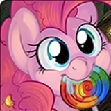
This is, I'm guessing, someone pulling vectors out of the Deviantart pony vector group, or using screencaps or something? I swear I've seen that exact same pose on Pinkie before, and I really hope you didn't totally re-create her just for a simple joke. :P
On the one hand, I'm fine with people doing that; resources exist for a reason, and they're being shared with that intent. Efficiency is clever and good. On the other hand, this feels like really low effort to me, so although you get points for clean execution of a cute idea, I don't think I can really consider this as highly as I would if it was carefully drawn.
A coathanger is probably not the best tool for toasting marshmallows… If that’s a stick, maybe the outlines shouldn’t intersect?
Sorry, Artist, this is a bottom-slater.
Sorry, Artist, this is a bottom-slater.
For those who are curious about who these characters are, the alt-text says "A very poor Sunset Shimmer envies a very, very rich Trixie Lullamoon."
I probably wouldn't have figured it out myself without that hint, though. Perhaps putting the streaks in Sunset's hair more clearly would have helped? And although that mini hat barrett is really cute, maybe making it Trixie's traditional point wizard cap would have been clearer, or putting her cutie mark more prominently somewhere? I dunno, this sort of thing can be hard to get across sometimes; how my stylism is enough, which things should be more/less stylized, what parts of a character are the most essential to convey their identity, stuff like that.
Maybe it's because I can't line-art at all, but I'm impressed. The expressions are evocative and the composition is good. The proportions feel kinda weird (especially in Trixie's smile,) but the strangeness makes it grotesque without actually tipping the line into ugly. The artist can obviously draw people, and is wiling to take risks with how they're posed. Nice work!
This is prettily composed, and the background is gorgeous. I can appreciate a minimal approach in constructing the figure, but I wish the Artist had done a better job of erasing the construction lines. That just makes it a doodle on top of a nice background, not a finished piece.
I’m going to think about this one a bit longer before giving it a rank.
I’m going to think about this one a bit longer before giving it a rank.
>>Zaid Val'Roa
Ah, so this is a movie reference I didn’t get. Fair enough.
There is skill in the execution (I like the backlighting and the visor stars on the astropone). I’ll put this one in the upper tier.
Ah, so this is a movie reference I didn’t get. Fair enough.
There is skill in the execution (I like the backlighting and the visor stars on the astropone). I’ll put this one in the upper tier.
This is hand-drawn, and multiple panels, which means the artist definitely put in some effort. On the other hand, it's mostly just a silly joke. I'm not sure how I'll rank it. When I first looked at this, I thought Celestia was making a cigar. On second thought, I decided that the phoenix is actually re-incarning into a cigar. Either way, I did laugh.
This reminds me of a commercial I once saw. A girl finds a frog and kisses it, and it turns into a handsome man. He kisses her back, and she turns into a glass of beer. :P
This reminds me of a commercial I once saw. A girl finds a frog and kisses it, and it turns into a handsome man. He kisses her back, and she turns into a glass of beer. :P
I feel like this would be a lot better without all those sketchy lines on top. Maybe I'd have liked them better if they were just used for emphasis... like around the wingtips or something? I tend to like 'clean' art, I guess, so maybe it's just a stylistic difference, but to me, this feels like a very simple picture with a bunch of added distraction.
I think this would be creepier if you didn't burn her lips off quite so much, or burned the muscles straight down to the bone. To me, it looks like she's got a fairly goofy grin, and I just can't take it seriously.
Very good concept, though.
Very good concept, though.
Simple bordering on simplistic, but I feel like it's trying to be evocative? I just wish it was a little more concrete on what it was shooting for.
There's a two-colored feather and some fire. My first thought is that the fire is changing the color of the feather, but is it going up or down? Is this Twilight/Rainbow Dash? I wish there was more to go on than just the color. And if it is changing the color from one to the other, what's that supposed to mean?
I dunno. I feel like this one has a strong concept behind it that's just not getting through to me, because it's been overly simplified. That being said, minimal + evocative is my favorite, so I think this will still do fairly well by me.
There's some pretty deep symbolism here, and the fact that no single interpretation dominates the rest is in my opinion a good thing. The piece can be viewed from any number of seemingly correct interpretations.
What caught my eye first was Fluttershy's cutie mark burned onto a note. What does the note symbolize? Running away? A breakup? A plea for help in the midst of a rough time? All are acceptable answers. Was the note ever answered, or did the recipient run out of time?
Next, the image displays Rainbow's cutie mark above the note. Again, multiple interpretations abound. The mark almost looks like a cloud; is it raining on the note, thus allowing life to grow again from the ashes? Or perhaps it was meant to signify a ghost--Rainbow's passing. That interpretation would make the note Rainbow's and its recipient Fluttershy. Obviously, Fluttershy would be devastated and would have to find the strength to rise up out of this low point in her life.
As a prompt, it is very open-ended, which is probably its greatest strength. It was well thought out and equally well executed. The single complaint I have with it is that I'm not sure if we're supposed to be able to make out the words on the note or not. Despite that relatively minor flaw, I give it high marks.
Top tier for how evocative this one is by remaining so simple.
There's a lot of stories to get from it but it has a solid anchor with the fact that the two feathers obviously belong to Rainbow Dash and Twilight Sparkle.
There's a lot of stories to get from it but it has a solid anchor with the fact that the two feathers obviously belong to Rainbow Dash and Twilight Sparkle.
Nothing much to say with this one.
Very powerful and the setting is really great.
A top tier without a doubt.
Very powerful and the setting is really great.
A top tier without a doubt.
Is the cigarette supposed to be clipping through the ashtray like that?
This is fairly well done, technically, but it's so very simple conceptually that I'm not sure what to make of it. It's a cigarette in an ashtray, sketchily drawn. If there's more here, I'm missing it.
This is fairly well done, technically, but it's so very simple conceptually that I'm not sure what to make of it. It's a cigarette in an ashtray, sketchily drawn. If there's more here, I'm missing it.
Cutie Mark Crusader Ancient Ones! It's cute, it's simple, it's red and burning. A piece after own heart/namesake.
Upon the rising sun of another day in Equestria, it turns out to be another dreadful day...
I can most definitely see where your imagination went into, however I do have to deduct in the fact that I have to study it in order to understand what truly is happening. Though, with a color scheme of only black and white, I do have to give you at least some kind of benefit of the doubt in your struggles. But I can't forgive everything.
Maybe, though, it could've been overall better if you had probably planned in advance. Stuff like the tree meshes in the background of the sky, and you have to look close to realize that the tree is actually a separate entity.
Or is that smoke from a campfire? Like I said, it really requires studying.
At a glance, I have to admit that I did glance over it, as I didn't really give it much thought after glimpsing it for under a second within the gallery. It makes me more confused as to what it could actually mean rather than giving me the answers straight up as to what it actually is. If it was intended to be a piece that was supposed to be thought about with further inspection, then congratulations, you've achieved that.
To me, it's something that's actually supposed to be a book cover for a fic on fimfiction.net. Maybe it's a cover of a book after all and you've duped everyone!
To me, it's something that's actually supposed to be a book cover for a fic on fimfiction.net. Maybe it's a cover of a book after all and you've duped everyone!
The unpleasing mix between negative and positive space puts my eyes off the piece in a way that I honestly don't want to do consciously. If the piece had mixed the A's into a more complete black and putting a clear difference between the negative and positive space of the work, for me at least, it would have been much less of a convoluted piece to look at.
Though, I do have to say that this could become the definite basis of a story's plot, that's for sure. But, maybe it's a bit too easy on the writer for giving such a simple plot? One could think so, but I don't, as it's very open ended from what you've given.
Though, I do have to say that this could become the definite basis of a story's plot, that's for sure. But, maybe it's a bit too easy on the writer for giving such a simple plot? One could think so, but I don't, as it's very open ended from what you've given.
An absolute masterful job at the cloud effect. Visually, I have no doubt in my faith to say that this is done by an artist with experience.
However, what exactly does the piece say about the prompt? To me, it's a pony viewing the distance with absolutely no indication as to what they're looking at. Maybe they're in a dream as to what gives off the visual appearance? Maybe they're off in the middle of a plains and they're using the starry skies to navigate home? Maybe the pony was simply drawn in after the background was done just to show off the fancy visual effects?
I don't know, and with that, I don't see how this could be used as inspiration for writers. If it is, I think it would be used irresponsibly or without putting too much emphasis into the context of the drawing.
Hrm. There's a lot to like here, but I'm going to nitpick anyways.
Your dragon seems to have gotten a lot more love than your phoenix, which is significantly smaller and less detailed. (No pupils?) The detailed incense burner draws a lot more attention than the sketchy smoke; I think you could balance the level-of-detail a bit better between the top and the bottom of the picture, maybe by adding a few more curves to the smoke and simplifying the burner. For example, the shapes on the cone that holds the incense don't seem to add anything; they feel like visual 'noise' to me, especially since the burner has a very minimalist design otherwise. You don't need pointers for the smoke there, either; the cone/incense combo are a strong enough attention guide, I think.
Other details feel incoherent, too. The bottom of the burner has very elaborate shadows, while the inside of the bowl is totally shadeless. (the incense ash doesn't even have a shadow.) The cone and the top of the rim have edge-lines, but the curve of the bottom of the bowl and the entire incense stick don't. The three pieces of ash in the bowl are very similar, to the point where they look copy-pasted to me, mostly because the tiny piles of ash next to them also look repeated. A small amount of variance in the length would have fixed that.
The symbolism here is great; you have classic duality/harmony stuff going on. It's evocative and clear, and this is very strong concept-wise. Execution wise, this is also good, but there's enough dissonance in the details that it still feels oddly incoherent to me. I'm going to guess that this was partially 3Dmodeled and rendered with ambient occlusion to get the bottom of the bowl, and then the inside was either vectored, or modeled with edges, before the smoke was drawn in by hand. If so, it's very possible that a lot of what feels off to me comes from the mixing of media in one way or another. If you did use multiple techniques, I applaud you; that's clever, and lets you draw on the strengths of each. But... I think it also tends to introduce the weaknesses of each one as well, so pay careful attention to the overall effect you want to achieve.
Definitely something I wasn't expecting with the announcement of art for this contest. You truly peaked my interest when I glanced at it, as you most certainly made out to be different from the rest of the crowd (minus one, Automating Friendship, which also stands out). I'd like to praise it more, but I must continue.
Simple, yet effective. I can see that you had the pure intention of sparking interest for the potential writers.
>>QuillScratch
Well, yes. Freedom with it is a good thing, however, those artists, to me anyway, felt like they went too far. Most of those mentioned were great, quality drawings, but didn't seem related at all to the prompt. I'm certain others saw ways for them to be, but not me. And as such, I simply chose to abstain.
(Wait, we are allowed to share where we put things on our voting, right? I mean, I don't see anything telling me not to).
I'd love to see this as a high-concept piece, but the execution just seems a bit too loose for me to really be sold on it.
If the outline was a little more purposeful and less sketchy, I could go off on some rabbit trail about the aborigine Australians negative space constellations and star symbolism and stuff like that, but as is, I can't see this as anything more than a rough sketch slapped over a touched-up photo. Maybe that's unfair to you, Artist, but this just isn't cohesive enough for me to pick out the thought you were putting in, or feel like there's enough intentional purpose behind the choices that have been made here.
You obviously have a command over shape and perspective that I can only admire, so it's not like I'm going to bottom-slate this or anything. I just wish this looked a little less like a rough draft, I guess.
FLAMESFLAMESFLAMES
I hope this was literally actually made in pony creator.
I hope this was literally actually made in pony creator.
ello, trad'ah. what goods have yah got me?
Pretty simple as a source of inspiration, honestly, but I don't mean that in a bad way. It's great, and it gives a lot of potential for cute/comfy/funny moments. That being said, in my most honest opinion,I want to pat her head I'd like to see this done.
This could've been cleaned up immensely, as said previously, yeah, but I'm getting the feeling as if the background was drawn by the fillies/colts in particular. You could've made that more clear by the immense difference in quality shown on their characters in contrast to the background, but meh.
I really want to pat her head.
Pretty simple as a source of inspiration, honestly, but I don't mean that in a bad way. It's great, and it gives a lot of potential for cute/comfy/funny moments. That being said, in my most honest opinion,
This could've been cleaned up immensely, as said previously, yeah, but I'm getting the feeling as if the background was drawn by the fillies/colts in particular. You could've made that more clear by the immense difference in quality shown on their characters in contrast to the background, but meh.
I really want to pat her head.
Is this watercolor pencil? I really like how the clouds and the flower look. The Crystal Castle and the Town Hall in the distance are great, too.
I wish I knew who that pony was.
This one is very nicely done. Great color, shape, composition, even has something of a story in it; it'll do very well by me.
I wish I knew who that pony was.
This one is very nicely done. Great color, shape, composition, even has something of a story in it; it'll do very well by me.
I'm sorry I was unable to contribute artwork this time. The fact that the competition occurred during a busy week coupled with my lack of knowledge about the competition in advance made my contributions impossible.
Does this mean I am not permitted to write?
Does this mean I am not permitted to write?
>>Trick_Question
You don’t have to submit art in order to write. If possible, your story should relate in some way to one or more of the images.
You don’t have to submit art in order to write. If possible, your story should relate in some way to one or more of the images.
Huh. I guess he's offering a hoof? The forelegs on the skeleton look weird to me, like they're missing the feet, but I guess I'm not used to looking at bones.
The background draws more attention than it should, I think, because it's got an obviously repeating pattern. Softening that, or scaling it up, might bring the focus into the foreground more strongly.
If I'm supposed to know who that pony is, I'm missing it.
Very nicely done on the technical side. The lines are good, the proportions seem very well done, and the colors work well. Composition - wise, I'm not sure it's quite as strong, since I'm not entirely certain how they're interacting, but it's still very good; they obviously are interacting, and Green Suit is obviously (and understandably) shocked because of it.
Ashes? Nope. Instead, it's me! Pinkie Pie!
Simple and effective. It doesn't catch the eye in any particular way, and it doesn't really put that much imagination in my mind, at least for me, but it does what it does and it does it quite well.
That's an oddly-shaped rock and you know it. Just kidding.
Simple and effective. It doesn't catch the eye in any particular way, and it doesn't really put that much imagination in my mind, at least for me, but it does what it does and it does it quite well.
That's an oddly-shaped rock and you know it. Just kidding.
Hmm. Interesting use of color and glow to get your idea across.
The pose seems odd, and the lack of shading doesn't really help; I thought this was rather mis-shapen until I realized the leftmost leg as a hind-leg, not a weirdly shaped forleg or something.
The pose seems odd, and the lack of shading doesn't really help; I thought this was rather mis-shapen until I realized the leftmost leg as a hind-leg, not a weirdly shaped forleg or something.

Oooo a threatening crazed guard! Did he turn manic in his duty to standby and watch as every pony but himself receive the gift of Friendship? Was he all alone with no one to talk to or hold when he realized that he grown hateful of the things around him? Love the angle of the spear and the expression of the guard.
Pretty simple and effective. The outline makes it look like one of my action scene comic books that stopped half way through with it's design in them. You could've hid the sketch layer while you're at it, but maybe it adds to something that I don't know about.
Overall a piece that's pretty straight forward in intention for the writers. Not much inspiration besides what's given, but it can do.
Overall a piece that's pretty straight forward in intention for the writers. Not much inspiration besides what's given, but it can do.
Abstract yet a solid piece contain not one but a multitude of meanings. Hm one issue I have artist is that I do not understand what this piece means to you. Could it spell a mishap between beloved Pegasi? Is it a rescue of some sort? Maybe a pony is taking advantage of another? While this piece is good it makes it difficult to write about. It doesn't pop out as an inspirational piece to me but it does intrigue me enough.
I love this piece simple yet complex. The execution is small but the expression holds so much into it. Now what exactly is being burned that could cause such an effect? Perhaps the three fillies dropped into the Everfree Forest got lost and needed to camp out. The fire more so is the focus here while the three points it's end up becoming part of it background. The smoke and ash that flicker about melds I to the shape of the flame's life-giving counterpart/so. Careful ladies something may be watching you.
>>GroaningGreyAgony
Okay. Yeah, I assumed you needed to tie it to one specific image.
I'm not sure how I feel about the round in general at this point, though. It's probably me being dumb, but I feel I've already been too much of a bitch at this point about things, and I'm discouraged. Regardless, it isn't anyone's problem but mine.