Hey! It looks like you're new here. You might want to check out the introduction.
Show rules for this event
Oh cool, drawing first! Been a while since we've had one of these, looking forward to seeing what everyone submits!
>>Moosetasm
>>Hap
These are:
My favorite sorts of rounds, actually, writing a story to go with one of the submitted pictures. I'll be down in San Diego for Comic-Con this Thursday and Friday, but I hope to have time on the weekend to actually enter.
Mike
>>Hap
These are:
My favorite sorts of rounds, actually, writing a story to go with one of the submitted pictures. I'll be down in San Diego for Comic-Con this Thursday and Friday, but I hope to have time on the weekend to actually enter.
Mike
>>Hap
>>Baal Bunny
Conversely, I will probably be able to make a picture or two by the end of the week, but I don’t know if I’ll be able to write a story.
>>Baal Bunny
Conversely, I will probably be able to make a picture or two by the end of the week, but I don’t know if I’ll be able to write a story.
WHOA. This has to be the most metal prompt of any Writeoff ever. I don't usually do Original rounds but my interest is piqued.
Wait, art before writing? This is new to me; how does this work? I mean, do the fics have to be based on the art, and can you base a fic on one of your own art submissions? What if you don't like any of the artistic works? :/
>>BlueChameleonVI
Your story can be based on your interpretation of the art.
You can say some aspect of the art sparked your imagination and that led to a story.
You can also base your story on a specific element of an art piece.
Your story can be based on your interpretation of the art.
You can say some aspect of the art sparked your imagination and that led to a story.
You can also base your story on a specific element of an art piece.
>>BlueChameleonVI
It's the same as the fic2pic round but reversed. So when you submit a story you have to attach it to a piece of art.
I understand the connection doesn't have to be super concrete, though. Just pick something that inspires you, fam. In a way, you'll have a lot more to choose from than if you were writing based off a prompt.
>>Zaid Val'Roa
>>Miller Minus
All right. In that case, I'm guessing you can't base it on one of your own, then. Seeing as that's how the fic2pic version went.
>>Miller Minus
All right. In that case, I'm guessing you can't base it on one of your own, then. Seeing as that's how the fic2pic version went.
>>BlueChameleonVI
I don't think anything is stopping you, but it might be considered uncouth by some.
Edit: In case anyone reads this and gets the wrong idea: the site doesn't allow you to select your own art.
I don't think anything is stopping you, but it might be considered uncouth by some.
Edit: In case anyone reads this and gets the wrong idea: the site doesn't allow you to select your own art.
>>Miller Minus
(chewing apple while talking) What's uncouth? (BELCH)
Duly noted. All righty, let's see if we can rustle up some pics afore we rustle up some fics...
(chewing apple while talking) What's uncouth? (BELCH)
Duly noted. All righty, let's see if we can rustle up some pics afore we rustle up some fics...

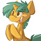
First thought: "...But how do they stay up?!"
Realization: "Oh, right, that's what the strategically placed button is for." XD
Final verdict: 8 airborne sexy labcoat assassins out of 10
Realization: "Oh, right, that's what the strategically placed button is for." XD
Final verdict: 8 airborne sexy labcoat assassins out of 10

As much as I love beautiful landscapes and landscape photography (and painting!), the format this website uses to display them (a 900-pixel wide container) makes these panoramic photographs... really tiny.
I'm sure this is a beautiful photograph, but I see only a shadow of it, through no fault of the photographer. Perhaps, for the writeoff, at least, it may have been better to crop the photo so viewers can see moreof it detail?
I'm sure this is a beautiful photograph, but I see only a shadow of it, through no fault of the photographer. Perhaps, for the writeoff, at least, it may have been better to crop the photo so viewers can see more
I'm really surprised there wasn't more art from a similar perspective as this. And then this piece has such a tiny focus character, yet the viewer is even lower, forcing us to look up to such a tiny thing.
And all the sunflowers are looking down at her, rather than at the sun. But because of their stature, towering above her, it feels judgmental rather than worshipful.
And all the sunflowers are looking down at her, rather than at the sun. But because of their stature, towering above her, it feels judgmental rather than worshipful.

>>Hap
A trick that works in most web browsers to view the maximum resolution is to right click on the image and choose "open image in new tab". Mobile users can usually press and hold on the image to get a menu. Failing that, you should be able to save the image and open the file in an image viewer.
A trick that works in most web browsers to view the maximum resolution is to right click on the image and choose "open image in new tab". Mobile users can usually press and hold on the image to get a menu. Failing that, you should be able to save the image and open the file in an image viewer.

*looks it up*
hmm
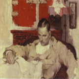
Ah I see. It's a Skye terrier? I'm very glad that someone was able to pull off 'against the sky' without it actually representing the sky above the Earth. Well done! That being said, there's a lot about this image that I really enjoy, and some things that confused me at first.
All three subjects in this image, I think, are well done. It's pretty unsettling, and the medium used here makes it even more so. I really like that the rat on the left is wielding a screw. It's a great touch that also somewhat establishes a sense of scale. I also like that the dog's teeth were drawn much darker (lighter?) than the rest, making it a more obvious focal point.
Some things that didn't read well to me were the clock in the top right and the shelf in the top left. The clock appears to be rather large and somewhat off angle. The shelf seems just a bit out of place by itself. If there was a drawer or cabinet or any other background element accompanying it, it might feel better. All the background elements in general seem like they don't fully need to be there unless a more detailed background was going to be drawn.
However! I think the background elements as an idea help the scene by further establishing the scale.
I think this is a successful drawing! Very nicely done.
hmm
Ah I see. It's a Skye terrier? I'm very glad that someone was able to pull off 'against the sky' without it actually representing the sky above the Earth. Well done! That being said, there's a lot about this image that I really enjoy, and some things that confused me at first.
All three subjects in this image, I think, are well done. It's pretty unsettling, and the medium used here makes it even more so. I really like that the rat on the left is wielding a screw. It's a great touch that also somewhat establishes a sense of scale. I also like that the dog's teeth were drawn much darker (lighter?) than the rest, making it a more obvious focal point.
Some things that didn't read well to me were the clock in the top right and the shelf in the top left. The clock appears to be rather large and somewhat off angle. The shelf seems just a bit out of place by itself. If there was a drawer or cabinet or any other background element accompanying it, it might feel better. All the background elements in general seem like they don't fully need to be there unless a more detailed background was going to be drawn.
However! I think the background elements as an idea help the scene by further establishing the scale.
I think this is a successful drawing! Very nicely done.
>>GroaningGreyAgony
That only brings it up to the maximum 1800 pix width. Better, but still not the full beauty that I'm sure was captured originally.
That only brings it up to the maximum 1800 pix width. Better, but still not the full beauty that I'm sure was captured originally.
Wuhaaa
Is this a photo or is it a manipulation? All the elements in this picture seem so independent of each other that it feels like they were cut out of other images and placed here.
Which is extremely interesting! I don't know too much about photography; that's a field reserved for a close friend of mine.
What I will say is that I like the space that the sky occupies in the image. Very nice.
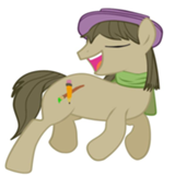
Oooo nice, nice!
The color choice of this image is great and the square brush strokes make for a nice painter-ly look. The lines present on the character makes the image feel somewhat unfinished, but not necessarily in a way that makes it less pretty. What the character does and why they're there is ambiguous, and I think that's a really cool thing. It might make for some interesting stories!
The color choice of this image is great and the square brush strokes make for a nice painter-ly look. The lines present on the character makes the image feel somewhat unfinished, but not necessarily in a way that makes it less pretty. What the character does and why they're there is ambiguous, and I think that's a really cool thing. It might make for some interesting stories!
I love this picture. It feels like it should be hung on the walls of a haunted house in a horror movie.
Nice thing you did there with the eyes. Nobody has them, they were all taken by the wolf.
I don't know if I'm biased or not but this style of painting is a favorite of mine if done well. And it is. The clothes on everyone look perfectly done with the creases getting the perfect amount of...crease. The birds' and human's head are done literally perfectly. The shading on their faces is magnifique. (hon hon hon)
One of my criticisms on this is that one of the eyes look like an anime eye. I know it might be just nitpicking but the realisticness on it is way below the rest of the painting so it sticks out a bit. Also, the eagle's arm is a bit wonky. If the joint went in rather than out it would make more sense.
Overall this is on my list of favorites. Love the style, the medium, and the picture portrayed.
Keep drawin'. ;)
>>Roseluck
FYI, this is a scene of lower Manhattan, probably taken from the Staten Island or Sunset ferry. It's a good photo but the buildings do not appear to be manipulated.
FYI, this is a scene of lower Manhattan, probably taken from the Staten Island or Sunset ferry. It's a good photo but the buildings do not appear to be manipulated.
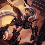
Oh wow, this is an excellent drawing, and the narrative possibilities are very interesting.
The palette chosen for this picture is great. The character's designs are fantastic. I love the seraph-esque (Or maybe Cherub, since they have a sword) character and how intimidating they seem, and the darker tones make for some really good contrast. The fawn-esque character is drawn with proper anatomy, and the pose is strong.
At first, I thought the bright circle between the two characters was a shield of some sort, but maybe it's the smaller character's halo? I'm not sure. There are tiny little symbols that I can barely make out around the edge of it. Not sure what those are. The only reason I think it's a halo is because the larger character has one around their head too. I also just noticed that the larger character's wearing what looks like a crown of thorns? There's a few elements to this that seem somewhat Christian in nature. I won't over-analyze too much though!
The concept is great, and the execution is stellar. This is definitely one of my favorite pieces! (If not, my most favorite.)
That's a big boy!
There's something really cool about how the celestial bodies in the sky almost mirror the scene below. That's a neat touch!
The color usage also seems to go in layers from the top from cool to warm to cool to warm again. It's pleasant.
The big boy seems wounded, but maybe he could be a friend?
Very nicely done!
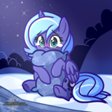
I like the concept of this image. "There's Space for love" is also a good line. Let aliens on Earth!
I can't read runes too well at all. I think it says 'bæum' or 'beum'? The photo itself is nice. It fits the prompt well.
This image is adorable. The stories this one could inspire will probably be very sweet.
I also think this is well done! The silhouettes are drawn quite well and it all looks good.
I also think this is well done! The silhouettes are drawn quite well and it all looks good.
This is a really interesting image, but it's also quite clean. It's pretty macabre, but also just pretty.
The strokes are calculated for an ink brush. It looks lovely. The style is almost like the kind of thing you'd see in an old book illustration, like a Canterbury Tales drawing. Speaking of which, I noticed some text in the background. I was wondering if this drawing was done on the back of a page of some sort, but then the letters should appear in all the characters' white space. I tried to take this image and up the contrast to see if I could read it, but I can't make out the script. It looks like Latin maybe, and if not that, then maybe just old print. I could vaguely make out the 'ſ' long s. I'm interested in knowing what it says!
This is a very interesting drawing. Well done!
Is this 3D rendered? you might want to throw some SSS on that marble, or at least soften the specular. If it's just photobashed, picking a statue with brighter lighting to match your background would, I think, make them fit better together.
This one's pretty great! I like the idea, and the painting really looks well done.
I kinda feel, though, that the foreground character doesn't quite fit in with the background. It might be because she's outlined and the sunflowers aren't, it might be because my brain's saying that, no matter what I look at from this camera position, it should be more difficult to see than that?
Still, there's definitely something of a hook here, her expression and the sunflowers position suggest some sort of story, so that's good.
I think your stars are a bit too evenly spaced.
The composition feels decent to me, although the style seems overly simple.
The composition feels decent to me, although the style seems overly simple.
This is impressively done; I like minimalist pieces like this a lot, where a simple medium is used to convey plenty of information. The expression on the rats, the 'pit' eyes, highlighting the dogs claws and teeth, the 'focus' of the scene, (the clock-hands form an arrow pointing towards the dog's mouth!) all the little stuff, it's great.
As for constructive criticism... I think making the dog look more dog-like might have made it more obvious to me what was going on at first glance. I originally went 'Bear?' seeing this in the gallery, and although I concluded 'must be a dog' after clicking through and seeing the rats, I wasn't entirely sure until I saw your alt-text.
Two things that might have helped me: making the ears more obviously pointy (I realize they're covered by hair, but the shaped underneath could be highlighted more, maybe?) and stylizing the end of the dog's nose a bit more. Dogs have this little black heart-shaped thing their nostrils sit in, and although that's kinda in your picture, it's not very obvious; to me, the end of your dog's nose looks 'flat', and that's making the whole muzzle kinda fade into the nose, which throws off the whole 'dog' idea at first glance.
As far as being a prompt, this obviously has great potential. Tool-using rats, evocative expressions, immediate conflict, all good stuff. Maybe it would be even better if it raised more questions, but eh.
I like the style of this one, and the lighting, especially the shading in the folds of cloth and the growing intensity towards the whatever-that-is in the center of the image.
That being said, I have very little idea what this is actually about. There's a person on the side, looking at the thing in the center, but the center-thing is entirely too simplistic for me to actually recognize it. A door opening? An erupting volcano? A burning person? Sure, some ambiguity is good for prompting stories and pulling people into thinking about your piece, but for me, there needs to be some shape to that; a big '?' isn't much better than a blank sheet of paper as a prompt.
Nice painting skills, but the choice of subject seems too vague in comparison.
I know the artists like feedback, but I've never bothered commenting on any, since I don't feel like I have anything useful to add. I can say whether I liked it, but I don't have a basis for suggesting how it could be any better.
>>CoffeeMinion
Anyway, in response to this, "nimrod" has come into popular usage as meaning someone stupid, but its original meaning was a master hunter. Nimrod was potentially associated with the tower's construction, which was seen as a foolish endeavor, but until the 1900s, the hunter meaning was prevalent.
This is really, really reminiscent of the first scene of The Last Jedi. And so the last shall be first.
The unbalanced number of signs is bothering me more than it should. :/
I really don't have a lot to say here. You obviously have better art skills than me; you've grasped your idea, outlined its scope, and evoked it cleanly.
...well, that one sign on the far left looks kinda like a cooked alien to me...
I really don't have a lot to say here. You obviously have better art skills than me; you've grasped your idea, outlined its scope, and evoked it cleanly.
...well, that one sign on the far left looks kinda like a cooked alien to me...
>>Not_A_Hat
I assumed the outline was a deliberate artistic choice. It's a common technique to make a character stand out from the background; either outline the characters and not the background (like much anime/manga that uses painted backgrounds but cel-shaded characters... heck, look at a western animation like The Rescuers.), or give the characters thicker outlines than the background (like the more traditional western comic books). Also, if you pay attention, you'll notice that characters closer to the foreground (or parts of them that are, and are foreshortened) will often have thicker outlines.
I assumed the outline was a deliberate artistic choice. It's a common technique to make a character stand out from the background; either outline the characters and not the background (like much anime/manga that uses painted backgrounds but cel-shaded characters... heck, look at a western animation like The Rescuers.), or give the characters thicker outlines than the background (like the more traditional western comic books). Also, if you pay attention, you'll notice that characters closer to the foreground (or parts of them that are, and are foreshortened) will often have thicker outlines.
This one is really well done. I like the two-tone approach, and how surreal and alien the whole thing looks. The monstrous shape and the sword-wielder have obvious suggestions of conflict, but it's not the only interpretation, either.
As for constructive criticism; I'm still not sure if the sword-wielder has a fireball or something in their left hand, or if the right foreclaw of the monster is what's wounded. There also appears to be wound on the monster's left shoulder, but... I didn't notice that at first, possibly because it seemed pretty... flat? like, until I noticed the drip, it just felt like highlighting.
The suggestions of mountains in the background and the radiance on the ground near the sword-wielder are especially nice touches. I don't think I need to break down why this one could be a great prompt! Good work.
Wow, this one's great! But it feels kinda... jumbled to me? I don't really see a 'focal point' in this composition, and a lot of the little details feel just a touch askew, and it leaves the whole thing feeling just a bit off.
Like the faces. Don't get me wrong, I think they're quite impressive, and I think it's great that you drew them; but the centaur-ish person is looking away from the swords, and the winged person's expression is like 'huh, what, how'd this get here?' It makes me wonder how they ended up in this position. Did they just bump into each other holding swords or something?
The halos/hats is another thing. They're probably supposed to be halos, but they're not the ring-shape I'd recognize as a 'solid' halo, nor are they the half-transparent 'glowing' halo, I was at first like 'are these people wearing huge bulbous hats' for a moment, before I caught on. Well, I didn't notice the script there until Roseluck pointed it out, maybe it's more apparent they're something mystical in a higher res or the original medium?
Well, this is possibly a matter of time, too, but I think a few more feathers in the winged guy's wings wouldn't go awry; the ones on the left are pretty obvious from the outline, but the ones on the right seem pretty smooth.
And the centaur-guy (is that a whitetailed deer?) seems just a bit out of wack between his lower and upper half. A piece of clothing that ties them together might help (a scabbard?) or making his deer-half just a bit larger, or... I dunno. Just felt off to me.
Sorry if this seems like a lot of criticism; I honestly like this piece a lot, and I think it's got great potential as a prompt, and you're obviously a very skilled artist. The composition feels jumbled is all.
Ooo, cool!
I honestly didn't notice the runes until Roseluck pointed them out. I'm not sure if I like the picture more or less now that I've seen them.
Still, I like this one a lot either way.
I honestly didn't notice the runes until Roseluck pointed them out. I'm not sure if I like the picture more or less now that I've seen them.
Still, I like this one a lot either way.
Nice photo! Rainbows are great.
Doesn't raise a whole lot of suggestions as a prompt, tho. I mean, sure, I could go with 'mountains' or 'leprechauns' or something, but it's not like the photo itself raises a whole lot of questions or suggests anything particularly interesting to me.
Doesn't raise a whole lot of suggestions as a prompt, tho. I mean, sure, I could go with 'mountains' or 'leprechauns' or something, but it's not like the photo itself raises a whole lot of questions or suggests anything particularly interesting to me.
Nice photo! I especially like the sailboat, because sailboats are great. Is this from New York? That poem goes with the Statue of Liberty, right? "Send these, the homeless, tempest-tost to me, I lift my lamp beside the golden door!"
Well, aside from 'city' or 'sailboat' or something with the title, I don't see a lot of prompt potential in this one. It's a very nice photo, but not, you know, evocative. To me.
Well, aside from 'city' or 'sailboat' or something with the title, I don't see a lot of prompt potential in this one. It's a very nice photo, but not, you know, evocative. To me.
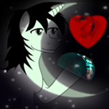
E.T. phone home.... Well, I also thought 'is that Luna?' when I saw this in the gallery.
I like that we can see the edge of the piece, where the paper shows through. Dunno why, but that seems like a nice touch to me. The stars seem a tad on the 'too even' side, but that might just be me. The texture on the moon is great, especially as a background to the flat-black silhouettes. The floating/raised hand thing is evocative, and a good place to start a story from.
I will say, though, that this composition does feel very... safe, to me? You're obviously a talented artist who picked an idea and executed it with a clear scope and clean composition, but I guess... you make it seem so easy, I don't feel like you were challenged at all. Maybe that's unfair to you, as an artist; I don't know how much blood/sweat/tears you poured into this, but it doesn't feel ambitious. I'll try not to let that color my judging, but yeah.
Ahaha, the alt-text made me laugh. :P
Clever idea, cute jokes! Also, good potential as a story prompt, although the heavy religious associations might make people shy away from it a little... well, and Cold in Gardez also wrote a story about random language switching yonks ago. Was pretty good.
Clever idea, cute jokes! Also, good potential as a story prompt, although the heavy religious associations might make people shy away from it a little... well, and Cold in Gardez also wrote a story about random language switching yonks ago. Was pretty good.
Nice work on the clouds and shading the light on those curved walls! This whole thing feels very cohesive, all the pieces fit together really nicely.
As a prompt, though, it's not suggesting a whole lot to me. Castle in the clouds, something about a mirage... I dunno. I'd like to see the castle itself suggest more. What's its story? How'd it get up there, or what happened to leave it so empty?
Good work, but it's a bit on the simple side, I think?
>>Pascoite
I was literally about to comment that a couple hours ago but I decided against it.
I do like the planes in the background and the spy look going on. The cracks in the window and the bullets in her make it all the more such an intense picture.
I can tell you actually draw humans, artist. Unlike some people *cough me cough*. Anatomy is great and so is shading.
My only gripe is, “where is she?” I know it’s up for interpretation but it bothered me a little more than it should. Other than that, gr8 job m8.
>>Hap
Yeah, I've seen that before, especially in old Disney movies. And it's not like I think it's necessarily wrong, but... something makes me feel like the piece isn't quite cohesive, and I was trying to figure out what that might be.
Maybe if the background were something more textured, the outlines would feel more fitting, because being more distinct from the background would be helpful, then? As it is, though, I'm not going to have trouble differentiating their arm from the sky/wing, so I thought it might look more cohesive without them.
EDIT: Well, perhaps the artist was trying to deliberately break cohesion, especially if they wanted the flowers to seem 'weird'. That feels like a really 'meta' way to think, though, and I don't think I can comment on it.
Post by
Anon Y Mous
, deleted
Not_A_Hat is right: The stars don't form a believable night sky. It would help if there were some spots of empty space and if the stars were organized into faux constellations and clusters.
Also, the blue portion of the sky closer to the ground, what is that? What is the orange band separating the sky from the ground?
One thing I do like about this image is the choice of purple you used along with the color of the stars. It does look nice together.
Also, the blue portion of the sky closer to the ground, what is that? What is the orange band separating the sky from the ground?
One thing I do like about this image is the choice of purple you used along with the color of the stars. It does look nice together.
This image was weird to me, but Not_A_Hat's comment has at least opened my eyes to what might be going on in the image.
If I think about how this image would have been made, there's one thing that would require a bit of touching up to make it look just a bit neater. You either erased the purple overlay behind the shade with an eraser or with a selection tool. Maybe you did something similar. Either way, on the far left of the image, the shade does not line up with what the wall is actually covering. It's off by a bit.
As a concept, I think this picture could make for an interesting story, though.
>>Pascoite
Huh, that's a big 180 on the definition. I wonder how that got turned around...
Huh, that's a big 180 on the definition. I wonder how that got turned around...
Oh, hey, this one's got that action vibe to it. It's pretty nice looking!
I like the fact that the lasers are the only color in the image. It's very popping.
The character also pops well from the background and you seem to have a good grasp of anatomy.
I've got some nitpicks though.
What is she holding in her hand? Is it a detonator or is it a grenade? I see a little thing coming off of it, so I'd assume it's a grenade, but she's holding it like a detonator.
I see the lasers are casting reflections on the glass, but the reflections are too crisp. It's almost like a mirror, though the character's reflection is barely there.
The fabric on her knees are of different sizes. It looks strange.
I'm also trying to wrap my head around where she might be, though I suppose that's up to anyone who writes for this.
Overall, nice work!
Ohhh this angle is very interesting. It fits the prompt like a glove.
I love the wing colors! They appear to be a bit translucent. It'd be neat if some colored light poured through them to drive that idea home. Your anatomy's alright here. Some mistakes I see appear to be from how it was painted, though I think her left wings are slightly misplaced.
Huh, >>Not_A_Hat I might know why you think the flowers look so weird compared to the lady? I think the picture's a bit unfinished looking.
I think I can see parts of your sketch for the flowers on the right and a bit in the leaves in the bottom left. The lines on the lady, especially on her raised arm, seem like sketch lines that have yet to be covered. A lot of the rendering doesn't seem deliberate in some aspects too. I think you might just need a bit more time on this image in general.
As it is now, it's still pretty good, and the idea's cool too. Good job!
I feel like I would appreciate the detail of all this more if it wasn't for the sniper in the bottom-right.
Don't get me wrong, this whole image would make for a pretty cool alien invasion story, but that chick's ass is literally poking out of her shorts. I usually don't mind a good ass, but this seems like the wrong context for one.
Don't get me wrong, this whole image would make for a pretty cool alien invasion story, but that chick's ass is literally poking out of her shorts. I usually don't mind a good ass, but this seems like the wrong context for one.
Crop this a bit and you get a vaporwave album cover.
For real, though, there's not much I feel can be said about this. I'm assuming the artist was just taking the piss, so I'll just say this is lower tier a e s t h e t i c and take my leave.
For real, though, there's not much I feel can be said about this. I'm assuming the artist was just taking the piss, so I'll just say this is lower tier a e s t h e t i c and take my leave.
Those are freaky. Those are toats freaky. This is some cosmic horror stuff. Neat! I think this concept is awesome. The monster's designs are something else.
The sniper lady on the right is really well done, and I can easily recognize the weapon she's holding. (Geez, those are some short shorts.) Even the cliff she's laying on is nicely rendered.
The lights of the far away city are done alright. They seem like bokeh. The closer city's lights, however, I think are a bit lacking. Firstly, they seem to be placed at a weird angle. Second, if the red lights in lines are supposed to be cars, then the streets they're on would have to be incredibly wide. All the other lights don't really seem like building lights.
Another thing is that the water doesn't really look like water to me. The reflections from the city lights are nice, but I believe it's missing something. Something like waves to suggest the monsters are stepping in it.
All in all- this is a pretty good one. Nice work!
At first glance this is a pretty great piece. I like how it's possible to interpret the girl's expression and the flowers' looking down at her in multiple ways, though it's most likely to be dramatic. The premise of fairies/wood sprites being in touch with nature is very old, but there seems to be conflict between them here.
It's been mentioned before, but I like the angle here, playing with perspective and making us feel even smaller than the fairy.
There are some gripes I've got, though. The anatomy is a bit wonky; aside from what >>Roseluck said her left arm (our right) seems oddly proportioned, with the placement of her elbow and everything.
I don't know if I should note how meaty her thighs are. Not even as a complaint, I just like them.
The lack of outlining for the flowers also makes them look unfinished, and in a couple cases weirdly out of focus.
Aside from that, not a bad piece. Not bad at all.
This is phenomenal; it is both well drawn and evocative. The downward angle of the rays and flowers to the subject implies menace and dominance; the flowers are turned downwards away from the light, which is quite unnatural. To top it off, the subject is a pixie of some kind, and should be at home in nature. At a glance, the piece is a pixie warding their eyes from a sudden ray of sunlight. Closer examination imparts a feeling of dread.
The title is... odd. “Weirdo” has a silly sort of feeling about it; even if it is meant scornfully, it is usually said from a position of superiority. I don’t get the feeling you would call someone a weirdo if they were menacing you and you were scared, but you would call someone if they were manacing you but you didn’t feel threatened.
The title is... odd. “Weirdo” has a silly sort of feeling about it; even if it is meant scornfully, it is usually said from a position of superiority. I don’t get the feeling you would call someone a weirdo if they were menacing you and you were scared, but you would call someone if they were manacing you but you didn’t feel threatened.
For an image that uses stick figures, I don't dislike this nearly as much as I probably should. Literally nothing about this is realistic or believable, but I feel like that could actually be used to the writers' advantage, for inspiration.
There is enough going on here that you could make a story off it, but it's also incredibly vague.
The closest comparison I can think of is the album cover to Sextant by Herbie Hancock. Similar premise, although obviously that one is infinitely more detailed.
I don't know, man, I like this enough.
There is enough going on here that you could make a story off it, but it's also incredibly vague.
The closest comparison I can think of is the album cover to Sextant by Herbie Hancock. Similar premise, although obviously that one is infinitely more detailed.
I don't know, man, I like this enough.
This is great in a lot of ways, but I'm having a lot of trouble orienting myself. My first thought was that she was laying on something curving out, and the planes in the background were reflections. (Probably because I saw the laser reflections, although... shouldn't those curve with the curved glass?) My second thought was that she was on something curving in, but on the ceiling, but that was obviously nonsense. I finally decided that she was in something curving in, and it was on the floor, but wouldn't that mean the snipers are high above her? I dunno. Lots of little things about the perspective here just feel off to me.
Well, there's a lot of tension in the scene, and that's great. She's been shot, I think, and she plans to suicide? I'm not sure what she intends to accomplish by suiciding there, but eh.
That cloud in the background looks like like a hand, and those fighters look suspiciously similar... alright, fine, I'll stop nitpicking. This piece is good in a lot of ways. Some of the details seem off, but that doesn't stop me from appreciating it overall, especially since it's very clearly got story. Great work!
Of the photography pieces for this contest, this is probably my favorite. It's the one that feels closest to a real "art" piece, in terms of what we often consider to be art. I know the artist must've used Photoshop to get this particular look, and I don't care, because it's pretty damn striking.
The sign at the bottom-left is just icing on the cake, and it can be taken in a number of ways. Impressive for something that was probably meant something innocuous in real life.
The sign at the bottom-left is just icing on the cake, and it can be taken in a number of ways. Impressive for something that was probably meant something innocuous in real life.
It's cool how despite this being so minimalist on the surface I can tell pretty much exactly what's going on. It reminds me of something like Watership Down, or Secret of NIMH, but with the rats as the protagonists.
My big complaint, though, is that this is such a vivid image that there's not too much room for playing around with it. Preferably you want a piece whose context can be manipulated in a variety of ways by the writers, but this is so well-realized that I'm curious to see if anyone can really play with it.
My big complaint, though, is that this is such a vivid image that there's not too much room for playing around with it. Preferably you want a piece whose context can be manipulated in a variety of ways by the writers, but this is so well-realized that I'm curious to see if anyone can really play with it.
They’re some kind of cthonian/spider/ant/Godzilla hybrid...
I like the way the city lights are done, the blur adds a nice focus/lack thereof effect. The sky and clouds are also well done
The monsters are suitably alien and horrifying. They are similar enough to imply a race of them exists...
Now, for the water: your lighting blur and reflections are very well done.
Your water tension though... water doesn’t work like that except at smaller scale. At a large scale like this, there will be wakes and eddies created as the monsters drag their feet through the water, or much larger waves if they’re stomping their way through.
Sniper girl has a shadow that does not match up with the placement of the Moon, from that angle it should stretch out far behind her. Speaking of behinds... the fact that she is brighter than anything else and is wearing almost no pants does distract significantly from the rest of the piece.
Good photography. The angle and cropping has been well done. The runes are hard to see. I wouldn’t recommend making them ultra-blatant, but a tiny bit more contrast or brightness would make them less likely to be missed entirely.
The photo is nice, it’s centered and has good resolution and the rainbow is solid enough to be more than just a suggestion, without overpowering the beauty of the surroundings. Unfortunately, relevance to the prompt comes into question.
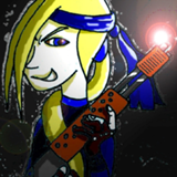
I oriented pretty quick, she’s on her back, about to blow something up since she’s about to be shot full of even more holes.
The anatomy is good, the clothing design is classic “how the hell do these stay up on their own?” Her sidearm is missing, nice touch. Her hand is too flat if she’s holding a grenade; if it is a grenade, her hand will be larger. If it’s a detonator, then it’s fine.
The lighting is good, but the background around the window seems sparse; there should be some metal seams or structural ribs.
Those planes behind her... are strange. If this is something like Skycaptain and the world of tomorrow? They just don’t seem to work like real planes (typically they have either engines on the wings or afterburners in the rear, not both) regarding engines.
The wounds are done well. I don’t know if it was your intent, artist, but I’m pretty sure she’s dying: that one shot will have punctured her liver or one of her kidneys.
I have mixed feelings about this one.
On the one hand I'm a sucker for this kind of painting, and stylistically it is both consistent and high-quality. What little we see of the woman if very well-done, in terms of anatomy, and judging from her clothing I'd say this could be taking place in ye olden times.
But then there's the subject of the piece, or rather the lack of it. The woman is in a forest, and apparently she's looking at something, but we don't know what. We only see trees. Aside from the woman, then, there is little to grab our attention, because we don't know what we should be focusing on, if anything.
The title is also overly vague, and I'm honestly not sure what it could be applied to here.
So yeah, I think it's okay.
I like this piece. There is an eerie feeling to it. I feel like this is a scene we get after stalking the creature through the mist for several hours.
The creature is wounded, although it is unclear if it is due to the sword or due to the weird electrical thing that’s going on with the swordsperson’s left arm.
The sky and stars are nice, my view is drawn to the one patch of brighter stars. The two celestial bodies are also nice, I concur with >>Roseluck that they mirror the two subjects.
I like this because my eyes keep getting drawn to different parts of the composition, not in a bad way, it’s not a busy piece.
This is an interesting photoshop job. The left pair of footprints is done well, but the right pair is in a patch of differently colored rock.
Unfortunately, the footprints are placed in such a way that they make no sense; nothing leads to or from them.
Unfortunately, the footprints are placed in such a way that they make no sense; nothing leads to or from them.
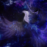
This piece is very well done. The silhouettes are done well, the stars are numerous and the night sky is shaded well.
Now... am I the only one with alarm bells going off in my head? The way the entity’s silhouette is, it looks like it is there, with the child, but it looks to me as if it is stretching all the way from the Moon. O_O Maybe it’s just the Lovecraftian in me, but I see potential for horror here as well.
Now... am I the only one with alarm bells going off in my head? The way the entity’s silhouette is, it looks like it is there, with the child, but it looks to me as if it is stretching all the way from the Moon. O_O Maybe it’s just the Lovecraftian in me, but I see potential for horror here as well.