Hey! It looks like you're new here. You might want to check out the introduction.
Show rules for this event

Oh wow, this is an excellent drawing, and the narrative possibilities are very interesting.
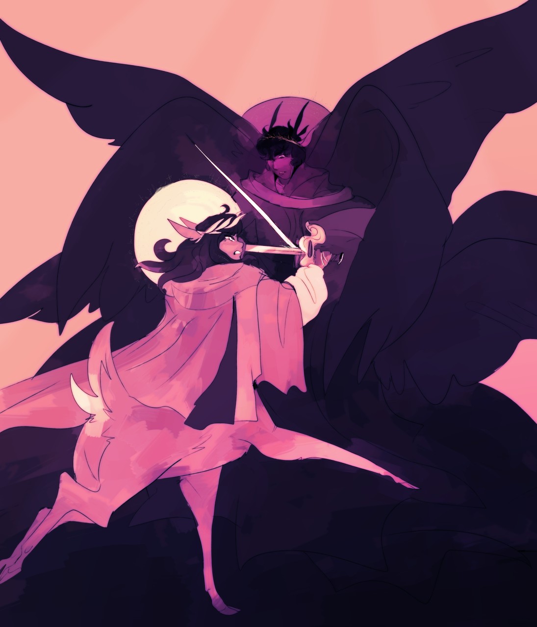
The palette chosen for this picture is great. The character's designs are fantastic. I love the seraph-esque (Or maybe Cherub, since they have a sword) character and how intimidating they seem, and the darker tones make for some really good contrast. The fawn-esque character is drawn with proper anatomy, and the pose is strong.
At first, I thought the bright circle between the two characters was a shield of some sort, but maybe it's the smaller character's halo? I'm not sure. There are tiny little symbols that I can barely make out around the edge of it. Not sure what those are. The only reason I think it's a halo is because the larger character has one around their head too. I also just noticed that the larger character's wearing what looks like a crown of thorns? There's a few elements to this that seem somewhat Christian in nature. I won't over-analyze too much though!
The concept is great, and the execution is stellar. This is definitely one of my favorite pieces! (If not, my most favorite.)
Wow, this one's great! But it feels kinda... jumbled to me? I don't really see a 'focal point' in this composition, and a lot of the little details feel just a touch askew, and it leaves the whole thing feeling just a bit off.
Like the faces. Don't get me wrong, I think they're quite impressive, and I think it's great that you drew them; but the centaur-ish person is looking away from the swords, and the winged person's expression is like 'huh, what, how'd this get here?' It makes me wonder how they ended up in this position. Did they just bump into each other holding swords or something?
The halos/hats is another thing. They're probably supposed to be halos, but they're not the ring-shape I'd recognize as a 'solid' halo, nor are they the half-transparent 'glowing' halo, I was at first like 'are these people wearing huge bulbous hats' for a moment, before I caught on. Well, I didn't notice the script there until Roseluck pointed it out, maybe it's more apparent they're something mystical in a higher res or the original medium?
Well, this is possibly a matter of time, too, but I think a few more feathers in the winged guy's wings wouldn't go awry; the ones on the left are pretty obvious from the outline, but the ones on the right seem pretty smooth.
And the centaur-guy (is that a whitetailed deer?) seems just a bit out of wack between his lower and upper half. A piece of clothing that ties them together might help (a scabbard?) or making his deer-half just a bit larger, or... I dunno. Just felt off to me.
Sorry if this seems like a lot of criticism; I honestly like this piece a lot, and I think it's got great potential as a prompt, and you're obviously a very skilled artist. The composition feels jumbled is all.
Post by
Anon Y Mous
, deleted

>>Not_A_Hat
The halos are absolutely textbook. I take it you've never seen a picture of an illuminated manuscript from the middle ages?
The halos/hats is another thing. They're probably supposed to be halos, but they're not the ring-shape I'd recognize as a 'solid' halo, nor are they the half-transparent 'glowing' halo, I was at first like 'are these people wearing huge bulbous hats' for a moment, before I caught on. Well, I didn't notice the script there until Roseluck pointed it out, maybe it's more apparent they're something mystical in a higher res or the original medium?
The halos are absolutely textbook. I take it you've never seen a picture of an illuminated manuscript from the middle ages?
>>Hap
I was going to comment back to them, too. The halos look like their straight from the biblical paintings out there. I have to walk past a jesus wearing his crown of thorns every week. I can’t not notice the halo. (Personally, whenever I look at the picture I think he’s wearing a sun hat lol)
I was going to comment back to them, too. The halos look like their straight from the biblical paintings out there. I have to walk past a jesus wearing his crown of thorns every week. I can’t not notice the halo. (Personally, whenever I look at the picture I think he’s wearing a sun hat lol)
I feel like I should love this a bit more than I do, but maybe that's because I have a few gripes.
I totally get the halos and the style the artist copped for them, but the placement of the halo for the centaur (half human half deer?) feels off to me, although the halo for the winged dude is perfect.
The halos themselves are meant to evoke religious or mythological imagery, and this battle we're seeing feels like it could be taking place at the top of Mount Olympus, or in the middle of an ancient forest between nature gods. I can also probably guess who drew this, considering some of us have a fetish for this sort of thing.
The winged dude's design is... odd, if you stop to think about it. Where are his legs? Does he even have legs? If the centaur is part deer, then is the winged dude part bird? Why does he had like three pairs of wings? How would you even be able to move around like that? It just seems really cumbersome.
There is also a lot of unused space in this image, but that's grasping at straws honestly.
I dig it, on the whole. It would make for a pretty epic story.
>>No_Raisin
In the bible, there were angels mentioned who specifically had six wings. There's a big can of worms to unpack, here, if one should choose to do so. The book of Ezekiel has an awful lot of odd creature designs, if you care to read it.
In the bible, there were angels mentioned who specifically had six wings. There's a big can of worms to unpack, here, if one should choose to do so. The book of Ezekiel has an awful lot of odd creature designs, if you care to read it.

This one as well could be a classic novel cover. My main complaint is that the image could use more contrast and clarity.
One technique for testing clarity in composition is to make a silhouette of the figures in the image and look to see if the images are still recognizable. Here’s an image comparing Wounded with this piece, with the foreground figures siloed in black. Wounded retains its menace when seen this way; but this piece becomes incomprehensible.
Since you’re trying to portray a deer-taur, which is not so common a thing even on fantasy novel covers, separating the figures instead of overlapping them, so that each has its separate identity of form, may help you to convey it.
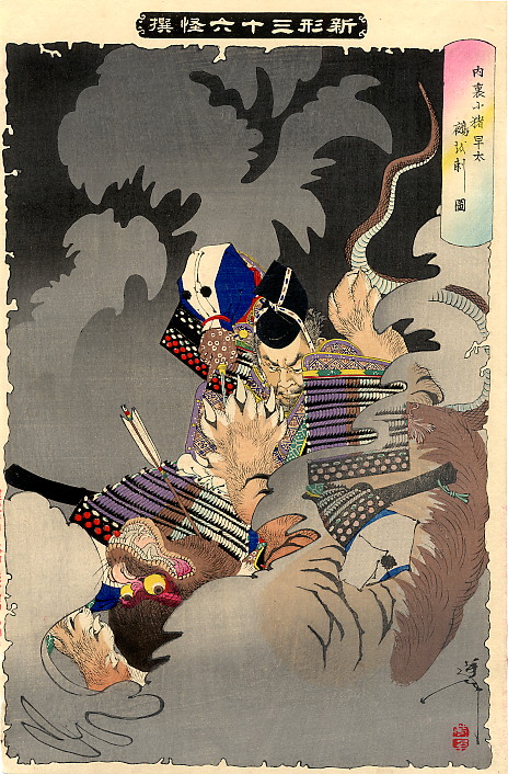
coincidentally I was looking at this just now, also depicting a chaotic melee clash. so I disagree with the silhouette test, because negative space is being used cleverly here. that much is fine.
the deer-being is excellent because of a clear form, and the dynamic forward motion. My eye follows up to the sword, and the eyes glaring upward. But that's kinda where everything stops, like hitting a wall. Partially I think its the winged-being's pose being too neutral and static. Is he pushing forward, or being pushed back? What's he doing with his sword? It's a bit too vague, especially when next to the deer. The many wings feel like they're just floating in the background, rather than directing attention to anything.
But it's also the lack of texture on the wings; from the darker colors it was kinda murky and at first I assumed they were a continuation of his flowy robes, because they don't stand out much. Compare it to the deer, who has animal fur, a cloak, and the long hair -- it's easy to tell apart these elements just by the way the lines are drawn (though the lighter colors help too). And going back to that Japanese print I linked, which may seem like a messy jumble of bodies, but the contrast in textures keeps each of the figures distinguishable, in separate states of motion. Different art style, but I think it's the same basic concept at work.