Hey! It looks like you're new here. You might want to check out the introduction.
Show rules for this event

Tim Burton? (it seems that most of my contributions this round is comparing pics to works of other artists...)
Okay, we had Burton, a collab between Picasso and Munch, and now I see Beksiński. Not bad :)
"AI Paradise"
I translated this so you guys don't have to. :')
Love the shadows on this piece. The lighting immediately behind all of the computers is stunning and you have a very nice sky.
I translated this so you guys don't have to. :')
Love the shadows on this piece. The lighting immediately behind all of the computers is stunning and you have a very nice sky.
Ah, I get it. Since you didn't write spine, Fern can bend that way.
jk, I really like this piece, it's funny in all the right ways.
jk, I really like this piece, it's funny in all the right ways.
Some...WHERE. Oooooo-ver the RAINbow way up hiiiiiigh!
Despite its simplicity and lack of polish, I find this piece so endearing I can't help but give it an upper tier placement.
Despite its simplicity and lack of polish, I find this piece so endearing I can't help but give it an upper tier placement.
I like how someone -- Miller? -- said over the Discord chat that #silicon would get no art because it was too hard to illustrate. I like to think every single fucking artist in the Writeoff saw that and took it as a PERSONAL CHALLENGE because by far #silicon has had the most art.
That aside -- I like this one! It's a rather literal interpretation of the story, no? A series of characters, and the only thing that differenciates them is how they talk and act, and the fact that they're all computers. So, a series of monitors with different pictures, and that's your cover art. Pretty damn representative of the story, really.
Not one to know a lot about art, sadly, so take these commens as coming from a novice -- but I like the composition of the piece? It's just two rows of identical monitors facing each other, but the detail of there being more off-camera that we don't see implies an infinite number of them.
It's pretty romantic! In a way the story isn't, actually. The story more plays with the whole who's human-who's machine dilemma, while this is pure machine, so it feels colder.
The shadows are a bit weird? There's shading on the ground but not on the screens themselves, and the perspective is kinda wonky too, because it's just the same monitor copypasted again and again.
But ultimately I think the piece works pretty well. It's kinda abstract in that I think it's not supposed to represent a literal row of monitors, but rather the idea of computers talking to each other -- this, I don't know, sense of futility to it all? In the end this doesn't matter, it's just monitors passing time and breaking each other. But they're not unique, aside from what is inside, and you can clearly just substitute one for the other on a whim.
It's a cold piece, in other words. Fits the story, though I do think it has a much more melancholic air than the story itself. That might be me reading too much into it? But, hey, I'm not an artist, so y'all have to do with me trying to interpret this as a story in purely visual form. That'll work.
Good job, author. I think this picture does a better job than the story itself at giving the story some emotional depth. Which is hard to do, when all you're looking at is a bunch of screens.
Holy shit.
Right, see, here's when not being an artist severely harms me, because I have no idea how one would go about painting this. Is this drawn by hand, is this a photoraph with effects...?
Look, no clue. Looks dope as hell, though. Which is, ultimately, all that matters.
I'm not gonna go crazy here trying to assume which character the pic represents because I'm not exactly sure if that matters. The story is a rather melancholic, dark-edgy story about two women, and this one could be either one of them. Not really the point.
I like the feeling this gives a lot! It's very dark with only white to highlight the woman, and so she blends into the shadows whenever she's not directly hit by the light coming out the... is that a window? I don't think it is because the shadow of the woman is cast over it, so I doubt the light is coming from there. Then again, it does hit her neck from that direction, so...?
I don't know a lot about shading. Whatever.
So the main feeling I got from the story was that of melancholy. It's all very demure, very sad, very dark. Very 'what happened in the past' and heartbreak and shit. This piece has an air similar to that. Woman alone, darkness around her... I do read her expression as a smile if I don't look too hard at it (if you do that it sort of blurs out and you don't know what you're seeing anymore), so it doesn't feel overly sad, but it does feel lonely.
The imagery of the fic is very bleak, and I'm assuming this picture tries to go after that with the high contrast. I like it! It feels like something that could very well be the cover of it.
I'm afraid I don't have a lot to say about this. Composition is nice, and your eyes get drawn to the woman's face automatically; the use of black and white gives this a noir/somber feeling, and overall it's very visually pleasant. You can picture this being something that happens in the story itself. Good job!
Yo hey. This one's pretty much the total opposite of the previous one in the gallery, even though they're from the same story. Nice!
At first it took me a moment to notice that the picture created a face, but once I saw it I understood what the artist was going for -- it's a pretty clever idea! The fic is full of nutty weird imagery, and while this is not taken literally from it, it's in the same spirit.
So the ravens create her eyes and the blood on the snow creates her lips, which I think is exactly how the story defines Sylvia's smile. The trees sorta form the contorn of her face? But this is supposed to both look like a face and be a literal scene in a snowy field, so mostly I'm assuming they're just trees and that's it.
I like the idea a lot, and it does give that weird-ass feeling the story reaches with the strangest descriptions, so I dig it. That said, the crows vary in size and detail a lot, which is a bit distracting? And the composition is nice, but the tree on the right looks significantly worse than the one on the left.
I don't know enough about abstract art to know if that should matter or not, though. Like, I could very well tell you that having the birds be more homogeneous would help make the picture look more polished -- but, would it?
I mean, ultimately what this picture is going for (I think -- I hope?) is less a literal, photorealistic depiction of a particular image, and more to evoke a feeling. Much like the story that inspired it. It's strange and has dark imagery, it's black against white against red, and it depicts a human face that looks disturbing even if it's recognizable, because it doesn't really register as human.
The story's kinda gruesome, and this pic imitates that same gothic/dark/gross feeling pretty well. So, fuck it. I don't think having the birds be more photorealistic and similar to each other in detail and size would've helped the picture that much; if you picture this as drawn in that style it gives a completely different feeling. This pic tries to do one thing and does it pretty well; that's all that matters.
This is a photograph! Of a weird place! I think I can safely assume that this time.
So the story is -- as the title puts it -- about a crystal palace; the photograph tries to emulate it by depicting something that reminds the viewer of that place.
This is a bit of a tricky one. The story talks about a palace made of glass and sunlight doing rainbows and shit when it goes through the walls; the picture is of a building that is clearly not of glass. Like, at all. But the lighting is weird, and you can sorta see where the author is going.
Because, yeah, when you look at this it sorta reminds you of the crystal palace. It's the way it's lit, and the color white, and the darkness all around it. There's an air to it that reminds me of the story, and you kinda default to this sorta image when reading descriptions of the place.
So good job in finding a real world place that looks nothing like what the fic talked about -- but still makes me go 'oh yeah I kinda see it actually!' Not a small feat!
I know fuck-all about photography, though. I think the composition is nice? Feels like there's a lot of wasted space, though. I wonder if zooming in a bit more, or finding a different angle would've created a better effect. It's also kinda blurry, too, which does give it a bit of a weird air. Part of the course when you're trying to emulate a fantastical environment with a real life photograph, but it does distract me a bit.
The picture does a pretty good job of emulating a certain feeling -- despair, sort of. Desperation? Breaking down, a dude screaming to the heavens. It's all blurry and weird-looking, abstract-ish, to emphasize the emotion of the piece rather than the realism of it.
Thing is, as effective the piece is at emulating despair -- and it is! -- it also makes me wonder if it fits the story that well? No I'm Fine sorta emphasizes quiet distress and the idea of evading the problem that's eating you inside, it's precisely about not screaming, but rather being skittish and reassuring yourself that you're fine no really you're fine.
(Pun, uh, not intended).
It's a fundamentally different feeling, is what I'm going for. Like, I guess you can say that this picture emulates what's going in the heart of the main character of the story -- sure, he's ignoring the problem, but to ignore something you need to first be aware that it exists. So he's lying to himself, right, when he says he's fine. So the truth is that he is not, and in fact he's quite desperate!
Bit of a reach tho. Like yeah I can see the point, but the story's focus is not on how he's REALLY despairing; the subtlety of it all is that we focus exclusively on the lie that the character tells himself to then infer what's really going on. This story avoids that and just goes, fuck it, here's him screaming because he's so fucked.
And he should be screamin', yeh, 'cause he's totally fucked. But the pic, effective as it is at emulating a certain feeling, and well-drawn as it is with that goal in mind, to me kind of misses the point the story is trying to make, and focuses on the opposite. So, great pic, but I ain't sure if it's the best pic to go with the story itself.
I directly mentioned this one on the Writeoff discord channel when the gallery came out, 'cause I find that it works pretty well as a book cover for the story. Which is pretty fun!
So I'm guessing this is like, Photoshop stuff over a photograph. The effect is simple but works -- I like the effect of the story itself being in the picture; it emphasizes the whole 'book cover' feel of it.
That said, not much I can add for the picture. Colors are nice, a purple palette and all, although I think the title gives it a cheap feel. It reminds me of those covers you see on Amazon sometimes -- and they don't always look like the cream of the crop, if ya get me.
I'm assuming this is supposed to represent one of the participants on the chat, and the fact that her face is blurred signifies the whole 'hidden identity' thing; the story is about finding who's human after all, so she's hiding something. Adding to the book-cover feel of it all is that, unlike any other pic made out of this story (I think), this one doesn't give away the twist, i.e., that there are no actual humans in the story. Rather, this cover shows the opposite.
So it's a lying cover, but more than that, it's a cover that doesn't spoil the story. Which, in the end, is what book covers should do, so I don't actually think that's bad -- kinda see it like a plus, honestly.
Not much else to say. Colors look nice, effects look nice, but I think the title takes away from it. Neat, overall, though!
So this one's a rather literal representation of the story, which is nice! The masks are clearly well-drawn, and they have a lot of character. This is a very fanart-ish pic, in that it's simply illustrating something that happens in the story, rather than trying to abstractly represent the story itself, like some other pictures this round.
That said, while the artistry in here is pretty good -- as in, the drawing is nice, and the artist knows how to draw faces and the masks are all cool (the one on the left is my favorite) -- I think the way the picture is composed is kind of simple?
The weird colorblob space above and below the picture makes me think that the artist just drew the masks and then did the background to sorta fill the pic with something, but there's a clear disconnect between both elements, faces and background, and it all looks a bit half-done. The way the heads are arranged is also weird; they're just side to side with no real sense to their order or the way they're placed.
I think this story would benefit a lot from a little more thought put into how it all looks as a whole, rather than focusing solely on the individual masks. Having the heads in V formation or playing with perspective, for example. The bigger picture, pun intended, of it all, kinda. As it is, this is just five illustrations of 'I think this is how X mask looks' put together.
So, very well-drawn if we go bit by bit, but I do think as a whole this didn't have a lot of thought put into it. Mind you, I like how everything is drawn, it's just that -- yeh, I think pictures like Blood on a Snowy Field, which have less polish in every little detail, but more attention to the big picture, are overall more effective than illustrations like this one.
Really cool-looking masks, though, so that's that. Real cool job in there, author; I just think a bit more perspective on how to tackle the picture from the start would have benefitted it massively.
More #silicon art! Miller is rolling in his grave.
So this one is, I'm assuming, more Photoshop stuff. Picture with some effects and then overlaid over something something then add Pint Hello Word which is a famous sentence yaddah yaddah, simple stuff.
The idea, though, is what I like about this. We've seen a lot of interpretations of the story this round because #silicon has proven itself to be popular with the artists. I've been picking up which pictures give away the twist of the story (sort of) and which ones don't; this one is funny because it does both at once.
As in, there are no humans in the story! And this picture portrays humans and machines both, but it obviously mostly represents computers passing themselves as human, which is exactly what happens in the story. There are no actual humans in this picture, but one gets the feeling that there are, so like, ya get me. Clever shit. This feels like the kind of thing that you look at before reading the story (but knowing the plot, say, because you read the blurb on the cover), and go 'ah-hah'. Then you read the story, come back to this, and oh hey shit that was some nice foreshadowing.
So, cool-ass idea there!
Composition-wise: this is simple and works damn well. I don't know if I have a lot to say about it. It looks good, and there's nothing I would change if I had like, unlimited artistic skills and also Photoshop in my computer. I think it's as fine as it can ever be as-is, and I like the imagery behind it.
The 'Hello World' sentence is kind of pointless, though. I get the significance, but the picture works perfectly fine without it. That said, composition-wise, it does look better if there's text over there; I wonder if having something lifted from the story proper, or just the title of the fic, would've felt more relevant.
But overall, I really like this! It's a pretty damn good representation of what happens in the story. It also works as foreshadowing for the story itself, which is a really nice detail. So, good job.
Boy, this one's complicated.
Aight so -- this is three pictures; I'm assuming you took them yourself, Author, or you found them somewhere or yaddah yaddah doens't matter. It depicts two characters related to the story and also Jack Skellington.
Not really sure why Jack is there? Skellington, I mean. Didn't appear in the story that I remember, although I guess his name IS Jack, and he also has a pumpkin as a head -- so he's somewhat related to Jack Pumpkinhead in that regard.
I don't really have much to say about this because, plain and simple, I have no idea what comment I can make. If this is an arts n crafts sorta thing and you yourself made these things, Author, then shit -- that's a cool scarecrow. I like how the background of each photo is different and sorta follows the palette of the character, and I like how they're all framed or zoomed-in in a way that makes them all roughly the same size.
But there's no real meaning I can get from this other than 'Look! It's them!' And, I mean. Look! It's them! But that's as far as I go. Not to say that this is a bad picture or anything, just that I'm drawing blanks over here. It's a cool arts n crafts depiction of the characters, but there's not a whole lotta analysis one can make, I'm afraid.
This one is really, really cool!
I do sense a Tim Burtonesque style to the characters, which fits the story rather well -- it's a dark halloweenesque story with like, horror elements (even if mostly it's melancholic). But what I really like here are the expressions in the characters. Madeleine over there looks like a sad delicate little figure, and I really dig how she looks either sad, or hopeful, or just awkward and lonely and human and mostly just really sad.
Which is like, hey, exactly how she is in the story, so props for that. And then Sylvia over there sitting looking like she doesn't know what 'blinking' means, and being overall creepy. The shadow is also a great detail, and also really Burtonesque. The pic has a lot of character, a lot of style, and I dig it. It feels really, really nice to look at, and creepy in that cool sorta way.
Only problem I really see with the picture is that anything past the characters -- which again, I really dig -- is kind of bare bones; there's nothing in the room but the table and the teacup. Granted, I looked back at the story and we get literally no description of anything in there aside from the characters, and even then that is flimsy as shit, so there's not a lot to take from the source material in that regard.
Still, some more detail, or at least something more artsy to avoid it looking like they're standing in a completely empty room with a random table in there (dunno, keep the background dark or something, or change the framing so we only see the characters and the shadow or whatnot) would've made this look more complete. As it stays, this looks like a great draft for a picture that isn't finished yet because it lacks a background; mind you, I understand that one can only do so much with the given amount of time, but in that case maybe reframing how you approach the picture from the start so you can do more with less would be a good idea?
Anyway: great characters, but anything that's not the characters sorta takes away from the pic. Really digging Madeleine over there, though, and I like how much we can infer from these characters just from one single picture. Great job in there, Author.
This one's easy to analyze. Phew.
So here's literally another fanart-ish picture, as in, it's literally something that happened (?) in the story, and the artist here went aight, here's how it looked like. Bam. Fucking A. Which means I don't have to wax poetic about how this means that and the framing means blahblah melancholy blahblah abstract representation of whatever.
Nah. Straight face here. Figure A: Tiff. Figure B: Magpie. Bam. Next thing.
So this one looks good! The drawings are nice, you can read the expression of Magpie rather well, and Tiff has -- well, she has hair, which is all we can see, but it's well-drawn hair. There's a clear contrast in their respective color palettes that I like a lot; likewise, when you look at it well, you see Tiff has rather long eyelashes, which gives her figure a little bit more character and emphasizes that she's a girl, I suppose.
However, all the detail that went into the faces clearly didn't go into Tiff's armor, which is less an actual armor and more a series of random shapes that kinda represent the abstract idea of a leather armor. Her shoulder is also either dislocated or weird, I'm afraid, and doesn't really fit her position at all. Magpie looks a bit better in that regard, but that's because we barely see anything but her head and hair -- nice hair, too, although it looks a tad strange near her forehead; I see what you're going for and it looks nice, but if you look at it too hard it looks like it's way too close to her head, or there are bold patches somewhere that we don't see due to perspective.
That's a bit of nitpicking, to be honest. Background suggests a river and some grass, I'm assuming, since we're looking down; it might be that they're on a very tall hill and the blue thing is the sky. Doesn't really matter; it's not the focus and so it's literally out of focus, and that serves the picture well. Trying to have a more defined background would take away from the main point of the picture, I think, if it has such vibrant colors, so having a green-and-blue blob was the best choice here.
It's well-drawn! But yeah, some details are a bit wonky here and there. That's my main takeaway here.
A little detail, though -- I'm fairly sure this didn't happen in the story proper? As in, it didn't even happen off-screen. The whole kiss scene was unplanned, and Tiff made it up on the spot; the characters never got around to like, practicing it, which is I think what is going on in the pic.
That doesn't really affect the picture of its execution, though, it's just me wondering out loud. Overall, nice work, artist! I like the hair a lot.
This is one of the few art entries this round that focuses more on the background and the environment than on the characters -- and it looks really good!
It goes well with the story, too; in there, the feeling of isolation and slowly drifting away and going mad is the main focus of the story (at least conceptually; tonally it's more about a snarky narrator) so focusing harder on everything but the characters makes sense in that regard.
Cool water, by the way! It looks super good, extremely pretty -- I like the waves and the highlights on the right. The way all these tones mix together is particularly eye-candy-ish. Funnily enough, the sky is not as detailed as the sea, but I like the color palette. I keep thinking some pink or orange might go well in there? Though it would look kind of more dusk-ish that way.
The characters look okay, though the one on the right has a bit of a weird-looking hair. Still, definitely, the highlight of this picture is the water, and it looks extremely good. That alone gets my thumbs up, man. Nice one.

I liked this one. Some of the dialogue had jarring tone shifts that pull the reader out of the medieval fantasy world into a firmly modern tone.
A lot has already been said about most of the stories before I had a chance to read them, so most of the in-depth analysis has been done.
I found this story entertaining, gripping, and thoroughly enjoyable.
A lot has already been said about most of the stories before I had a chance to read them, so most of the in-depth analysis has been done.
I found this story entertaining, gripping, and thoroughly enjoyable.
I think anything I would have said has already been addressed. I'll just say that I enjoyed this story, and it should be reworked into a story that the wider public gets an opportunity to read.
I would've liked the chat messages to have timestamps, to see if response times could be used as clues (or red herrings).
>>No_Raisin
This isn't really the right question to ask. Rather: Is IRC the most appropriate communications platform to hold this contest on? The answer, even in 2038, is almost certainly yes.
The reason IRC isn't a popular platform in 2018 is that people want more out of a communications platform than just text messages. People want server-side logging, hypertext, media embeds, file uploads, finer permissions levels, phone-number-as-id, an identity extending beyond a single server's fiefdom, etc.
For the purposes of this competition, though, IRC is sufficient, because the competition only needs text chat. To the human users, the platform is irrelevant. They just need a text box they can type into.
The choice for IRC would be made for two reasons:
- Every programming language has a library for writing a bot
- It's stable: you can be sure it's both not going anywhere and not changing anytime soon
However, this explanation still leaves a plot hole: The limited history of the human's clients makes no sense, not just for technical reasons (they could connect with whatever IRC client they please), but that the organiser wouldn't want to leave such trivial gotchas into the contest environment. This isn't their first rodeo.
This is a totally compelling story throughout, but as >>Pascoite says there's a lot of fridge logic.
Why do human clients have a history limit? It's IRC.
Why is swearing not allowed? It may be a "globally broadcast" competition, but even in 2038, the only people who would actually watch this are nerds. There'd be no need to make it family friendly. Even then, enforcement is either strict (in which case <fern> would have been kicked immediately) or lax (in which case swearing shouldn't be considered definitive evidence of humanness).
<xcomwell> fabricating a memory is if anything more likely to occur with a human than a bot. A human could skim read "small chalk ... fell out of my hands" and assume a memory of that occurring to them.
What's the penalty for kicking a human? You get increasingly more points just for staying in the round as late as possible. So unless the penalty for kicking humans is super high, you should just always vote to kick.
What are the points for? Does the contest have an entrance fee and prizes? In that case, <fern>'s strategy of acting like someone who just opened the game up for a lark isn't that convincing.
I think that a lot of these pegs can be squared with 2 changes:
First, that the voting is done by the audience, not the participants. This way the strategy is simple: If people think you're a bot, you lose. You get more points the longer in the round you last. Humans try to act human to humans. Bots try to act human to humans. Otherwise, there's metagaming where you're trying to act human as other bots think humans act, because the bots typically outnumber the humans, and you have to evaluate kick decisions not just based on whether you think the subject is a bot or not, but based on your expected points gained by being wrong versus progressing to later stages of the round. Similarly, it would make the decisive elimination of bots like <cccccc> and <Lizzie> more sensible. It would also make the contest more attractive as a spectator sport, since it'd involve the audience. And it'd have the result less subject to the quirks of a particular group and closer to the intent of a Turing test: winning would mean you appeared human to a wide array of humans, rather than just to a small group of mostly bots.
Second, that there actually are humans in the game. For example, make <xcomwell> and <Shiva> humans. As >>alarajrogers says, the type of speech that <Shiva> exhibits could be autism just as well as it could be a bot tell, and as I say above, <xcomwell> could just as well be a human fabricating a memory from a skimmed read of the text. You could have <Shiva> say he's using software assistance to make estimates of whether other participants are bots and find their most damning tells, like a centaur in Advanced_Chess. I think players metagaming and explicitly appealing to the audience about these strategies and pontificating about what is and isn't a bot tell would make the game more interesting, but is also probably difficult to actually make into a satisfying narrative, given that the main problem with there being any humans at all is that who actually is human and who is a bot is ultimately authorial fiat and probably unsatisfying in one way or another. At least everyone being a bot is a closed circle. The main purpose here is for the story to actually have something to say (c.f. >>Pascoite "it's kind of thin and doesn't make a point"), since if you can make this work you'd be saying something about what it is exactly that makes humans human.
>>No_Raisin
So author, I don't know who you are, but do you really think IRC is still going to be a thing in 2038?
This isn't really the right question to ask. Rather: Is IRC the most appropriate communications platform to hold this contest on? The answer, even in 2038, is almost certainly yes.
The reason IRC isn't a popular platform in 2018 is that people want more out of a communications platform than just text messages. People want server-side logging, hypertext, media embeds, file uploads, finer permissions levels, phone-number-as-id, an identity extending beyond a single server's fiefdom, etc.
For the purposes of this competition, though, IRC is sufficient, because the competition only needs text chat. To the human users, the platform is irrelevant. They just need a text box they can type into.
The choice for IRC would be made for two reasons:
- Every programming language has a library for writing a bot
- It's stable: you can be sure it's both not going anywhere and not changing anytime soon
However, this explanation still leaves a plot hole: The limited history of the human's clients makes no sense, not just for technical reasons (they could connect with whatever IRC client they please), but that the organiser wouldn't want to leave such trivial gotchas into the contest environment. This isn't their first rodeo.
This is a totally compelling story throughout, but as >>Pascoite says there's a lot of fridge logic.
Why do human clients have a history limit? It's IRC.
Why is swearing not allowed? It may be a "globally broadcast" competition, but even in 2038, the only people who would actually watch this are nerds. There'd be no need to make it family friendly. Even then, enforcement is either strict (in which case <fern> would have been kicked immediately) or lax (in which case swearing shouldn't be considered definitive evidence of humanness).
<xcomwell> fabricating a memory is if anything more likely to occur with a human than a bot. A human could skim read "small chalk ... fell out of my hands" and assume a memory of that occurring to them.
What's the penalty for kicking a human? You get increasingly more points just for staying in the round as late as possible. So unless the penalty for kicking humans is super high, you should just always vote to kick.
What are the points for? Does the contest have an entrance fee and prizes? In that case, <fern>'s strategy of acting like someone who just opened the game up for a lark isn't that convincing.
I think that a lot of these pegs can be squared with 2 changes:
First, that the voting is done by the audience, not the participants. This way the strategy is simple: If people think you're a bot, you lose. You get more points the longer in the round you last. Humans try to act human to humans. Bots try to act human to humans. Otherwise, there's metagaming where you're trying to act human as other bots think humans act, because the bots typically outnumber the humans, and you have to evaluate kick decisions not just based on whether you think the subject is a bot or not, but based on your expected points gained by being wrong versus progressing to later stages of the round. Similarly, it would make the decisive elimination of bots like <cccccc> and <Lizzie> more sensible. It would also make the contest more attractive as a spectator sport, since it'd involve the audience. And it'd have the result less subject to the quirks of a particular group and closer to the intent of a Turing test: winning would mean you appeared human to a wide array of humans, rather than just to a small group of mostly bots.
Second, that there actually are humans in the game. For example, make <xcomwell> and <Shiva> humans. As >>alarajrogers says, the type of speech that <Shiva> exhibits could be autism just as well as it could be a bot tell, and as I say above, <xcomwell> could just as well be a human fabricating a memory from a skimmed read of the text. You could have <Shiva> say he's using software assistance to make estimates of whether other participants are bots and find their most damning tells, like a centaur in Advanced_Chess. I think players metagaming and explicitly appealing to the audience about these strategies and pontificating about what is and isn't a bot tell would make the game more interesting, but is also probably difficult to actually make into a satisfying narrative, given that the main problem with there being any humans at all is that who actually is human and who is a bot is ultimately authorial fiat and probably unsatisfying in one way or another. At least everyone being a bot is a closed circle. The main purpose here is for the story to actually have something to say (c.f. >>Pascoite "it's kind of thin and doesn't make a point"), since if you can make this work you'd be saying something about what it is exactly that makes humans human.
I really, really like this place and would like to visit it and perhaps scribble a litte "Zaid was here" on a wall.
Photo entries are usually hit or miss for me, and this is definitely a hit. Maybe it's just the contrast between the dark night and the structure lit from within with the moon high above (I would've painted over the streetlamp to make it seem as though the building was standing alone)
I echo what >>Aragon Aragón said. Even though the building resembles nothing at all the one described in the story, it still has an air of mystery of its own. Also, while I like how the blackness frames the building, it is a bit too much, just cropping it a bit would've done wonders for this piece.
Nicely done.
Thanks, folks:
And congrats to our medalists! I was hoping I'd be able to comment on all the entries, but a friend in my RL writing group asked me if I'd beta read the novel he's just finished, and that ate up my commenting time over the weekend.
As for this story, the very first thing that popped into my head after reading the prompt was "the Glass Cat of Oz." Which was odd 'cause I hadn't read an Oz books with her in it for years. Every once in a while, I read the 2nd one, The Land of Oz, out loud on my radio program because it's got so many great silly voices--that's the one where Tip, our youthful hero, discovers at the end that he's actually Princess Ozma, transformed into a boy when she was a baby so the Wizard wouldn't have to worry about her trying to retake the throne, and that's in a book published 114 years before Bowsette. :)
The problem was I couldn't even remember the Glass Cat's name, and besides, this was an original fiction round. Still, the rules only say "fiction not dependent on work under U.S. copyright," and the original Oz stuff has been in the public domain for decades. So there was my story: cat wants to go out and explore the public domain, but Ozma's against it. Of course, I only got a rough draft finished in time for the contest, but thanks again to everyone who commented. I'm already on my third draft--I read the opening of the second draft to my writing group and got more comments--and I'm looking to polish it up to submit to the "Portals" anthology listed here.
There are three anthologies they're reading for on that page if folks wanna take a look.
Mike
I like the scale of this piece, Artist. The monolithic server racks dwarf the lone human as they trundle along in the waning light of sunset, as the menacing glow in the gathering dark precludes even the solace of a dark night sky.
My one quibble would be that since the bottoms of the monoliths seem to slope down from right to left, it conflicts with their diminishing size to create the illusion of perspective. You'd want to have them slope up a bit to create the illusion of an eventual vanishing point.
Still, I like how you made the effort with the red indicator lights to differentiate one monolith from the next. That extra work is putting this pretty high on my slate.
Unless I miss my guess, Artist, you've done something rather clever here - the actual building you've photographed is, in reality, only one story tall, and you've copied and shrunk that level a few times before capping it with the wee bit on top. It's the lighting that gives it away - if the sources were all the same size, the illuminated area would take up more and more percentage of each level, and if they weren't, the light would illuminate with the same color/intensity. Also, the photo seems to get slightly better resolution the higher up you go, but that could just be my eyes playing tricks on me.
I didn't catch it until the third time I examined the piece though, so well done! I'd very much like to know where the original building is, it looks pretty neat! And I love how the moon sits overhead, even if that's another bit of clever trickery on your part. ^^
I didn't catch it until the third time I examined the piece though, so well done! I'd very much like to know where the original building is, it looks pretty neat! And I love how the moon sits overhead, even if that's another bit of clever trickery on your part. ^^

The concept of LCD screens as glass masks is one of the more fruitful ideas one can pull from the prompt. Artist, you get a minor downcheck for using the same monitor frame over and over, but I’ve been there before and done CRTL-V and flip many times and cannot comfortably chasten you. The caption is a nice tip to the story. I will rank this as a mid slater.
Artist, I am guessing you used a photo reference, perhaps solarized, and painted the highlights. Black and white sharply emphasizes the division of figure/ground, perhaps a nod to the “tearing.” A striking piece and I want to put it in the upper-mid tier, but it’s going to have a lot of competition.
I much admire what you tried to achieve here, Artist. Double images and visual puns are a fondness of mine. The bleak portrayal of the murder scene is in keeping with the feel of the source story.
I do think you should treat this as a first draft and work on the proportions of the face, which looks much too wide and has a cartoonish feel to it. Striving for a more natural-looking face will enhance the uncanny feel of the work. I’m ranking this as mid tier.
I do think you should treat this as a first draft and work on the proportions of the face, which looks much too wide and has a cartoonish feel to it. Striving for a more natural-looking face will enhance the uncanny feel of the work. I’m ranking this as mid tier.
Expressionistic, and captures the emotions of horror and despair. I think you should try varying the thickness of your lines, Artist; some of them look blobby as it stands and thinner lines for non-outline features may help. The earmarks of digital editing are all over your work, but you may not have been trying to hide them. They are, of course, just as valid a sort of artifact as brush strokes are on a painted piece. I’m putting this in the mid tier.
“Love sofa?”
A simple display of Nominalism, and a fair attempt at representing a semantic network. It’s a bit crowded on the right and could use more contrast of the varying elements, which tend to blend together on first inspection. Choosing a different perspective could help here and add interest to the piece. I’m calling this a mid tier work.
A simple display of Nominalism, and a fair attempt at representing a semantic network. It’s a bit crowded on the right and could use more contrast of the varying elements, which tend to blend together on first inspection. Choosing a different perspective could help here and add interest to the piece. I’m calling this a mid tier work.
A cute doodle. I’d say it’s mid tier, but frankly it’s going to be pushed rather lower by the quality of the other works. Thanks for creating it, Artist.
This does have an unfinished feel to it, Artist, despite the effort you took in drawing so many faces and varied masks. Part of it is composition; they don’t really stand out from each other, and they all seem to have much the same expression. Arranging them differently, as Aragon suggested, might help. This will go to the mid tier of my slate.
The future will be copies, copies without end. A nice job of capturing our imminent despair. Upper tier.
Filling shapes with bytes to communicate the “machine in the ghost” is a tad done by now, but it works here. Simple and effective. Upper mid tier.
Here there’s a lot of virtuosity on display. I take it you are stoning two birds in one bush by getting your Halloween decorations done at the same time. Nice mouseover, you wise guy. Upper tier.
I haven’t much to add to what’s been said. An unpolished sketch, but full of character and quite disturbing. Upper tier.
Thanks for the classic rock reference in the caption. This is quite well executed and is going in my top tier.
And, even though no one’s reading anymore… a couple of mashups.
Hello As I Go
Laying the Jack of Spades
Hello As I Go
Laying the Jack of Spades
I like the idea behind this piece, but there was so much you could've done with it. It's a very basic proof of concept, and I think the thought of what this could've been overshadows the impact of what the actual piece accomplishes. That being said, I will admit it is effective within the confines of its simplicity. It's born from an idea and delivers on it.
Nicely done.
Nicely done.
>>Pascoite
>>Not_A_Hat
>>Ferd Threstle
>>WritingSpirit
>>Miller Minus
Fortunately there aren't many excuses I can give this fic, as I can agree with nearly all the critique levied against it, especially the problems most of you noticed with tenses and the lack of any clear message in the story. If there was any message in my head at the time, it might have had something to do with how aimless and desolate I've felt my writing to be lately, just drifting along with an uncertain future—but that would still be assigning purpose to something that I went into with no purpose or goal besides simply finishing on time. I kind of regret canning my original idea when I was 3k words into it on Saturday.
Thank you all for taking time to read and provide feedback. I didn't have fun writing this, and I apologize for conveying that feeling to you.
Funny thing, apparently the image displayed in Photoshop is much lighter than the uploaded result. I wonder if it has something to do with my monitor. Anyway, water under the bridge. and all that.
>>Samey90
Munch's Scream was a partial inspiration, for sure. That being said, There's one thing I did wrong which I feel hurt the piece as a whole.
>>Aragon
He's not screaming.
It was a rather poor choice of mine, but I was using a picture of the creature from The Thing as a colour reference as well as for the general shape of the mouth, If you squint, or tilt your screen, you can see he's grinding his teeth in pain.
His red teeth.
I wish I could tell you why I thought this was a good idea, but honestly, I'm drawing a blank.
Nevertheless, as you said, there were probably better ways to represent the protagonist's inner conflict. Duly noted.
>>GroaningGreyAgony
This was an experiment in blending. I focused on trying to make the guy's head and arms have enough shading to look like a head an arms, and I should've paid attention to some thinner lines for defining certain features.
Live and learn. Live and learn.
I originally asked Roger if one could submit animations, because my original idea was to have a ghastly face flash across her face as thunder roared outside.
Since that was outside the realm of possibility, I decided for a simple high contrast image.
>>Aragon
I'm glad you liked it! I liked the story quite a lot, as well. The process of making this image was similar to what >>GroaningGreyAgony said. I took a couple of pictures (woman in dress, fluffier dress, a window), upped the contrast to the maximum, and then started painting over all the lit areas.
The thought I tried to represent here was that Madeleine has a very warped view of Lady Silvia. She idolises her and holds her in the highest regard. So you could say she focused only on what she perceived as good (lit) and let all the bad things just sort of fade into the background (dark).
For the most part, anyway.
And here you can pinpoint the moment where my thesis assessor told my partner and I would have to present an approximate 56 plans and schematics by December 17th.
I can't promise I won't die.
Anyway, >>Aragon got it right. This was a more direct depiction of the very ending of the story. Because I thought it was neat.
I'm glad Tiff and Madeleine's expressions carried enough emotion to still make this drawing feel interesting. (>>Icenrose Thanks!)
I originally planned to make Tiff's leather armour pop out more, and even sketched the castle behind them and the crowd down below. However, the aforementioned thesis situation threw a wrench into my plan and just didn't have the time to go with my full idea. Rather than scrap it, I decided to at least complete the painting of the leather armour and did the most basic background possible.
I wish I could've finished this piece, but what's done, I like.
I just mentioned how I couldn't finish "Best Laid Plans" because my thesis got in the way. Yeah, that's not the only one of my entries which suffered. I'd argue this was even worse, because this is half of what my original plan was, and it's not even the cool half.
What I wanted to do was draw a glass mask, as the main one described in the story, and have all these be reflections on the glass, while the mask itself floated on the dark void.
However, I never got around finishing the glass mask, and since I'd already drawn all the other masked people, I figured submitting what I had was better than scrapping it.
>>Aragon
>>GroaningGreyAgony
I hope this explains why this feels unfinished. That's because it is. But hey, tied for fourth place is not that bad, if I say so myself.
Thanks for the critiques, I'll be sure to keep them in mind.
Haha! A drawing I actually finished!
>>Aragon
Yeah, I liked that feeling of being isolate, apart from the rest of the world save for those within the confines of the raft that I got from the story, and wanted to make that feeling come through.
Funnily, the very first draft of this was actually an underwater view of the raft with sunlight coming down did not look good. This made me skeptic about being able to pull off a convincing water look (I still think I could've done better highlights), but I'm glad to know it still looked good.
I also liked shading the raft. I think I was able to make it look not lika a log, as it was originally. And yeah, there's something funny going on with the guys on the raft. I was trying a few new brushes to see how they worked.
>>GroaningGreyAgony
Thanks! I'm glad you liked it so much.
wew, gold
Do you ever get that strike of inspiration where a concept just appears in your head fully formed? I can't say I'm familiar with that, but it happened this time, and I'm glad it did.
>>CoffeeMinion
I'm glad you liked it so much. I mentioned this in other entry, but this image is much darker than how it looked in Photoshop when I saved the pic. Maybe it worked in my favour, hiding some of the less polished corners of the servers.
>>Samey90
I'm glad someone recognised the Beksiński influence. AA72 is a beautiful painting, and I was immediately reminded of the tall, ghoulish figures surrounding the man walking when I read #silicon, and thought of blatantly ripp--I mean, paying homage to it with rows of server farms marking the progress of an ambiguous figure (it could very well be a cyborg) walking towards the light.
>>Anon Y Mous
I thought of a storm in the distance when painting the sky red. I'm glad you felt it was a positive addition.
>>Icenrose
Yeah, I wanted to play with the size of the servers and have them become smaller as they reach the edge of the frame so your eyes are drawn to the walking figure. I could've done more, but I feel that had I done a proper scaling and fade out it would have looked too similar to the inspiring piece.
>>GroaningGreyAgony
Thanks. Hopefully I'll get to draw something for future rounds, if time allows it.
Thanks to everyone who commented and voted so highly for this drawing. I'll do my best in the future, too!
>>Aragon
Thanks so much for your feedback! The lines in the title and caption jumped out at me as particularly evocative in the story, so I just ran with them. The crows varying in size was me trying to force a bit of perspective - the small blip on the back of the dead guy is supposed to be a crow perched there to help sell that, but I don't think that's in any way clear. The tree on the right looking worse is a product of me messing up following my own line work (if you look really closely, you can see the original line for the rightmost branch) so I can only blame time constraints for not starting over from scratch (that, and waiting until the last minute to actually get cracking on art ^^).
All that said, you nailed what I was going for - photorealism is pretty far beyond what I'm capable of at this point, so I went for a disturbing, uncanny feel. I'm glad you liked the piece!
>>GroaningGreyAgony
Yep, as soon as I started filling in the birds I realized that the tree on the left was too far away to properly frame her face. The birds are a bit too far apart and a bit too... rigid, maybe. I was hoping for more of a suggestion of a face, but when I took a picture with my phone to upload it the phone tried to recognize the face for what it was. /shrug.
All told, I'm still pretty pleased with how this turned out. It's clumsy in its execution, sure, but its still close to the image I had in my head, and I'm still at the point where I'm impressed with accomplishing even that much. ^^
Progress! Onwards and upwards!
>>Aragon, >>Zaid Val'Roa, >>Icenrose
Abated Tower
Thanks for the great comments! Despite the visible praise, hidden undercurrents won this piece a Controversial award, which I can take both ways. :)
The source of this piece is the water tower at the old Sparta NJ train station. This station itself burned down and has now been rebuilt as an event venue, but the water tower has lingered, with renovations, from an earlier time.
I was attending a function at the station, noted the tower bathed in striking purple floodlights, and took a few shots. (Original base image / Closeup.) It wasn’t until later that I made the connection to the Crystal Palace story.
As >>Icenrose observes, I stacked copies of the higher-resolution shot of the tower like a wedding cake and tweaked it until happy with the results. I left the original tower at the top, and you can see the strip of numbers on the side if you look closely.
As usual, the easy project done at the last minute gets more attention than the one upon which you spend most of your time and care. But such is art.
Abated Tower
Thanks for the great comments! Despite the visible praise, hidden undercurrents won this piece a Controversial award, which I can take both ways. :)
The source of this piece is the water tower at the old Sparta NJ train station. This station itself burned down and has now been rebuilt as an event venue, but the water tower has lingered, with renovations, from an earlier time.
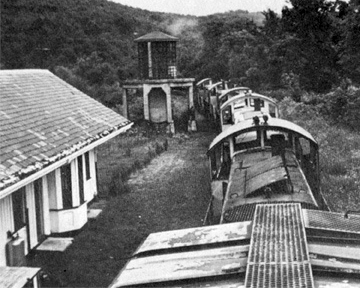
I was attending a function at the station, noted the tower bathed in striking purple floodlights, and took a few shots. (Original base image / Closeup.) It wasn’t until later that I made the connection to the Crystal Palace story.
As >>Icenrose observes, I stacked copies of the higher-resolution shot of the tower like a wedding cake and tweaked it until happy with the results. I left the original tower at the top, and you can see the strip of numbers on the side if you look closely.
As usual, the easy project done at the last minute gets more attention than the one upon which you spend most of your time and care. But such is art.
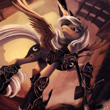
Ya know, I'm not surprised that out of my top 5 favorite art pieces, 3 of them won the round. I am surprised at how poorly the other 2 did considering they were ranked higher than the winners.
A little disappointing, but understandable.
A little disappointing, but understandable.
The Strawman and the Jacks
>>Aragon
Thanks for the review, Aragón! I’m glad you stepped up to the plate.
With the serendipity to which the world is sometimes given, I was given the task of making a Scarecrow-painted pumpkin head for a curbside Oz display, and then Baal Bunny’s pretty tale came along and made it appropriate to also execute it for the art round.
Oz is a place where you have to be careful when building things, as they tend to come to life. The Scarecrow and Jack Pumpkinhead have this in common. Slipping over to the real world, as the story does, Jack Pumpkinhead is given as one of Tim Burton’s inspirations for the character of Jack Skellington from Nightmare Before Christmas. Since I had access to pumpkins of all different colors, that’s how this came out. All are hand painted with acrylic paint. I put the most effort into the Scarecrow, as his face texture needed to match the burlap around the back of his head.
The Scarecrow is currently residing in a nearby town as part of a display, Jack P. is on my porch, and I’ve taken Jack S. to work.
I confess to being disappointed that this placed last, even though there was a lot of good art in this round. However, the Scarecrow has drawn a number of positive comments from peers and passerby, it has already made a TV appearance or two (:49 seconds in at the video above), and a pizza party is in the offing, so things have worked out well. See you next round!
>>CoffeeMinion
>>Samey90
>>Aragon
>>Hap
>>GroaningGreyAgony
First of all, sorry for the title! I made my caption, "Tea, mister?", and I think my brain was still on that train and missed the next stop. Repeatedly. :')
Thank you all for taking time to review my art! Also, yes, it is very Tim Burtonesque. I may or may not have literally typed into google, "Tim Burton" and referenced the corpse bride eye for weird lookin eye. I love his style so much and this story made me think of his kind of art. Scratchy, thin, scraggly, but beautifully executed. It also made me think of this video and other settings like Outlast 2 (Gr8 game. Loved it all the way thru. 10/10 -ign)
>>Aragon
But I digress.
Dang. I feel like you secretly despise your fic not-so-deep down inside you. You're right that the background is more or less lacking. In my defense... I have no defense. I just really fucking hate drawing furniture. So many straight lines. Geometry class gives me PTSD from all the rectangles I have to draw. Let's just say my comfort zone has hot chocolate and snuggies, and everything else is a freezing 0 degrees.
Thanks for your long-ass review, though. I really really appreciate it!! Maybe one of these days I'll step out of my comfort zone ;).
>>Samey90
>>Aragon
>>Hap
>>GroaningGreyAgony
First of all, sorry for the title! I made my caption, "Tea, mister?", and I think my brain was still on that train and missed the next stop. Repeatedly. :')
Thank you all for taking time to review my art! Also, yes, it is very Tim Burtonesque. I may or may not have literally typed into google, "Tim Burton" and referenced the corpse bride eye for weird lookin eye. I love his style so much and this story made me think of his kind of art. Scratchy, thin, scraggly, but beautifully executed. It also made me think of this video and other settings like Outlast 2 (Gr8 game. Loved it all the way thru. 10/10 -ign)
>>Aragon
But I digress.
Only problem I really see with the picture is that anything past the characters -- which again, I really dig -- is kind of bare bones; there's nothing in the room but the table and the teacup. Granted, I looked back at the story and we get literally no description of anything in there aside from the characters, and even then that is flimsy as shit, so there's not a lot to take from the source material in that regard.
Dang. I feel like you secretly despise your fic not-so-deep down inside you. You're right that the background is more or less lacking. In my defense... I have no defense. I just really fucking hate drawing furniture. So many straight lines. Geometry class gives me PTSD from all the rectangles I have to draw. Let's just say my comfort zone has hot chocolate and snuggies, and everything else is a freezing 0 degrees.
Thanks for your long-ass review, though. I really really appreciate it!! Maybe one of these days I'll step out of my comfort zone ;).
>>Anon Y Mous
I don't think a piece like this needs that much background. This art, like the story, is about the characters. The background is enough of a frame to give us claustrophobia and the crepuscular rays from the window provide the atmosphere. Anything more would have felt cluttered without an exceptional amount of detail, and it really would have taken some colors to make the characters stand out at that point.
If you really wanted a background, still, then there's a technique you could have done, to draw just the highlights of a background in white paint pen on black paper, as if all we can see of the room is the light gracing the edges of the furniture and drapes. Then you could photoshop the characters onto that background. But that seems like a lot of work for what's clearly concentrating on the characters.
I think the background is fine.
>>Anon Y Mous
You kidding? That story is the closest I can get to public masturbation -- I adore it. I was just CLEVERLY HIDING MY IDENTITY, ya see.
And yeah, I feel ya, furniture sucks -- but that's why I said that another option is to reframe the way we see the picture so there is no need for a background. The problem is that this picture both wants to have one and doesn't want to, which is why it sits in that odd middle ground, I think.
Dang. I feel like you secretly despise your fic not-so-deep down inside you.
You kidding? That story is the closest I can get to public masturbation -- I adore it. I was just CLEVERLY HIDING MY IDENTITY, ya see.
And yeah, I feel ya, furniture sucks -- but that's why I said that another option is to reframe the way we see the picture so there is no need for a background. The problem is that this picture both wants to have one and doesn't want to, which is why it sits in that odd middle ground, I think.
Sorry it took a long time to reply! Hopefully it isn't too late. Let's get into the replies before I go into a ranting rampage. I'll keep this one short (In other words, rushed).
>>Pascoite
The sloppiness probably gave it away quick. But, being sneaky isn't what I'm here for. If so, I would be on two losses, four wins so far. Improvement is primary, anonymity is secondary.
Most of my problems here is character issues and delivery issues. I should probably spend more time fleshing the characters out, names included. With your pointers, I hope to make better characters in the future.
Thank you for the comment! It helped a bunch! This piece shows exactly the weaknesses I have, since this isn't exactly my finest work.
>>Ferd Threstle
To answer your question, yes, I had a clear, elaborate vision in my head. It first was supposed to be about a popular girl dressing up as a nerd (which is a trope, spun on its head). However, since I was too busy trying to punch a trope in the face- I lost sight of what it was originally. By then, it was already too late for edit, and my sloppy writing slipped through its little mouse hole into the Writeoff. My fault- I'm not using the clock as a scape goat this time around.
>>Miller Minus
Yes, your comment is useful! Don't worry! Anything- even if it's an echo of another comment- is useful in my eyes. It helps to get another perspective.
Knowing my Characters need a little more finesse, I will study up on it. Maybe others have figured it out- do you know how to view things from your character's perspective when their attributes don't match your own? I've been stuck on that one for a long time.
>>Aragon
Thank you for your reassuring comments. It helps. When I see that notification bell light up on the Writeoff, I get excited and nervous (anxious- if that's the right word). So far, It has been an easy in the comments. I doubt that will last long though. For the time being, I'm squeezing out every last drop of it.
I agree that the conflict also took a toll. I wanted an overall conflict for the whole debate club, but at the same time, a moral that the main character learns. Neither were delivered properly. So, I need to establish the conflict(s) ahead of time before moving forward. A shaky foundation of plot topples the moral and resolution after all.
Final remarks:
Not the best strategy, on my part. Ambitious, yes, but lacking in skill. By far this was a challenging prompt, but thank you for the comments, slowly and surely I will become a better writer :twilightsmile:
>>Hap
Thanks!! That was my other reason for not putting in a background. But it wasn’t in the end because the actual wall in the background wasn’t close enough for my liking. I drew everything and then realized that I wanted everything to be closer. The walls were juuuust close enough to make it seem too airy. And I'm a lazy bastard who won't redraw ANYTHING EVER. The picture instead ended up claustrophobic like if I replaced a coffee straw for you to breathe through with aplastic paper straw.
The other thing I could have done was make the back wall go on endlessly and stop a mile back. Which would have been pretty cool but then, ya know, the picture needs more perspective from the characters than it already has.
Also, I like your idea for the white pen on black. I think I’m gonna steal that.
Thanks!! That was my other reason for not putting in a background. But it wasn’t in the end because the actual wall in the background wasn’t close enough for my liking. I drew everything and then realized that I wanted everything to be closer. The walls were juuuust close enough to make it seem too airy. And I'm a lazy bastard who won't redraw ANYTHING EVER. The picture instead ended up claustrophobic like if I replaced a coffee straw for you to breathe through with a
The other thing I could have done was make the back wall go on endlessly and stop a mile back. Which would have been pretty cool but then, ya know, the picture needs more perspective from the characters than it already has.
Also, I like your idea for the white pen on black. I think I’m gonna steal that.
>>Aragon
So clever that even I was bamboozled!!
You kidding? That story is the closest I can get to public masturbation -- I adore it. I was just CLEVERLY HIDING MY IDENTITY, ya see.
So clever that even I was bamboozled!!
>>Zaid Val'Roa
>>GroaningGreyAgony
I had a sketch for art class due and this story gave me a lot of inspiration to spite Miller. The theme was, as you may have guessed, draw with words. So I did. I drew Fern's head a liiiittle too low and said, "fuck it." because I thought I was going to redo the picture later to have him sitting straight up in the chair.
Nope. :)
I give my deepest apologies to the appalling puns made In the title and caption of this piece, and Fern's spine. RIP in peace.
>>Samey90
>>Zaid Val'Roa
>>Hap
>>GroaningGreyAgony
I'm glad you guys liked this! I had just read 100% and was really inspired, so I made this doodle on mspaint. Tip: never draw with a mouse or else your towers will turn out like this.
Also, I'm glad Samey found my little easter egg. I was afraid no one would find it!
Tara-taaaa.
So yeah this one was mine, and that was kind of obvious according to Cassius! Who also guessed me for No I'm Fine! So yeah, not that obvious, no matter what y'all say in the Writeoff Discord. Y'all more full of shit than me, AND THAT'S SAYING SOMETHING.
Anyway yeah no love this story. I was juggling two different stories for this prompt, because the whole thing about the glass mask ("It is a mask made out of glass. The point is not that it hides who you are. The point is that you are wearing it") made me think of an interpersonal drama sorta thing? But the whole idea also sounded gothic to me, and I'd been toying with writing something in that vein for a while.
So at like, 2am of the last day, I went 'aah fuck it just write both at the same time'. Bam. Seeing how I was going experimental already, I just threw everything at the story I'd been meaning to do for a while -- experiment with the narrative purposes of a chapter, as well as the aesthetic ones, this particular brand of perspective and framing device, a more extreme version of the "describe how things feel rather than how things look" thing... Just, just do everything at one. Fuck it.
Yeah this story is me firing on all cilinders and just having as much fun as possible. I genuinely like the story, though. I think it has heart! I'll keep working on it a bit and I might try to do something with it, because no kidding -- love it.
>>BlueChameleonVI >>Pascoite
Yeah, nobody liked this story. A lot of people in the Writeoff discord went 'oh god I hate this shit, it's my #1 but I don't like it'. CALL IT QUALITY.
I'm a bit surprised at how the ending wasn't clear? Pascoite got it right; Madeleine killed herself. Both because of the guilt of taking the only love Sylvia ever knew, and because that way, as the narrator says -- hey, maybe Sylvia will love her too. Fun for all the family.
That said -- the 'second person injections' were pretty much what >>Baal Bunny said. I wrote this while picturing simply a recording, and there's a voiceover of the main character now and then to gloss over the bits that take too long or are unneeded. I had a couple podcasts in mind while doing this; establishing that it's a recording a bit harder at the start would maybe make it clearer?
There are no dialogue tags per se, if you pick it up. There's never a "blahblah," Father Harrison says. There are injections, as in, the narrator interrupts dialogue to add a bit that is not seen in the recording -- mainly thoughts about who's talking or descriptions of body language.
(For the record -- I don't think "this should not be split into chapters because interviews aren't split into chapters" is totally fair? Seen a shitton of those, my man.)
Harley turning into Harvey is just me not knowing how to write -- that much is obvious I guess. Bleh.
Also like, the fucking lipstick. Which nobody got! And that's totally my fault. After posting it I picked up the main reason, I think? It was meant to be just another bit of surreal imagery. It's got no real plot significance, it's merely descriptive, to add to the air of weirdness. I mean, it has meaning, mind you, but it's all symbolic and shit?
Problem is, this is the only time the surreal imagery happens in-story, instead of being merely part of the narrator's monologue. It's diegetic symbolism, and that's why it looks so weird, while describing Sylvia's smile as wings spread against the back of a dead man is simply brushed off.
As per what it means, Father Harrison is portrayed in sensual imagery all through-out (he holds the cigarette like a lady and the smoke smells delicious! He's handsome! He's touching the main character constantly and eve hugs him!), to create a dichotomy both with himself (he's a priest, so sensuality shouldn't be associated to him) and against Sylvia, who through the whole story is explicitely described as disgusting, and the narrator almost has an episode trying to picture her fucking Gard.
So, lipstick. It implies that he's not fulfilling his vows and getting some action on the side -- and the fact that it's on his wrists evokes imagery of stigmata, and, like, holy stuff and all that. Only instead of blood, it's lipstick! I pictured it as kiss marks, but I didn't specify that, and that was another mistake -- it's clearer that way. Sensual stigmata, yes? Odd shit.
Him 'licking it' was just him kissing it back, really, only also coded to look like he's drinking blood. Blood of Christ, communion, you get me. Holy stuff and sex stuff mixed together so that they're one and the same. The fact that after he's licked it it looks like blood on his teeth is even more blatant, really.
So yeah that bit was just me not doing symbolism properly. There's nothing to "get", it's just adding to the oneiric idea of the whole story. Every character is flawed and has something going on 'n stuff. This is all very wanky, which is why I like it so much.
Also, gotta apologize to >>Pascoite here because the names mean absolutely nothing. I just went down a list of names from the Castlevania franchise to get a feel for gothic-sounding shit and then either mix-n-matched or made up shit that sounded right (Victor Monte in particular was all mine, 'cause I like how it sounds). Madeleine is only called Madeleine because I like how it's spelled 'Madeleine'. It looks like transliterated French! Hahah.
But yeah no that's you reading too much into it, mate. Names are random.
And I think that's it? That's all I've gotta say, right? Dunno if I missed anything. Uuuh.
Well dang, double-daddy, literally the only thing you know of him is that he speaks like that. I've no idea why you would look at the character-establishing narration and immediately go "this is out of character". That's some assumin' there. It's very fancy for a regular Joe, so maybe he ain't a regular Joe, unno. His personality is his narrative style, on account on him being the narrator!
Originally I had like, more narrator shit going on -- HE EVEN HAD A NAME HOW CRAZY IS THAT -- but then I went, nah, that's fucking boring. What's interesting is everything else. Narrator is just there to narrate, and then the ending is caused by him, because you can't observe something gruesome without affecting it, or being affected by it.
Yaddah yaddah. Very wanky, I tell you. I'll try to edit this and sell it maybe. Would love that, though I unno if any publisher will see "me waxing poetic about how there's a hidden knife made of pearls hidden behind the lady's eyes" and not feel an overwhelming urge to shoot me in the spot.
So yeah this one was mine, and that was kind of obvious according to Cassius! Who also guessed me for No I'm Fine! So yeah, not that obvious, no matter what y'all say in the Writeoff Discord. Y'all more full of shit than me, AND THAT'S SAYING SOMETHING.
Anyway yeah no love this story. I was juggling two different stories for this prompt, because the whole thing about the glass mask ("It is a mask made out of glass. The point is not that it hides who you are. The point is that you are wearing it") made me think of an interpersonal drama sorta thing? But the whole idea also sounded gothic to me, and I'd been toying with writing something in that vein for a while.
So at like, 2am of the last day, I went 'aah fuck it just write both at the same time'. Bam. Seeing how I was going experimental already, I just threw everything at the story I'd been meaning to do for a while -- experiment with the narrative purposes of a chapter, as well as the aesthetic ones, this particular brand of perspective and framing device, a more extreme version of the "describe how things feel rather than how things look" thing... Just, just do everything at one. Fuck it.
Yeah this story is me firing on all cilinders and just having as much fun as possible. I genuinely like the story, though. I think it has heart! I'll keep working on it a bit and I might try to do something with it, because no kidding -- love it.
>>BlueChameleonVI >>Pascoite
Yeah, nobody liked this story. A lot of people in the Writeoff discord went 'oh god I hate this shit, it's my #1 but I don't like it'. CALL IT QUALITY.
I'm a bit surprised at how the ending wasn't clear? Pascoite got it right; Madeleine killed herself. Both because of the guilt of taking the only love Sylvia ever knew, and because that way, as the narrator says -- hey, maybe Sylvia will love her too. Fun for all the family.
That said -- the 'second person injections' were pretty much what >>Baal Bunny said. I wrote this while picturing simply a recording, and there's a voiceover of the main character now and then to gloss over the bits that take too long or are unneeded. I had a couple podcasts in mind while doing this; establishing that it's a recording a bit harder at the start would maybe make it clearer?
There are no dialogue tags per se, if you pick it up. There's never a "blahblah," Father Harrison says. There are injections, as in, the narrator interrupts dialogue to add a bit that is not seen in the recording -- mainly thoughts about who's talking or descriptions of body language.
(For the record -- I don't think "this should not be split into chapters because interviews aren't split into chapters" is totally fair? Seen a shitton of those, my man.)
Harley turning into Harvey is just me not knowing how to write -- that much is obvious I guess. Bleh.
Also like, the fucking lipstick. Which nobody got! And that's totally my fault. After posting it I picked up the main reason, I think? It was meant to be just another bit of surreal imagery. It's got no real plot significance, it's merely descriptive, to add to the air of weirdness. I mean, it has meaning, mind you, but it's all symbolic and shit?
Problem is, this is the only time the surreal imagery happens in-story, instead of being merely part of the narrator's monologue. It's diegetic symbolism, and that's why it looks so weird, while describing Sylvia's smile as wings spread against the back of a dead man is simply brushed off.
As per what it means, Father Harrison is portrayed in sensual imagery all through-out (he holds the cigarette like a lady and the smoke smells delicious! He's handsome! He's touching the main character constantly and eve hugs him!), to create a dichotomy both with himself (he's a priest, so sensuality shouldn't be associated to him) and against Sylvia, who through the whole story is explicitely described as disgusting, and the narrator almost has an episode trying to picture her fucking Gard.
So, lipstick. It implies that he's not fulfilling his vows and getting some action on the side -- and the fact that it's on his wrists evokes imagery of stigmata, and, like, holy stuff and all that. Only instead of blood, it's lipstick! I pictured it as kiss marks, but I didn't specify that, and that was another mistake -- it's clearer that way. Sensual stigmata, yes? Odd shit.
Him 'licking it' was just him kissing it back, really, only also coded to look like he's drinking blood. Blood of Christ, communion, you get me. Holy stuff and sex stuff mixed together so that they're one and the same. The fact that after he's licked it it looks like blood on his teeth is even more blatant, really.
So yeah that bit was just me not doing symbolism properly. There's nothing to "get", it's just adding to the oneiric idea of the whole story. Every character is flawed and has something going on 'n stuff. This is all very wanky, which is why I like it so much.
Also, gotta apologize to >>Pascoite here because the names mean absolutely nothing. I just went down a list of names from the Castlevania franchise to get a feel for gothic-sounding shit and then either mix-n-matched or made up shit that sounded right (Victor Monte in particular was all mine, 'cause I like how it sounds). Madeleine is only called Madeleine because I like how it's spelled 'Madeleine'. It looks like transliterated French! Hahah.
But yeah no that's you reading too much into it, mate. Names are random.
And I think that's it? That's all I've gotta say, right? Dunno if I missed anything. Uuuh.
The only other issue that might cause is that you're using a first-person narrator. That means this narrator is the one choosing to describe things this way. And this is very fancy language for a regular Joe to be using. I don't know anything about him yet. I don't know if this narrative style matches his personality. It may be a poor fit for him.
Well dang, double-daddy, literally the only thing you know of him is that he speaks like that. I've no idea why you would look at the character-establishing narration and immediately go "this is out of character". That's some assumin' there. It's very fancy for a regular Joe, so maybe he ain't a regular Joe, unno. His personality is his narrative style, on account on him being the narrator!
Originally I had like, more narrator shit going on -- HE EVEN HAD A NAME HOW CRAZY IS THAT -- but then I went, nah, that's fucking boring. What's interesting is everything else. Narrator is just there to narrate, and then the ending is caused by him, because you can't observe something gruesome without affecting it, or being affected by it.
Yaddah yaddah. Very wanky, I tell you. I'll try to edit this and sell it maybe. Would love that, though I unno if any publisher will see "me waxing poetic about how there's a hidden knife made of pearls hidden behind the lady's eyes" and not feel an overwhelming urge to shoot me in the spot.
>>Aragon
I thought of this just as I was starting to leave that part of my review, so I went to check, in case I needed to head off saying it at all. You're right, it avoids dialogue tags. For the most part. Though you do have these:
I could buy a couple of those with colons that break the actual quote to a separate paragraph. The last one is a gray area, too, but an awfully strange thing for him to say to someone listening to the recording. But a couple of those are pretty blatant speech tags, and even the ones that aren't would require him to sync up incredibly well with the recording, unless he's pausing it.
Then something like this also bugs me, because wouldn't it be on the recording?
There are several spots that do this.
I didn't figure there was anything to the names, because Harrison didn't fit in any way, just leaving him with a last name. I was just having some fun there. The only one I knew offhand was Beatrice, so I went and looked the others up for the hell of it.
Well... no, I didn't assume. I explicitly said it may be a poor fit for him, but that I didn't know, and as I said later, I don't know anything about him. It's kind of a weird prospect to inhabit a perspective and yet be so uninformed about it. I know he likes to purple it up in front of an audience of one, and I can guess at what his job is, and that's it. When you commented on some of the art you got for this story, you acknowledged that there wasn't much physical description of any of the setting. Stories can get by without that, but a point I've seen several good authors make, like GaPJaxie and bookplayer, is that this is a good tool for informing the reader what the character is like. What catches his eye, what shades of word choice he uses for it (i.e., reacting positively or negatively to things that wouldn't seem to inherently be either), what assumptions he makes—all those say a lot about who he is. There's some of that going on here, with how he reacts to people, but the only way he reacts to the setting or his environment is noting the smell around Sylvia. And maybe more to the point, the reactions he does have are all completely expected ones. Of course nobody would like the smell, of course nobody would like Doctor Harley's immediate antagonism, of course everybody would be on edge around Madeleine, so none of those really do anything to characterize him. The only one that surprised me was how he had an instant affinity for Harrison, so in all those opportunities to shift my mental picture of him from "just an average Joe," only two got taken. And maybe that's not going to bother most readers, but I was hoping the character I spent all my time with would be interesting.
There are no dialogue tags per se
I thought of this just as I was starting to leave that part of my review, so I went to check, in case I needed to head off saying it at all. You're right, it avoids dialogue tags. For the most part. Though you do have these:
the Lady Sylvia asks:
“Did she not tell you?” Father Harrison replies instead.
Then he tells me:
So I ask: “For example?”
“The Lady Sylvia,” he says, “is not the first
“Do you…?” I start, then I stop, then I start again.
I could buy a couple of those with colons that break the actual quote to a separate paragraph. The last one is a gray area, too, but an awfully strange thing for him to say to someone listening to the recording. But a couple of those are pretty blatant speech tags, and even the ones that aren't would require him to sync up incredibly well with the recording, unless he's pausing it.
Then something like this also bugs me, because wouldn't it be on the recording?
He asks me if I mind if he smokes, and I say no.
There are several spots that do this.
I don't think "this should not be split into chapters because interviews aren't split into chapters" is totally fair?I don't know if this was directed at me? It's not really what I said, though I did object to the chapters, mostly if it's supposed to be a real-time narration, because it completely takes me out of the effect that's supposed to create. That is, it puts a meta story element in there that explicitly couldn't work for that conceit, except it seems that's not what you were going for. Even as someone listening to him talk through a recording later, it does interrupt the feel a bit. Yes, other authors have gotten away with that, but I don't know of one in this short a format. You wouldn't want to read a whole novel in one unbroken chapter, for instance, but in this case, you didn't have to break it into chapters, and I don't get what doing so buys you. At best, this was a neutral effect for me; it didn't enhance the story any.
I didn't figure there was anything to the names, because Harrison didn't fit in any way, just leaving him with a last name. I was just having some fun there. The only one I knew offhand was Beatrice, so I went and looked the others up for the hell of it.
Well dang, double-daddy, literally the only thing you know of him is that he speaks like that. I've no idea why you would look at the character-establishing narration and immediately go "this is out of character". That's some assumin' there.
Well... no, I didn't assume. I explicitly said it may be a poor fit for him, but that I didn't know, and as I said later, I don't know anything about him. It's kind of a weird prospect to inhabit a perspective and yet be so uninformed about it. I know he likes to purple it up in front of an audience of one, and I can guess at what his job is, and that's it. When you commented on some of the art you got for this story, you acknowledged that there wasn't much physical description of any of the setting. Stories can get by without that, but a point I've seen several good authors make, like GaPJaxie and bookplayer, is that this is a good tool for informing the reader what the character is like. What catches his eye, what shades of word choice he uses for it (i.e., reacting positively or negatively to things that wouldn't seem to inherently be either), what assumptions he makes—all those say a lot about who he is. There's some of that going on here, with how he reacts to people, but the only way he reacts to the setting or his environment is noting the smell around Sylvia. And maybe more to the point, the reactions he does have are all completely expected ones. Of course nobody would like the smell, of course nobody would like Doctor Harley's immediate antagonism, of course everybody would be on edge around Madeleine, so none of those really do anything to characterize him. The only one that surprised me was how he had an instant affinity for Harrison, so in all those opportunities to shift my mental picture of him from "just an average Joe," only two got taken. And maybe that's not going to bother most readers, but I was hoping the character I spent all my time with would be interesting.
>>Pascoite
>>Not_A_Hat
>>BlueChameleonVI
>>alarajrogers
>>Hap
If anyone:
Would like to read the final revised version of this story, it's gone up in the 5th issue of Zooscope e-zine.
Mike
>>Not_A_Hat
>>BlueChameleonVI
>>alarajrogers
>>Hap
If anyone:
Would like to read the final revised version of this story, it's gone up in the 5th issue of Zooscope e-zine.
Mike