Hey! It looks like you're new here. You might want to check out the introduction.
Show rules for this event


Tim Burton? (it seems that most of my contributions this round is comparing pics to works of other artists...)
This one is really, really cool!
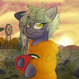
I do sense a Tim Burtonesque style to the characters, which fits the story rather well -- it's a dark halloweenesque story with like, horror elements (even if mostly it's melancholic). But what I really like here are the expressions in the characters. Madeleine over there looks like a sad delicate little figure, and I really dig how she looks either sad, or hopeful, or just awkward and lonely and human and mostly just really sad.
Which is like, hey, exactly how she is in the story, so props for that. And then Sylvia over there sitting looking like she doesn't know what 'blinking' means, and being overall creepy. The shadow is also a great detail, and also really Burtonesque. The pic has a lot of character, a lot of style, and I dig it. It feels really, really nice to look at, and creepy in that cool sorta way.
Only problem I really see with the picture is that anything past the characters -- which again, I really dig -- is kind of bare bones; there's nothing in the room but the table and the teacup. Granted, I looked back at the story and we get literally no description of anything in there aside from the characters, and even then that is flimsy as shit, so there's not a lot to take from the source material in that regard.
Still, some more detail, or at least something more artsy to avoid it looking like they're standing in a completely empty room with a random table in there (dunno, keep the background dark or something, or change the framing so we only see the characters and the shadow or whatnot) would've made this look more complete. As it stays, this looks like a great draft for a picture that isn't finished yet because it lacks a background; mind you, I understand that one can only do so much with the given amount of time, but in that case maybe reframing how you approach the picture from the start so you can do more with less would be a good idea?
Anyway: great characters, but anything that's not the characters sorta takes away from the pic. Really digging Madeleine over there, though, and I like how much we can infer from these characters just from one single picture. Great job in there, Author.

I haven’t much to add to what’s been said. An unpolished sketch, but full of character and quite disturbing. Upper tier.

>>CoffeeMinion
>>Samey90
>>Aragon
>>Hap
>>GroaningGreyAgony
First of all, sorry for the title! I made my caption, "Tea, mister?", and I think my brain was still on that train and missed the next stop. Repeatedly. :')
Thank you all for taking time to review my art! Also, yes, it is very Tim Burtonesque. I may or may not have literally typed into google, "Tim Burton" and referenced the corpse bride eye for weird lookin eye. I love his style so much and this story made me think of his kind of art. Scratchy, thin, scraggly, but beautifully executed. It also made me think of this video and other settings like Outlast 2 (Gr8 game. Loved it all the way thru. 10/10 -ign)
>>Aragon
But I digress.
Dang. I feel like you secretly despise your fic not-so-deep down inside you. You're right that the background is more or less lacking. In my defense... I have no defense. I just really fucking hate drawing furniture. So many straight lines. Geometry class gives me PTSD from all the rectangles I have to draw. Let's just say my comfort zone has hot chocolate and snuggies, and everything else is a freezing 0 degrees.
Thanks for your long-ass review, though. I really really appreciate it!! Maybe one of these days I'll step out of my comfort zone ;).
>>Samey90
>>Aragon
>>Hap
>>GroaningGreyAgony
First of all, sorry for the title! I made my caption, "Tea, mister?", and I think my brain was still on that train and missed the next stop. Repeatedly. :')
Thank you all for taking time to review my art! Also, yes, it is very Tim Burtonesque. I may or may not have literally typed into google, "Tim Burton" and referenced the corpse bride eye for weird lookin eye. I love his style so much and this story made me think of his kind of art. Scratchy, thin, scraggly, but beautifully executed. It also made me think of this video and other settings like Outlast 2 (Gr8 game. Loved it all the way thru. 10/10 -ign)
>>Aragon
But I digress.
Only problem I really see with the picture is that anything past the characters -- which again, I really dig -- is kind of bare bones; there's nothing in the room but the table and the teacup. Granted, I looked back at the story and we get literally no description of anything in there aside from the characters, and even then that is flimsy as shit, so there's not a lot to take from the source material in that regard.
Dang. I feel like you secretly despise your fic not-so-deep down inside you. You're right that the background is more or less lacking. In my defense... I have no defense. I just really fucking hate drawing furniture. So many straight lines. Geometry class gives me PTSD from all the rectangles I have to draw. Let's just say my comfort zone has hot chocolate and snuggies, and everything else is a freezing 0 degrees.
Thanks for your long-ass review, though. I really really appreciate it!! Maybe one of these days I'll step out of my comfort zone ;).

>>Anon Y Mous
I don't think a piece like this needs that much background. This art, like the story, is about the characters. The background is enough of a frame to give us claustrophobia and the crepuscular rays from the window provide the atmosphere. Anything more would have felt cluttered without an exceptional amount of detail, and it really would have taken some colors to make the characters stand out at that point.
If you really wanted a background, still, then there's a technique you could have done, to draw just the highlights of a background in white paint pen on black paper, as if all we can see of the room is the light gracing the edges of the furniture and drapes. Then you could photoshop the characters onto that background. But that seems like a lot of work for what's clearly concentrating on the characters.
I think the background is fine.
>>Anon Y Mous
You kidding? That story is the closest I can get to public masturbation -- I adore it. I was just CLEVERLY HIDING MY IDENTITY, ya see.
And yeah, I feel ya, furniture sucks -- but that's why I said that another option is to reframe the way we see the picture so there is no need for a background. The problem is that this picture both wants to have one and doesn't want to, which is why it sits in that odd middle ground, I think.
Dang. I feel like you secretly despise your fic not-so-deep down inside you.
You kidding? That story is the closest I can get to public masturbation -- I adore it. I was just CLEVERLY HIDING MY IDENTITY, ya see.
And yeah, I feel ya, furniture sucks -- but that's why I said that another option is to reframe the way we see the picture so there is no need for a background. The problem is that this picture both wants to have one and doesn't want to, which is why it sits in that odd middle ground, I think.
>>Hap
Thanks!! That was my other reason for not putting in a background. But it wasn’t in the end because the actual wall in the background wasn’t close enough for my liking. I drew everything and then realized that I wanted everything to be closer. The walls were juuuust close enough to make it seem too airy. And I'm a lazy bastard who won't redraw ANYTHING EVER. The picture instead ended up claustrophobic like if I replaced a coffee straw for you to breathe through with aplastic paper straw.
The other thing I could have done was make the back wall go on endlessly and stop a mile back. Which would have been pretty cool but then, ya know, the picture needs more perspective from the characters than it already has.
Also, I like your idea for the white pen on black. I think I’m gonna steal that.
Thanks!! That was my other reason for not putting in a background. But it wasn’t in the end because the actual wall in the background wasn’t close enough for my liking. I drew everything and then realized that I wanted everything to be closer. The walls were juuuust close enough to make it seem too airy. And I'm a lazy bastard who won't redraw ANYTHING EVER. The picture instead ended up claustrophobic like if I replaced a coffee straw for you to breathe through with a
The other thing I could have done was make the back wall go on endlessly and stop a mile back. Which would have been pretty cool but then, ya know, the picture needs more perspective from the characters than it already has.
Also, I like your idea for the white pen on black. I think I’m gonna steal that.
>>Aragon
So clever that even I was bamboozled!!
You kidding? That story is the closest I can get to public masturbation -- I adore it. I was just CLEVERLY HIDING MY IDENTITY, ya see.
So clever that even I was bamboozled!!