Hey! It looks like you're new here. You might want to check out the introduction.
Show rules for this event
More #silicon art! Miller is rolling in his grave.
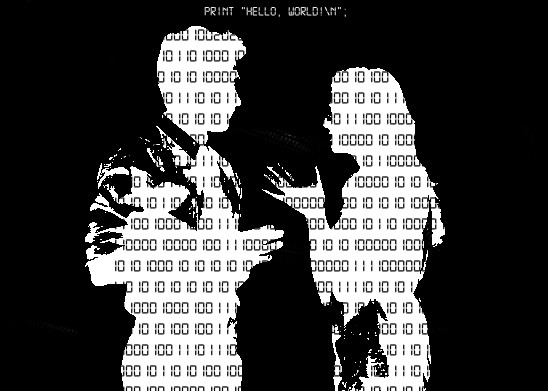
So this one is, I'm assuming, more Photoshop stuff. Picture with some effects and then overlaid over something something then add Pint Hello Word which is a famous sentence yaddah yaddah, simple stuff.
The idea, though, is what I like about this. We've seen a lot of interpretations of the story this round because #silicon has proven itself to be popular with the artists. I've been picking up which pictures give away the twist of the story (sort of) and which ones don't; this one is funny because it does both at once.
As in, there are no humans in the story! And this picture portrays humans and machines both, but it obviously mostly represents computers passing themselves as human, which is exactly what happens in the story. There are no actual humans in this picture, but one gets the feeling that there are, so like, ya get me. Clever shit. This feels like the kind of thing that you look at before reading the story (but knowing the plot, say, because you read the blurb on the cover), and go 'ah-hah'. Then you read the story, come back to this, and oh hey shit that was some nice foreshadowing.
So, cool-ass idea there!
Composition-wise: this is simple and works damn well. I don't know if I have a lot to say about it. It looks good, and there's nothing I would change if I had like, unlimited artistic skills and also Photoshop in my computer. I think it's as fine as it can ever be as-is, and I like the imagery behind it.
The 'Hello World' sentence is kind of pointless, though. I get the significance, but the picture works perfectly fine without it. That said, composition-wise, it does look better if there's text over there; I wonder if having something lifted from the story proper, or just the title of the fic, would've felt more relevant.
But overall, I really like this! It's a pretty damn good representation of what happens in the story. It also works as foreshadowing for the story itself, which is a really nice detail. So, good job.
Filling shapes with bytes to communicate the “machine in the ghost” is a tad done by now, but it works here. Simple and effective. Upper mid tier.
I like the idea behind this piece, but there was so much you could've done with it. It's a very basic proof of concept, and I think the thought of what this could've been overshadows the impact of what the actual piece accomplishes. That being said, I will admit it is effective within the confines of its simplicity. It's born from an idea and delivers on it.
Nicely done.
Nicely done.
