Hey! It looks like you're new here. You might want to check out the introduction.
Show rules for this event

I think, unfortunately, this ended up another piece that I want to like more than I actually do. It tells its story at a glance, and is great at that holistic level, but I find the actual details of the piece mostly frustrating. The fine lines of the calligraphic font combine with the smudge-black nature of the page background to render the text unreadable without serious effort; I understand that by putting the work in Latin you're going for a deliberately unreadable lorem-ipsum effect, but there's a difference between discerning the letters/not interpreting them and being unable to discern the letters in the first place.
I've kind of got the opposite color complaint about the blood as above readers. The red-to-brown of the text as it dries sat perfectly fine with me; my issue was that the left-hand page appears to be basically black. I understand that old dried blood can get very dark indeed, but that's old dried blood -- if the book was being written in real time and interrupted recently enough that the drops on the right are still arterial-fresh, I'm having a lot of trouble picturing the script on the left as having been written that long ago.
I also can't help but wish that the lorem ipsum itself had more of the flavor of some forbidden magical text. It looks sort of ... journal-y, like the author was interrupted writing a novel. I realize the caption identifies it as spellbook text, but that's not typically how spellbooks actually look in practice (at least in the era of modern book-bindings). Some sort of mystical diagram, or even just a list of instructions or bullet points, would have gone a long way for me in communicating the flavor of what led to the bloody ending.
Excellent concept, however, and a good implied story. Thank you for sharing.
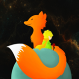
Sorry, artist; this one isn't wowing me like it did many of your commenters. Compositionally I am most puzzled by the starfield completely surrounding the central ... pillar? cave? thing?; the nature of the two figures' exploration is already somewhat muddy to me, and that stands further in the way of any sensible interpretation that doesn't involve The Little Prince-style people-sized planets hanging in the void. And while compositionally the occasional highlights on the winding road to the top do add some welcome relief from the darkness, they complicate the narrative further -- making it more or less impossible for this to be a cave, and raising the question of why the entire road isn't gently highlighted if this is some sort of mountain or whatnot being illuminated from above.
So, good vision, but frustrating me in the details. Regardless, thank you for sharing.
So, good vision, but frustrating me in the details. Regardless, thank you for sharing.

>>horizon
While swapping the first and second panels might be a clearer progression...
For the world to be mad, rather than merely decaying, there would also have to be a world which is sustainably alive. The transition from one symmetrical, harmonious form to another contrasts with the decay that follows.
The third panel is the first introduction of formlessness. It doesn't immediately look like a decay, with very little of the world lacking colour. The asymmetry is a little interesting, especially since all we've known till now is symmetry. The independent shapes are bold. Maybe this was an experiment in... abstract art!
Suddenly, however, the world is very rigid. Every shape from this point remains until the end, rotting. For new shapes to spring up, they have to carve their place out of the world, rather than being one with it. Each new shape robs the old of their colour.
There's historical evidence that a better way is possible, but the decay marches on. Hence, madness.
So clearly this is abstract art about how abstract art is eroding the world of its beauty.

>>horizon >>RogerDodger I am very much in line with RogerDodger's interpretation except for the last line, and I have little else to say.
>>Dubs_Rewatcher
Kek, I'm pretty sure he's in the clear.
else you might have a lawsuit coming your way, artist.
Kek, I'm pretty sure he's in the clear.

Not going to make it this time; I had an idea, but I also had a headache, and the idea was an expensive one to pull off, so I didn't have nearly enough energy. Good luck to remaining authors.

The story train has arrived at the station as a horrible flaming wreck, but it is on time.

Ha HA! It's in! And just in time too!
And I resisted the urge to try to write 2000 words around a horrible, horrible pun that would have gotten me booed out of the Write Off! So go me! ;>
And I resisted the urge to try to write 2000 words around a horrible, horrible pun that would have gotten me booed out of the Write Off! So go me! ;>
Ugh, wildly hammering this one into submittable shape and getting it posted (in the 5-minute grace period, at the tail end of a 22-hour day...) was like pulling teeth. I hope I like it better when I reread it than I did when I clicked "Submit". :|
Edit: It's oddly reassuring to see the regrets of the other last-minute posters.
Edit: It's oddly reassuring to see the regrets of the other last-minute posters.

Ahahahahahahaha! Meta! Amazingly meta! I can't even comprehend the amazingness of this! Top tier!

That was funny as hell. A good balance between weirdness and consistency.
We have somehow a complete arc with Moira overcoming her arachnophobia but also an opening for further expand. And that would be my main complaint: it's too short, I wanna see Moira and Zoe living big adventures together and becoming BFF. :pinkiecrying:
The other nitpick would be when Moira gets home and notices the web, until she removes it. That part felt a bit long, your pace slowed here. I was a bit impatient that you come to the inevitable and expected meeting between Zoe and Moira.
But aside from that, great comedy, very good job.
I laughed way too hard for my own good.
We have somehow a complete arc with Moira overcoming her arachnophobia but also an opening for further expand. And that would be my main complaint: it's too short, I wanna see Moira and Zoe living big adventures together and becoming BFF. :pinkiecrying:
The other nitpick would be when Moira gets home and notices the web, until she removes it. That part felt a bit long, your pace slowed here. I was a bit impatient that you come to the inevitable and expected meeting between Zoe and Moira.
But aside from that, great comedy, very good job.
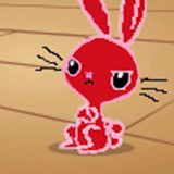
"And if you start making jokes about spiders surfing the web, I swear I'll bite you."
I laughed way too hard for my own good.

There's a little bit of inconsistency I noticed with the character's origins:
So, she's not from Viscera originally... except
and other lines imply she is. And then, the history of Viscera is sorta presented with the sort of familiarity it would if she was there for it, I felt? These threw me off a bit as I was reading. I'm also having a hard time figuring out what her age is supposed to be, since at the very beginning she sounds young, but for the rest of it she sounds more like she's a teen, but Ego I assume is an adult if he has a medical license? Might just be me.
This is a really neat little ecosystem you've got here; I just wish we got to see more of it.
Back in ‘47, when we first came to Viscera, there was my dad, my momma, and then there was little me tagging along with them.
So, she's not from Viscera originally... except
...‘cause sometimes I think the people born in Viscera are really the sane ones. I mean, the only two people I know who weren’t are...
and other lines imply she is. And then, the history of Viscera is sorta presented with the sort of familiarity it would if she was there for it, I felt? These threw me off a bit as I was reading. I'm also having a hard time figuring out what her age is supposed to be, since at the very beginning she sounds young, but for the rest of it she sounds more like she's a teen, but Ego I assume is an adult if he has a medical license? Might just be me.
This is a really neat little ecosystem you've got here; I just wish we got to see more of it.

So, first story of the round for me, and it's off to a great start, because this is excellent! The writing and narration is exceedingly competent, very controlled and engaging. That's the thing I really like about this.
The setting for the story is interesting, very subtle and fairy-tale-like, with the mentions of Fae and Bearfolk and all sorts. I think what I like the most is that, like the writing itself, the author manages to give across the tone and some intriguing pieces of information that give the world a sense of scale in a very controlled manner. I really like the YA fiction kind of tone for the setting, and it ties into the art piece very well. Also, the texture of the imagery of the bone stairs and the skull – really neat.
Honestly, the story is so simple and straightforward in what it sets out to accomplish that I can't really think of anything I can point to that I really dislike about it. Although, actually, I kind of dislike Akistere, mostly because he blathers a lot about what's going on and what happened in the past, and then the whole conflict is resolved super quickly and easily. I would have really loved this story if the plot had been developed into something more intricate – maybe Akistere is only barely capable of talking when they find him, as it was established that ghosts don't say much because it's difficult for them, and the main characters work out what happened to him mostly by themselves, through the skeleton they're exploring and some more worldbuild-y moments?
Or, alternatively, the story could be more dark and intense, in a kinda fitting fairy-tale way, if the author had taken the implication that Akistere was trying to Stranger Danger the kids and made him into a straight-up antagonist, and the environment itself would maybe take on an even more sinister vibe. I think there's potential in a longer story with that kind of premise. It would certainly lead to a more... deserved conclusion? A more satisfactory one.
As a small, nitpicky note, I'm really not a fan of the first line? It doesn't hook me like it should, it feels very weak.
Overall, though, I really liked what the author managed to do with this story in such a neat, concise manner through some very professional writing, but I do think that as a story it doesn't have a super solid, engaging conflict that interests me. I think there was potential for something much more engaging, and as it stands I don't think there was anything that really changed for the characters from the beginning to the end, and that's not a good thing for something that's intended to be a functional short story and not just a vignette.
This starts off feeling like the setup for some absurd dark comedy, and then abruptly changes into something else right before the punchline, and I don't think it works. Some of the dialogue is janky, too. I'm sorry, author, but this one isn't for me.
Ooh, xenofiction!
Okay, from the start you're communicating the nature of the world pretty well, but everything's on the verge of becoming an unwelcome lecture. I'm about a third of way through, and it feels as though almost nothing has happened.
Wings and tentacles and multiple pairs of eyes give a good sense of alien (though they also remind me a bit too much of cthulu).
You might want to tone up your clarity. I spent most of the story imagining the Short Down as some sort of floating fabric thing. Considering how important it is, we're not told much beyond that it's valuable. This is cleared up in the end as a sort of revelation, but there's a fine line between being coy and unnecessarily obscure.
Speaking of the end, the obsidian reveal feels like it's trying to carry more weight than it does. And for that matter, it's a cheat to just call it obsidian when everything else is alien calques and made-up names.
Honestly, I'm struggling to find anything else to comment on. My biggest problem with this story is that there's so little there. Okay, so it's only two thousand words, but still. The plot is that a character goes and gets a thing. The characterisation is that he's the sort of person (or Charfl) who would go and get a thing. The reveal isn't. There are no interactions between characters at all. And the world, though interesting, is presented so fleetingly that I leave feeling unsatisfied.
I'm surprised that this didn't also reference that 'she had the longest legs' picture.
The grammar and mechanics were mostly clean, and I liked the importance of scent as a descriptor. There was a section where the dialog attribution broke down for me, though, and I wasn't sure who was talking.
The art analysis was a strong point - you clearly have a keen eye for detail, and you noticed some things and raised questions that I hadn't considered. I don't know how satisfying the answers were, though, even if that seems somewhat intentional. Still I could buy the pro art-critic thing, which is a good sign.
There were some details that hung me up, like, isn't there usually a call button in the elevator for times like that? I kept expecting them to use it, or at least give it some sort of offhand nod.
Given the fellow's familiarity with the painting, I half-expected him to reveal himself as the painter.
The characters seemed solid. The ending had a melancholy sense of leaving things hanging, but intentionally so. At least for me it seemed like it hit the note it was aiming for.
For some reason, the first scene had me thinking that this was a politician ceremonially offing themselves. Perhaps because of the way they ordered people around.
The first few transitions were jarring, in that they were unmarked and the descriptions of him struggling and drowning bred concern he was doing it in the main story, too.
Once I got oriented with the flashbacks, they worked effectively - the two threads braiding together in a way that built to a strong finish.
A fantastic portrayal of something utterly alien. Getting through the beginning was rough, as to be expected, but as the fic went on it got easier and easier to understand what was happening. Great job.
It's funny, just yesterday I was musing in the car about what it might be like for a creature that spent its whole life cycle in the air, and how it might evolve. I was imagining more of a flyer than a floater, though.
Enough about strange coincidences, though.
Seconding S&S on xenofiction.
There was a lot of information conveyed quickly, but for the most part, it was done anecdotally enough that I didn't find it particularly distracting.
The meat of the action was simple, but did what it came for.
Agreed that I wasn't entirely sure what short down was, and my perception was colored by 'Artificial.' While appropriate to their worldview, it did make me suspect that it might be some technological alien(human) artifact.
Overall, the plot could have been more engrossing, but the perspective and world were refreshing.
Wow, I really like this story! It's bursting at the seams with character and comedic charm. The writing is spotless, incredibly precise and allows Moira and Casey to really shine with their personalities. It's really great.
The spider was very amusing (the thing about spiders surfing the web put a big ol' smile on my face) but I actually feel kinda sad that the weirdness of a glass spider made in a lab kinda started and ended at, "it can talk". I think I would have liked this story a lot more if the glass spider was more... alien? Spider-like? Like, a peek into the mindset of a spider made out of glass that can tap into the internet and stuff, that would be really cool. As it stands, it's just kind of a weird and funny thing, which I guess is fine. It functions well within the story. But I can't help but feel like this story was mostly a clever title with enough content to justify the title being there – the story has a glass spider who talks about something metaphysical, so the title "works", I suppose. And it definitely fits the prompt picture well, for what that's worth.
I guess that's the thing really – I hate saying this because I hear it all the time about my own work and it never feels that constructive – I really feel like this story needed more meat on its bones to make it memorable. As it is, I'd say it's super solid, and very charming, but it never really made the jump to being a truly great piece.
Um.
Wow.
This...
First of all, this is metal AF. The metalness of the title is what hooked me, and the rest delivers. It starts out with creepy psycho killers and then it only gets worse as we learn more about them. The juxtaposition of the guy's jaunty inner narration and what's going on could easily be off-putting, but it isn't. Mind you, it's unsettling as hell, but that's rather the point. Our narrator is far beyond Worst Pony status and in the end the story is much stronger for it. I love how what they're doing doesn't quite make sense at first but then it slowly builds until becoming clear.
I don't know how broad the appeal here will be considering the religious... everything about this. But that aspect of it wins major reader appeal points from me. 10/10, best portrayal of demony-things in a vaguely Judeo-Christian context that I've had the uncomfortable pleasure of reading.
This is a very interesting piece. The first thing that struck me about it, sadly, is that the construction of the prose leaves something to be desired, with several awkward phrasings and cluttered paragraphs here and there. But what I do really like is how the author layered on so many evocative sensory details – especially the line about the smell and the "Eau d'Elevator." It was kind of perfect.
As a story, I felt like this was a solid standalone vignette – the dialogue between the characters feels quite natural and interesting. The emotions at play come across well, and there's a lot of personality here – the way the protagonist describes the art, in particular, was very interesting to me, and did a good job at portraying how the protagonist thinks.
All in all, I don't think this piece was anything special, but it showed a lot of character and the prose was certainly very readable past the slightly cluttered introductory paragraphs. I really liked the ending lines too.
So yeah, I think this succeeded very well in what it was trying to do, but in the end I don't think it's much more than just a solid character piece, and personally I think more highly of more adventurous stories.
To be honest, I've got issues with this story. I like everything that surrounds the art discussion -- the description of the girl, the snippets of the narrator's previous life, the character and tone of the prose...
But the argument itself is what kills the story for me. Because, I mean -- this is an entire story written just to explain how bad the picture is. I looked it up, and apparently you can't submit stories based on your own pictures, so we're not seeing a case of the artist being cheeky.
Kind of a rude move, I think? I mean, really, this reads as just an art critique (a negative one, too) wrapped up in a story to give it flavor. The narrator explains why the picture is bad and then the professional art critic goes "You know what? You are so right, you get art so well, that I'm not even going to bother arguing with you'.
Thing is, in a vacuum this is a good story. If it hadn't been based on an actual, real picture that exists, I would have liked it a lot, I think, although I would have said that the art review is the weakest part of it. It just sounds kind of hollow, devoid of meaning. It doesn't really seem like a conversation between people who know about abstract art; it kind of reads as just somebody being annoyed at the aesthetics.
Also, it's totally ripping off Fenton's comment on the pic proper:
That's a side-by-side comparison: story first, Fenton's comment second.
I really don't like leaving comments like this. I'm sure that the author just had an idea they liked and wrote about it using art critique as a medium to establish a relationship between the two characters. In that it works, and I like the prose and all that, as I said, Solid writing, good characters.
But the entire meat of the story is kind of misguided, and I can see it as offensive. I sorta feel sorry for whoever drew that picture, y'know? If you had also shown the characters defending the picture so this is more of a debate, it could have been seen as just a reflection of the arguments that surrounded the work itself here in the Writeoff, and then I guess the message would've beem more "Abstract art depends on the viewer" or something less... unintentionally insulting?
But as it is, to me it reads as 'This picture is garbage, and here's why'. Again: I like to think that wasn't the author's intent at all, and maybe I'm being overly sensitive, and I feel bad about being this blunt, but yeeeeah.
But the argument itself is what kills the story for me. Because, I mean -- this is an entire story written just to explain how bad the picture is. I looked it up, and apparently you can't submit stories based on your own pictures, so we're not seeing a case of the artist being cheeky.
Kind of a rude move, I think? I mean, really, this reads as just an art critique (a negative one, too) wrapped up in a story to give it flavor. The narrator explains why the picture is bad and then the professional art critic goes "You know what? You are so right, you get art so well, that I'm not even going to bother arguing with you'.
Thing is, in a vacuum this is a good story. If it hadn't been based on an actual, real picture that exists, I would have liked it a lot, I think, although I would have said that the art review is the weakest part of it. It just sounds kind of hollow, devoid of meaning. It doesn't really seem like a conversation between people who know about abstract art; it kind of reads as just somebody being annoyed at the aesthetics.
Also, it's totally ripping off Fenton's comment on the pic proper:
"[...]It seems like the artist aimed for a deconstruction of something, but I don’t know. I guess it leaves too many questions that don’t fall into any interpretation.”
“Questions?”
“I don’t know, like, why do the curved lines disappear in the second part and then reappear in the next panels? Or like, uh, why did they add a darker blue on the second panel and a darker grey on the fifth? It seems really random, like maybe it would seem more cohesive if they went with the same colors throughout the whole thing.”
So this is a very abstract piece. It seems that you aimed for a deconstruction of something, which I still need to figure out, but I guess it is also what you aimed for by not giving much of a context aside from the title and the subtext.
However, there are questions left open, questions that doesn't fall into any interpretation.
Why curved lines disappear in the second part to reappear in the next panels?
Why did you add a darker blue on the second panel and a darker grey on the fifth? IMO, you should have gone with the same colors throughout all your entry
That's a side-by-side comparison: story first, Fenton's comment second.
I really don't like leaving comments like this. I'm sure that the author just had an idea they liked and wrote about it using art critique as a medium to establish a relationship between the two characters. In that it works, and I like the prose and all that, as I said, Solid writing, good characters.
But the entire meat of the story is kind of misguided, and I can see it as offensive. I sorta feel sorry for whoever drew that picture, y'know? If you had also shown the characters defending the picture so this is more of a debate, it could have been seen as just a reflection of the arguments that surrounded the work itself here in the Writeoff, and then I guess the message would've beem more "Abstract art depends on the viewer" or something less... unintentionally insulting?
But as it is, to me it reads as 'This picture is garbage, and here's why'. Again: I like to think that wasn't the author's intent at all, and maybe I'm being overly sensitive, and I feel bad about being this blunt, but yeeeeah.

I wanted to like this more than I did. the mad captain and his plan to go directly o'er the edge (do not pass go, do not collect $200) is pretty interesting. but it's revealed far too late to be an effective hook.
the opening paragraph tells me that this is about a young map-maker and a sea captain, and they meet. but it needs more! is this a comedy or a tragedy? are we heading into a thrilling adventure like in Treasure Island, or a cycle of despair and madness like in Moby Dick? both of these nautical stories establish their tone immediately, but here I had no idea what was promised to me as a reader. it wasn't until the story was wrapping up did I figure out the tone, and then it's too late for me to feel any tension.
I did like the captain well enough, but he's like the only character I remember. all the ship's crew acted about the same. I have no idea what made them change their minds at the climax. I couldn't say much about the narrator except that he's a scholar. that's just a job, not a personality. it feels like this should be his story, since he gets barged in like Bilbo Baggins and invited to go on a crazy quest. it sounds ludicrous at first, but he changes his mind.... for some reason. in the end it all turns out to be the captain's story, and Atticus just an observer. I guess the experience changed him at the end, I'm not sure how, but to be honest I didn't care much about him. I would've much rather jumped in after the captain and see what happens to HIM.
by any chance, inspired by the Slylandro? probably a coincidence.
for all the descriptions of tentacles and air sacs, somehow this creature didn't feel inhuman enough, at least in its thinking. I think I prefer aliens that are a bit more exotic, with a unique outlook shaped by their strange environments. This one just felt like a human with a different outward appearance.
The plot is pretty basic, since so much text is spent on explaining the setting, but to me it feels like worldbuilding for the sake of worldbuilding. Repeatedly telling me that this area is dangerous and awesome, but I'm not feeling it in my bones. Nothing hints at a relationship between the character and the danger zone. If this were a human-fic, it might as well be a generic haunted house or something.
The treasure recovered at the end was a bit of a letdown, I was expecting something with a greater revelation. To be fair, I think the obsidian can work just fine, if there was some foreshadowing for this earlier on. For example, showing that these creatures have an urgent need for this material, or perhaps establish that solid matter is so rare that even a few chunks of rock can be priceless. For a while I thought he was just doing it for thrillseeking, or bragging rights.
I do appreciate that this story was trying something a little different from the usual.
Well, that was both epic and anticlimatic. Let's see why.
You have a strong setup, with characters who felt deeper than what we only have here. We understand that they have some backstories together, which you didn't bother to fully explain but instead hinting at it here and there, and that is great.
The fight scenes were pretty neat and epic, with enough build-up to have good tension.
The interaction between the characters were good too.
The writing is simple but I think it greatly fits the kind of story you wanted to tell.
As a little nitpick, I would suggest to avoid relying on stereotypes and clichés from not so popular materials and explain them a bit more. I got some of them but some others passed over my head.
My main problem is with what the story actually tells with such a setup. I got the impression to read an anime episode (good job on that part if it was one of your goal) but not the kind of epic episodes with a lot of drama. It felt more like a filler episode where the heroes live a plain adventure without much to get from. I mean, Anthony is a freelance working for SPOOK and this mission didn't seem very big, just the kind of casual missions he probably does regularly.
Anthony doesn't seem to have learned or understood something. He did his job, succeeded, end of story.
Now I can enjoy filler episodes when they're good, and this one was good, but I can enjoy them because they belong to a whole. Filler episodes are opportunities to add more characterisation and details on your story. Unfortunately, this story doesn't belong to a whole saga, it has to stand on its own and some of foundations are a bit weak.
I still enjoyed the story and I will probably rank it as a high mid-tier. Thank you for sharing.
Ohey, I'm the first one to comment on this one!
So, I think the title is exceedingly appropriate – this really is just an ordinary day in someone's life, straight up. And... It's really quite engaging, and kinda sad, but kinda hopeful at the same time. And oh my god, I have these sorts of weird inner recursive monologues inside my brain all the time. That's the real power of this piece, I feel that it's very relatable, not just to me, but maybe to a lot of people, and I think that's a remarkable thing, even if the core premise is very simple.
The writing is suitably scattered but in a neat, concise way, with recurring loops of thought poking in and out as appropriate. There's a couple of points where I think that the narration uses a few too many complex sentences or words that don't really fit with the picture we're being painted, at least in my opinion, but that's only really a small nitpick.
I honestly don't have much to say about this one. A simple story told well. I rather like it.
Also, was this written by a fellow Brit? 'Cause holy hell, it's pretty damn impressive if it wasn't.
It's been a while:
Since I last took part in a Writeoff, so I don't remember if there's some protocol when it comes to discussing basic English language issues. But this story has lots and lots of them. Some are really interesting--I could see the phrase "the worse of the pain vanished, leaving only the worst of it" working in a Romance language, for instance, but comparatives and superlatives don't function that way in English.
As for the story itself, I'm not quite sure what happens. There seems to be some of the old "Think Like a Dinosaur" teleportation going on, but then I don't see how we get from there to the Mobius strip part of the thing. And with the story's setting being so undefined, I was left just scratching my head at the end. Sorry, author...
Mike
Hmm. I didn't really like this story.
The narration and the dialogue is functional, with little-to-no mechanical errors, but the style is so... bland, and quite tell-y in a few places. None of the characters have any real personality, and the premise itself, while simple, is also just straight up not-interesting to me. It just feels like a series of events that have happened, with no sense of urgency or conflict or intrigue.
Really not a fan of this story at all.
WOW. Okay. So, this story is really, really interesting to me.
I kinda went back and forth on what I thought of the writing style – in some ways it makes it difficult to read, but overall I can't help but feel it gives the piece sooo much authenticity. The terminology and the descriptions of the rituals and the gods and the tower and the cloud-mountain – it drew me into the world magnificently.
I'm actually having a lot of trouble with organising what I think about this story, and it's very late, so I think I'll come back to it tomorrow and see if I can provide some more helpful feedback. I reckon this story might be among the more controversial of the entries, just because I'm not sure how people will take the style. It's quite jarring to begin with, but as it settles into a rhythm it gets a lot smoother. The fact that it inherently provides a bit of an obstacle in the reading of it might just mean it might just be better off with a more traditional style.
Not sure. Definitely one of my personal favourites of the stories, I think, though, if only just for the thought that went into this. Like, holy hell.
I always look for:
Three things when I start reading a story: a Person in a Place with a Problem. The people here are terrific in every sense of the word, author--you've got the whole characterization thing down really well. The Problem takes a little long to arrive, but it's an interesting enough spin on the idea Neil Gaiman made a big splash with in American Gods to get a thumbs up from me.
The Place, though, needs some work. What does the landscape look like around the Pit? Desert? Rocky hills? Overcast sky? And what happens when they get out of the van? He says they're in the middle of nowhere, and then three paragraphs later, they're walking through the streets of a city. More than that, though, I find myself wondering a lot about the rules this world operates under. How do they choose the people they throw down the Pit? Do our characters face any opposition from the forces of Heaven? How is the whole metaphysical balance on display here measured? Stuff like that. You've got a discursive enough narrator that you could have him address this in little throw-away lines here and there...
Pretty darn good, though.
Mike
So, I'm of two minds on this one.
Prose and style is excellent, as is atmosphere. This actually nicely puts me in mind of something classic pulp fantasy shorts, ala Fritz Leiber or the like. Which, at some level, makes me a bit jealous as, for all that no one will ever be able to see it, he is actually one of my inspirations.
The actual reading is a bit of a slog though, largely because of name and terminology density makes it really, really hard to track things. I'm not great at names at the best of times, so add in names in an unfamiliar language and a LOT of them (I realize more of them don't really recur, but the reader doesn't know that and thus tries to retain information... which is seriously hard when you namedrop like, 7 people in the first 4 paragraphs.) And this issue is FURTHER compounded by additional tough terminology.
I also end up really confused about the group's makeup, which is awkward when sex and sexuality apparently play part in it.
So really, I disagree a bit with >>Pearple_Prose in that I don't think it is the style that is the problem, but rather the choice of what information to share within that style.
>>Haze Is the idea revealed far too late? I mean it comes up in the first scene.
Which is actually a bit of my problem with this story. It really amounts to "people get cold feet about really stupid sounding idea at the climax." Like the plan from moment one has been to sail off the edge. I'm really not sure why so many people have second thoughts so late into the process.
Anyhow, prose is a bit rough in this one, which I think is one of the bigger demerits. Lotta places where, even accounting for narrator voice, I think swapping word order around and the like would've been better.
Given that the fellow's a shopkeeper I was a little surprised that he wasn't more reluctant to step away from his livelihood, at least initially. The actual means of convincing him were logical enough.
I'm less sold on the attitude of the crew. They're entirely too gung-ho about sailing off the edge of the world. I can see maybe some of them, but the whole crew? It would help if there was some nod to it being volunteers and/or a skeleton crew.
The journey was straightforward enough, but still entertaining.
The edge of the world scene is where we finally start seeing human nature reassert itself, and to some degree it's a little surprising it took so long. Maybe it might help to show hints of them not taking it seriously until then? It also might not hurt to share some anecdotes about just why this captain is apparently so beloved.
The captain's actions in sailing off the edge are nicely in character with what's been built up before.
Okay, an immediate issue: “ … the nearest platform, a green-toned stone held in place by a thin membrane of dull gray attached to countless other similar platforms.” First, “green-toned stone” doesn't scan well. Second, I have no idea how to picture this. The best I can come up with is a sort of bouncy castle/drumskin landscape with bits of stone embedded in it. Clearly this isn't the case, since the narrator falls again, so I have no idea what the scene actually looks like.
“Where I didn't seem to have real consistency to its gravity. Up, down, left right—none seemed to hold any real meaning, each constantly shifting at a moment’s whim as if under the control of some hyperactive toddler with a television remote control.”
Cute metaphor, but I'd rather see this actually happening rather than just have it recounted to me.
Also, why is the narrator trying to move if most (or even some) of their bones are broken? I'd accept this if it were a neat way demonstrate some special healing power, but as it is, it just reads like they're stupid.
“Despite being face up towards what would have been considered ‘down’, I was instead facing up into the ‘sky’, or its closest approximation in the insane realm.” Again, a confusing sentence. And not in the fun unheimlichy scifi way. It's just obscure. It doubles back on itself too many time. If you want to communicate uncertainty, it's better to be clear about it. For example, you might say: “Facing up towards what, fifteen minutes earlier, had been the down, I …” And later, when looking around. “In every direction, a void. Upwards …”
We get a paragraph about sound. It's interestingly creepy, but I can't help but think it should come before the visual description, since it would be evident first. Perhaps that just nitpicking, though.
Later we get a discursive bit about teleportation. Here, there's the opposite problem. Your audience are all but guaranteed to know what teleportation is. You don't need to spend time telling us stuff like, “The final answer to the age long question of how to transport materials.” It's fluff, and you'd do better to cut it out. It would be far more effective to just show us the narrator's negative reaction to having to teleport.
The teleportation isn't working. I presume it's meant to be horrifying, but violence in it quickly becomes silly. Do people in the future have bones made of twigs or something? And when a dismembered arm goes flying by, that's more Happy Tree Friends than Alien.
“Something instinctual told me that it was far too unfathomable for my mind to comprehend.” Yes, that is what unfathomable means. Redundant.
And to the end.
The final twist is servicable, if not that original. But it's obvious from a mile off – or more specifically he moment where you invoke the Möbius strip. It also goes on for too long. Yo'd do better just ending on the first paragraph.
Your beginning scene is very odd. And the fact that it's not clearly described makes things even more bewildering. The big problem here is that it reather steals the thunder of the teleportation scene. You might do better to make it something more banal.
Clearly you want the experience to be an unpleasant one. Hence the horror. But there are better ways to do that than LSD imagery and bones snapping every time someone looks at them. (Oh, a crib from Lovecraft's weaker horrors that never goes anywhere.) The bit with the other selves sort of works (though it's never explained why this happens), but it's let down by cartoon violence.
More generally, all this means you're not managing your tension well. We start with mad stuff happening, progress to mad stuff happening, and end with mad stuff happening. With horror, surreal or otherwise, you want to build tension, start off with something superficially normal, then slowly dial it up as you progress.
>>Haze has raised many good points. I agree with most of them so I won't repeat them. I ended up feeling the same, I want to like this story and, in a way, I did.
Each flaw aren't big when you take them individualy but when you add them to one another, I can see how this fic fails just short to get me into a great and epic adventure to the edge of the world.
Now, I still want to say that all these small flaws are things that are missing in the fic, not things that are actually in it. What it means to me is that, as it is, this story is still good and solid. It's just that the story doesn't shine enough.
This is the only address to the reader and it threw me off a bit. Is it something that slip your edit pass? Or is it something my poor French mind can not grasp?
I'll finally add that I liked how you fully included the image in the story without breaking your narration.
Each flaw aren't big when you take them individualy but when you add them to one another, I can see how this fic fails just short to get me into a great and epic adventure to the edge of the world.
Now, I still want to say that all these small flaws are things that are missing in the fic, not things that are actually in it. What it means to me is that, as it is, this story is still good and solid. It's just that the story doesn't shine enough.
the man was as good as they said, unnaturally so, but if he was cheating I couldn't tell you how.
This is the only address to the reader and it threw me off a bit. Is it something that slip your edit pass? Or is it something my poor French mind can not grasp?
I'll finally add that I liked how you fully included the image in the story without breaking your narration.
This is an odd beginning. The intro seems to hint the narrator is an alien, but the family scene after that feels not just human, but 21st century western culture human.
So, what, this ship has absolutely no redundancy on systems that that are essential to the crew's survival? And no way of fixing these systems if they are damaged?
Escape pods, fresh from Star Trek's cutting room floor! Evidently the ship is provided with these even though they are almost entirely useless (since the characters know they'll die in the pods before a rescue mission arrives).
An Earthlike planet. I wonder if it's Earth?
And the narrator hasn't received training on how to pilot the pod properly. Who is behind these missions? Evidently they're the sort who's look at Star Trek's exploding consoles and decide they're far top staid and sensible.
Earth confirmed.
… And we're at the end.
Again, I'm running into the problem that there's nothing really here. The setting is generic space opera. The plot is alien falling to Earth. The character has the same emotional affect whether she's talking to her family, in a life-or-death situation, or concussed and severely injured. There's little I can comment on, because there's little here.
Interesting set up. You could have drawn upon Phileas, the Phocaean sailor (born in Marseille) who went north to discover the purported island of Thule and, arguably, discovered ice floes (“curdled sea”).
Character names: names sound Greek, “but not enough to be true”.
Waldorf – the village in the woods – (note al > oo in English) is anachronistic. Besides, Greek has no /w/ sound. That /w/ existed in Ancient Greek (Homeric) and is noted with a F (di-gamma) but then became the voiceless rough breathing or disappeared in classical Old Greek. Compare :
• Greek /ἡσπερη/ - Latin /vesper/ - English /west/ : evening
• Greek /ὁινος/ (e.g.: oenology) - Latin /vinum/ : wine
• Greek /αλοπεξ/ (e.g.: alopecia) - Latin /vulpes/ : fox
• Greek /ἑργω/ (e.g.: ergonomics) - English /work/
Same thing happen with initial s- (also in Celtic languages) before vowel. Compare :
• Greek /ἁλος/, Breton /hal/, Latin /salum/ : salt
• Greek /ἡλιος/, Breton /heol/, Latin /sol/ : sun
• Greek /ὁλος/, Latin /solum/ : whole
• Greek /ἡμι/, Latin /semi/ : half
So, definitely no /waldorf/ for Greek people. :)
Note: gs = ξ in Greek. So schturm-pergs σχτουρμ περξ
φ in Old Greek is not pronounced /f/ but /p/+/h/ (later coalescing into /f/).
Nail should probably be Nialr, but not sure here. -r is Old German nominative anyway, but the two final consonants might coalesce.
Okay. Let’s put aside linguistics. This is a nice story, riding on the line between true Old Greek traditions and imagination. It’s interesting, but it’s told in a rather telly way (diary form, no dialogue) and sometimes I found it dragged a bit. The end drives full tilt into fantasy, and, well, that contrasts with the beginning, and I’m not sure it’s a good thing; I fought to adjust, but hopefully the story ends right after, so no need for dragons or valkyries.
The prose that accompanies the discovery of the airy mountains also sounds much more catholic than Greek.
Also, there’s something that poisons me here: we never get to know why the expedition arrives here and what its goal is.
Finally, the story ends a bit abruptly. We don’t know what fate is reserved to the Greek party.
But I acknowledge the prose and the effort behind it. It’s a nice attempt to recreate what the first contacts between Greeks and German could’ve been, but at the same time I can’t help but see in it a reference to Poe’s Narrative of Arthur Gordon Pym of Nantucket.
This is an excellent opening. It manages the flow of information perfectly. It doesn't lecture; It just gives us the concrete details, the immediate events – but lays them out so as to explain with clarity and economy exactly what's going on.
And by the time we're into the flashbacks, I'm even more impressed. This liquid style, slipping from one moment to the next without structural cues. It's a gamble, but it pays off. It entwines perfectly with events of the story so far. And best of all, it seems like part of the same credo as the intro: There's no hand-holding here. No extraneous information to thump the reader with. But the unobtrusive clarity of the narration makes it perfectly obvious what's going on.
And, of course, their content works too. We see a continual progression here, illuminating more of what's going and demonstrating why it's important.
That said, I'm a little uncertain about the scene with the journalist and the doctor. It looks like a cutaway to what's really happening, but it could be part of Brice's memories/ A bit of imagination perhaps? That would explain the slightly-off casual aspect to the scene. Anyway, given the competence on display here, I'm willing to give it the benefit of the doubt.
(It's also odd, now that I think of it, that they're not mentioning pressure effects, which would certainly be there at 200 metres deep.)
Then at the next scene … things start to go wrong.
“Mum yelled, her face crimson with anger.”
And later:
“Your dad was a fucking scientist who slogged all his life in a laboratory so that other people could cash what he discovered.”
Ouch! Reading these, especially against what came before, feels like you'd slipped out of key. “Crimson with anger” is verging on cliché – and besides, there are better ways to get anger across. Yelling like that itself has a touch of the melodramatic. And the scientist dialogue is clearly, clearly aimed at the reader. It feels utterly false.
250 metres in a minute? Okay, so I'm no expert here, but that seems like you're asking for decompression sickness. (For reference, safe SCUBA ascent rates are 30-60 feet per minute.)
And the ending.
Hm.
Structurally, what you've got it very sound. Filling out the meaning of present events with backstory is one of my favourite techniques, and you do it admirably, up to and including your twist. You don't telegraph it to soon, but a creeping sense of dread starts to kick in near the end.
And yet ... I don't feel satisfied. The conceit here is clever and interesting. The backstory was less so. It verged on being cliché and melodramatic. They feel a little too engineered – it's clear their purpose is to explain why Brice did what he did rather than to fill out his character.
Still, this is the top of my slate so far.
Well, that was confusing, both in a good way, and a bad way.
In a good way because I'm pretty sure you wanted to have your character being confused about what was happening to him and you managed to do that pretty well. I was kinda experiencing his confusion as I was trying to figure out what was directly happening to him.
In a bad way because the context lacks details for me. I don't really get what is this man mission, I didn't understand where he was in the slightest.
That's why I think with a bit of rework, mainly explaining the context and the background of your story, will really help it to make it shine brighter. As it is, it's too confusing to get something from it.
I wish I would have been able to fully understand and grasp the style in which this story is written. I figure that the way sentences are written are meant to be elegant but I can't tell how.
As it is, I have a very vague idea of what's going on. I think I see what you intended to do with this but since I can't really figure out neither what's going, nor if the execution of the writing style is good, I'll have to abstain on this for now.
(Maybe I'll come back later to see what I can get)

This is a load of random dankitude and silliness. I smiled a few times. Author, I can’t call this a particularly strong effort, but at least you telegraph your intent in the first paragraph and manage to more or less hit it.
I have to concur with the above. Imagine watching the first Star Wars movie and we get to the point where the droid’s escape pod lands on Tatooine… and the movie ends. Escape pods are such an old trope in SF that they can’t form a story in themselves; they would need to be well packed with other meanings to form a good skeleton for a story, and the backstory and introspection here aren’t original or engaging enough to pull that off. Sorry, Author!
*Hmmm, hmmm*
Welcome, welcome! Come and gather to behold the Grrreat and Powe— What? This is not a pony round? Damn...
*Hmmm, hmmm*
Welcome, welcome! Come and gather to behold the— What is this time?... Huh, huh... Okay... Right...
Long story short, I have to shut my mouth and stop trying to be funny because, apparently, I'm not.
This is the announcement for the knock-off of the radio podcast. Our fellow podcaster are stillhaving a good time in Las Vegas quite busy with things so GroaningGreyAgony and I are taking their place once again.
Welcome, welcome! Come and gather to behold the Grrreat and Powe— What? This is not a pony round? Damn...
*Hmmm, hmmm*
Welcome, welcome! Come and gather to behold the— What is this time?... Huh, huh... Okay... Right...
Long story short, I have to shut my mouth and stop trying to be funny because, apparently, I'm not.
This is the announcement for the knock-off of the radio podcast. Our fellow podcaster are still
Radio Writeoff Podcast
Coming this Saturday and airing on your favorite Discord server (link at the top)
03/06/2017 22h UTC+2
We'll discuss arts and stories because we are totallyqualified prepared average for this.
Do you want us to talk about some specific stories? Well, guess what, you can vote right here.
Also, I have to say that there is still room for speakers. Aren't you tired how Quill and Not_A_Hat are always stealing the spotlight? Well, you have now the chance to prove you're better.
(Find me on Discord for details.)
We hope to see you there!
Coming this Saturday and airing on your favorite Discord server (link at the top)
03/06/2017 22h UTC+2
We'll discuss arts and stories because we are totally
Do you want us to talk about some specific stories? Well, guess what, you can vote right here.
Also, I have to say that there is still room for speakers. Aren't you tired how Quill and Not_A_Hat are always stealing the spotlight? Well, you have now the chance to prove you're better.
(Find me on Discord for details.)
We hope to see you there!
Gonna start my reviewing by going off-slate to the story without any feedback.
This is, on the whole, an engaging fantasy travelogue. The first scene did an excellent job of setting the hook, with vivid descriptions and a very showy approach to the immediate plot dilemma of the sailing-off-the-edge-of-the-world thing. The story as a whole felt vivid and descriptive, which was a major strength, although I feel like that there were sections later on which didn't quite cohere as I tried to imagine them.
The main weakness here was … a sort of sensation, I guess, that it was being made up as it went along, which progressively shook my suspension of disbelief. I'm willing to spot it the impromptu invention of winged flight, especially with the hints of a steampunk-esque background that we get, but other parts made no sense in the context of the existing story. I'm thinking especially of the flock of birds who swoop down to save the crew — the fact that they paint themselves to signal the birds means that they know the birds exist, and yet instead of mentioning them as a potential solution for "we're all gonna die", everyone blindly panics right until they appear and then calmly bails. If the sailors have some sort of pre-existing pact with these birds that allows them to get home (as the captain calmly implies), then how come more isn't known of the world over the edge? Why doesn't someone just ride the damn birds down to figure out what's out there?
Similarly, what's the actual cosmology here? The birds who live in the "hell" village send a single bird to swoop around "the world" once per day, and that explains the sun, but now you have the lava world underneath "the world" onto which all of "the world's" oceans fall. What's under the lava world? Where does its liquids go when they reach the edge? Why does gravity pull that way? You don't necessarily have to answer all those questions, especially in a magical-realism sort of story, but I'm getting uncomfortable because this is starting to feel like a literal turtles-all-the-way-down scenario.
I'm really not a fan of the ending, unfortunately. Part of the problem is that, in a story explicitly told in first-person past-tense narration, the implication all along is that we are reading a journal, or at least a retrospective — and so it kind of deflates the question of whether he chose the journal or the egg. And part of the problem is that it feels Writeoff-hasty ("Deadline's here, I need an ending"). But mostly it doesn't feel like it reflects the overall theme of the piece and the earlier implications about the narrator. We're being handed a moral dilemma with very little setup, and no earlier indication that the narrator even feels strongly enough about the question to make it a dilemma. (This dovetails with my earlier grumping about the birds that save the sailors: why is he so adamant that these are important world-changing discoveries if people who have been over the edge are demonstrably already headed home?)
I think there's a lot of potential here, but it's so ambitious that it feels like it's colliding with itself in trying to meet all its goals. The good news is that the core idea engaged me like it needed to. Editing will definitely smooth this out, especially if you focus on resolving the story's internal contradictions.
Tier: Almost There
OK, let's do this. First one of the round and already stalled me for a while on writing comments, so forgive the disjoint as I want to just get it out there.
I think this entry can be viewed in two different ways: a single story, or two stories concatenated (the kids, and the mage.) Either way, I can see some ideas expressed, but there are also some weaknesses in characterization and lack of hooks.
The first half of the story leans on simply presenting a fantasy setting. That's fine for readers who are already fans of YA-style fantasy settings, but not much of a hook by itself. Unfortunately, "Here is my original fantasy setting, let me tell you all about it!" is a dime a dozen in Writeoff entries (even in pony rounds!) so I'm looking for more than mere existence. What's the story in this setting, where are the characters, why do these details matter? Halfway through the piece, I knew a great deal about these kids' Feather Fall charms and mushroom pendant thingies, but I had no idea who the characters actually were - they're very bland Protective Brother and Little Sister figures walking around in some cave, and don't pick up any distinct characterization until the very end.
Then Akistere's half of the story hits, and we take a minute and sit right there and listen to how he became the Fresh Prince of Bel Stair. (In West Foelstam born and raised, in the stoneshaping pits he spent most of his days, etc etc etc.) This part hits some pretty interesting story beats! The magic system stuff starts to matter, we see costs and consequences, and can imagine some vivid imagery... but this time it has to be imagined, because it's all in one giant backstory dump, and the narrator is cagey on the details.
So - opposite problems in these two halves. The first part goes into too much description of inconsequential detail, while the second part holds an interesting story, but it's told too vaguely and too far removed to get into. The halves feel like almost completely different stories. While they do finally intersect, the ending is pretty clearly rushed and doesn't feel like it meshes with either part of what came before. "Shall we resolve this and all get out?" "Token objection, but yes, let's." And then they did, the end.
Let's make a comparison here. If you strip it down to the essentials, this is the same story told in act 1 of Disney's Aladdin: a pair of youths end up trapped in a cave, find a powerful but trapped magical being, and negotiate to join forces so they can all escape. Except here, the children lack the character of Aladdin's quick wit or Abu's comical greed. They fall in at random, instead of entering for a reason or being tricked by a Jafar figure. The cave is mysterious, but doesn't actually contain much in the way of wonders or adventure. Akistere - well, there's no shame in not living up to Genie, but clearly more could be done with his character than a flat backstory dump and "I am sad and bored down here." And the final negotiations simply happen with no fanfare or new sparks (unless you count mind control solving consent issues, which makes me squint a little...)
The prose feels pretty clunky to me. Some example lines:
Nothing technically wrong, but oof. It doesn't read naturally, and there are too many proper nouns and "As you know, Bob..." exposition.scattered around. I hate to harp on this aspect, because I can't get too in depth about prose without devoting an excessive amount of time to critique for a single piece, but hm. Try reading your sentences out loud and thinking about characters' personalities and how they would speak to each other. (For a single example, why would Akistere call that marketplace famous?)
Yeah, I'm struggling to come up with a good way to wrap this all together. I suppose that itself is emblematic of the piece: it doesn't come together well, and never delivers clear answers to the questions of what the reader should care about and why. I don't forsee it doing very well on my slate, and would say it's in need of a complete overhaul to reach its potential.
Make no mistake, though, it DOES have potential. Akistere's story, in particular, did capture my interest. I have to wonder if this might be a case where the author had Akistere in mind beforehand, as an idea they wanted to write, and then found themselves bogged down trying to write this elaborate frame story around it in order to fit the art prompt, and come up with a conflict with the kids and so forth. No way to tell if that was actually the case until author retrospective, but it does leap out at me when I try to put myself in the author's shoes and think about how this was written. Anyway, thanks for writing!
I think this entry can be viewed in two different ways: a single story, or two stories concatenated (the kids, and the mage.) Either way, I can see some ideas expressed, but there are also some weaknesses in characterization and lack of hooks.
The first half of the story leans on simply presenting a fantasy setting. That's fine for readers who are already fans of YA-style fantasy settings, but not much of a hook by itself. Unfortunately, "Here is my original fantasy setting, let me tell you all about it!" is a dime a dozen in Writeoff entries (even in pony rounds!) so I'm looking for more than mere existence. What's the story in this setting, where are the characters, why do these details matter? Halfway through the piece, I knew a great deal about these kids' Feather Fall charms and mushroom pendant thingies, but I had no idea who the characters actually were - they're very bland Protective Brother and Little Sister figures walking around in some cave, and don't pick up any distinct characterization until the very end.
Then Akistere's half of the story hits, and we take a minute and sit right there and listen to how he became the Fresh Prince of Bel Stair. (In West Foelstam born and raised, in the stoneshaping pits he spent most of his days, etc etc etc.) This part hits some pretty interesting story beats! The magic system stuff starts to matter, we see costs and consequences, and can imagine some vivid imagery... but this time it has to be imagined, because it's all in one giant backstory dump, and the narrator is cagey on the details.
So - opposite problems in these two halves. The first part goes into too much description of inconsequential detail, while the second part holds an interesting story, but it's told too vaguely and too far removed to get into. The halves feel like almost completely different stories. While they do finally intersect, the ending is pretty clearly rushed and doesn't feel like it meshes with either part of what came before. "Shall we resolve this and all get out?" "Token objection, but yes, let's." And then they did, the end.
Let's make a comparison here. If you strip it down to the essentials, this is the same story told in act 1 of Disney's Aladdin: a pair of youths end up trapped in a cave, find a powerful but trapped magical being, and negotiate to join forces so they can all escape. Except here, the children lack the character of Aladdin's quick wit or Abu's comical greed. They fall in at random, instead of entering for a reason or being tricked by a Jafar figure. The cave is mysterious, but doesn't actually contain much in the way of wonders or adventure. Akistere - well, there's no shame in not living up to Genie, but clearly more could be done with his character than a flat backstory dump and "I am sad and bored down here." And the final negotiations simply happen with no fanfare or new sparks (unless you count mind control solving consent issues, which makes me squint a little...)
The prose feels pretty clunky to me. Some example lines:
"Come on. We’re of strong stock, you and I! You’re named for Great-Great-Grandmother Shaviel, who defeated a bandit twice her size with magic and cunning! Let’s show her that we can be brave, too.”
“I… I was… I am Akistere. I am a stoneshaper, and I came bearing wares from Foelstam to sell in the famous marketplace at Gorsden.”
He took his mushroom up in one hand and raised it over his head.
Nothing technically wrong, but oof. It doesn't read naturally, and there are too many proper nouns and "As you know, Bob..." exposition.scattered around. I hate to harp on this aspect, because I can't get too in depth about prose without devoting an excessive amount of time to critique for a single piece, but hm. Try reading your sentences out loud and thinking about characters' personalities and how they would speak to each other. (For a single example, why would Akistere call that marketplace famous?)
Yeah, I'm struggling to come up with a good way to wrap this all together. I suppose that itself is emblematic of the piece: it doesn't come together well, and never delivers clear answers to the questions of what the reader should care about and why. I don't forsee it doing very well on my slate, and would say it's in need of a complete overhaul to reach its potential.
Make no mistake, though, it DOES have potential. Akistere's story, in particular, did capture my interest. I have to wonder if this might be a case where the author had Akistere in mind beforehand, as an idea they wanted to write, and then found themselves bogged down trying to write this elaborate frame story around it in order to fit the art prompt, and come up with a conflict with the kids and so forth. No way to tell if that was actually the case until author retrospective, but it does leap out at me when I try to put myself in the author's shoes and think about how this was written. Anyway, thanks for writing!
Very intriguing story.
Like >>Pearple_Prose said, this is very engaging. And starting with a cataphora , top-notch, I love that.
I wish I would be able to talk about the writing style because I can see it is elaborate.
However, there are a few things that felt a bit off to me.
The way the kids talk doesn't really fit their age. I had trouble to accept that fact at first. I was expecting them to talk, well, like normal kids would do.
There is the fact that Akistere has trouble speaking at first, but then, it completely disappear. He delivers pretty big speech with pretty fancy words without sweating.
As for the resolution, it sure comes out pretty quick.
That's still a solid piece of work, a very strong mid-tier for me. Thanks for sharing.
Well. That was some ride. Very stylish, very flashy, very emotional, very direct-to-Netflix B movie vibe. The pacing, descriptions and use of language speak for themselves. Clearly, the author had a lot of fun writing this, and I think a lot of people will have fun reading it. Well done there!
But me, I like some substance to go with my style, and when I examine the story in that regard, things go a bit south. Looking past the surface-level roller coaster ride, I keep on hitting a solid wall of "What the heck is going on here?!" There's a couple of ways I think it could be improved, both by explaining less and by explaining more.
"Explaining less" is the simplest action item. Or so I thought, until I wound up typing all the below. All the science, all the exposition and history, all the references to the Outside? Cut it. Cut all of it. Especially everything between the first and second break markers. Chop it all and don't give any replacements. Do not attempt to provide any sort of scientific explanation or rational placement for how this setting could actually exist. None of it adds anything substantial to the story, by my reckoning. It just subtracts a bit of the absurd feel, and opens up the door of saying that you're willing to engage questions of science and rationality from the readers. And you shouldn't be willing to engage those questions, because it's not a battle you can possibly win.
I don't mean Viscera's biology here, that's fine. A science fiction story is generally allowed one free conceit, one impossible or implausible thing that is handwaved to Just Work Because The Author Says So. But after the one free pass is used, everything else needs to make sense. The very nature of that genre lies in examining implications, saying "Assuming this one weird thing is true, then what happens?" So we accept that Viscera exists, and works, somehow, and probably has always been there at the bottom of the ocean, and it wakes up, and what happens then?
... Well, it's not clear exactly how big Viscera is, but if she's big enough to span continents, the answer probably involves apocalyptic earthquakes and tsunamis severe enough to annihilate human civilization, triggered irrevocably within minutes of the world-beast's awakening just by its movement. Whatever actions it takes are probably worse.
Assume bombers are scrambled immediately and manage to nuke the thing to death. (This is no small feat, given the very small number of usable nuclear weapons existing in 1945, and the fact that even Viscera's slumped corpse towers high over the flight range of 1945 aircraft, but maybe she puts her head down and something vital gets hit.) Whatever humans have survived the waves will have to deal with massive weather distortions in the coming years, as the corpse forms a new mountain range taller than the Himalayas. Everything's flooded and growing crops reliably is a lost cause, so the survivors probably depend heavily on fishing... but her glowing blood, trailing "across half a world" even before she finally dies, pervades every ocean worldwide.
Ok, I got a bit sidetracked there, but you probably get the picture - even if Viscera's self-contained existence works, the rest of the history given doesn't. And that's just the Outside, we haven't yet begun to touch on on the implausibility of the survivors developing alien stem cell nanosuits by the 70s (stem cells weren't experimentally isolated in real life until 1981,) or the contradictions in Skye's personal timeline that the first review pointed out. None of this is easily if at all solvable in the context of science fiction explanations - the way out is to not turn it into a science fiction story in the first place. The story's already entirely contained In Viscera anyway, just let the setting itself be the conceit and cut away all the distractions.
On the subject of what to explain more, then: what's going on here with the characters? Are the zombies trying to restart Viscera's heart and bringing her back to life? Is there some sort of sporelike infection going on, spreading to the protagonist through the tear in her suit? How did her parents get involved with whatever's going on? What exactly is the extent of human civilization in Viscera, where are the boundaries and maps, what's known and unknown? Has no one else ever made the obvious connection between patients raving about heartbeat-like sounds and maybe something happening with Viscera's heart? What are the rest of the eggheads doing, does Ego have no oversight or what? Why does Skye restart the heart???
What I feel like I'm missing here is the why, behind all the important actions. That... yeah, that really sums it all up. Tell me why all or any of this is happening. In its current state, it's a superficially fun ride, but I wound up not caring very much when it was over, because I don't feel like I understand the characters or events or how any of it fit together. The setting's rational existence doesn't need to be explained; the events of the story do. Take a break from the somewhat overwrought mantras of blood, meat and bone, and give it some soul.
I have no idea where this is going to end up in my votes; I'd say mid-ish but I've seen entries like this rise or sink quite a ways depending on the strength of the rest of the field. (Probably a lot of folk who are not as curmudgeonly as I are going to go high on it, which is why I spent more attention on areas for improvement than on praise.) Thanks for writing - definitely looking forward to the author's notes here!
GOD getting two of these fantasy epics back to back is exhausting to do decent critique for. Slate algorithm whyyy.
Boy, I was so scared that this entry would be badly received but I’m very happy that it wasn’t the case.
Since I can’t draw even if my life depended on it, I started messing with Paint without anything in mind (I was bored at the moment). I ended up with the last panel and thought that, in fact, this could be interesting to start from something well defined and deconstruct it. So I started drawing the fifth panel, then the fourth, up to the first.
Until I finished it, I hadn’t any kind of interpretation in mind, I just knew that I wanted to be a deconstruction of something (like I said). Once finished, an interpretation came clearly so here is my explanation (be aware that it doesn’t invalidate yours)
The first panel represents our mind, the colours our emotions. At first, it’s something perfectly shaped (a circle), it is united, it is one. But then, society kicks in and our minds are shaped according to society’s needs. The rest of the panels follows the same pattern. The more society pressures our minds, the more they become shattered, to the point that our emotions are separated from one another.
You must also have noticed how almost all colors get smaller and smaller. That symbolize the fact that our modern societies condemn almost every emotions, relying on facts and events (the blank spaces). Only a few emotions are approved by societies.
It’s a comment on society I fully agree with. I think that we must do all what we can to gather our own being in own unique entity, reconnecting to our emotions and dismissing any kind of society’s approval or disapproval.
I also chose the title and the subtext to let the interpretation of a comment about modern art open.
Now that intellectual masturbation is out of the way, let’s reply to each one of you.
>>TitaniumDragon
I’m glad that it’s at least aesthetically pleasing as you said. That was my first goal before anything else, make something pretty.
As for the connection with the prompt, see the explanation above. It’s a long way down from unity to shattering.
>>Fenton
Fuck you! If you have nothing interesting to say, just shut up!
>>wYvern
Thank you for standing up for me :)
As for what you see, you got that right in a way. Because the first panel is human mind in its purest form (unaltered, untainted), it’s a biological representation. It evolves into something mechanical indeed, to end up in something digital, changing along society with new technologies being discovered.
>>RogerDodger
Exactly. It’s a slow descent into madness.
>>Not_A_Hat
I’m curious to hear your interpretation. Everyone so far have pretty much guessed the meaning behind this piece.
I really tried to show that progression and I’m glad that I’ve succeeded.
As for your comment on interpretation, that’s what I thought when I made this. If people minded the fact that it was too obscure, they wouldn’t have lost too much time.
>>horizon
Whoa! Someone actually found it. I’m impressed, good job :)
I understand your point about switching the first two panels. However, it would contradict what I wanted to convey. A circle is the utmost ‘perfect’ form. There is no edge on a circle. When edges appear, it means that the ‘corruption’ has started. Humans are trying to describe the world with rules and equations. That’s why I chose a Platonic solid, as you mentioned it.
About the entropy shift, it’s mainly because of the explanation I gave above, but also because I didn’t want to make about ten more panels just to have a smooth transition between all of them and instead, I wanted the point to be the most obvious. I feared that, with too many panels, the meaning would be more vague.
>>shinygiratinaz
You have found a lot of clues. The second panel wasn’t supposed to be a D20 but a Platonic solid as horizon mentioned. However, a D20 is a Platonic solid. So your reading is right somehow.
About the interpretation, that was one of the point to let the viewer see what he wanted to see. The only solid clues are the title and the subtext, which I tried to make them the most understandable.
And I’m glad that you found this pleasing. I took some time to choose the color, struggling between contrast and shades. However, I’m curious about what you mean by ‘consistently abstract’.
>>GroaningGreyAgony
You got it right, congratulations! You even guessed, like shinygiratinaz, that the first panel was a human head form. I see we have the same readings. I didn’t fully copy the panel you linked, but I think I had it somewhere in my mind when I draw the first panel.
I’m really glad that you liked it, both for the composition and the interpretation. I was really scared that everyone would find this boring and not worth the time thinking about it. So yay!
>>RogerDodger
Once again, a solid explanation of what I had in mind. The last line is a possibility too. While I don't automatically dislike modern art, quite the opposite, I can't stand when meaning comes before beauty (whatever form it could take).
>>Light_Striker
Still thank you for leaving a comment. While it's not detailed, it helps to know which side you're standing.
To conclude, I thank everyone of you for your time and your comments. Like I said, I feared that this won't be well received but it seems I was wrong.
Congratulations to the medalists, and good luck for the reviewing.
Since I can’t draw even if my life depended on it, I started messing with Paint without anything in mind (I was bored at the moment). I ended up with the last panel and thought that, in fact, this could be interesting to start from something well defined and deconstruct it. So I started drawing the fifth panel, then the fourth, up to the first.
Until I finished it, I hadn’t any kind of interpretation in mind, I just knew that I wanted to be a deconstruction of something (like I said). Once finished, an interpretation came clearly so here is my explanation (be aware that it doesn’t invalidate yours)
The first panel represents our mind, the colours our emotions. At first, it’s something perfectly shaped (a circle), it is united, it is one. But then, society kicks in and our minds are shaped according to society’s needs. The rest of the panels follows the same pattern. The more society pressures our minds, the more they become shattered, to the point that our emotions are separated from one another.
You must also have noticed how almost all colors get smaller and smaller. That symbolize the fact that our modern societies condemn almost every emotions, relying on facts and events (the blank spaces). Only a few emotions are approved by societies.
It’s a comment on society I fully agree with. I think that we must do all what we can to gather our own being in own unique entity, reconnecting to our emotions and dismissing any kind of society’s approval or disapproval.
I also chose the title and the subtext to let the interpretation of a comment about modern art open.
Now that intellectual masturbation is out of the way, let’s reply to each one of you.
>>TitaniumDragon
Abstract art! Wasn't really expecting something like this.
There's something aesthetically pleasing about several of these. That being said, I'm not quite sure what it has to do with the prompt.
I’m glad that it’s at least aesthetically pleasing as you said. That was my first goal before anything else, make something pretty.
As for the connection with the prompt, see the explanation above. It’s a long way down from unity to shattering.
>>Fenton
What's with all these entries trying to be what they aren't?
You probably didn't take much time to do this so I won't bother to waste my time on the review.
Next please.
Fuck you! If you have nothing interesting to say, just shut up!
>>wYvern
Wow, please take a step back and cool off. I think that tone is really uncalled for.
As for the picture, maybe it's a descent into chaos? I can certainly see a progression from bilateral, round shapes (biological), to multi-symmetric with straight lines (maybe mechanical?), to very abstract (maybe digital?). I don't get the last 3 frames, though.
Thank you for standing up for me :)
As for what you see, you got that right in a way. Because the first panel is human mind in its purest form (unaltered, untainted), it’s a biological representation. It evolves into something mechanical indeed, to end up in something digital, changing along society with new technologies being discovered.
>>RogerDodger
Each panel increases in entropy. So: The world gets madder and madder.
Exactly. It’s a slow descent into madness.
>>Not_A_Hat
So I actually have an interpretation for this one, but I'm not going to say it because I'm curious if anyone else will come up with something and if the artist will reveal their intent.
I'm a bit iffy on something this abstract, because it tends to lean very heavily on viewer interpretation. It bugs me somewhat less in visual art, I think, possibly because I consume it so much faster; if I end up feeling my time is wasted in a choose-your-own-meaning story, I've sunk several minutes into it, whereas with visual art, I can glance, decide if I like it, and turn away if I don't find anything worthwhile.
That being said, this shows a clear progression, and I do appreciate that. Although I don't think what that it signifies is signposted strongly enough for good symbolism, it's clear the artist is trying to convey meaning, and that's great.
I’m curious to hear your interpretation. Everyone so far have pretty much guessed the meaning behind this piece.
I really tried to show that progression and I’m glad that I’ve succeeded.
As for your comment on interpretation, that’s what I thought when I made this. If people minded the fact that it was too obscure, they wouldn’t have lost too much time.
>>horizon
Call me crazy, but it almost looks like the fourth panel can be read as the word "please" (the A is the purple-red-pink section).
I think I can see where this connects to the prompt (the "descent" into madness). I'm a little less excited about the execution. For one thing, I would switch the top two panels, because the "most" ordered to me feels like the one that is evocative of a Platonic solid. As previously noted, it also feels weird that entropy is increasing in the bottom four panels despite the core structure remaining much more similar than it does between the first three. I could read it as a sort of parable against weighing down a work with too many details, but the sudden context shift halfway through weakens that considerably.
Thank you for sharing though!
Whoa! Someone actually found it. I’m impressed, good job :)
I understand your point about switching the first two panels. However, it would contradict what I wanted to convey. A circle is the utmost ‘perfect’ form. There is no edge on a circle. When edges appear, it means that the ‘corruption’ has started. Humans are trying to describe the world with rules and equations. That’s why I chose a Platonic solid, as you mentioned it.
About the entropy shift, it’s mainly because of the explanation I gave above, but also because I didn’t want to make about ten more panels just to have a smooth transition between all of them and instead, I wanted the point to be the most obvious. I feared that, with too many panels, the meaning would be more vague.
>>shinygiratinaz
I'll agree with everybody else that the weird entropic shift in the middle throws me off a bit. On top of that though, something that really messes with any interpretation of this that I could have is that the second panel is unquestionably a d20. Combined with the fact that the first panel appears to be forming a human portrait, this sets up a very specific expectation in my mind as to where this is going to go... and then it turns into a full abstraction.
This could be signifying the point where viewer interpretation kicks in, but honestly, the point of abstract art is generally that the whole thing is up to any interpretation. Here, with defined shapes suddenly shifting to abstractions, we get an odd mix that neither lets the viewer have a completely subjective experience nor gives them a solid idea of what's going on. Personally, I think you should've either stuck with the theme of your first two panels, or only included the last three.
Aside from that though, this piece is really well made. The lines are crisp and the colors pop. I just wish it was a bit more consistently abstract.
You have found a lot of clues. The second panel wasn’t supposed to be a D20 but a Platonic solid as horizon mentioned. However, a D20 is a Platonic solid. So your reading is right somehow.
About the interpretation, that was one of the point to let the viewer see what he wanted to see. The only solid clues are the title and the subtext, which I tried to make them the most understandable.
And I’m glad that you found this pleasing. I took some time to choose the color, struggling between contrast and shades. However, I’m curious about what you mean by ‘consistently abstract’.
>>GroaningGreyAgony
The top panel does seem to include a human head form, with what I take to be an intrusion from some other source. (I am put in mind of this comic panel (top left) which represents Dr. Strange entering and reading the mind of an alien invader.) I disagree that the second panel is necessarily a D20; it seems to be mostly the result of straightening the lines in the first form. With the title and caption, it’s reasonable to take the colors as potential emotions, ideas and ways of life which are first regimented by societal pressures, then straightjacketed, sequestered and reduced so that what was once unthinkable and horrid now becomes the only possible and sensible choice.
Whether I’ve gotten your full intent or not, Artist, you made me think about it, for which I thank you. Your work is technically solid and well composed. I will rank this as an upper tier effort.
You got it right, congratulations! You even guessed, like shinygiratinaz, that the first panel was a human head form. I see we have the same readings. I didn’t fully copy the panel you linked, but I think I had it somewhere in my mind when I draw the first panel.
I’m really glad that you liked it, both for the composition and the interpretation. I was really scared that everyone would find this boring and not worth the time thinking about it. So yay!
>>RogerDodger
While swapping the first and second panels might be a clearer progression...
For the world to be mad, rather than merely decaying, there would also have to be a world which is sustainably alive. The transition from one symmetrical, harmonious form to another contrasts with the decay that follows.
The third panel is the first introduction of formlessness. It doesn't immediately look like a decay, with very little of the world lacking colour. The asymmetry is a little interesting, especially since all we've known till now is symmetry. The independent shapes are bold. Maybe this was an experiment in... abstract art!
Suddenly, however, the world is very rigid. Every shape from this point remains until the end, rotting. For new shapes to spring up, they have to carve their place out of the world, rather than being one with it. Each new shape robs the old of their colour.
There's historical evidence that a better way is possible, but the decay marches on. Hence, madness.
So clearly this is abstract art about how abstract art is eroding the world of its beauty.
Once again, a solid explanation of what I had in mind. The last line is a possibility too. While I don't automatically dislike modern art, quite the opposite, I can't stand when meaning comes before beauty (whatever form it could take).
>>Light_Striker
>>horizon >>RogerDodger I am very much in line with RogerDodger's interpretation except for the last line, and I have little else to say.
Still thank you for leaving a comment. While it's not detailed, it helps to know which side you're standing.
To conclude, I thank everyone of you for your time and your comments. Like I said, I feared that this won't be well received but it seems I was wrong.
Congratulations to the medalists, and good luck for the reviewing.
I wasn't gonna submit anything at first, but in the final hour I thought I'd scribble out my one good idea that I was sure nobody else would think of.
I even did it on a Post-it note to trick everyone into assuming it's by Monokeras.
Three stories! Huge success! Thank you for choosing this one for your inspiration. Too bad you three aren't allowed to reply to this yet.
I even did it on a Post-it note to trick everyone into assuming it's by Monokeras.
Three stories! Huge success! Thank you for choosing this one for your inspiration. Too bad you three aren't allowed to reply to this yet.
Every art round needs a juvenile weed joke.
I'd enthusiastically read a story about a pothead princess. You have all disappointed me.
I'd enthusiastically read a story about a pothead princess. You have all disappointed me.
This goes atop my slate for now, above North. That doesn’t mean it is perfect, though. First, it needs a solid pass of edition, as there are many tiny mistakes (tense shifts, typos…) left.
Then it’s sometimes a bit confusing to follow it. There are many notions we’re introduced to, and especially the combat scenes are difficult to figure out because the characters are set in intricate situations that require a lot of description to be laid out, and all that mix together to lose the reader somewhat. I think you could’ve cut some passages, also. Make it a big tighter and packed. Clocking at 7,600, you’re well inside the limits, but some passages were a bit tedious to work through.
Both constantly refer to their legs with numbers, but I’ve no clue how the numbering works. What distinguishes leg #1 from #2?
Aside from that, the idea is nice, and the plot – even though it runs a well trodden and simple path, see, e.g. The Fox and the Hound – is executed well enough. It’s a definitely a good, enjoyable story, and that’s why it’s atop my slate for now.

>>TitaniumDragon
This was super last minute entry on my part so I actually did this piece in 3 in the morning when I realized the cut off date was on May 26. I thought I would have time on Friday to work on it, but apparently not. The low light on my screen made it looked darker to me so I just thought it looked fine at the time. However, I do agree to give it a more light vs dark contrast later when I edit and actually post this.
>>Fenton
I can see your point. I don't exactly remember what my sleep deprived mind was thinking at the time, but I assume I was going for the wing angle so it wouldn't look like a specific winged bird or creature. It could be a phoenix, a red bird, a griffin, a winged person, or anything the writer would see. Heck, it even looks like a sunset/sunrise.
Oh and a little known fact about me, I am completely horrid at coming up with names. Drawing and painting stuff, yep, but when naming something I’m at a lost. I suggest focusing more on the art piece rather than the title for your interpretations.
Thank you for your review regardless. ^-^
>>GroaningGreyAgony
Thanks! And I’ll think about that when I edit this in the final product.
>>Ratlab
I actually never noticed that before, but I could definitely see what you mean. If taking out of context, I could see the sun catching the clouds lighting the sky like fire. At the same time, the cool mist blowing against the mountaintop. I absolutely love unintentionally art, they open up so many interpretations and perceptions.
>>horizon
For this piece, I was going for a third person point of view. I wrote about this on another reply with a similar comment about the angle:
The close up angle simply allows me to open up to those interpretations. Both in a literal and in a symbolic sense. Though, as you suggest, I think I could've executed this attempt a little better.
Another thing that led me to do the wings in this angle was of a diving bird on a steep incline if my memory serves me correctly. It's just something that hit me due to the limited amount of time I had to come up with before the cut off time. I actually thought I would have the time to work on my submission on Friday, which I found I didn't have.
And yes I agree with everything about contrast. I responded about this too:
Combined with a sleep addled mindset and a low lit room while running on pure determination to submit something didn't help. This was definitely another rushed piece that I felt a bit disappointed on when I saw it again that morning. Though, by this point I feel like I’m just making excuses since I know I am capable of fixing these issues. But yes, I’m aware that contrast and tone are some of the factors of an aesthetically pleasing art. I will definitely work on that.
Overall, I appreciate your detailed critiques and review. They're something to keep in mind whenever I work on future art pieces.
This was super last minute entry on my part so I actually did this piece in 3 in the morning when I realized the cut off date was on May 26. I thought I would have time on Friday to work on it, but apparently not. The low light on my screen made it looked darker to me so I just thought it looked fine at the time. However, I do agree to give it a more light vs dark contrast later when I edit and actually post this.
>>Fenton
I can see your point. I don't exactly remember what my sleep deprived mind was thinking at the time, but I assume I was going for the wing angle so it wouldn't look like a specific winged bird or creature. It could be a phoenix, a red bird, a griffin, a winged person, or anything the writer would see. Heck, it even looks like a sunset/sunrise.
Oh and a little known fact about me, I am completely horrid at coming up with names. Drawing and painting stuff, yep, but when naming something I’m at a lost. I suggest focusing more on the art piece rather than the title for your interpretations.
Thank you for your review regardless. ^-^
>>GroaningGreyAgony
Thanks! And I’ll think about that when I edit this in the final product.
>>Ratlab
I actually never noticed that before, but I could definitely see what you mean. If taking out of context, I could see the sun catching the clouds lighting the sky like fire. At the same time, the cool mist blowing against the mountaintop. I absolutely love unintentionally art, they open up so many interpretations and perceptions.
>>horizon
For this piece, I was going for a third person point of view. I wrote about this on another reply with a similar comment about the angle:
“I was going for the wing angle so it wouldn't look like a specific winged bird or creature. It could be a phoenix, a red bird, a griffin, a winged person, or anything the writer would see.”
The close up angle simply allows me to open up to those interpretations. Both in a literal and in a symbolic sense. Though, as you suggest, I think I could've executed this attempt a little better.
Another thing that led me to do the wings in this angle was of a diving bird on a steep incline if my memory serves me correctly. It's just something that hit me due to the limited amount of time I had to come up with before the cut off time. I actually thought I would have the time to work on my submission on Friday, which I found I didn't have.
And yes I agree with everything about contrast. I responded about this too:
“This was super last minute entry on my part so I actually did this piece in 3 in the morning when I realized the cut off date was on May 26. I thought I would have time on Friday to work on it, but apparently not. The low light on my screen made it looked darker to me so I just thought it looked fine at the time. However, I do agree to give it a more light vs dark contrast later when I edit and actually post this.”
Combined with a sleep addled mindset and a low lit room while running on pure determination to submit something didn't help. This was definitely another rushed piece that I felt a bit disappointed on when I saw it again that morning. Though, by this point I feel like I’m just making excuses since I know I am capable of fixing these issues. But yes, I’m aware that contrast and tone are some of the factors of an aesthetically pleasing art. I will definitely work on that.
Overall, I appreciate your detailed critiques and review. They're something to keep in mind whenever I work on future art pieces.
Seems that, just like Ranmilia, I have the two fantasy stories in my slate.
And my review will pretty much look like >>Ranmilia's.
What we have here is engaging, very engaging. I enjoyed following Skye's journey but unfortunately, the ending threw me off a bit. I have troubles to fully grasp the setting and I expected the ending to throw some new light that would have helped me getting it. I'm afraid to say that it didn't. I eneded more confused than I already was. I don't understand what the ending is supposed to mean.
That makes me sad because I can see how much effort you put in this author. I see a solid writing and a very effective pace. I see a vivid background for your story. I see the possible meanings for your characters' name choice. I see many things except the overall meaning of all this. Thus, this can't be placed at the top. I wish I could and I hope some of your readers will be smarter than me and will be able to figure everything out.
I still thank you for the journey, it was very pleasant.
I'll largely echo >>Fenton:
There's a lot of fun stuff here, but, as with most of the stories I've read so far this round, the ending leaves me dissatisfied. Why are we getting the story of this particular adventure in Anthony and his friends' lives? Why not the adventure before this one or the adventure after? The events here don't seem to matter much to the characters, so I found it hard in the end to make them matter much to me...
Mike
Why? Why do I have so many complex fics in my slate? Can't you just write about silly, common and plain things?
So, in order to not just say "I agree with horizon, here, review done," I'll try to address as many points as I can that he didn't address.
The beginning is engaging and vivid. I got caught by the story and followed with a bit of confusion (and I think it was on purpose) what was happening to the protagonist. About that, I got the feeling that there were many places where a comma would have been required. Example:
I suppose you did this on purpose to add to the confusion and the chaos happening, but know that for a not trained reader, it was a bit hard to follow. Maybe a native could clear that and show how stupid this point is.
So that's it, for the rest, see >>horizon's comment.
I sill would like to say that I quite liked it.
So, in order to not just say "I agree with horizon, here, review done," I'll try to address as many points as I can that he didn't address.
The beginning is engaging and vivid. I got caught by the story and followed with a bit of confusion (and I think it was on purpose) what was happening to the protagonist. About that, I got the feeling that there were many places where a comma would have been required. Example:
A cry escaped my lips as the wall became the floor as the ship leaned beyond all imagining and my heart was hammering in my chest as the lurch turned into a slide and then the room twisted to the side like we were a leaf in a gale.
I suppose you did this on purpose to add to the confusion and the chaos happening, but know that for a not trained reader, it was a bit hard to follow. Maybe a native could clear that and show how stupid this point is.
So that's it, for the rest, see >>horizon's comment.
I sill would like to say that I quite liked it.
Trying in my few spare moments this week to review the stories with not enough love. Unfortunately, author, I don't know that I have a lot of love to add here, but I'll try at least to be useful.
I have certainly been known to enjoy random comedies, but I felt like this one … tried too hard? (That judgment may tell you more about me than about your story, but let me explain. ¯\_(ツ)_/¯) It was extremely relentless with the jokes — which really seems like it ought to be a good thing, but I felt like in its rush to make every single line a punchline, it leaned too hard on randomness, which ironically made it more predictable. ("Oh, look, another non sequitur!")
I felt like some of that randomness was actually funny ("Unsurprisingly 1852 wasn’t a time of gender equality so don’t @ me"), so good job! But other parts felt much more lazy, checking off all the boxes of the bog-standard Random Comedy clichés — turning things into a video game, invoking the power of heavy metal, making risque jokes, etc. For me this started right in the first line, with the self-deprecating 2000-word joke. For >>GroaningGreyAgony that was a positive, setting expectations appropriately, and credit to you certainly for that; but in my case it got me cringing and bracing for my personal worst-case scenario, which was, well, exactly what you delivered.
So, apologies, author, but I would really have preferred a random comedy that chose a single insane premise and then ran with it well past its logical conclusion — just because something is a crackfic doesn't mean it can't be internally coherent. I know, I know, "what fun is there in making sense?", but again see the thing about predictability: the more often you use "this makes no sense!" as a punchline, the more you condition readers to not expect sense, so each individual punchline carries less and less humorous weight.
Less reliant on my humor tastes, there's also a number of cases of unnecessary repetition which could be cleaned up to make the piece unambiguously stronger:
That's already implied. Don't belabor the point.
This is sort of a cross between a redundancy problem and a joke-structure problem. What you're trying to do is set up the expectation that he has one parent due to a childbirth death, and then break the expectation with the punchline that it was his father. So the current wording explains the joke after the punchline. Just removing "his mother" doesn't fix your problem, though. You could say "Doug's mother (his father died during childbirth)", which flows well, but reduces the focus on the joke. What you might have to do is set up the childbirth death a few sentences or paragraphs earlier and then drop the father being the dead one as a brick joke.
Anyway, I'm gonna give this one a miss but I hope this helps you tidy the piece up regardless.
Tier: Misaimed
I have certainly been known to enjoy random comedies, but I felt like this one … tried too hard? (That judgment may tell you more about me than about your story, but let me explain. ¯\_(ツ)_/¯) It was extremely relentless with the jokes — which really seems like it ought to be a good thing, but I felt like in its rush to make every single line a punchline, it leaned too hard on randomness, which ironically made it more predictable. ("Oh, look, another non sequitur!")
I felt like some of that randomness was actually funny ("Unsurprisingly 1852 wasn’t a time of gender equality so don’t @ me"), so good job! But other parts felt much more lazy, checking off all the boxes of the bog-standard Random Comedy clichés — turning things into a video game, invoking the power of heavy metal, making risque jokes, etc. For me this started right in the first line, with the self-deprecating 2000-word joke. For >>GroaningGreyAgony that was a positive, setting expectations appropriately, and credit to you certainly for that; but in my case it got me cringing and bracing for my personal worst-case scenario, which was, well, exactly what you delivered.
So, apologies, author, but I would really have preferred a random comedy that chose a single insane premise and then ran with it well past its logical conclusion — just because something is a crackfic doesn't mean it can't be internally coherent. I know, I know, "what fun is there in making sense?", but again see the thing about predictability: the more often you use "this makes no sense!" as a punchline, the more you condition readers to not expect sense, so each individual punchline carries less and less humorous weight.
Less reliant on my humor tastes, there's also a number of cases of unnecessary repetition which could be cleaned up to make the piece unambiguously stronger:
but to be quite honest the story only becomes eventful at around the year 1834 so we can skip up until then. Doug was born within this year.
That's already implied. Don't belabor the point.
As the celebrations wound down to a close however, Doug’s remaining parent, (the father died during childbirth) his mother, donned a more serious tone.
This is sort of a cross between a redundancy problem and a joke-structure problem. What you're trying to do is set up the expectation that he has one parent due to a childbirth death, and then break the expectation with the punchline that it was his father. So the current wording explains the joke after the punchline. Just removing "his mother" doesn't fix your problem, though. You could say "Doug's mother (his father died during childbirth)", which flows well, but reduces the focus on the joke. What you might have to do is set up the childbirth death a few sentences or paragraphs earlier and then drop the father being the dead one as a brick joke.
“Ow, my dick!” one of the skeletons said after being hit in the dick by Dougs NUT
Anyway, I'm gonna give this one a miss but I hope this helps you tidy the piece up regardless.
Tier: Misaimed
Yeah, no. I tried reading this, but the writing is probably the lowest quality I've seen so far, with lots of telly language and just incorrect, awkward construction. If the opener wasn't so poor, it might have been more forgivable, but I'm afraid I couldn't get very far into this story. I had trouble following what was going on, and the ideas and characters here didn't really grab me either. The dialogue, too, seemed really forced, crude, and just generally clunky.
For example:
This just doesn't feel like actual dialogue. It feels like bad dialogue from a bad movie. And I can't even really tell what they're trying to say? Like, argh. I'm having trouble even engaging with the events of the story because of this.
Sorry I don't have a more complete review for you, but this generally just needs a hell of a lot of work.
For example:
The next evening, when he came back, she was gone.
“Fuck! Click that fucking switching you moron,” Gary screamed to the doctor. “It’s already past 260! He’s gonna die!”
“I DID!” the medic yelled back. “He should’ve pressed his switch and gone up. What’s wrong with him?” He looked at the screen. 270 and counting up. “Wait, what’s this? What the fuck is he doing?”
This just doesn't feel like actual dialogue. It feels like bad dialogue from a bad movie. And I can't even really tell what they're trying to say? Like, argh. I'm having trouble even engaging with the events of the story because of this.
Sorry I don't have a more complete review for you, but this generally just needs a hell of a lot of work.
“I really don’t get you,” said Ranmaria, rubbing her nose.
“I already told you.” The story's voice was trembling. “Society has judged me. I’m a member of this society so I have to respect its decision. You should too and—”
“You’re crazy.” She rolled her eyes, taking her head between her hands. “Why doesn’t Mike just commit suicide? It's the Writeoff.me standard ending, but it does make sense if he truly believes the initial judgment conferred a social absolute. Of course, that's obviously nonsense, and the lawyer is correct. 'Society's judgment' includes the whole of the legal system, including the potential for appeals and overturned verdicts, so if that's what Mike actually believes in then he should be as accepting of this appeal as he was of the initial conviction. So what is his ethos then?”
Her eyebrows were raised and A Simple Death started to feel guilty. Why wasn’t it able to explain to her what was obvious for its author?
“Anyway," she continued, "the procedure has been initiated and there isn’t much we can do about it. My role is to critique and vote on stories, even if it’s sometimes against their auteurist will. So let’s make things simple. This reads more like a strange author tract than a story, because Mike has no motivation or agency to do anything except throw tantrums and mope in his cell. The other characters point out that he could have agency and choose to do something for himself, so that clearly hasn't been overlooked. He simply refuses to do so, and doesn't offer any convincing explanation why. Likewise, the resulting piece doesn't affect me as a reader. I get the message that living is hard, but I'd need a lot more convincing to buy that it's worse than prison beatings and execution."
A Simple Death continued to meander for what felt like an eternity, while Ran was trying to comfort it with kind words. “I know it may look hard with the votes this round, but you’ll see, things will get better in no time. While there are some errors in spelling and grammar, I did enjoy the pacing and prose overall. It was a nice relaxing read, one which allows the reader to focus on the content quite well.”
“Thanks for writing!” she offered as final words.
Another underreviewed story. Let's dig in.
You've got quite a strong hook here, author:
This upends all reasonable expectations. Right off the bat we want to know why Mike thinks that his death is a good thing.
This story's big problem is, I reached the end, and I still haven't answered the question that hooked me.
Mike's very insistent on it. He talks about it with several different side characters. It destroys his relationship and upends his, well, life. But despite all this focus we still never find out why. This is a big gaping hole in the heart of your story. "Why don't you kill yourself?" Maria says, and that's a really damn good question — which Mike never actually answers, so I really have no choice but to side with Maria here. That's not what you want. It destroys your main character's sympathetic-ness and shines a big spotlight on how the story tap-dances around giving us any context.
Some of the scenes do work well with your premise — his disappointment over the lack of beatings from the guard, for example — but would be even more powerful if we had that death-wish context.
And to your credit, I think the story does make an attempt:
The problem is, that just leaves me with way more questions. If he looks forward to execution because society is infallible, how can he object to society's decision to assign him a defense lawyer? And why is he so gleeful at not only his fate but the beatings? There's something there beyond moral principle — a sort of masochism for which I don't see a real defense beyond Maria's accusatory "you're crazy".
(Edited to add: >>Ranmilia ninja'ed a post in while I was writing and made this point vastly more eloquently)
Honestly, that's the only major problem I have with the story. It is, unfortunately, a very large one, and I don't think the story quite works as-is unless you can do some editing on that central point and strengthen Mike's justifications for his feelings. I really would like to see this tweaked and brought to its full potential, and I think you can do it.
Tier: Almost There
You've got quite a strong hook here, author:
Today was a good day, because it was the day Mike would die.
This upends all reasonable expectations. Right off the bat we want to know why Mike thinks that his death is a good thing.
This story's big problem is, I reached the end, and I still haven't answered the question that hooked me.
Mike's very insistent on it. He talks about it with several different side characters. It destroys his relationship and upends his, well, life. But despite all this focus we still never find out why. This is a big gaping hole in the heart of your story. "Why don't you kill yourself?" Maria says, and that's a really damn good question — which Mike never actually answers, so I really have no choice but to side with Maria here. That's not what you want. It destroys your main character's sympathetic-ness and shines a big spotlight on how the story tap-dances around giving us any context.
Some of the scenes do work well with your premise — his disappointment over the lack of beatings from the guard, for example — but would be even more powerful if we had that death-wish context.
And to your credit, I think the story does make an attempt:
“So what is it then?” Her eyes were watering and Mike started to feel guilty. Why wasn’t he able to explain her what was obvious for him?
“I already told you.” He heard his voice was trembling. “Society has judged me. I’m a member of this society so I have to respect its decision. You should too and—”
The problem is, that just leaves me with way more questions. If he looks forward to execution because society is infallible, how can he object to society's decision to assign him a defense lawyer? And why is he so gleeful at not only his fate but the beatings? There's something there beyond moral principle — a sort of masochism for which I don't see a real defense beyond Maria's accusatory "you're crazy".
(Edited to add: >>Ranmilia ninja'ed a post in while I was writing and made this point vastly more eloquently)
Honestly, that's the only major problem I have with the story. It is, unfortunately, a very large one, and I don't think the story quite works as-is unless you can do some editing on that central point and strengthen Mike's justifications for his feelings. I really would like to see this tweaked and brought to its full potential, and I think you can do it.
Tier: Almost There
I'll break with the others and give this general praise. It obviously suffers from an abrupt ending that doesn't give us much closure. But apart from that, I felt like this did a good job of hooking my curiosity and interest in the characters and their situation. The hints of the protagonist's family were particularly interesting.
T’Shhrl’s tentacles quivered in anticipation.
Well, that's certainly a first sentence.
Good book. Better than the movie Avatar by miles, though I'm a general Zahn fan.
Anyway, here I can fall back on the existing comments, especially S&S and Haze. It's well done in the sense that it isn't too hard to figure out the basics, but why force any amount of puzzling? As Haze noted, once you're able to decode what "Charfls" and "Downs" and all that actually mean, the story might as well have been about a human diver. There's no payoff for the xenofic barrier, it's just xeno for xeno's sake. Maybe some people are into that, but it leaves me feeling neutral at best and frustrated at worst. If I have to spend time and mental energy decoding what's essentially a CIA document of Xyzzys and Plughs, I expect some reward for having done so, in the form of some interesting ideas that couldn't easily be expressed otherwise.
I'm not too sure about the decoding part too. At first I thought the setting was underwater. Then, from the mention of layers and currents and spots, I thought it was Jupiter, or a similar gas giant with no surface. Then the ending reveals that the Short Down is something made of obsidian?! Is it a ship? A mountain? How does a Charfl even know what obsidian is, when they seem to be unable to observe a surface, let alone volcanic rock? Very weird choice in the absence of any further context. It's not too important to the plot, but probably a downgrade for the story compared to what I expected (grabbing bits of technology off of some sort of human space probe or observation vessel).
All that aside, the one scene IS a pretty nice action scene. Those are harder to write well than people think, and I do like this one. Even though I never got a good mental image of a Charfl, I could follow what was going on and get properly excited for the protagonist.
Overall serviceable, mid-tier fare, and an interesting deviation from most of the entries we get round here. Thanks for writing!
"Anime was a mistake." - fake quote misattributed to Hayao Miyazaki
So yeah, I have no knowledge about or skill in the visual arts, this was a joke/prompt fodder entry (I'll save my thoughts on that for the conclusion of the round, if at all...) that took a few hours on an old computer to whip up. I tried to make it as trashy as possible! Seems that aspect didn't come across too well for everyone, though.
>>GroaningGreyAgony also did a very similar concept way better in this same round, good stuff there. I'm surprised that one didn't at least medal, I liked it. But congrats to the winners, thanks to the voters, and I hope people at least got a chuckle out of it!
NO
IT ENDED RIGHT AS IT WAS GETTING GOOD
COME BACK
I kind of want to leave the above as the entirety of my comments, but that would be a little gauche. S&S and GGA covered all the actual critique I would make, though. The setup's implausible and the execution fairly generic.
Yeah, it hooks, but it hooks by setting up "something interesting will happen later" instead of "something interesting is happening now!" All the language used is coded to looking forward and creating anticipation of what's finally going to happen, creating expectations for a payoff and making the reader want to know what will happen, and then it doesn't deliver. The flash-forward opening, in particular, is a big red flag that this is happening - the author knows the real opening scene with the family call isn't engaging, so instead leads off with "it'll be exciting later, I promise!"
It's also just barely over the minimum length requirement, so I'm going to call this one as probably a rush job that ends where it does due to time pressure. That's a shame. Good hustle getting something in, though. I didn't, again, so I can't complain too much! And the mastery of attention grab techniques is certainly worth some praise. I do think this WOULD have been good, if it continued to actual meat and cut some of the fluff and panic from this start. Thanks for writing!
>>Fenton
Ask, and ye shall receive.
Note, I actually wrote this not long after my post above, so other people's views hadn't colored what I thought. Here's the interpretation and explanation, edited for readability.
Here's what I see. It's subjective. and probably reveals more about me than the art or artist; like a Rorschach, it's what I've projected onto the art. As such, I didn't weigh it heavily when voting, because I don't feel there's enough information in here to signify the details of this interpretation were intentional.
The top frame looks like a brain. I see a PET scan from the top. This represents Art, as it exists in our heads, the tropes and thoughts and patterns we use to understand this stuff. It's organic and complete.
The second frame is a D20. This represents randomness, but understood and contained; it's statistical, static, logical and consistent.
The third panel is the combination of the two into Art, as it exists in the world; the tropes and thoughts and visualizations of the artist, projected onto some medium, with the flaws and restrictions that requires. Notice the combination of curves and angles in the rectangle? It's Brain and D20, combined and framed.
The successive panels are about increasing amounts of randomness in the art. This is, in my mind, about intentional randomness in modern art, where careful thought and intentional communication is decreased, in an attempt to force the reader to project their own thoughts onto the work, something I feel that can be abused by dishonest or lazy artist. This is also signaled by the abstract style, the title, and the alt-text; it's about how 'literary techniques' break up the thread of the narrative, or how something like Duchamp's 'Readymades' can sell for millions of dollars. It's also about how 'literary criticism' can be an inbred spiral, where if artists don't sanity-check themselves they can end up painting everything blue and calling it 'high concept', or claiming jars of urine are 'artistic'. It speaks to me as a critic in a community of critics and artists about how I view and critique art; have I begun to search for 'complexity' for its own sake, instead of needing them to serve artistic ends? Is my mind 'tainted' with an elitism that could eventually divorce my view of art from reality, as I dive into meaningless distinctions or pointless nuance?
Or, well, something like that, I guess.
Anyways, I find this both deeply ironic and recursive, since I see modern, abstract techniques used to question modern, abstract ideas. :P I find I've also been tricked into playing a game I hate; that of doing the artist's work myself, and inventing Meaning to project onto what may be mostly Noise.
In the end, I'm quite sure I've overthought this; if the Artist claims they intended the details of this interpretation, I'll be shocked. The 'idea' feels strong-ish, but I'm not convinced my interpretation was intended. It has, however, due to a possibly accidental junction of aesthetic and context, caused me to think, and that's definitely worth something.
And that's about it. One of the two stories I considered writing this round was based on this, but I didn't write anything because... I dunno. If I could supply a satisfactory reason, I'd probably be a much happier human being.
I kinda hate my brain.
Oh, wow.
Well. Half an hour later, finally recovering from fits of laughter, I should probably do something resembling commentary on this.
Everything >>Fenton said. Commentary done!
Ok not done, but that's a really great starting point. I'll disagree with the above posters on knocking this for being episodic, I am completely fine with this being an episode of Tony the Vampire Slayer, I don't think it needs any grand drama or sweeping resolution when an ordinary mission for this motley crew is so entertaining. Keeping things light keeps the focus on the characters and jokes, which I think is a good thing. It was clear I didn't need to search for any grand plot, and that let me free my attention and enjoy the ride.
At the same time, there IS a very serviceable plot for this short story, with more meat on it than most entries have. We get a nice opening, action, a move back to character dynamics and some searching and attempts to overcome a problem, each character clearly faces some individual problems of their own, and then once the stage is set we move in and have a climax encounter and resolution. This is exactly the sort of complete narrative arc that I mention looking for in, oh, 70% of writeoff critiques. Well done, almost full marks. The only flaws I can pick at are the ending (which is rather rushed, doesn't revisit Grey at all, and could use some more elaboration on where Anthony's going to go from here with the cursed blade) and the early-to-middle bits (which are a bit slow, sometimes repetitive, and could use some fat-trimming.)
Great characters, very vivid. Great jokes, I think I got most of them, but there are probably more to be discovered. In the interests of full disclosure, this story hits a fair number of my personal tastes, so take that with a grain of salt, but WOW does this nail its tone and cadence perfectly for the genre. It is derivative in some respects, but that's the whole idea, to be able to fire off madcap references while maintaining its own spin.
This is an instant favorite for me, hands down, ranking highly among everything I've seen on the site. It's not unbeatable (and I hope there is something else here that beats it, because that means we get another amazing story this round) but it's going to play King of the Hill on my slate, and taking that hill won't be easy. I both want to read more about these characters, and would be satisfied if this was the only piece I ever read about them. Revise this, fix the ending, and post it somewhere. Thanks for writing!
>>horizon
>>MLPmatthewl419
>>wYvern
>>Fenton
So, uh, yeah, this was actually mine. Go figure. :V
I was originally intending on this being more journalish, but then I came across the text of a Latin spellbook and decided to use that instead (that, plus I felt like writing a mini-story as an art piece was kind of cheating, and would be less inspiring).
The fact that it is illegible is a casualty of site limitations; I made it at a higher resolution, but it ended up being 8 MB at any sort of readable size. So I shrank it down to make it so that it would fit on Roger's site, but it made the text nigh illegible.
As for the blood thing - yeah, I actually used references to actual blood writing and actual blood to get the colors right, so I was more or less complaining over nothing. That being said, I feel like the text down on the bottom-right isn't quite fresh enough looking; it looks red, but it lacks the shininess of fresh ink/blood.
I'm glad someone actually used it as a prompt for a story.
Oof.
I was checked out of this four paragraphs in, and forced myself through the rest to see if it got better or was going someplace. It didn't, and it wasn't. It's a solid wall of stream of consciousness ramble about alcoholism and nothing in particular. Relatable? Sure. A story? Only vaguely. A showcase of good writing? Sadly not. Not for me, anyway.
Good stream of consciousness works employ the style purposefully, to illustrate or make some point they couldn't otherwise make. Virginia Woolf used it in order to challenge the male-dominated literary world to engage with distinctly female perspectives, which she could not do without dragging readers into a female headspace. James Joyce used it in order to contrast with other styles and allow him to experiment with other formal techniques and explore new artistic frontiers. (To put it favorably. I'm not a Joyce fan, but he did have his reasons.) Marcel Proust used it in order to explore the fundamental natures of consciousness and memory, which would be impossible to do with any depth if the text was abstracted away from the mind's inner workings.
This? Not seeing the purpose. I agree with the first review in that the piece's goal is simple relatability, but that's not good enough of a goal to justify slogging through 4k words with no hook or narrative arc. There's a quote what gets tossed around here now and then, about the goal of writing being to make the reader feel that their time was not wasted, and, well, ah... this piece is a good example of what I am not looking for in a writeoff entry.
Ugh. I hate having to say that, and hold no hard feelings against the author. I even dallied about an hour or two hoping someone else would post so I could chicken out and just say "I agree," but no dice (and this has the fewest reviews in the round so far, oddly, so I have to wonder if others were doing the same.) I don't think this was a frivolous entry, and clearly at least one other commenter felt positively about it. So best of luck with other viewpoints, and thank you for writing, and please do come back and try a different style in the future!
horizon is the hero my brain needs. See all of that. Yes.
I wasn't quite as engaged by this one as the other commenters, mostly due to personal skepticism regarding the "turtles all the way down" feel horizon described. The story felt a little aimless from the beginning, and that feeling only increased the further I read. It seems more like consecutive chapters from a long book, the selection beginning and ending at arbitrary points, rather than a curated, self-contained story. First it's about a sea voyage, then about a fall, then some betrayal and birdmen, and then everything after the landing feels like a completely different piece entirely...
But the most damning point was this:
There are only two named characters, and they swap names halfway through! That's... I don't know what to say. In the one sense it's a minor error. But in another sense, it takes my suspicions of "the author didn't think this through and doesn't have a plan for the piece as a whole" and raises them to a certainty.
So, to turn this into a more effective story, pick a section and some themes to focus on and flesh them out. One possibility that leaps out at me would be to start around "Master Davis, your experiment has killed us after all," end around the successful landing, and maybe cut the sailor's connection to the birdmen and have them join in constructing personal wings for themselves. Something like that.
As is, I can't lend this much credit beyond some proficiency at in-the-moment active engagement. But it does have potential. Try starting from a framework with a single, focused narrative next time! Thanks for writing!
I wasn't quite as engaged by this one as the other commenters, mostly due to personal skepticism regarding the "turtles all the way down" feel horizon described. The story felt a little aimless from the beginning, and that feeling only increased the further I read. It seems more like consecutive chapters from a long book, the selection beginning and ending at arbitrary points, rather than a curated, self-contained story. First it's about a sea voyage, then about a fall, then some betrayal and birdmen, and then everything after the landing feels like a completely different piece entirely...
But the most damning point was this:
Captain Grayson bellowed orders, his voice cutting through even the howling wind ... "Master Davis. It seems that your experiment has killed us all after all."
I nodded as the last wrappings were tied off and Captain Grayson gave the order to extend them.
Captain Davis did as well. "God's tempest, it's like we're falling into the fire."
The crew seemed to have calmed somewhat by the time I finished appraising the situation, and Captain Davis looked askance at me as I pulled him aside. “We need to get to the far side of that lava sea, but we’re falling too quickly.”
There are only two named characters, and they swap names halfway through! That's... I don't know what to say. In the one sense it's a minor error. But in another sense, it takes my suspicions of "the author didn't think this through and doesn't have a plan for the piece as a whole" and raises them to a certainty.
So, to turn this into a more effective story, pick a section and some themes to focus on and flesh them out. One possibility that leaps out at me would be to start around "Master Davis, your experiment has killed us after all," end around the successful landing, and maybe cut the sailor's connection to the birdmen and have them join in constructing personal wings for themselves. Something like that.
As is, I can't lend this much credit beyond some proficiency at in-the-moment active engagement. But it does have potential. Try starting from a framework with a single, focused narrative next time! Thanks for writing!
>>Not_A_Hat
I mainly let some room for this kind of interpretation. Duchamps was in my mind when I was thinking about the title and the subtext. So no, I didn't intend all the details, just some of them :p.
if the Artist claims they intended the details of this interpretation, I'll be shocked.
I mainly let some room for this kind of interpretation. Duchamps was in my mind when I was thinking about the title and the subtext. So no, I didn't intend all the details, just some of them :p.
Someone recommended I go out after the assigned slate and read this one, so here I am! ... I'm impressed, but not quite as much as the recommender was.
It seems like the theme of this round is "Bring back maximum atmosphere. Style is Priority One. All other considerations secondary. Crew expendable." As with several other entries, I was engaged in the moment to moment reading, but left unsatisfied when thinking about the story after finishing it. The above comments have already noted several concerns, and I'll add some of my own here:
- What is the expedition doing? What were they expecting to find in the north, if not something like this?
- Who is the narrator? She's nameless, faceless, and characterless. I was badly confused in the lodge scene because I didn't realize she was female until it was explicitly spelled out, and I still have no idea what her own role in the expedition was supposed to be.
- Who is the protagonist of the piece? Is it Dagmar? She seems to be the only character who has a goal and overcomes obstacles. But what's her deal, anyway?
- What's Seher's deal? Is she a snake? Why kill Unnr? Are the Northern gods real? Clearly, some supernatural things exist. Was Nial murdered, divinely smote, or was the storm just a coincidence?
- Is the expedition just going to die in another storm when they leave? Why didn't they just cut down the northerners, or at least Seher, when they showed treachery? What would have happened if they had done so?
Without even a vague resolution to Dagmar and the Northern Gods, it's very difficult for me to say this piece had a coherent narrative. Some events happened, but I don't know why, or how to feel about them, or how to assemble them into a narrative arc, or what will happen next. Nor do I feel like I know who the characters involved were or with whom (if any) I am intended to sympathize. Too much is withheld. (Or for a less formal break, at the round as a whole: dammit people, just tell me clearly what is going on in your story and why! Don't hold back basic information from the reader!)
Moving on to the positives, I did enjoy the prose. The journal style is well used here, excepting the narrator's lack of character. I was able to follow the events of the story easily, quickly grew absorbed in the atmosphere, and constantly wanted to know what would happen next. There are an awful lot of ancient Greek cultural references; whether the details are accurate or not, I think it's fair to note that people with above average knowledge of that culture will surely get more out of the piece. Though I do think it does a fair job at trying to convey the important points for people who are less familiar.
It does aim high, and executes well enough to earn an above average vote from me. (Virtual second place at the moment, were I able to vote for it, though that is likely to fall if/when I encounter others with stronger narratives.) With a little more work, I think this could be an excellent piece. Thanks for writing!
Let's tackle the longest entry of this round.
First, I liked it, I liked it a lot, especially around the second third. The first third was a bit confusing since your setting and your characters are alien. It took me some time to understand what this was all about, but I must say that you gave enough informations to understand it. While it doesn't make the beginning very engaging, at least it clears most of the confusion in order to enjoy the rest more and I rather have it this way.
The characters and their interactions were great. I enjoyed seeing them interacting with subtlety. I would have liked to know their names earlier though (just a little detail).
I may be wrong but I'm pretty sure that this fic is a retake of the Nordic myth Yggdrasil and I loved that. While I'm not very familiar with this mythology, I've been able to see one or two references here and there (aside from the obvious name of the tree "Drasil").
The ending was great, with a call back to the beginning.
Side not:
More than 7.000 words were used to dwell on that point. Nice apophasis.
One of the main thing that hasn't been cleared though is the 'swimming'. Are they in water or something alike? Because I assumed they were flying but then the verb 'swim' pops up. I know that air is a fluid like water but usually, fly is used before swim.
Overall, this was great. You'll go up to the top, without a doubt. Thank you very much for your entry.
First, I liked it, I liked it a lot, especially around the second third. The first third was a bit confusing since your setting and your characters are alien. It took me some time to understand what this was all about, but I must say that you gave enough informations to understand it. While it doesn't make the beginning very engaging, at least it clears most of the confusion in order to enjoy the rest more and I rather have it this way.
The characters and their interactions were great. I enjoyed seeing them interacting with subtlety. I would have liked to know their names earlier though (just a little detail).
I may be wrong but I'm pretty sure that this fic is a retake of the Nordic myth Yggdrasil and I loved that. While I'm not very familiar with this mythology, I've been able to see one or two references here and there (aside from the obvious name of the tree "Drasil").
The ending was great, with a call back to the beginning.
Side not:
No point in dwelling on how I got here.
More than 7.000 words were used to dwell on that point. Nice apophasis.
One of the main thing that hasn't been cleared though is the 'swimming'. Are they in water or something alike? Because I assumed they were flying but then the verb 'swim' pops up. I know that air is a fluid like water but usually, fly is used before swim.
Overall, this was great. You'll go up to the top, without a doubt. Thank you very much for your entry.
Nice. I like the bantering between the two demons. They play well off one another, even though at times their dialogue can smack of cliché a little. The scene with the women was great, too.
I’m less enthusiastic about the end. There's a lot of cheap philosophy going on there, and it really doesn't add anything to the story itself. It seems like a pretence for you to dwell on some religious creed rather than a true dialogue. And it dodges two important elements: 1. Why are archangels mortal? 2. Why doesn't the guy shoot her from the get-go rather than letting her “throwing up” her spiel.
But, beyond this, the dialogues are crisp and bouncy, the interplay between characters is nice, and the end's fun so that goes right atop my slate. Thanks for writing, dude.
Well, that was quite a dive.
As >>Scramblers and Shadows said, the strongest point of this story is the back and forths between past and present. You chose to not having clear breaks between them and that was risky, but you managed to handle that very well. I haven't been lost one single time. So great job with that.
As for the writing, I can't really say if it's awkward or not. I'll just say that your points came across and that's at least something.
Some dialog felt a bit over the top, unfortunately. While it conveys your message, it feels a bit forced, like here
A kid asking about insurance after her mother reminded him his father was dead, I don't buy it.
Even if there was some clichés here and there and some awkward moments, I still enjoyed the story. That will be a mid-tier for me.
As >>Scramblers and Shadows said, the strongest point of this story is the back and forths between past and present. You chose to not having clear breaks between them and that was risky, but you managed to handle that very well. I haven't been lost one single time. So great job with that.
As for the writing, I can't really say if it's awkward or not. I'll just say that your points came across and that's at least something.
Some dialog felt a bit over the top, unfortunately. While it conveys your message, it feels a bit forced, like here
“What am I going to do with you. If only your father was still alive…”
“What about the insurance?”
A kid asking about insurance after her mother reminded him his father was dead, I don't buy it.
Even if there was some clichés here and there and some awkward moments, I still enjoyed the story. That will be a mid-tier for me.
>>TitaniumDragon
Some of the best people I know are the ones who can fake anonymity by critiquing their own work without going overboard on the issues.
Some of the best people I know are the ones who can fake anonymity by critiquing their own work without going overboard on the issues.
Alright, so: I'm headed off to a convention in a couple of hours and I don't know if I'll be able to offer any more reviews during prelims. Curse you, RL!
There are currently three stories with only two reviews each:
Doug innit
An Ordinary Day
On The Ontology of Glass Spiders
If you've read them and would like to offer any feedback to the authors, now's a great time for it. Even if you don't feel like you can write the detailed feedback that some of the reviewers have been putting out, it's still useful for authors to hear your reaction to the story as a whole -- what you enjoyed most about it and what you didn't enjoy as much.
The ultimate goal of a story is to connect with readers, and readers-as-a-whole have a very different perspective than one-well-spoken-reviewer, so even "I agree with X's commentary" is useful because it helps distinguish between "one well-spoken reviewer has dissenting opinions" and "one well-spoken reviewer represents the majority". (The former happens much more often than you'd think.)
Art retrospective! Mostly because there's a funny story behind this one I want to share.
Long Way Downstream
As with all powerful art, this took both effort and a huge heaping helping of luck.
So when I saw the prompt, I realized that — living out in the middle of some beautiful mountainous country — the possibility of entering a photograph as art was screaming for attention. The problem was that the deadline was super early Friday morning; Mon-Weds I was working all day, and Thursday I was free only up until a late afternoon work presentation. It wasn't like a drawing/painting where I could work on it in bits and bobs: I had to set aside a block of time to travel to a photoshoot site, set up the shots, and travel home, and I didn't have quite the right equipment for reasonable night shots. But if I was careful on timing I could do a Thursday thing.
But then Thursday rolled around and the morning vanished, which wiped out my first choice (the Sierra Nevada crest, where I could go climb a mountain and get photos off the edge of a cliff), and I looked at fallbacks closer to home. I live only half an hour away from the Foresthill Bridge, which is 220m (730 feet) high, and assembled some gear for a trip there, including a locking tripod so I could get a camera well past the edge of the bridge for a look straight down. However, at the last minute I wondered whether that would really work and googled some bridge photos: apparently in the last couple of years they've added giant barriers to the sides of the bridge to discourage suicides, which would have made it very awkward to try getting photos. So that was out. I turned to my fallback plan: down to the South Yuba River where I swim every summer; there's a big jumpy rock over the river about a mile upstream of the Bridgeport covered bridge, and it was the most photogenic "long way down" I could think of (the surroundings were a lot nicer than just driving to some random traffic bridge).
(damn it >>RogerDodger please add comment image embedding)
There was a catch though. When I got down to the jumpy rock, this is what I expected to see:
... but due to California's exceptional rains this year, what I got was ... well, see the rock in the middle of the river in the upper right of my entry? That's the same rock formation from the middle of the pic above. Suddenly the "long way down" of the jumpy rock wasn't quite so long.
At this point I doubled down: I was there for an art project and damn it I was going to find some Long Way Down. I started taking photos like crazy. That is the overriding principle of good photography: Take insane amounts of photos. Multiple angles, multiple exposures, multiple framings (ALL the framing), multiple subjects. Variations you don't think you need and twice as many that you think you might. When you're done and sifting through the pile later on, some of those are going to be better than others through sheer random chance — and the public only sees your finished product. Stack the odds in your favor!
Climbing a trail to well above the river didn't really end up working out:
Nor did looking down from the jumpy rock:
(You can see in the shadow there that I had mounted the camera on my tripod and was holding the tripod out over the edge. Because that put the camera beyond arm's length, I put the shutter on a timer. That worked well but it also significantly increased the setup time of each shot.)
I found some good spots at the water's edge and tried to play around with the concept of falling, using the camera timer to scramble down the rocks downstream and into frame:
I liked that well enough, especially after I played with angle and framing to get the above. But I had immediate concerns about entry anonymity because even with face covered I'm pretty sure someone would have recognized me.
Then I tried playing around with the river itself, and the "Long Way Down(stream)" I ended up using for the title. This used the same strategy I was going to use out on the Foresthill Bridge — get as close as I could to the edge, and use the tripod as a "super selfie stick" to position the camera far beyond arm's reach.
Naah too mellow where's that whitewater
Now that's what I'm talkin bout.
So I had something enterable. I kept shooting, because that's the other golden rule of photography: Keep taking shots. If you stop once you hit "something you like" you miss the chance for "something you love"!
I tried going back to the top of the jumpy rock. I really wanted something jumpy-rock-y to work, because it was what had brought me there in the first place. I shot a bunch of crap that I could tell was going to turn out unusable because of the core problem when dealing with nearby rocks and distant background: photography flattens out the foreground/background distinction (it was too light to play with f-stops to effectively give me an out-of-focus background, plus putting the river out of focus just meant a big green mush) and just gives you a jumble of colors. I needed to anchor the foreground somehow. Hmm. What did I have on hand? Take off my shoes and go with a narrative of someone jumping in?
This is when my other lucky break kicked in. I hadn't brought any props, but I had stumbled across an empty bottle of Fireball whiskey in a shady spot a little ways back from the edge. And I was wearing shoes. And socks. And clothing ...
So I had my core idea. I had my alcohol bottle and an unexpected opportunity for a full-body suntan and an infinite supply of whisky-looking river water. (I had to carefully position the bottle to hide the label lest someone call me out on Fireball actually being amber-colored.) I had a jumpy rock, and a way to finally maybe take a good shot with it. Cue up:
Mmmmh okay there's a good photo in this concept but this isn't quite it.
My biggest lucky break of the day was the placement of the alcohol bottle. I had filled the bottle about halfway, and set it on its side somewhere it wasn't going to roll away; I let the water inside just splash out and drain away. The S-shaped drainage pattern was a beautiful coincidence. I couldn't have asked for a better addition to the shot from an element I only picked up on the scene.
But I didn't like the framing of that shot. The river felt incidental.
I backed up.
Better! But that was the best of my further-away shots; I couldn't frame a good one without foliage in the way, or without zooming in enough to start losing the river again.
This is when I realized that, if I climbed a little cliff above the jumpy rock, I could get the benefit of distance along with a better angle and no foliage.
So that's the story of how the final shot involved a dude wearing only underpants and a camera doing some bare-footed rock climbing.
Shortly before some other folks rounded the corner on their way toward the lunch spot nearby. I EARNED MY SILVER THANK YOU VERY MUCH
Anyway, I hope that this inspires further photographic entries! I don't want to be the only one.
Long Way Downstream
As with all powerful art, this took both effort and a huge heaping helping of luck.
So when I saw the prompt, I realized that — living out in the middle of some beautiful mountainous country — the possibility of entering a photograph as art was screaming for attention. The problem was that the deadline was super early Friday morning; Mon-Weds I was working all day, and Thursday I was free only up until a late afternoon work presentation. It wasn't like a drawing/painting where I could work on it in bits and bobs: I had to set aside a block of time to travel to a photoshoot site, set up the shots, and travel home, and I didn't have quite the right equipment for reasonable night shots. But if I was careful on timing I could do a Thursday thing.
But then Thursday rolled around and the morning vanished, which wiped out my first choice (the Sierra Nevada crest, where I could go climb a mountain and get photos off the edge of a cliff), and I looked at fallbacks closer to home. I live only half an hour away from the Foresthill Bridge, which is 220m (730 feet) high, and assembled some gear for a trip there, including a locking tripod so I could get a camera well past the edge of the bridge for a look straight down. However, at the last minute I wondered whether that would really work and googled some bridge photos: apparently in the last couple of years they've added giant barriers to the sides of the bridge to discourage suicides, which would have made it very awkward to try getting photos. So that was out. I turned to my fallback plan: down to the South Yuba River where I swim every summer; there's a big jumpy rock over the river about a mile upstream of the Bridgeport covered bridge, and it was the most photogenic "long way down" I could think of (the surroundings were a lot nicer than just driving to some random traffic bridge).
(Photo from 2016)
(damn it >>RogerDodger please add comment image embedding)
There was a catch though. When I got down to the jumpy rock, this is what I expected to see:
(Photo from 2016)
... but due to California's exceptional rains this year, what I got was ... well, see the rock in the middle of the river in the upper right of my entry? That's the same rock formation from the middle of the pic above. Suddenly the "long way down" of the jumpy rock wasn't quite so long.
At this point I doubled down: I was there for an art project and damn it I was going to find some Long Way Down. I started taking photos like crazy. That is the overriding principle of good photography: Take insane amounts of photos. Multiple angles, multiple exposures, multiple framings (ALL the framing), multiple subjects. Variations you don't think you need and twice as many that you think you might. When you're done and sifting through the pile later on, some of those are going to be better than others through sheer random chance — and the public only sees your finished product. Stack the odds in your favor!
Climbing a trail to well above the river didn't really end up working out:
Nor did looking down from the jumpy rock:
(You can see in the shadow there that I had mounted the camera on my tripod and was holding the tripod out over the edge. Because that put the camera beyond arm's length, I put the shutter on a timer. That worked well but it also significantly increased the setup time of each shot.)
I found some good spots at the water's edge and tried to play around with the concept of falling, using the camera timer to scramble down the rocks downstream and into frame:
I liked that well enough, especially after I played with angle and framing to get the above. But I had immediate concerns about entry anonymity because even with face covered I'm pretty sure someone would have recognized me.
Then I tried playing around with the river itself, and the "Long Way Down(stream)" I ended up using for the title. This used the same strategy I was going to use out on the Foresthill Bridge — get as close as I could to the edge, and use the tripod as a "super selfie stick" to position the camera far beyond arm's reach.
Naah too mellow where's that whitewater
Now that's what I'm talkin bout.
So I had something enterable. I kept shooting, because that's the other golden rule of photography: Keep taking shots. If you stop once you hit "something you like" you miss the chance for "something you love"!
I tried going back to the top of the jumpy rock. I really wanted something jumpy-rock-y to work, because it was what had brought me there in the first place. I shot a bunch of crap that I could tell was going to turn out unusable because of the core problem when dealing with nearby rocks and distant background: photography flattens out the foreground/background distinction (it was too light to play with f-stops to effectively give me an out-of-focus background, plus putting the river out of focus just meant a big green mush) and just gives you a jumble of colors. I needed to anchor the foreground somehow. Hmm. What did I have on hand? Take off my shoes and go with a narrative of someone jumping in?
This is when my other lucky break kicked in. I hadn't brought any props, but I had stumbled across an empty bottle of Fireball whiskey in a shady spot a little ways back from the edge. And I was wearing shoes. And socks. And clothing ...
(Pictured: The photographer and his resources)
So I had my core idea. I had my alcohol bottle and an unexpected opportunity for a full-body suntan and an infinite supply of whisky-looking river water. (I had to carefully position the bottle to hide the label lest someone call me out on Fireball actually being amber-colored.) I had a jumpy rock, and a way to finally maybe take a good shot with it. Cue up:
Mmmmh okay there's a good photo in this concept but this isn't quite it.
My biggest lucky break of the day was the placement of the alcohol bottle. I had filled the bottle about halfway, and set it on its side somewhere it wasn't going to roll away; I let the water inside just splash out and drain away. The S-shaped drainage pattern was a beautiful coincidence. I couldn't have asked for a better addition to the shot from an element I only picked up on the scene.
But I didn't like the framing of that shot. The river felt incidental.
I backed up.
Better! But that was the best of my further-away shots; I couldn't frame a good one without foliage in the way, or without zooming in enough to start losing the river again.
This is when I realized that, if I climbed a little cliff above the jumpy rock, I could get the benefit of distance along with a better angle and no foliage.
So that's the story of how the final shot involved a dude wearing only underpants and a camera doing some bare-footed rock climbing.
Shortly before some other folks rounded the corner on their way toward the lunch spot nearby. I EARNED MY SILVER THANK YOU VERY MUCH
Anyway, I hope that this inspires further photographic entries! I don't want to be the only one.
>>Dubs_Rewatcher >>Not_A_Hat >>Pearple_Prose >>Fenton >>GroaningGreyAgony >>TitaniumDragon
I'd respond to individual comments but I think all I really need to say is "thank you". That goes for everyone who viewed and voted as well! ^.^
I'd respond to individual comments but I think all I really need to say is "thank you". That goes for everyone who viewed and voted as well! ^.^
Boy, someone has been inspired by what I submitted for the art round. I wasn't expecting it at all. So warning, this review might be biased since I'm very happy that someone write around and about my entry. That being said, let's see what this story is made of.
I can make out three different points in this. The first one is the opening and the ending of the story, bookends. The second is the interaction between the narrator and the critic. The third, the comment about the art.
Let's start by the interaction.
That was great, very enjoyable. Both the dialogs and the narrator's voice were excellent. I felt a lot of empathy for this poor guy trying to play out of his league, trapped in an elevator (another shoutout to one of my prevous entry? I'm curious).
Two examples of several sentences that I found hilarious.
There isn't much I could add to be honest, other than repeating that I enjoyed it.
Then, let's talk about the bookends.
Those actually didn't work much for me. I mean, the beginning on his own is great but put side by side with the ending, I don't know how it works. While the beginning is a blunt start right into the scene, the ending seems to try to resolve the narrator's life. We didn't follow him through a long period of his life, we only saw him taking an elevator. And it's not like he had a meaningful epiphany during the lift, he just talked about art with a woman, on who he fantasised.
And last, but definitely not least, the comment on the art piece.
>>Aragon said he found the comment very rude. While I understand why he could feel it that way, I didn't find it rude. In fact, I find it funny that the art critic was annoyed by all these pretentious smartasses who think they know better and only them can really enjoy this kind of art. Moreover, there is this line:
It felt like a genuine answer for modern art. Like art's goal is to challenge the viewer, not providing him the answer.
However, if you did intent to be 'rude' like Aragon said, I'm afraid to tell you that you failed (see above why).
There is one last thing to talk about. It's the pretty much copy-pasted comments on This is A Mad World. There are two possibilities in my mind. Either you didn't bother to actually write them and simply copy pasted them, only slightly changing one or two words, or you did this on purpose.
Because I'm an optimist and tend to see the good everywhere, I lean towards the second. Especially because I can smell Walter Benjamin and his successors from miles away (The Work of Art in the Age of Mechanical Reproduction). Basically, I feel that it plays on two layers of meta. The first one is directly referencing things happening in the comments and the second, what I've linked above. The comments become some kind of art, which are replicable in a new form of arts. It adds to the interpretation of art discussed by the two characters and that is art raises too many questions to be relevant to try finding answers.
Moreover, the rest of the story is well written so I can't buy the author writing solid paragraphs and not bothering working on the comment part.
So all in all, this was enjoyable and funny. I feel like there was some imbalance between the comment on art and the actual interaction between the two characters, but it is still solid and consistent to be placed in the mid-tier. Thank you for your work.
I can make out three different points in this. The first one is the opening and the ending of the story, bookends. The second is the interaction between the narrator and the critic. The third, the comment about the art.
Let's start by the interaction.
That was great, very enjoyable. Both the dialogs and the narrator's voice were excellent. I felt a lot of empathy for this poor guy trying to play out of his league, trapped in an elevator (another shoutout to one of my prevous entry? I'm curious).
The third thing is the carbonized three month’s paycheck she wore on her left hand.
I wasn’t exactly keen on angering someone when I had no escape.
Two examples of several sentences that I found hilarious.
There isn't much I could add to be honest, other than repeating that I enjoyed it.
Then, let's talk about the bookends.
Those actually didn't work much for me. I mean, the beginning on his own is great but put side by side with the ending, I don't know how it works. While the beginning is a blunt start right into the scene, the ending seems to try to resolve the narrator's life. We didn't follow him through a long period of his life, we only saw him taking an elevator. And it's not like he had a meaningful epiphany during the lift, he just talked about art with a woman, on who he fantasised.
And last, but definitely not least, the comment on the art piece.
>>Aragon said he found the comment very rude. While I understand why he could feel it that way, I didn't find it rude. In fact, I find it funny that the art critic was annoyed by all these pretentious smartasses who think they know better and only them can really enjoy this kind of art. Moreover, there is this line:
“It’s art. I like your questions but stop looking for answers.”
It felt like a genuine answer for modern art. Like art's goal is to challenge the viewer, not providing him the answer.
However, if you did intent to be 'rude' like Aragon said, I'm afraid to tell you that you failed (see above why).
There is one last thing to talk about. It's the pretty much copy-pasted comments on This is A Mad World. There are two possibilities in my mind. Either you didn't bother to actually write them and simply copy pasted them, only slightly changing one or two words, or you did this on purpose.
Because I'm an optimist and tend to see the good everywhere, I lean towards the second. Especially because I can smell Walter Benjamin and his successors from miles away (The Work of Art in the Age of Mechanical Reproduction). Basically, I feel that it plays on two layers of meta. The first one is directly referencing things happening in the comments and the second, what I've linked above. The comments become some kind of art, which are replicable in a new form of arts. It adds to the interpretation of art discussed by the two characters and that is art raises too many questions to be relevant to try finding answers.
Moreover, the rest of the story is well written so I can't buy the author writing solid paragraphs and not bothering working on the comment part.
So all in all, this was enjoyable and funny. I feel like there was some imbalance between the comment on art and the actual interaction between the two characters, but it is still solid and consistent to be placed in the mid-tier. Thank you for your work.
Well, my review will be a mix between >>CoffeeMinion and >>Baal Bunny.
I very much enjoyed the ride, it was metal \m/ \m/
Characters and pace were also spot on.
However, like >>Baal Bunny said, it lacks some information to some places. There aren't that important but it would have been nice to learn more about the locations where the scenes take place.
I also have a question with this part
How Anne has been able to know that? Can she read mind? That the only occurrence I can remember where the narrator say something inside narration while another character respond to that. I'm a bit confused.
So overall, it was solid and enjoyable. A strong mid-tier without a doubt. Thank you for the ride.
I very much enjoyed the ride, it was metal \m/ \m/
Characters and pace were also spot on.
However, like >>Baal Bunny said, it lacks some information to some places. There aren't that important but it would have been nice to learn more about the locations where the scenes take place.
I also have a question with this part
I like the Pit. It’s one of my favorite things in the world, because to be honest, I’m kind of an asshole. But, you know—the good kind of asshole. The kind of asshole that gets the girl and charms your dad at Thanksgiving.
“No, you’re fucking not,” Anne said as she washed the blood of her hands. “You’re the worst kind of asshole. It’s physically impossible for you to charm any father in existence.”
How Anne has been able to know that? Can she read mind? That the only occurrence I can remember where the narrator say something inside narration while another character respond to that. I'm a bit confused.
So overall, it was solid and enjoyable. A strong mid-tier without a doubt. Thank you for the ride.
So, off the bat, I'll +1 everything the previous comments said. This is a nice character fluff piece that ends up feeling entertaining, but a little bare. I think the prose is generally nice, but it reminds me of my own work (which could usually benefit from more restraint,) so take that with a grain of salt.
To get to the heart of it: I think this is lacking a third act. In act 1 we learn about the sisters, particularly Casey. In act 2, the spider appears, changing the course of the story to something unexpected (I thought it was shaping up to be a dramatic thriller!) and forms a friendship. And then, in act 3, well, there is no act 3 because (I assume) the author ran out of time. But there SHOULD be an act 3, in which Casey returns to the house and we achieve some resolution tying all three characters together.
Casey's development in act 1 needs to pay off somewhere, and I still feel lingering nervousness from the tense opening of the second act, so it'd be nice to get some closure on the exact nature of the experiments and whether we need to worry about deadly monofilament webs or men in black. It's nice that Moira and Zoe are friends now, but is everything really going to be okay? I'm not sure.
Or maybe that's just me and my reading a lot of sci-fi horror in my youth. And to the present day. "Silicon-based spiders" is a specific concept that keys very strongly to me as "horror movie threat, Chekhov's web, at some point someone is going to walk into a web and fall apart in bloody chunks!" The tone of the opening playing hard on Moira's fear, and the slow start of the second act (as Fenton pointed out very nicely) reinforced this impression and prevented me from reading it as a comedy until much later.
Maybe it's just me, though! It's an area where I really can't tell. So no imaginary points off for that, the lack of third act and resolution and Casey payoff is the big issue here anyway. Finish the story and it's a winner! As is, two-thirds of a winner, scoring above average but not quite in my top tier. Thanks for writing, this was a neat one!
Same as horizon, mainly. It's hard to give useful critique on this when I can't tell how much is intentionally bad and how much is just bad. Some of the lines show surprising sophistication, others lack basic capitalization and I can't find a humorous intent behind the errors.
This is a very hard genre of comedy to do well, and some would argue it can't be done well at all. I respect the effort, thank you for writing, but unfortunately, I have to point out that according to the Universal Tao, it is in fact yin energy that is stronger, and even in spring a man should ejaculate no more than once every three days. I fear the qi of Doug's lineage may fall low.
This is a very hard genre of comedy to do well, and some would argue it can't be done well at all. I respect the effort, thank you for writing, but unfortunately, I have to point out that according to the Universal Tao, it is in fact yin energy that is stronger, and even in spring a man should ejaculate no more than once every three days. I fear the qi of Doug's lineage may fall low.
“I see,” the gravelly voice said. “The goal must be accomplished. You know what has to be done.”
Er, well, no, I don't see, and I don't know. Sorry, but this one's a nonstarter for me. I have no idea what I just read. Too much exposition and technobabble in too many different directions, not enough hook, never any character or basic information to give me a grasp on what might be going on.
The one part I did manage to get something out of, maybe, sort of, was a concept of a cloning teleportation system, and this... place... is where the originals from the teleporter entry get dumped... somehow? Maybe? There are monsters swimming around in space? Is this hell? I don't know, that concept is interesting and has potential, but it needs an actual story written around it to be effective.
Confusion and mystery are overrated, and pretty lame techniques to rely on. Clearly tell the reader what's going on in your story, make your actual content interesting and open enough for anyone to follow, and you'll find your writing is much more effective!
Between that issue and the poor technical skills, I'd guess this is a fairly new writer. In which case, welcome! Don't be scared off, keep reading, keep writing, and you'll improve in no time. Thanks for writing, and hope to see you back soon!
Xenofic, huh. Well, I already covered one of those this round, and a lot of what I said there holds true for this piece as well: >>Ranmilia
What I'm looking for out of xenofic, in exchange for the confusion of trying to figure everything out, is the expression of ideas that couldn't be done with human characters. To its credit, this piece delivers with the concept of the multi-limbic brains and struggles with the titular harmony. I liked seeing that, and would have loved to see even more of it! As is, it feels a little underutilized. The clan feud overshadows it as a source of conflict, and the lack of harmony has only trivial effects on Rustmoss, and a major effect on Cobweb only once. But I'm GLaD to see the subject space be tested at all, if you get my drift.
In the exact same fashion as The Long Down, I never did get a good concrete physical idea of these beings or their environment. It reads like they're in caves, but they aren't on the ground so... floating islands, or what? What are these "worldtree" things, does this sort of drift happen often? Not vitally important, but not knowing did hurt my enjoyment of the early parts.
The adventure narrative is serviceable, but drags from being too long and too verbose. The whole piece could use a good strong editing axe to chop away, oh, 3-4k words in total, from everywhere. Work on keeping your outline distinct, hit the important beats and go on. Cut every sentence that isn't absolutely vital. As a starting example, Cobweb's italicized sections can probably all be cut and replaced by a very early setup that clans are important, and a few, more impactful sentences in the climax where she explains to Rustmoss that her own disharmony led her to hide her clan and so on.
Overall a solid effort. I can't say there were any parts that particularly wowed me, but nor did I note serious flaws other than the pacing, length and xenoconfusion. Thanks for writing, author! Rein in the doorstopper tendency some (all too common, and I feel you on it) and you'll be putting out some great stuff!
>>TitaniumDragon, >>horizon, >>Dubs_Rewatcher
Grave Manners
This was one of my second rate ideas–I judged that Longest Way and View from the Top were the ones best worth polishing, and so I put most of my efforts towards finishing them. On the last night, having never gotten beyond a few draft sketches for this one, I took the best sketch and cleaned it up a bit for submission.
This seems to have gotten about the attention that it deserved. Thanks for commenting, and I’m glad that the jokes were appreciated.
I'm afraid I'm with >>Pearple_Prose on the down side for this one. it started off well enough, looking like some David Blaine publicity stunt, but then suddenly it's about joining the army, and cruising for sex with "Francky boy you you," and then surprise, it was suicide all along, exclamation point, question mark, question mark, question mark. I feel like somewhere along the line I got duped as to what this was trying to do and how I was supposed to engage with it.
The fundamental problem here for me (well, one of them) is that I did not find the story elements convincing. I can accept a premise of this guy having a magic power to hold his breath. I can kind of sort of accept the abusive childhood. The military recruitment, though, and everything else following from it? No. Suicide at the end? Super no. Dude got dumped by one girl. It's just not believable, just a succession of cliches jumping around with no coherence or effort put into making them believable.
The other fundamental problem, as the other comments have said, is that the prose side of this needs serious work.
All I can say is read more, think about your own writing, read it out loud to yourself carefully, and focus on trying to improve it.
The past/present juxtapositions do work, kind of. That's probably the best part of the piece. However, the reason why they work is that the ending makes them irrelevant. There's no need to go back and figure out what the people screaming numbers were talking about, because the guy dies at the end anyway, so none of the other action in the present really matters.
So, this is going near the bottom of my votes. I hate to sound so negative though. The intro was pretty good. Try going back to that and working around a single clear idea, and double check your narrative for consistency and conveying the themes you want it to. Thank you for writing, though!
The fundamental problem here for me (well, one of them) is that I did not find the story elements convincing. I can accept a premise of this guy having a magic power to hold his breath. I can kind of sort of accept the abusive childhood. The military recruitment, though, and everything else following from it? No. Suicide at the end? Super no. Dude got dumped by one girl. It's just not believable, just a succession of cliches jumping around with no coherence or effort put into making them believable.
The other fundamental problem, as the other comments have said, is that the prose side of this needs serious work.
Sex was over and they were both lying in bed, naked, covered in sweat. Temperature had not dropped under 80, and the night was torrid, in every sense of the word.
All I can say is read more, think about your own writing, read it out loud to yourself carefully, and focus on trying to improve it.
The past/present juxtapositions do work, kind of. That's probably the best part of the piece. However, the reason why they work is that the ending makes them irrelevant. There's no need to go back and figure out what the people screaming numbers were talking about, because the guy dies at the end anyway, so none of the other action in the present really matters.
So, this is going near the bottom of my votes. I hate to sound so negative though. The intro was pretty good. Try going back to that and working around a single clear idea, and double check your narrative for consistency and conveying the themes you want it to. Thank you for writing, though!
Strong intro.
Tone was also a strong point, though I have a hard time labeling exactly what that tone is. Detached, absurdist horror, perhaps? Either way, witty banter
Voices were a strong point as well; this fic nailed the unreliable narrator, and also conveyed an abnormal perspective. The narrator did manage to get on my nerves a bit, but not too badly.
I did have some difficulty grokking the viewpoint that last human character they interacted with, though this maybe a deliberate choice.
This fic was effective at being unpredictable, though it feels kind of an oversight when someone can see the great cosmic pattern, but be unaware that they should avoid bullets.
>>TitaniumDragon, >>Fenton, >>shinygiratinaz, >>Not_A_Hat, >>MLPmatthewl419
To Hit Rock Bottom
This was another decent idea which I didn’t fully pursue because I had better ones to work on. Since the draft sketch came out decently, I decided to put it up anyway. I darkened it in editing–way too much, as everyone observes. I regret this, but I was under time pressure.
The subject is a diver’s corpse on the ocean floor. The air tank is floating because it is empty. I was inspired by this video (warning: shows skeletal corpse.)
Sorry to have caused you problems, viewers! Thank you for your comments.