Hey! It looks like you're new here. You might want to check out the introduction.
Show rules for this event
>>MLPmatthewl419
Sombra rising again would count. That said…
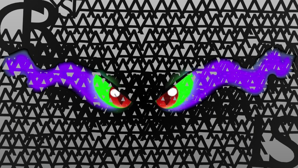
Artist, you get maybe a B for creativity and a D for effort. The A’s all got used in your image.
Sombra rising again would count. That said…
Artist, you get maybe a B for creativity and a D for effort. The A’s all got used in your image.
The unpleasing mix between negative and positive space puts my eyes off the piece in a way that I honestly don't want to do consciously. If the piece had mixed the A's into a more complete black and putting a clear difference between the negative and positive space of the work, for me at least, it would have been much less of a convoluted piece to look at.
Though, I do have to say that this could become the definite basis of a story's plot, that's for sure. But, maybe it's a bit too easy on the writer for giving such a simple plot? One could think so, but I don't, as it's very open ended from what you've given.
Though, I do have to say that this could become the definite basis of a story's plot, that's for sure. But, maybe it's a bit too easy on the writer for giving such a simple plot? One could think so, but I don't, as it's very open ended from what you've given.
I like how the A's get denser (or at least bolded) in the middle to make it darker. I'm not sure why the CR and the LS are so much bigger though, especially since the YST is the same size as the A's.
My biggest problem with this is that the text makes it look like Sombra should be screaming it in anger. But the eyes give me more of a hissing vibe (possibly because I think that's what he did on the show). I think it would match better if the text was more like "CRYYYYYYYSSSSSSTAAAAAALSSSSSS."
My biggest problem with this is that the text makes it look like Sombra should be screaming it in anger. But the eyes give me more of a hissing vibe (possibly because I think that's what he did on the show). I think it would match better if the text was more like "CRYYYYYYYSSSSSSTAAAAAALSSSSSS."
While there is something here (the cleverness of the use of the clustered letter As to represent a shadow in the middle), it wasn't clever enough to overcome the fact that this is clipart stuck on some text, and the As end up making the piece look extremely busy. I suspect that there's a better way of executing this - likely leaving more negative, unoccupied space and using the text more judiciously to form his smoke form.
Simple but clever. I had to squint to make out what was going on but I was pleased when I did.
