Hey! It looks like you're new here. You might want to check out the introduction.
Show rules for this event
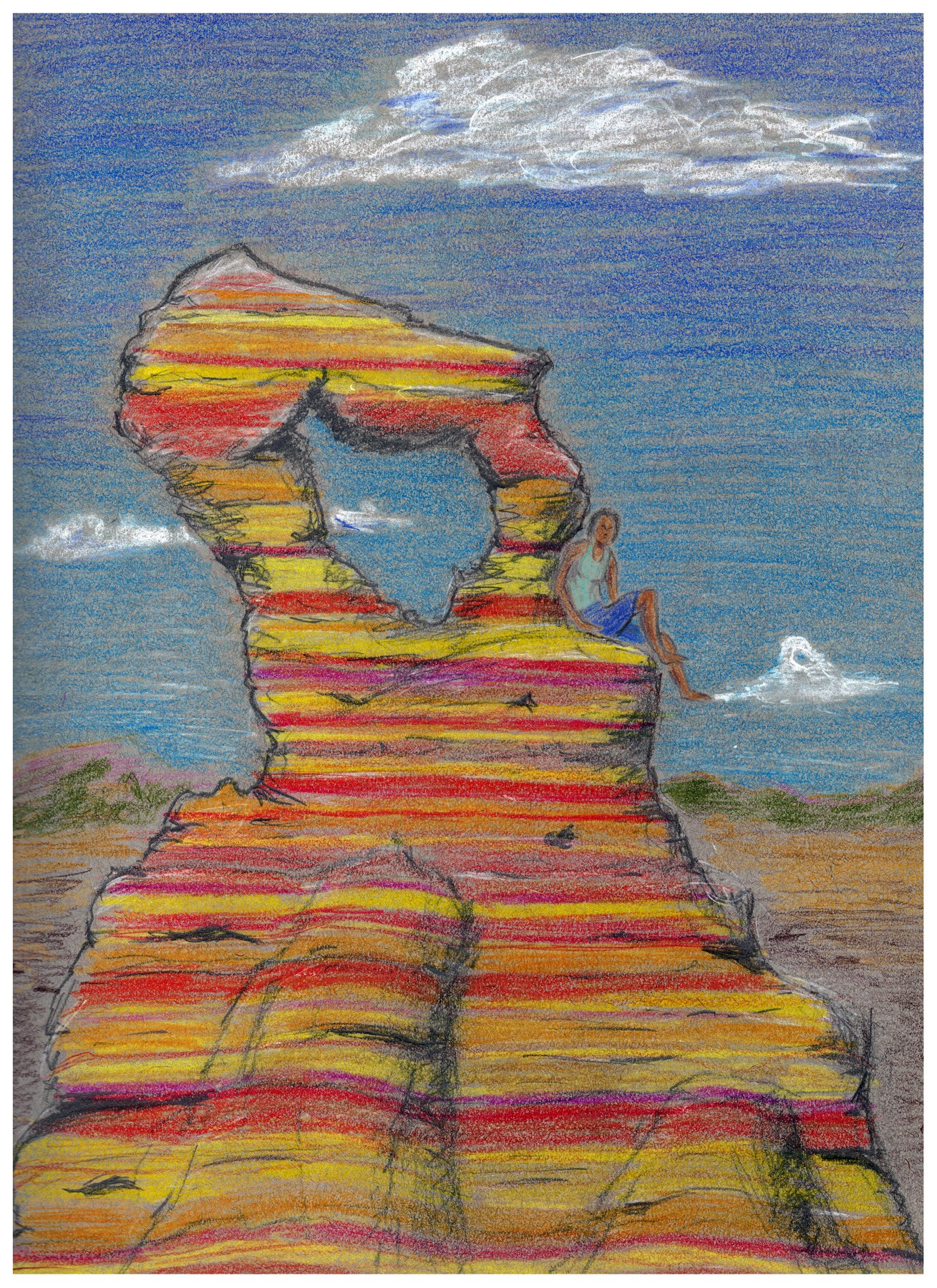

Evocative of the forms of Monument Valley, and exquisitely detailed. I am tempted to ask if she lives in Candyland. The artist either used dark paper or the gamma on the scan was off; adjusting this could have helped this piece to ‘pop’ more. Still, a very thorough effort, and an upper tier piece.

I actually didn't see the woman at first. I think it has to do with the fact that her outlines are less thick/defined than the ones of the rock formation.
I'm always impressed by really cleanly done physical coloring, and this certainly takes the ticket. Between the rock striations and the sky, it's just technically impressive that you made everything feel so clean.
I do have to mention that the tones of brown throughout along with the fact that your black isn't quite true black, kind of does mute your colors a bit. The whole thing has a pastel-y feel which made it harder to pick up all the visual information on first glance.
Overall though, I still like this one quite a bit. Thanks for arting!

Echoing >>GroaningGreyAgony. The colors contrast hard against everything else (the tones of which are very off). It is very hard on the eyes with the colors (dark reds and bright oranges and yellows) in the rock formation. In my opinion, chalky whites, salmon-y pinks and oranges would help it. But, if you were trying to bring attention to the rock by using these bright colors ignore me. Also if it was a problem with the scanner, as GGA suggested, then ignore me.
However, there is a lot of good in the piece also. Human is done proportionally, which I must give props to (I can't draw proportionally to save my life). The chinks and weathering in the rock is also a good detail (if you told me to draw a rock right now, a irregular gray blob is all I could manage) so bonus points there too. Clouds are also a good addition to the piece (very realistic clouds IMO).
Thank you for arting!


Now this is a beaut (butte?). Good coloration, good shapes, straightforward but interesting composition. Admirable stuff.
>>Bachiavellian, >>PinoyPony, >>No_Raisin, >>CoffeeMinion
Child
Thanks for the perceptive comments!
I sort of doomed this piece by doing it on gray paper. I tried to save it in Photoshop but I probably need to redo it.
I'd originally intended to just do a black and gray pencil sketch of a rock form eroded by wind and rain, but my colored pencil leads were just sitting there begging to be used, so I had a go. At least it was an instructive lesson on getting the basics right.
The human figure was an afterthought meant to add more visual interest and possibly a story hook. I drew her on a separate sheet of paper and merged her in with Photoshop.