Hey! It looks like you're new here. You might want to check out the introduction.
Show rules for this event
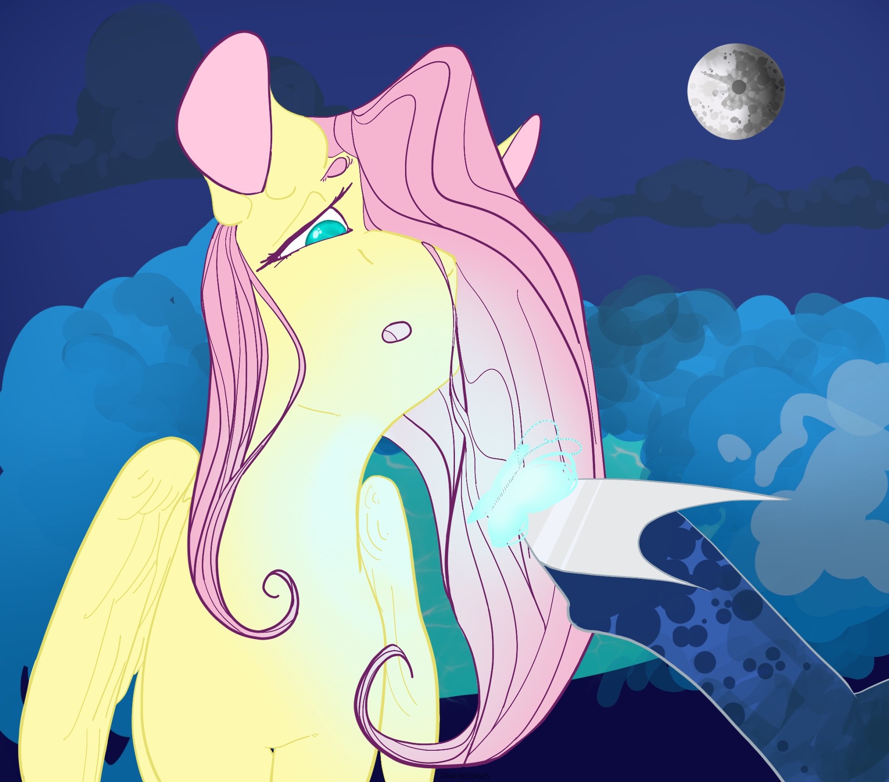
I must confess, when I saw the thumbnail I thought this was an anthro Fluttershy. The wings sort of look like arms and shoulders…
This is a harmoniously drawn and composed piece, and is beautifully colored. I love the mare in the moon and the subtle linework. Luna’s shoe looks flat to me; you should curve the highlight on it.
This piece will go high on my slate. Thanks for creating it, Artist!
This is a harmoniously drawn and composed piece, and is beautifully colored. I love the mare in the moon and the subtle linework. Luna’s shoe looks flat to me; you should curve the highlight on it.
This piece will go high on my slate. Thanks for creating it, Artist!
I like the abstract join of unrelated contour: her ear flows into her mane, her mane flows into her wing. Normally those are a bad idea but they work with the abstraction of this piece.
The butterfly is difficult to notice at first, and I think it would work better were it striking to behold. It's the focal point but you can't see it immediately, which is not what you want.
I don't like the discord between the fog style and the contour drawing in the fore. It would be better to me if you had stuck with contour drawing. As it is, the background seems very disconnected. The abstraction isn't bad, but the thick shapes without line are distracting.
Like Fluttershy, I hate it when I get my long hair stuck in my nostril.
I love this so desperately. Fluttershy looks great, the dreaminess is so on-point here; even the background-blurriness of the... background lends a sort of dreamy effect to the piece, while still letting me see what's back there. And this may not be the most insightful art critique I'll ever write, but I love the colour you chose for the pond.
Artist, whoever you are, thanks a lot for drawing this. Based on where I plan to take this story, it's a little spoilery to use as a cover art, but I'm going to try my best to find a place to use it amongst the text.
Also, it's my headcanon that the mouseover text is a continuation of what Fluttershy says in the title.
Oh, I'm sorry, Princess Luna. Did I crush this dream so hard that you decided to ding me for not fucking shading it?
I kind of found myself in the same camp as>>GroaningGreyAgony, with seeing shoulders instead of wings at a first glace. It's basically only her sihouette--once I actually registered the linework in her wings and neck, the illusion went away. So I think my suggestion would be to make her body linework a bit more clear, the way the outlines in her hair or Luna's hoof are. There's a lot of contrast in this piece so the fact that Fluttershy's shading and her outlines are so similar to one another makes them hard to pick up.
Okay, with all of that nitpicking out of the way, let's address the obvious. This piece looks absolutely fantastic.The aforementioned contrasts are used to great effect, and I particularly like how the blue of Flutter's eye almost matches the blue of the clouds behind her. It does an excellent job of making her pinks and yellows really pop out. Really, really neat stuff, all around!
Thank you for submitting it!
>>Miller Minus
Miller, that line about Fluttershy not having it when she created this perfect dream is fucking hilarious.
Miller, that line about Fluttershy not having it when she created this perfect dream is fucking hilarious.
“It has no reflection.”
“What?”
“In my shoe. See?”
Fluttershy leaned closer. Her mane drifted onto Luna’s leg. It tickled.
“What the hell, Luna? This is my first time doing this shit, give me a little wiggle room. You think I popped out of the womb dreaming of the day I would take over for your lazy ass? Goddamn,” she squeaked out. “A little ‘good job’ would suffice.”
