Hey! It looks like you're new here. You might want to check out the introduction.
Show rules for this event
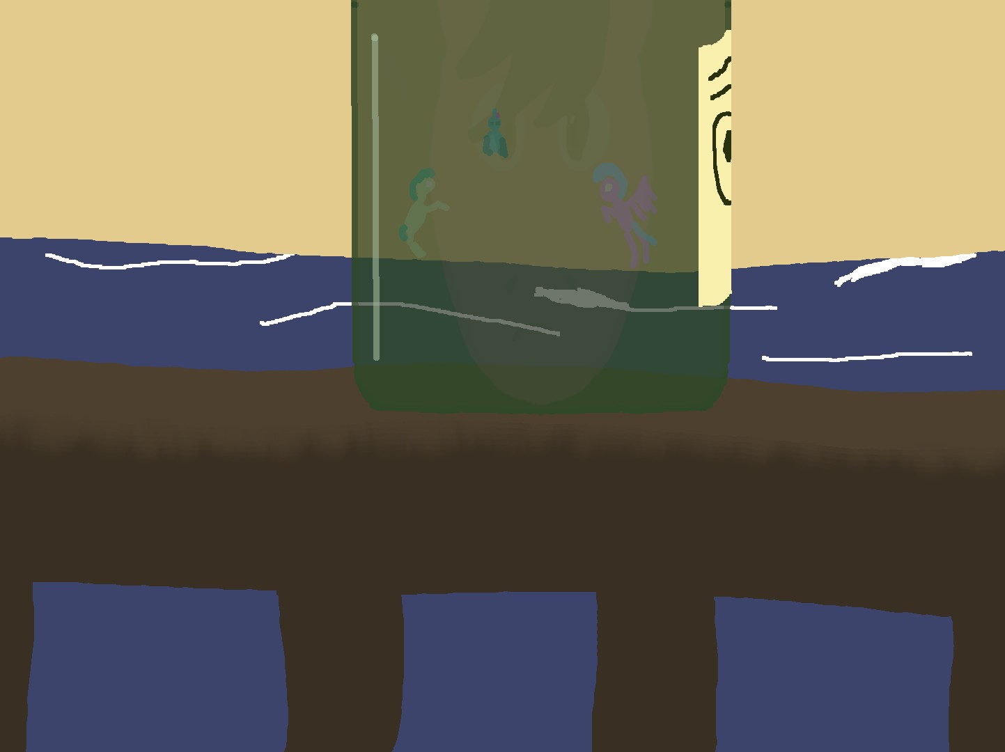
I love the multiple layers in this work. I didn’t even notice the face of the protagonist in the bottle until the second or third look, and then it was like one of those “When you see it” creepypasta things. The execution is cruder than I’d like to see for a work of introspection, but even so you manage to get the elements of the story into one basic object, so color me impressed. This piece will go high on my slate, with all the other ones that are also going high. Thanks for creating it, Artist!
This one is in want of more artistic talent (keep drawing!!!), but the composition is quite interesting. Use of the bottle to contain the reflections of the other characters well-illustrates how they live within her imagination more than reality through most of the story.
The excessive space on the edges is likely due to the artist's insecurity with their own work, but it also works compositionally in this case due to the nature of the story and how the mane character is alone and isolated. However, I think the bottle would be better positioned if it were horizontally aligned with a golden section rather than right in the middle (vertical is already perfect).
The excessive space on the edges is likely due to the artist's insecurity with their own work, but it also works compositionally in this case due to the nature of the story and how the mane character is alone and isolated. However, I think the bottle would be better positioned if it were horizontally aligned with a golden section rather than right in the middle (vertical is already perfect).
The ideas on display here are so great, and the feeling of watchful isolation comes across exceedingly well. The only suggestions I could make would be to maybe give the railing some solid lines, and to give the beach and the water a bit more of an "interface"--make the water look wetter the closer it is to the tide.
Thank you for submitting!!
Thank you for submitting!!
I like the idea you're going for, with the simple sihouettes in the background and the multi-layered foreground. That kind of composition has a lot of thought to it, and it shows.
I was a little confused about the background, though. At first, I thought it was the sunset sky, so it struck me as funny that Sandbar was sticking up into the air like that. After a few minutes, I realized that the tan background is probably supposed to be the beach bank, and things made a little more sense. My suggestion would be to find a way to break up the line between the water and the sand a bit, so it looks less like a horizon and more like a shoreline. Unless I'm mistaken about the whole thing, in which case you can go ahead and ignore me :P.
Thank you for submitting!
