Hey! It looks like you're new here. You might want to check out the introduction.
Show rules for this event

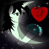
Review—
Prompt relevance: moderate
Style: pencil shaded, good variety of colors and contrasts
Background: multicolored, accentuates the subjects
Story potential: high
Result: strong contender
I unfortunately can’t relate this to the prompt, maybe because I don’t know the characters well enough. The artistry and style is very good though. I also think there is potential for story here, especially with the mystery letter being torn up.
Oof. Tough one, kid. There's more fish in the sea.
I'm not sure what it is about crayons but I'm pretty interested in them, and with the theme of this picture I do have to say that they are utilized pretty nicely to give an idea of their age and setting. Really breaks my heart though to have to see that kid get rejected like that though. Overall I'd give it a thumbs up.
Also, nice caption.
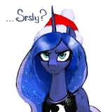
>>Moosetasm
I believe it is a love letter, based on the seal, and she is tearing it up in front of him. "Keep pretending" that she's into you, not out of your league, etc.
I believe it is a love letter, based on the seal, and she is tearing it up in front of him. "Keep pretending" that she's into you, not out of your league, etc.
>>Paracompact
But there’s no reaction from them other than looking away? And it could be that they’re about to give the letter, but tears it up first? It’s intriguing.
But there’s no reaction from them other than looking away? And it could be that they’re about to give the letter, but tears it up first? It’s intriguing.

There's a lot that could be going on in the image. The two characters could be friends talking about how one of them received the letter before ripping it up. Maybe the character on the left thought about giving the letter to the character on the right but decided against it and tore it up beforehand. MAYBE the character on the right gave it to the character on the left and while they weren't looking and it got torn up in silent rejection. However, the lines above their ears almost indicate to me that they both caught the sound of the paper. There's good story potential here!
The actual execution of the drawing is great too. The colors are clean and the linework is very well done. I'd say the proportions are just a bit off, particularly how the heads are compared to the hind legs, but this could simply be a choice of style. I'm just not sure it works the best here. Otherwise, it's a super solid drawing.
The actual execution of the drawing is great too. The colors are clean and the linework is very well done. I'd say the proportions are just a bit off, particularly how the heads are compared to the hind legs, but this could simply be a choice of style. I'm just not sure it works the best here. Otherwise, it's a super solid drawing.
(Art) Genre: OCs Outta Love
(Art) Thoughts: So we've got two well-drawn and well-colored ponies in the midst of an emotional moment that manages to come across despite not being able to see their faces.
Man, I can't draw that.
(Art Tier): High
(Art) Thoughts: So we've got two well-drawn and well-colored ponies in the midst of an emotional moment that manages to come across despite not being able to see their faces.
Man, I can't draw that.
(Art Tier): High

A bitttersweet image that allows multiple interpretations. The drawing might pop more if it were color corrected so that the paper in the background was the white point. Upper mid tier.

This was my favorite artwork out of the four. Sorry I haven't gotten around to reviewing. School and all, y'know?
>>Moosetasm
Thanks for the strong contender review bro.
>>Kritten
The medium was colored pencils but I like your interpretation of it being made of crayons. Also, thanks for noticing my caption. I was admittedly a little too proud of it.
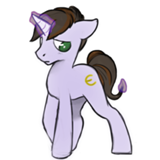
>>Roseluck
Although my art was very stylized, the hindlegs were a little bit too small. I lined it with black and just didn't give one diddly darn.
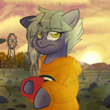
>>CoffeeMinion
You can draw that! I believe in you!!
>>GroaningGreyAgony
I don't entirely understand what that means. The paper was white but it turned out yellowish thanks to the dim lighting of my dad's house.
>>Moosetasm
Thanks for the strong contender review bro.
>>Kritten
The medium was colored pencils but I like your interpretation of it being made of crayons. Also, thanks for noticing my caption. I was admittedly a little too proud of it.
>>Roseluck
Although my art was very stylized, the hindlegs were a little bit too small. I lined it with black and just didn't give one diddly darn.
>>CoffeeMinion
You can draw that! I believe in you!!
>>GroaningGreyAgony
paper in the background was the white point.
I don't entirely understand what that means. The paper was white but it turned out yellowish thanks to the dim lighting of my dad's house.
>>Anon Y Mous
I mean that the image should be color corrected with an image editing tool, and that the correction software can be told that the paper should be the whitest part of the image. Hap is working on a tutorial that should help.
I mean that the image should be color corrected with an image editing tool, and that the correction software can be told that the paper should be the whitest part of the image. Hap is working on a tutorial that should help.