Hey! It looks like you're new here. You might want to check out the introduction.
Show rules for this event
Proud

Fics
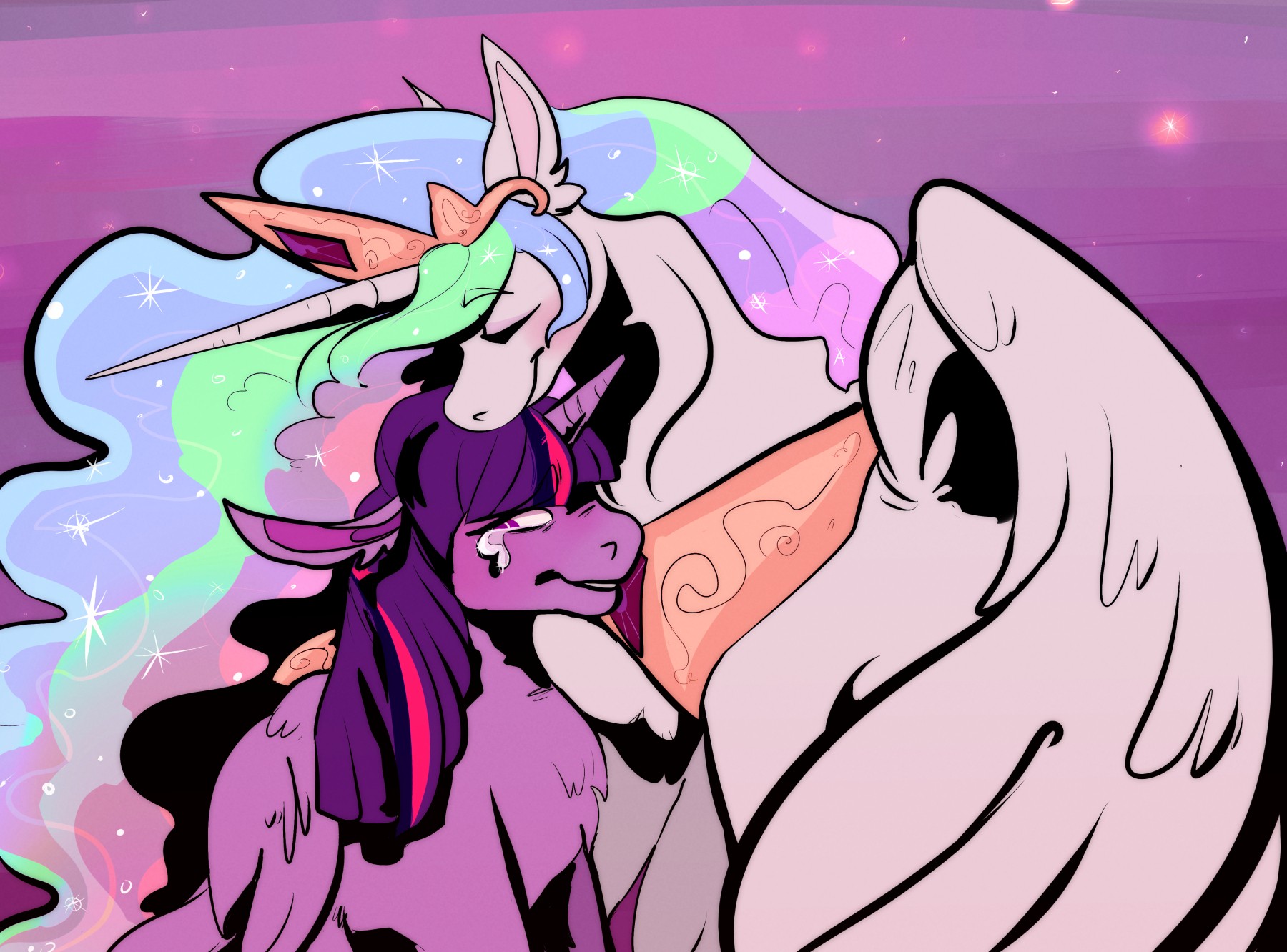
"Even with your ear extensions, I'm still proud of you, Twilight."
This is probably my favourite piece this round. Celestia's loving expression, Twilight's regretful smile. Solid work all around.
Though, for a second I thought Celestia was grabbing Twilight's jaw with her other hoof.
This is probably my favourite piece this round. Celestia's loving expression, Twilight's regretful smile. Solid work all around.
Though, for a second I thought Celestia was grabbing Twilight's jaw with her other hoof.
Review—
Prompt relevance: moderate
Style: good lines of varying width, good coloration, good expressions on the characters
Background: varying colors and details
Story potential: moderate
Result: strong contender
This is a very good picture, and would be at the top of my list if I saw more relevance to the prompt. The title is “Proud”, and Celestia is clearly proud in the picture. So to try and connect to the prompt, is Twilight the one pretending that she’s proud? Or not proud?
>>Moosetasm
I think it's supposed to be that Twilight feels like a pretender, but Celestia reassures her that she's proud of her. Basically, season four's best song.
And while I'm here, I'll just say that I loved the piece. I think it was a great choice to shade with flat black, since because otherwise all these pastel colors would wash themselves out without contrast. It's kinda unclear what's going on with Celly's neck, but I don't think this is a huge deal, because Twilight's silhouette naturally draws the eye more than Celestia's. Nice stuff!
(Art) Genre: Big Fluffy Pon x2
(Art) Thoughts: Wow, I don't know where to start with this one. This is quite beautiful, though very distant from the show's style. Floof is to the max. It's not exactly what I look for in MLP art but I can recognize the mad skillz here.
This is where I wish I had art critic stuff I could talk about instead of gawking and ranking it #2 or something.
(Art Tier): Pretty Much Top
Loose proportions add interest and life to well known characters Color is well done, though Celestia looks a tad greyish in comparison to Twilight’s eye. Overall, a top tier job.