Hey! It looks like you're new here. You might want to check out the introduction.
Show rules for this event
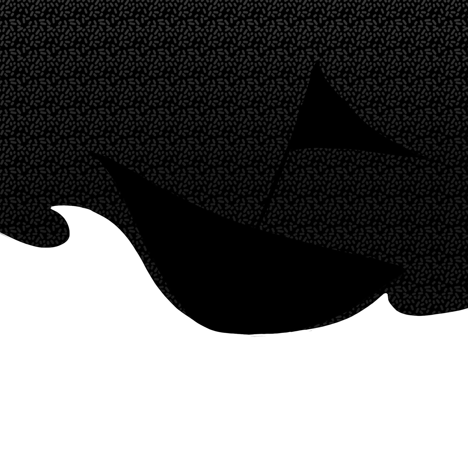
The dark background hides much at first glance. Not quite as compelling as the other piece the artist did for this round, but still a dynamic take on the idea. I will rank this as mid tier.
I ended up liking this one a lot (and not just because I did a similar thing some rounds ago :P). I didn't see the sihouette in the gallery thumbnail, which I assume was by design. It's a nice surprise, and it feels moody to me despite its simplicity. Thanks for submitting!
As GGA and Bachi said above, this takes the cake with the silhouette. It wasn't too hidden for me (probs since I was using dark mode), but good take nonetheless. It's a hard one to judge since its simplicity- which can be taken as a good thing and a bad thing just depending on the viewer. To me, there is nothing major to improve on. I guess the only thing I can think of that may be of use to you is that the sail seems a little static for what is going on. IMO, the sail should be more flayed and tattered in the wind since the waves are telling a story that the sea is in the midst of a storm.
Either way, thanks for arting!
Either way, thanks for arting!
