Hey! It looks like you're new here. You might want to check out the introduction.
Show rules for this event
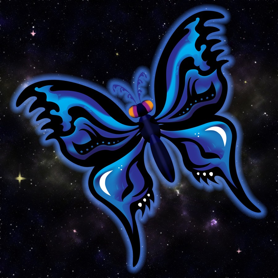
The background is a standard star-field; perhaps edited from a photo. It doesn’t detract from the the main subject: the Luna-Flutter-fly. The body is simple in comparison to the wings, which mirror each other with unearthly perfection. The details on the wings are near perfect in representing Luna’s color and Fluttershy’s cutie mark. The colors jump out and are rich and satisfying. This is an excellent piece that will take high marks on my slate. Thanks for creating it, Artist!
This is pleasant to the eye, but I'm not sure it embodies the story as much as it could. The butterfly is an easy synechdoche for Fluttershy's ability being almost-perfect, which is more of an issue I have with the story than something I admired about it.
That said, it hit me right in the feels...
Rest in peace, mythrilmoth.
That said, it hit me right in the feels...
Rest in peace, mythrilmoth.
Thank you so much for drawing this, artist. It's gorgeous gorgeous gorgeous. I think it's easy when drawing a butterfly to just kinda do some random bullshit, but you really gave this one a sense that the creature's design is blooming outwards from its body. I really dig this.
I also see what you did there, drawing half of the butterfly and then mirroring it. That's a kind of efficiency that I can seriously get behind.
I also see what you did there, drawing half of the butterfly and then mirroring it. That's a kind of efficiency that I can seriously get behind.
I like the use of the fuzzy blue outline to give the impression that the butterfly is glowing. And I thought the way you integrated the crescent moon shapes into the wings was neat.
In terms of critique, I'd say that the piece as a whole does seem a little static, despite the little tilt that you gave it. But I know a lot of this is kind of coming out of the style you're going for, so I'm not going to bag on it too much.
Overall, really cool piece. Thank you for arting!
In terms of critique, I'd say that the piece as a whole does seem a little static, despite the little tilt that you gave it. But I know a lot of this is kind of coming out of the style you're going for, so I'm not going to bag on it too much.
Overall, really cool piece. Thank you for arting!
