Hey! It looks like you're new here. You might want to check out the introduction.
Show rules for this event
The Previous One Wasn't That Good Either

Fics
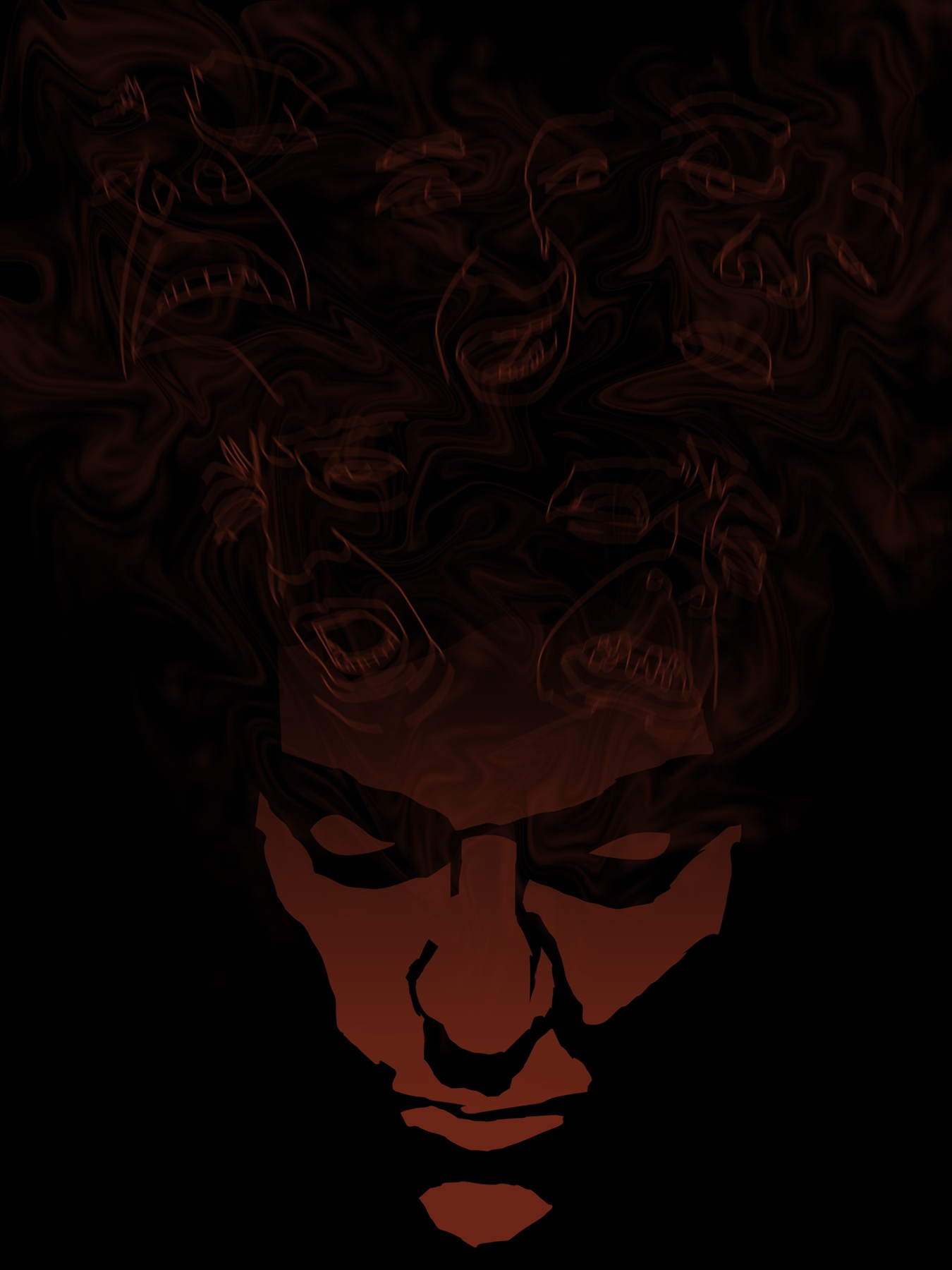
Funny thing, when I saw this on my phone, the mist thingie and faces floating weren't showing, so I just saw the face at the bottom and was confused for a moment.
Maybe too dark. I had to turn up the brightness quite a bit to see everything going on here, but I do like the subtlety of it. I can see why it inspired quote a few fics.
I like this. No idea on the movie, though, since I don't see many of them. I'm guessing it's supposed to supply a little more context?
This is rather dark, but once the contrast is up it’s quite expressive. I like how the solarization in the main face gives it the look of wearing a mask. I’ve ranked this as upper tier; thanks for creating it, Artist!
Just like Zaid said, most of these hovering faces weren’t visible when viewed on a phone, but I can’t really knock it for that.
This is definitely in my personal running for the top drawing this round, mainly because of how well-made it is overall. The silhouetted face surrounded by the phantoms of other faces is a poignant composition that’s also really clean. The subtle facial curves help to clearly create each of the emotions at play. This collage of emotions gives a frenetic tone to the whole thing. I feel like each of these emotions are fighting for control of the central character in this piece.
...but, when I stare at it more, these characters all seem to be variations of the same thing. I see frustration, despair, anger. Then the character at the base has a subdued, almost smug expression, even though it has all the other emotions attached to it. I don’t know how you intended this to read, but I find much of this condition to be very relatable, personally.
One last thing; I can’t be the only one who thinks the face above the left forehead looks like Voldemort.
>>Zaid Val'Roa
Thanks, kind person. I'll be sure to take that into account for next time.
>>No_Raisin
I think I may need a second monitor to see how things look in different settings. Duly noted.
>>Pascoite
I drew inspiration from the poster for In The Mouth Of Madness. I kept thinking of the screaming faces coming from the open book, only this time they're coming out of someone's mind.
>>GroaningGreyAgony
Yeah, that was kind of my approach. You had all these facets of personality fighting over who has control, which means the real face is kind of like a mask.
>>Rocket Lawn Chair
Plot twist! The faces are me. I suppose I could've gone with more variety, but it was past midnight and the deadline loomed closer. I've got to pace myself better.
-----
wew
Thanks for the gold!
I'll do my best in next rounds, too.