Hey! It looks like you're new here. You might want to check out the introduction.
Show rules for this event


I like the idea behind this one, but I'll be honest and say that it took me about 5-10 seconds to realize what was actually going on. I'm not sure how much of it is coming from the website's compression, but I think your resolution is just way too low to easily notice the yellow lines at first glance.I also think that maybe you could have outlined them to make them stand out a bit more from the light green background, yellowish houses, and the overall manila-ish tone of the piece. On the other hand, NMM pops up really nicely, and feels detailed despite the low resolution. Thanks for submitting!

[For the curious but unadventurous, online translation says that the title is Swedish for “Hidden Connections.”]
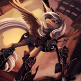
This piece is, at bottom, well drawn. The houses are simple but dimensional, and the Mare in the Moon is well defined.
But it doesn’t pop (grab the eye), and there are a few separate reasons.
1) When you’re using a marker or crayon for coloring, it’s easy to arrive at a scribbly appearance. This can be avoided by varying the direction of the strokes between sections, giving a different texture to different areas, and by using hatching techniques to fill space in a harmonious manner. In general, since we are used to seeing horizontal lines in the sky and in landscapes, using horizontal instead of diagonal or vertical coloring strokes would have helped to give a more natural appearance.
2) The impact of the golden lines is undone and darkened because they are blending in with the background color. They should have been drawn first, with the background added around them, or been applied with opaque color.
3) The biggest factor here is presentation, Artist. No matter how good your drawing looks to you, you also need to make it look good to the viewing audience. And here we have a low contrast, low resolution image that I am sure is not how you intended your piece to look. It’s difficult to see the golden lines at all unless you look closely; they at first appeared to me to be patches of green grass.
If you can’t scan the image yourself, or take a decent pic with a smartphone, you may want to see if a local copy center can make a scan for you. As I’ve mentioned repeatedly, learning to use digital adjustment tools to enhance your images will help immensely with your presentation quality.
So, points for composition, minus points for appearance. I’ll rank this as a low-to-mid slater. Thanks for participating, Artist! It’s clear that you have drawing skill, and taking more care in the execution will help your work immensely.
I am, frankly, not much of an artist. Or an art critic. My brother seems to have got all those genes, while I got all the write-y ones. But while I think others have given this the appropriate critiques, and I don't have much to add, given this is inspired by my entry I feel the need to comment anyway.
First up: thanks so much! I've never had anyone make art for me in any way, shape or form, so seeing this and Snap was immensely cool. Secondly, I like the title! Very snazzy, and fits the idea I had for the environment. Was definitely imagining a small, misty Scandinavian type town when I was writing. Thirdly, while I can see where the others were coming from vis a vis technique and such, you very clearly had the same mental image I did for the town stretched out below them. You captured the scene damn near perfectly in that sense.
First up: thanks so much! I've never had anyone make art for me in any way, shape or form, so seeing this and Snap was immensely cool. Secondly, I like the title! Very snazzy, and fits the idea I had for the environment. Was definitely imagining a small, misty Scandinavian type town when I was writing. Thirdly, while I can see where the others were coming from vis a vis technique and such, you very clearly had the same mental image I did for the town stretched out below them. You captured the scene damn near perfectly in that sense.
It's a refrigerator drawing? It's not a bad refrigerator drawing. It's a step toward better drawings?
The Nightmare Moon works for me, in and of itself, and I think is the best-rendered part of the pic. The perspective on the houses, not so much. The yellow I can see the purpose of when I look at the fic connection, though at first glance I originally thought this was supposed to be a representation of the burning from “My Sister Loved You”.
The yellow strands really need more clarity and contrast versus their background, especially since they're the main event, so to speak. The background textures are passable if you can get the foreground to work better and (figuratively) overshadow them. The scanning quality also hurts this a bunch: the resolution and contrast are both too low, so I have to squint to see anything.
This could have a better connection to the story if it had more dynamism or emotion to it, some in-pic reason for me to see the “ponies who can see it see it as this sacred thing” that was described in the text. To be fair, that's a really hard bar to try to meet: you picked something to draw that was described as the kind of otherworldly beauty that means any actual rendition is going to look disappointing when compared to the nonexistent one behind the curtain. So you get some points for ambition there.
Looking up, GGA seems to have some actually useful advice for you, as opposed to my mostly-non-artist tail trying to talk about technique, so I'll just point to that!
Slate: 3rd of 4.

So first up, thanks a whole buncho for taking the time to review my piece. You all had incredibly useful things to say about this one, and honestly coming on to the writeoff site and seeing the notification alert made my day every time. I do have a few things I want to address though.
1. I have absolutely no idea why the resolution is so low, in fact, I didn't even notice it was until mid-evening the day voting started. By then... all I could do was cry, and hope for the best.
2. I normally do the sky with slightly off vertical lines as I did here, and then the ground with horizontal lines. Why didn't I in this piece? I have absolutely no idea. As GGA pointed out, that certainly would have helped had I done that.
>>Bachiavellian
Yeah, the low resolution really killed me here. The yellow lines are from a yellow highlighter because I colored in the green ground, then went to do lines in yellow... note to self, don't try and see yellow on green, it doesn't work.
>>GroaningGreyAgony
They colored pencil approach really didn't transfer well to image in this case, primarily because of the two things I addressed earlier. Seriously though, thanks a lot for writing all that for me. It was really great receiving that level of feedback.
>>Meridian_Prime
You're welcome for the art! I'm just sorry I couldn't do your story justice with this piece. As for the title, I'm super happy I got the same image you did, and I feel like I should praise you for communicating that so well. While I was browsing Google Translate for the title, nothing felt right except for Swedish.
>>Light_Striker
Huge thanks for your thoughts. I'm not sure what you mean by refrigerator drawing, so that probably means it isn't that xD. And yeah, the low resolution was murderous.
>>CoffeeMinion
(\ Oh hey, thanks dude <3
~~~~~~~
I boosted up the resolution digitally, so not the best image quality, but hopefully this works for y'all to view it at least a bit better...
https://imgur.com/9JPQqKt