Hey! It looks like you're new here. You might want to check out the introduction.
Show rules for this event
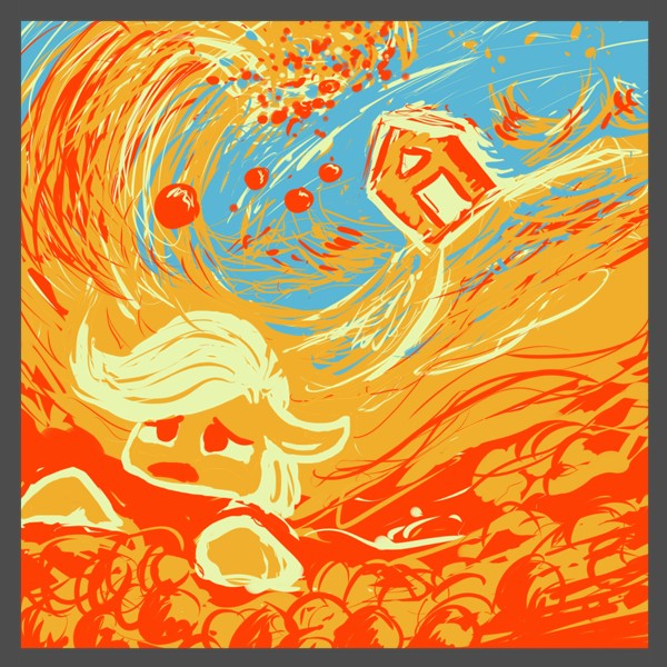
Stunning use of colors and the way our eyes move throughout the page is elegant. A nice little touch is the border. Well done. The apple wave is expertly done, but it contrasts badly with the half done pony face.
Just a little touch up on her face would do, maybe add a nose and more detail to the mouth. 🍎
Just a little touch up on her face would do, maybe add a nose and more detail to the mouth. 🍎
Is that Mt. Fuji in the background? :)
The scribbly style works in favor of the impressionistic nature of this piece. The negative space forming a fist-of-god aimed at AJ’s head may or may not be intentional, but once seen can’t be unseen. A nice reference to the story and a good piece in its own right.
Upper tier, but in this round, something is going to have to go lower…
I like that there's no black or white here. The colored outlines on colored objects with a colored background really gives the whole thing a dreamlike, smudged feeling, for lack of my ability to come up with a better term. It's also a cool bit of perspective play that you've framed the shot so that Applejack appears upright while the house is the one that's tilted.Really cool stuff!
