Hey! It looks like you're new here. You might want to check out the introduction.
Show rules for this event
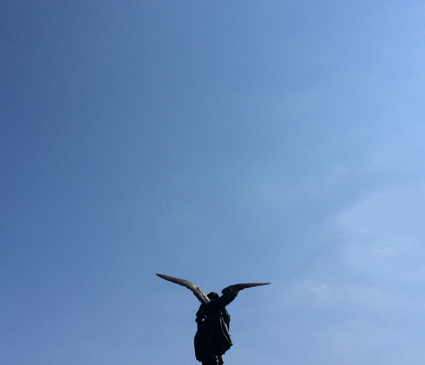
Simple and smart. Open wings with a big clear blue sky above, ready to be explored, that's very effective.
I wish I knew the statue so I could show my knowledge and explain how it adds another layer of meaning to the piece, but since I'm not, I'll just focus on the piece.
The statue is looking down for me. With all that sky above, it creates a nice contrast, which is very interesting to interpret for writing.
Thank you for sharing, and keep enjoying this beautiful weather.
>>Morning Sun
Don't reference Doctor Who. Whatever you do, don't reference Doctor Who. Reference Doctor Who, and you're dead.
Wait, what?
Don't reference Doctor Who. Whatever you do, don't reference Doctor Who. Reference Doctor Who, and you're dead.
Wait, what?
This might have worked better in an original fiction round. It just seems too not-pony for a pony round to me.
You did use the empty sky very effectively though.
You did use the empty sky very effectively though.
>>Morning Sun
>>Super_Trampoline
>>The_Letter_J
Actually I'm just the sort of heathen to hope against hope that we get 1+ Doctor Whooves/Weeping Angel type things out of this pic. (I've considered it myself but I can't think of how to write it.)
>>Super_Trampoline
>>The_Letter_J
Actually I'm just the sort of heathen to hope against hope that we get 1+ Doctor Whooves/Weeping Angel type things out of this pic. (I've considered it myself but I can't think of how to write it.)
As noted in my review of the other photographic piece this round, the art of photography is in the technical composition (lighting, framing, angle, focus, etc), the artistic composition (color, contrast, balance, use of space and negative space), and the narrative of the photo. For the most part this succeeds. Framing the statue at the bottom of the pic and focusing primarily on the sky was a strong design choice.
However, I think you would have benefited from off-centering the statue and taking advantage of the Rule of Thirds. My other major compositional critique is that the figure being largely in shadow gives the piece something of a weighty, oppressive feel — especially with the centering of the figure; you've got this giant blank lump plopped in the bottom of your frame and that makes this feel off-balance to me. Especially since (as >>Fenton notes) the statue is looking down. I hope that was an intentional contrast to all that open sky, rather than trying to invoke a figure in flight — though the outstretched wings sort of suggest the latter.
It would have been interesting taking this from a number of different angles (…assuming you didn't have buildings/power-lines/etc marring the sky), or perhaps different times of day, to play with the figure shape and lighting. As it is I think you've got a good concept here but the execution could be a little improved.
Thank you for submitting!
