Hey! It looks like you're new here. You might want to check out the introduction.
Show rules for this event
Aww! This one should sweep the competition. :)
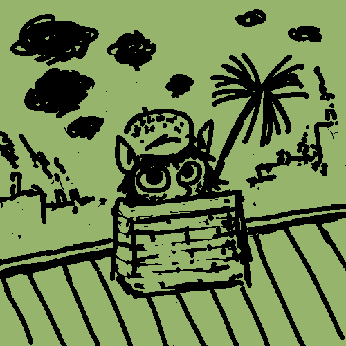
Seriously, this is okay for a draft and gets points for an original take on the concept. But it is a draft. The chimney doesn’t really seem to be attached to the roof, and the buildings in the background are rudimentary. The little pone has a cute look.
Mid tier, largely for lack of polish.
Seriously, this is okay for a draft and gets points for an original take on the concept. But it is a draft. The chimney doesn’t really seem to be attached to the roof, and the buildings in the background are rudimentary. The little pone has a cute look.
Mid tier, largely for lack of polish.
ello, trad'ah. what goods have yah got me?
Pretty simple as a source of inspiration, honestly, but I don't mean that in a bad way. It's great, and it gives a lot of potential for cute/comfy/funny moments. That being said, in my most honest opinion,I want to pat her head I'd like to see this done.
This could've been cleaned up immensely, as said previously, yeah, but I'm getting the feeling as if the background was drawn by the fillies/colts in particular. You could've made that more clear by the immense difference in quality shown on their characters in contrast to the background, but meh.
I really want to pat her head.
Pretty simple as a source of inspiration, honestly, but I don't mean that in a bad way. It's great, and it gives a lot of potential for cute/comfy/funny moments. That being said, in my most honest opinion,
This could've been cleaned up immensely, as said previously, yeah, but I'm getting the feeling as if the background was drawn by the fillies/colts in particular. You could've made that more clear by the immense difference in quality shown on their characters in contrast to the background, but meh.
I really want to pat her head.
This is cute, and I like the simplistic/unpolished look that others are complaining about. I think that it works well for this picture.
This is definitely a different take on the prompt, so props there. And while this is obviously a simple drawing, it is actually done quite well. It also works well as a prompt.
All in all, well done.
All in all, well done.
Easily my favorite picture of the contest—although I'm afraid I didn't interpret it exactly the way everyone else is... :P
Will be adding things to my slate until I can put this at the top.
Will be adding things to my slate until I can put this at the top.
