Hey! It looks like you're new here. You might want to check out the introduction.
Okay, artist, how did you know that I love Tempest depicted as a Cutie Mark Crusader?
As a straightforward scene that reflects the source story, I think this hits the mark. Tempest is visibly frustrated as she attempts to paint something we can't see. Nice work!
A few suggestions for improvement: Take a look at dem leg proportions. The back legs look like they're slightly too long. I'd also add a slight curve between each piece of Tempest's back armor, similar to how you've excellently drawn the neckplate meeting the shoulderplate.
I think Tempest's sketchy outline might be due to a deadline constraint, but I'm not entirely sure. You should smooth out those outlines, or else make it clear why you're thematically leaving the outlines so sketchy.
What is that goofy book horse up to now? Despite the dark color composition, this still manages to feel light and fun. I think the proportions of the face are very good, but the drawing lacks depth. This is mainly due to the light source (the candle) being a flat piece of background scenery, and not adding any striking contrast to the foreground elements. I'd suggest adding a bit of ambient glow around the candle's flame, and some bolder highlights on the covers to match.
The biggest strength of this drawing comes from the character it evokes from the story: Twilight is a relatable goofball, even when she's ancient.
The biggest strength of this drawing comes from the character it evokes from the story: Twilight is a relatable goofball, even when she's ancient.
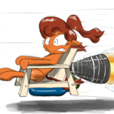
Post by
Rocket Lawn Chair
, deleted
(Here's another pic I'm reviewing without context of the fic, and waaaay after the event is complete, so feel free to ignore.)
I like some of the details, such as the ruffles in the mane, and the highlights in the eyes. most of the facial details feel natural. This characters is very legible, and the action they're trying to convey is very clear.
You've also worked some proportion into the character's forehoof gesture, and the subject of said gesture.
The perspective clash of this drawing is the main thing that bothers me. The boards of the table indicate a higher overhead perspective, while the angle of the forehoof/ medallion tell us a different perspective. I don't know whether it should be a shallow perspective or an overhead perspective.
I feel like the horizontal lines across the table should be closer together. And, lastly, I like how you've proportioned the character's facial features, however, I would probably make the shape of the cheeks something other than round. Slightly angled for the cheekbone, or a slight bulge for the lower jaw. Something along those lines.
Hey artist, I haven't read the story, so I don't feel entirely qualified to talk about your fabulous art. Feel free to ignore this review!
First impressions give me claustrophobia. The dominant yellow/orange color scheme of this drawing are entirely overwhelming. I don't know the themes that the fic is trying to encompass, but the subject (Rainbow) feels very oppressed by the colors in this drawing, and by extension, so do I.
Structurally/anatomically, you've illustrated Rainbow Dash nicely. The environment, however, can use some greater detail to denote depth. I can't really tell how deep the cliff is compared to the rocks adjacent to the grass. All the outlying terrain seems like rushed filler that I'm sure you'd have devoted more time to, if you'd been allowed.
I know the round's over, but I just gotta mention what a dang pleasure this story was to read. Wonderful example of what is possible in the tight word economy. I really wanted to make a drawing for this, but I've just been so busy lately.
Nice job on gold, Miller. You scoundrel.
Nice job on gold, Miller. You scoundrel.
>>GroaningGreyAgony
You and I will have to share one sometime. I only wish I remembered what it entailed.
You and I will have to share one sometime. I only wish I remembered what it entailed.
Spaayse!
We got a lovely skyline, we got a goofy green alien cameo, we got creative mumbo-jumbo, let’s toss these into a blender and see what we get!
....
Sadly, no fics came out of this, but not for lack of potential, artist. However, I’m here to comment about the quality of art stuff, so we’ll ignore the lack of fics.
The background is a gorgeous picture. I don’t know whether or not you took it. For now, I’ll give you the benefit of a doubt and say: “That’s a damn good picture!” (If you didn’t take the picture, you still have a good eye for photography).
Now we have the UFO above the skyline, which kind of clashes with the aesthetic of the background. Not entirely sure where this UFO is meant to be relative to the buildings. It might have helped to make a blurry reflection in the water, or else given the UFO some degree of ambient occlusion so that it looked further away in the background/atmosphere.
Ultimately, I think this was a good idea to bring to the prompt, but could have used some more polish to get by on its own artistic merit. Either more cartoony or more realistic, whichever you prefer. Best of luck!
I may have submitted this without remembering. Either way, it earned a story, which is great! Was I being philosophically deep when I potentially submitted this? Or blind drunk? God, this goes much deeper than I expected.
A very nice sketch here that has a lot of ambiguity in the story it’s telling, just as Pascoite mentioned. You can do a lot with the individual characters depicted, which I think is the greatest strength of this piece.
Overall, I think your linework conveyed what it meant to convey, but it could certainly be cleaner. Raisin and GGA already brought up this point. You’ve got to be careful that your cartoony-ness doesn’t start conveying messages they weren’t meant to convey (such as the balloons sprouting from the old man’s head. Does that mean anything? It’s catches my attention, making me think you did mean something by it, but I can’t be sure).
I also notice some rough shadows drawn underneath the robot and kid are blending into their feet. Kind of nitpicking there. You could probably get a nicer effect if you included some hatched shading on more of the elements in this drawing (the old man, the balloons, the cart, etc.)
Based on the broad, intriguing subject, I’m not too surprised it got a decent number of fics. I wish you the best of luck, artist!
We have a few rougher sketches this round, but I personally feel this one pulls ahead of the competition. The color, the detail, and the composition are all coherent, and convey your subject quite well. The color blue does a really bizarre thing to the image, being such a disparate color to the rest of the sketch. It neutralizes the aggressive red/brown of Hell, practically subdues it. I get the same feeling I got from the Pixies overtaking Fairy World in The Fairly Odd Parents from this drawing.
It lacks a bit of depth in the shading of the teeth below the throne itself, and I can’t really tell if the stalagmites are meant to be flames (but that might have been intentional. If it was, I don’t know why).
Works really well with the prompt, and has clean, clear imagery. Nice work, and good luck!
This gave me a really funny mental image right away. Imagine a landlord so lackadaisical that they don’t bother to ensure you’ve properly received your eviction notice. Imagine the tenant’s warning simply burned up without them knowing, and they returned home only to find a pile of smoldering ashes. The flavor text from Supreme Verdict came to mind.
I think this drawing could use more clarity from the outlines and shading. Especially where the scroll curls, I can’t really tell where the edge of the curl is. Maybe some brighter glowing cinders around the flames, as well as the smoldering bits, would help out this drawing.
This hits the prompt very well, though. Text is readable, and also hints at a curve to the scroll (which could have been gently shaded itself). Great job in leaving a lot of interesting information open to interpretation by the viewer, like the arrow, and the notice being actively burned.
Just like Zaid said, most of these hovering faces weren’t visible when viewed on a phone, but I can’t really knock it for that.
This is definitely in my personal running for the top drawing this round, mainly because of how well-made it is overall. The silhouetted face surrounded by the phantoms of other faces is a poignant composition that’s also really clean. The subtle facial curves help to clearly create each of the emotions at play. This collage of emotions gives a frenetic tone to the whole thing. I feel like each of these emotions are fighting for control of the central character in this piece.
...but, when I stare at it more, these characters all seem to be variations of the same thing. I see frustration, despair, anger. Then the character at the base has a subdued, almost smug expression, even though it has all the other emotions attached to it. I don’t know how you intended this to read, but I find much of this condition to be very relatable, personally.
One last thing; I can’t be the only one who thinks the face above the left forehead looks like Voldemort.
Until I can give a proper review, I just have to mention how lovely that restrained little flame is on top of the skull. Frankly, it's adorable.
>>CoffeeMinion
Dunno that I literally see any more than what you're seeing. I think my meaning is that there's some interesting implications in all the little pieces of the scene. A sliver of light in a dark room, implying a door cracked open slightly. One eye closed, like she's pretending to be asleep.
Initially when I saw this picture, I imagined Apple Bloom overhearing a whispered conversation in the hallway. Granny Smith and Applejack are talking about Apple Bloom. They're discussing something they don't want her to know. They don't know she's wide awake, listening.
If I'd written a story for this round, it would have been for this picture.
Time for a retrospective!
Thank you all for gold! I'm so glad that many of you liked my work and were able to give some great feedback. Some background on the inspiration: I was thinking back to some of my previous art entries, reflecting (ironically) on how many of them involved reflections. That's when I had a picture in my head of Rainbow Dash flying through the clouds alongside some fishes, but unaware of their presence, because it was just a reflection beneath her.
After that, it made more sense to put Fluttershy in the picture, much more aware of her fish friends. I wanted to make it look like she'd found a way to fly with them that wouldn't upset them. Her solution was kind of an illusion. It wasn't the whole truth, but the lie had a more important quality: it was harmless.
>>Not_A_Hat
I agree, a few more ripples would make it clearer what kind of effect I'm going for. I need to figure out a way to do that without, as you say, adding more visual noise. I'm glad you liked it, and thanks for the suggestion!
>>Pascoite
Thanks for the compliments! Personally, I didn't have any more meaning to this drawing besides the little anecdote I shared above. Ultimately, I hoped people would make whatever story they wanted out of it.
>>Bachiavellian
The lily pads were the most distracting part for me as well, especially the perspective they evoke. Something about the way they shrink toward the top of the page clashes with the angle of the reflection, I think.
Last night while I was touching it up, I made an interesting mistake that adjusted the entire perspective. I think I'm happy with this new direction,, even if it no longer fits the original theme. Thank you so much for your feedback! Also, congratulations on silver!
>>Caliaponia
Well-spotted. I don't think I got the water gradient effect quite right. I was trying to imagine how the surface of the water might look if I were standing in it. When you're looking directly down, you can see straight to the bottom. As you look further outward, the bottom becomes warped, and eventually the sky's reflection completely takes over. It's a surreal effect that I didn't do proper justice, but will certainly work on in the future. Thanks for the comments!
>>GroaningGreyAgony
Thanks! Really glad you liked it! Congrats on your medal!
>>Rocket Lawn Chair
I'm going to ignore this comment on the grounds that the commenter is obviously a doofus.
Whew, yeah. As most people have already mentioned, this one has some gorgeous color. Everything pops against that subdued blue background. There's so much life brought out of the fish, the lily pads, and our main mare in this piece. The way you've blended the sky and water together, making the fish swim through the clouds, gives it a delightful dream-like quality.
And dang, does that water look refreshing!
I don't think there's a ton more critique that I can add aside from what's been said already. >>Caliaponia makes a good point about the effect of the water surrounding the fish. The fish in the bottom of the shot could use more color around them to make them look submerged.
To nitpick a bit more, I'd say the blurry boundary between the sky and water looks a bit...dirty? There's some grey tones in there that clash with the cleaner blues and whites in the rest of the background. Some of the ripples around the lily pads feel out of place (I'm starting to get petty here). I really like how you did the ripples around the fish on the middle-right side of the piece. They seem to have a bit more volume and depth than most of the others. It would be neat if you could make more of the ripples like those.
Honestly, though, this looks pretty polished as-is, and I can't say much more about it. It's got notes of whimsy and tranquility, and I think you did a fantastic job in the time allotted. Fluttershy looks so happy to be flying with her aquatic buddies!
Let me get it out of the way up front, and say what everyone else has already said: there's a dark mode??
Oh, and that's a *wonderfully* thematic use of the website's tools.
All around, I think this is a really neat piece, especially for the creative use of the medium. I'd also give this my personal "Most Related to Prompt" award for this round. There's so many neat ways you can take this idea. Why do we see Luna with the sun and Celestia with the moon? What's the significance of their positions? What can be said about neither being present at the same time? Just a gold mine of story potential out of the symbolism in this one.
Putting aside the nifty gimmick, I'd say this also holds up decently on its own as a drawing. The characters are very cleanly drawn with some minor exceptions on the two sisters (see Celestia's muzzle, the top of her foreleg, and Luna's mane above the forehead). Kind of flat without more shadows, but it's obvious why this doesn't use them to excess.
Others have already mentioned the weird clipping on Twilight. I'm personally a bit put-off by Twilight's mane dissolving to ribbons in the back. I haven't really seen a mane work like that in flight, not even in a cartoony fashion. I think trying to round off the strands a bit, as you've done in the front of her mane, will make them look more like strands of hair and less like streamers. It's up to you, though. Far be it for me to judge an artist's style when I've tried to get away with weirder ideas simply because they looked/sounded cool to me.
Very good work! I wish you good luck, good health, and many more creative ideas from the Inspiration Gremlin.
(EDIT): I also want to mention that drawing silhouettes that actually look like characters and not featureless blobs is really impressive to me. Maybe just me, but kudos.
For the record, I really think this deserved a fic. Wish I'd been able to distill the words in my head into a coherent shape for a story.
Not too sure what's happening in this piece, but I get the feeling that's kind of the point. Whose who? Who's what? Who am I? Whose on first?? What's happening??? This feels like one of those games where you're supposed to figure out the rules based on context clues, and half the fun comes from watching your friends squirm in confusion while they figure it out. This drawing might be making me a little angry right now (in a good-natured way).
I like the overall tone of zaniness, from the sketchy style, to the rearranged cryptic messages, to Thorax hanging upside down from the top of the drawing. I can't stay angry at a playful drawing like this for long.
The drawing itself could stand to be cleaned up a bit. Looks like there's little grey specs all over the bottom half, and some overlapping outlines around certain features (ears, horns, etc.). I'm guessing this might have been sketched in a rush, so I'll leave it there. Thanks for the art!
This one is going to have a snazzy story underneath, I can just tell.
When I was looking at this on my phone, I really thought the shadows obstructing her face were meant to be the viewer's eyelids. Also, seen from a distance, the shadows on her eyelids gives her a more sinister expression.
Needless to say I completely missed the tone of this piece until I got a closer look, which I think could be my first critique. Some of the shadows around her face and body feel too soft and fuzzy. We don't have much contrast from crevices where deeper shadows would be, and some of the nuance is lost. Same can be said about the pillow. A few creases in the pillow would give it more depth and volume. Maybe a few creases on the pillow like the split you've put into her mane.
That being said, after I understood what was happening with this piece, I really liked it. Subtlety works great here. You've given us a sliver of light and just enough details to tell us what's going on in the scene.
Great work, and I wish you luck!
Paging WIP