Hey! It looks like you're new here. You might want to check out the introduction.
Show rules for this event
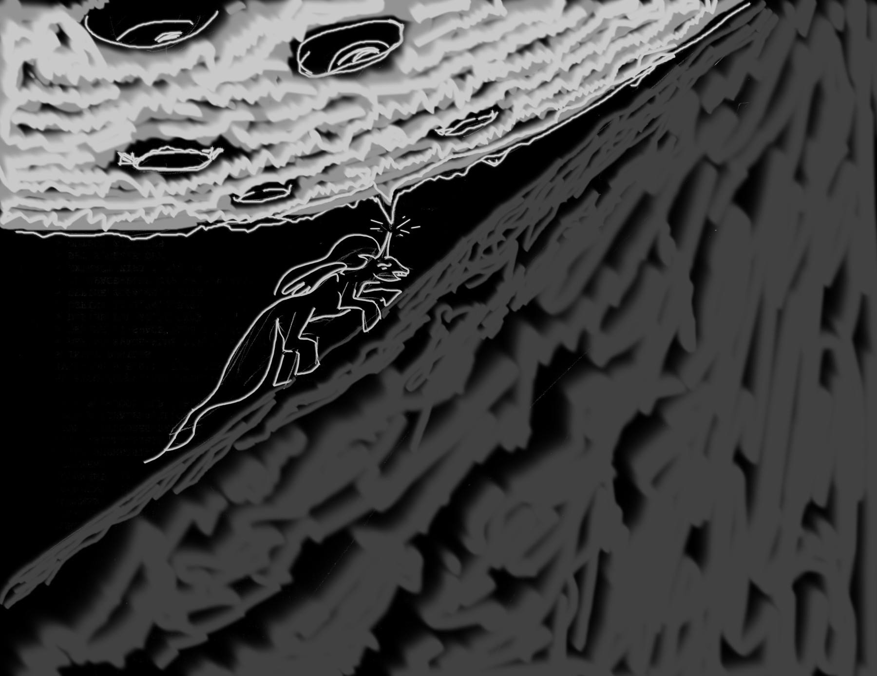
This is really cool in how it uses texturing to distinguish the three primary objects in the picture. The shape of the hill and the moon compliment each other well, giving the whole piece an astronomical sort of vibe. Really neat; thanks for arting!
Composition is definitly this piece's strongest suite. The way the moon and the hill almost connect at the top of the frame, leaving poor ol' moonbutt with an increasingly smaller and smaller space as she ascends is an excellent visual representation of the inescapable nature of her task I was going for the author was going for.
