Hey! It looks like you're new here. You might want to check out the introduction.
Show rules for this event
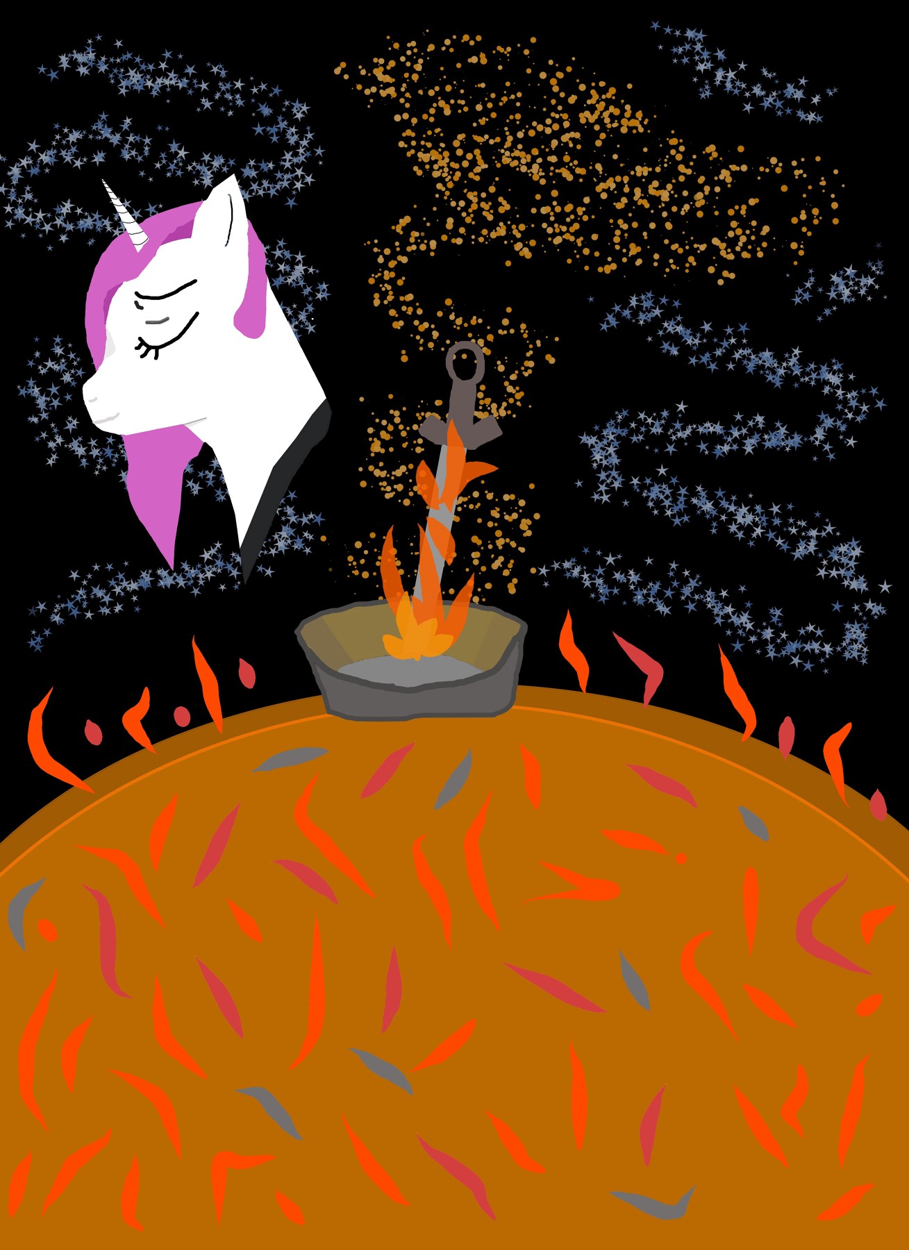
Really interesting color choice for the sun! I think going for that muted grey-orange really works and evokes the feeling of something that's burnt out.
Now to be honest, I'm not exactly sure what the centerpiece image is supposed to be. I kind of see a sword-ish shape, but I don't recall a sword being mentioned in the story. If I'm being blind and/or stupid, feel free to let me know.
As for Celestia, I like the shape of her head and her ear, but proportionally speaking, I think her horn and her mane look a little too small for her head. The hard lines on her horn also kind of stick out a bit when compared to the softer lines that make up her eyes and features. It's also a little odd just to see her head, but I assume that it's because she's burning away in this scene.
Thank you for submitting!
I agree with >>Bachiavellian for the most part. Celestia's proportions seem off, but having her original form is a good touch. You could improve your line work as well.
>>Bachiavellian I'm pretty sure that the sword is a Dark Souls reference. It looks like the sword from Dark Souls 3. The Dark Souls series is about Death and Rebirth, a cycle, and I think the artist drew parallels between the two.
>>Bachiavellian I'm pretty sure that the sword is a Dark Souls reference. It looks like the sword from Dark Souls 3. The Dark Souls series is about Death and Rebirth, a cycle, and I think the artist drew parallels between the two.
Thanks for illustrating my story, Artist!
I don’t know the Dark Souls symbolism and so can’t comment on it much. On the surface of the sun, it seems you’re going for a primitive style with the varied flame strokes. I think this could be improved if the strokes were more flowing / harmoniously arranged. I know the drawing program you used can do smooth flowing strokes, as the star trails in the sky are nicely serpentine. It may just be a matter of practicing with the tools.
I’ll adopt what the others have said about the proportions of Celestia’s head, with the observation that working on drawing smoother lines and enlarging her horn would really help things to come together. Note that the shapes of her head are well executed.
It’s clear that you have talent, Artist, and I hope to see more of your work in the coming rounds.
>>TerrusStokkr
Ah, I see! I know next to nothing about Dark Souls, so it kinda went straight over my head. :P
Ah, I see! I know next to nothing about Dark Souls, so it kinda went straight over my head. :P
