Hey! It looks like you're new here. You might want to check out the introduction.
Show rules for this event
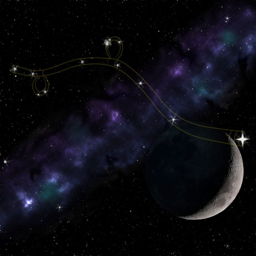
I'm not sure why, but the lines between the stars do a really good job of evoking the style of a constellation map to me, so kudos for that. If I had to make a suggestion, I would say to watch your neutral space; there's a lot of area in the lower left where there's not much going on, and it makes the piece feel a little.... unbalanced in a way?
I'm not an artist, so I have no idea what I'm talking about. :P
Thank you for submitting!
I'm not an artist, so I have no idea what I'm talking about. :P
Thank you for submitting!
I love that idea of the scythe being just the constellations.
Very nice.
Also, is there supposed to be a surprise pony in the (nebula?) next to the moon? If so, you cheeky [redacted].
Very nice.
Also, is there supposed to be a surprise pony in the (nebula?) next to the moon? If so, you cheeky [redacted].
So conceptually clever to have the scythe made up as a constellation. On idea alone, this one earns the middle spot on my slate with ease.
I think the remaining elements are fine and even beautiful in their own way, but compared with the ambition of Goodnight Moon, this one does feel a little underwhelming. Part of it is probably because of Bachi's point that there's a conspicuous empty area. Simple designs can be arresting on their own, but I think that relies on the execution of things such as angles and lighting and complementarity.
For instance, the scythe head being so low down on the right does mean it looks at first like just some wavy lines leading to the moon, thus harder to recognise as a scythe straight away. Also, the highly visible dark side of the moon sort of impairs one's ability to see the blade clearly distinguished. It needed to be darker. Lastly, the Milky Way behind it looks good on its own, but doesn't complement the scythe in any way that feels like it justifies its presence. It's distracting in its own right. Perhaps if it didn't cut through the scythe or was much dimmer, it would help rather than hinder the overall impact of the picture. It doesn't help that the constellation's lines are so faint as to be drowned out by it from a distance.
I should admit at this point that my credentials for art criticism are lower than my credentials for fic crit, which in turn weren't very high to begin with. At the very least, I hope I've isolated those elements useful for improving the art, or for considering next time.
And because I'm vain as hell, thanks for picking my fic as inspiration!
A sleek take on one of the story’s most striking visuals. Another member of the prestigious Moon-is-a-lot-closer-than-the-stars-and-goes-in-front club, though in a magical universe like MLP I suppose the stars could wind up just about anywhere. Gorgeous work on the starry background, and a wink to the “Horsehead Nebula” which I see that you did there. Extra credit for the looped scythe handles that a sapient horse might actually be able to use. This will neatly fill the only remaining spot on my slate.
