Hey! It looks like you're new here. You might want to check out the introduction.
Show rules for this event
colours of me and the colours of you are the colours we see

Fics

A digital ‘watercolor’, and the design is also simple and effective here. I expected we’d have a few “colorless figure / colored environment” pieces, but this conveys it effectively. I’ll call it upper tier.
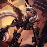
Well, that's.... really cool, and remarkably well done. I love how the white space around the figure is sort of like a shield bubble protecting her from the color, or it could be an explosion, blasting the color out of her and into the space around her to cover up the black... but there's still that black shadow, which to me, like, is representative of how everyone has a darkness to them, no matter how much they try to cover it.
So all in all, really great.
So all in all, really great.

This one sat oddly with me for some reason. I think it has to do with the fact that the figure is very sketchily drawn, but the lines themselves are really clean. It kind of reminded me of mid-2000's MIcrosoft Word clip art, in a way. I'm also not sure if the black-white gradient underneath the colors works the way you intended. intead of giving me a claustrophobic vibe (as I suspect it was meant to) it kind of made me feel like I was squinting at the piece. Which made it a tad frustrating.
Sorry, I'm being really subjective, and I don't know nearly enough about art to tell you why I feel the way I do.
Sorry, I'm being really subjective, and I don't know nearly enough about art to tell you why I feel the way I do.
I think there's a similar issue to The Last Connoisseurs of Warm Colours going on here, in that the focus contrasts between the colours and the person. Abstract images without boundaries make me think of chaos, and a literal lack of focus, while straight lines give me the feeling of control and conciseness. Yet the character who looks out of control is so in focus, so it strikes me as odd. I also can't make sense of why there's so much black pouring in from the outside. Another contrast.
And if I look closely I can see the same patch of water colour being used repeatedly, with the size unchanged, which is a bit of a peek behind the curtain that takes away from the piece.
Well, in the end, you gave me the emotion you wanted to!
And if I look closely I can see the same patch of water colour being used repeatedly, with the size unchanged, which is a bit of a peek behind the curtain that takes away from the piece.
Well, in the end, you gave me the emotion you wanted to!