Hey! It looks like you're new here. You might want to check out the introduction.
Show rules for this event
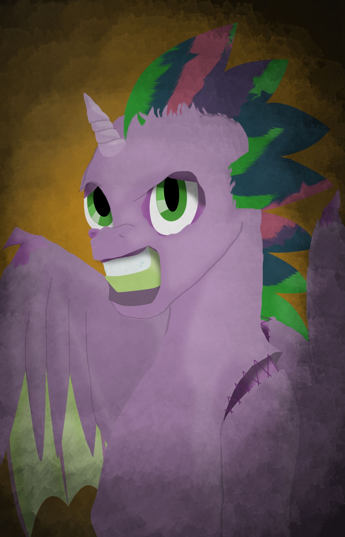
Ya know, I can't tell if it looks sorta rushed on purpose or if it just was rushed. It's just... kinda weird. Unfortunately not my kinda art, but it is good, and I particularly enjoyed the fade to black in the corners, really solidifies the portrait feel.
This has a suitably creepy appearance. I confess I was thrown off a bit by Spike’s jaw; since mainly the green part is visible, it tricked me into thinking that another character than Spike was meant. Showing more of his upper lip would solve this problem.
Upper tier, but in this round, something is going to have to go lower…
Upper tier, but in this round, something is going to have to go lower…
I think it was an inspired choice to draw (paint? I don't know digital art terminology!) this on a black background. It definitely helps with giving the piece a sense of character and mood. I also liked that you used subtly different shades of purple for Spike and the costume, which helped the contrast pop a little more.
I have to admit I was a little confused by the outlining, at first. There are distinct lines separating Spike's chin and neck from the wing behind him, but there is no such line for his chest and belly, which made it kind of hard to immediately pick up his silhouette at first. But nitpick aside, I still think this is a solid piece!
I have to admit I was a little confused by the outlining, at first. There are distinct lines separating Spike's chin and neck from the wing behind him, but there is no such line for his chest and belly, which made it kind of hard to immediately pick up his silhouette at first. But nitpick aside, I still think this is a solid piece!
