Hey! It looks like you're new here. You might want to check out the introduction.
Show rules for this event

I like the collage idea with a black void in the background. That also must have taken a lot of time to collect all of those starlight pictures haha.
The only problem I really have with this piece is that in some places there is blank space. (Where there are no pictures overlapping with eachother) Other than that this is a solid piece! :D
The only problem I really have with this piece is that in some places there is blank space. (Where there are no pictures overlapping with eachother) Other than that this is a solid piece! :D

Another finished piece! Kudos, Artist!
Pros: This collage theme works well; very well, considering the theme of the story it’s based upon.
Cons: That title drop needs to have more contrast to be legible. There are a few places where the images don’t align together and leave gaps; I found this to be offsetting.
Rant: I sometimes have trouble judging found-vector works against works done in traditional media. Am I supposed to be rewarding pure artistic skill over compositional eye? How does spending ten hours pushing a pencil over paper to express an internal vision compare to browsing Image Search for a half hour to find that one graphic that fits? In both cases, art is being made, but the former involves more creative work, in trying to bring an image intact out of one’s mind and record it in a form that can be shared with others. I usually prefer to reward that sort of work.
Here, it’s safe to say that the Artist put in some skullsweat to find the right images, and shows skill in using image editors to composite them attractively together. Therefore, I’m comfortable in assigning this piece, due to its polish and thematic match, to the top tier.
She never really had a chance
On that fateful moonlit night
I didn't imagine I'd end up winning gold this round, but hey, don't look a gift horse in the mouth and all that. Terrible jokes aside, I'm glad this had such a positive impact with you.
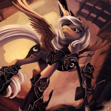
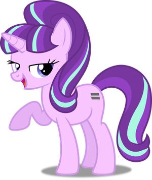
The Book of Might Have Beens was quite the enjoyable read, and I really felt for Starlight as she went through her journey of regret. As I read, I knew I had to create an art piece for this story. The first thing which popped to mind was to draw a sad Starlight and superimpose her face on low opacity with different expressions (such as anger, happiness, and regret) to show the different paths her life could've taken, however the initial versions left a lot to be desired, so that idea was scrapped in favour of using that same sad Starlight reflecting on her life and how it all could've been different.
As many of you have said, scouring the mlp wiki for the right images took a long time. And I mean a long, lots of pictures were just slightly different variations of close-ups and didn't really give me much to work. I had to go through all of S5, 6, 7, and 8 to find appropriate pictures which depicted mostly important moments of her life (and that one with Spike because I think Sparlight is cute). However, that was only half of it. I then had to dabble with the saturation to make them all look sepia. Why I didn't just group them all together and then do a single color change? Good question.
Afterwards, came Starlight. While I did base her silhouette off a vector, I drew her sad eyes, snout, mane, shading, and other minor details myself, so does that count as half a point? Also, I'm surprised nobody mentioned how she has both manestyles in this picture: Her newer combover and her old bangs. This was a leftover from my original idea of having superimposed Glimmies to show the different paths her life could've taken.
After that, I used the image as a base to draw a nebulous color shade with low opacity to go over the collage so the pictures would better blend with the image of Glimmyglams. Once that was done, I just added the black shadows around her and chose an appropriate font for the title. You can see the other candidates faintly above the negative space on the edges of the image.
All in all, a bit of a grind, but one I had a lot of fun making. Thanks a lot for giving my pieces so much love, and I hope to improve in following competitions.
>>TitaniumDragon
>>MLPmatthewl419
I'm glad you liked it so much!
>>dragon discord
Yup, I noticed that too, and while I tried to fix it, I had forty screencaps in that collage, and I couldn't tell which one was which from the little layer thumbnail, so I had to do a lot of trial and error to move some before giving up. I'll try to come up with a more efficient system in the future.
>>GroaningGreyAgony
Yeah, I wanted it to have a similar tone as the images, but perhaps there's something wrong with my monitor, because it didn't look as blurry as when I was working on it with Photoshop. I'll be sure to keep that in mind, though. It was a rather large oversight.
That I can attribute to the way I made the collage. As I was compiling them, I started placing them where I felt they fit best, however as time went on and I realised finding the right pictures wasn't going to be as easy as I thought, I started moving some around and changing the size of others. This, unfortunately, led to several empty spaces and even though I tried to correct most of them, they were forty images that I couldn't tell apart on the layer menu, so I just called it a day after a while.
I'm aware there's still some room left between my desired end goal and where my talent can lead me. I'll be sure to mind the gap.
As do I. The only reason I went with the screencap route was because my first idea was underwhelming and I just didn't have the time nor skill to recreate several dozen scenes from the show. And as much as I'd like to handwave all my shortcomings this round to my sickness, this one was just a whole slew of reasons.
In my defense, it took me way more than half an hour to find them all. But perhaps ther could've been better ways of pulling it off. Here's hoping I'll have less constraints next round.
And hey, I want to believe I did enough transformative work on the Starlight vector to warrant at least a pat on the head. (Even if none of those details can be really appreciated)
Anyway, thanks a lot to everyone, and here's hoping I do even better in the future!
On that fateful moonlit night
I didn't imagine I'd end up winning gold this round, but hey, don't look a gift horse in the mouth and all that. Terrible jokes aside, I'm glad this had such a positive impact with you.
The Book of Might Have Beens was quite the enjoyable read, and I really felt for Starlight as she went through her journey of regret. As I read, I knew I had to create an art piece for this story. The first thing which popped to mind was to draw a sad Starlight and superimpose her face on low opacity with different expressions (such as anger, happiness, and regret) to show the different paths her life could've taken, however the initial versions left a lot to be desired, so that idea was scrapped in favour of using that same sad Starlight reflecting on her life and how it all could've been different.
As many of you have said, scouring the mlp wiki for the right images took a long time. And I mean a long, lots of pictures were just slightly different variations of close-ups and didn't really give me much to work. I had to go through all of S5, 6, 7, and 8 to find appropriate pictures which depicted mostly important moments of her life (and that one with Spike because I think Sparlight is cute). However, that was only half of it. I then had to dabble with the saturation to make them all look sepia. Why I didn't just group them all together and then do a single color change? Good question.
Afterwards, came Starlight. While I did base her silhouette off a vector, I drew her sad eyes, snout, mane, shading, and other minor details myself, so does that count as half a point? Also, I'm surprised nobody mentioned how she has both manestyles in this picture: Her newer combover and her old bangs. This was a leftover from my original idea of having superimposed Glimmies to show the different paths her life could've taken.
After that, I used the image as a base to draw a nebulous color shade with low opacity to go over the collage so the pictures would better blend with the image of Glimmyglams. Once that was done, I just added the black shadows around her and chose an appropriate font for the title. You can see the other candidates faintly above the negative space on the edges of the image.
All in all, a bit of a grind, but one I had a lot of fun making. Thanks a lot for giving my pieces so much love, and I hope to improve in following competitions.
>>TitaniumDragon
>>MLPmatthewl419
I'm glad you liked it so much!
>>dragon discord
The only problem I really have with this piece is that in some places there is blank space. (Where there are no pictures overlapping with each[ ]other)
Yup, I noticed that too, and while I tried to fix it, I had forty screencaps in that collage, and I couldn't tell which one was which from the little layer thumbnail, so I had to do a lot of trial and error to move some before giving up. I'll try to come up with a more efficient system in the future.
>>GroaningGreyAgony
That title drop needs to have more contrast to be legible.
Yeah, I wanted it to have a similar tone as the images, but perhaps there's something wrong with my monitor, because it didn't look as blurry as when I was working on it with Photoshop. I'll be sure to keep that in mind, though. It was a rather large oversight.
There are a few places where the images don’t align together and leave gaps
That I can attribute to the way I made the collage. As I was compiling them, I started placing them where I felt they fit best, however as time went on and I realised finding the right pictures wasn't going to be as easy as I thought, I started moving some around and changing the size of others. This, unfortunately, led to several empty spaces and even though I tried to correct most of them, they were forty images that I couldn't tell apart on the layer menu, so I just called it a day after a while.
I found this to be offsetting.
I'm aware there's still some room left between my desired end goal and where my talent can lead me. I'll be sure to mind the gap.
I sometimes have trouble judging found-vector works against works done in traditional media.
As do I. The only reason I went with the screencap route was because my first idea was underwhelming and I just didn't have the time nor skill to recreate several dozen scenes from the show. And as much as I'd like to handwave all my shortcomings this round to my sickness, this one was just a whole slew of reasons.
browsing Image Search for a half hour to find that one graphic that fits
In my defense, it took me way more than half an hour to find them all. But perhaps ther could've been better ways of pulling it off. Here's hoping I'll have less constraints next round.
And hey, I want to believe I did enough transformative work on the Starlight vector to warrant at least a pat on the head. (Even if none of those details can be really appreciated)
Anyway, thanks a lot to everyone, and here's hoping I do even better in the future!