Hey! It looks like you're new here. You might want to check out the introduction.
Show rules for this event

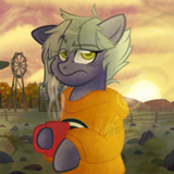
This is my favorite of the art pieces. Just a lovely drawing. I hope the author feels as good about it and would consider using it as cover art. I hope also that the artist would be good with this. Because the piece suits the story very well, IMO.
(Only other suggestion: maybe have Novel-Idea work his magic on this before going live as cover art.)
(Only other suggestion: maybe have Novel-Idea work his magic on this before going live as cover art.)
I can't believe I got a piece of art done for my story, and such a good one to boot. Now I feel almost obligated to fix the problems in this story, and then post it on fimfiction. If for no other reason than to show off this artwork, if you'd be willing to loan it to me.

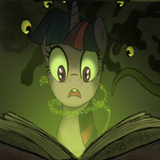
Nitpicks first: Artist, after doing so much to provide dramatic contrast for the clouds and rocks, you should have given Twilight some additional attention. Even thickening some of the lines that outline separate areas of her body would help clarity. The rocks of the cliff under her look a bit too regular as well.
Apart from that, Twi is well proportioned and executed, and the artwork glows with color along with the silver lined clouds. Well done. A top tier effort.
Apart from that, Twi is well proportioned and executed, and the artwork glows with color along with the silver lined clouds. Well done. A top tier effort.
This is a nice piece, and Twilight in particular is drawn skillfully - it evokes her emotions well.
My main nitpick is that Twilight seems to have been drawn in a slightly different style than the rest of it. While her edges have a soft gradient, the clouds and rocks have only three or four, rather distinct shades.
Their distinctness makes them feel blocky to me, compared to Twilight's more refined figure. Don't think this kept me from liking it, though.
Another in my high-but-not-top tier, held back only by the unevenness >>Caliaponia mentions. Twilight's figure is straight-up professional quality here, full stop. And I think I do like the clouds on balance, despite their shape and shading corresponding to no actual clouds I've ever seen. But that same blocks-of-color effect works less well for the sea than the clouds — I can't not see the static of a dead TV channel (which, um, I guess is thematically appropriate but still frustratingly distracting). And the cliffs look more like Minecraft cobblestone in their odd regularity than actual rock. And the grass atop them has a texture matching nothing else in the piece. The overall effect of the background is a sort of patchwork quilt that pulls my eye away from the figurework I want to admire.
Just work on those backgrounds, though, and this will be hard to compete against. Thanks for submitting!
Just work on those backgrounds, though, and this will be hard to compete against. Thanks for submitting!
Well. Even though my story bombed, at least it inspired the art that won. That's a victory right there =(^.^)=
Now I'm gonna go and sleep this off, Adieu.
Now I'm gonna go and sleep this off, Adieu.
Oh, The Clash. What a bunch of lovely chaps.
Before I say anything else, I want to thank everyone who voted for this piece. I'm proud to have finished in first place for the first time! I'll work hard to make enjoyable pieces in the future.
Alright, time for a little introspection. Maybe it's because this is one of the first stories I read and one which I enjoyed which made me want to get to work on it right away. I mentioned this in my comment on the other piece: that one captured the feeling of isolation I got from reading the story, and if I'd had the time, I probably would've taken a similar approach. However, I decided to make a piece which focused exclusively on Twilight, because at its core, this story is about her inner conflict and her endless pursuit of knowledge. At least, that's the way I interpreted it and the way which made it easier to draw.
>>CoffeeMinion
>>Lamplighter
I'm glad you liked it. I had a fun sketching and then inking and painting. I had the chance to try a few techniques I've never tried before, so it's good to know I fared decently.
>>Caliaponia
Twilight was the first part of the drawing I made. Once I inked her, did the flat tones and the basic shades, I just sort of focused on the backgrounds for the better part of a day. I am well aware this contradicts what I just said about focusing on Twilight's inner conflict, I never said I was good at being congruent with my ideas.
>>GroaningGreyAgony
Yeah, after being done--for a value fo the word--with the backgrounds, I should've gone back and work a bit more on Twi. I wanted to give a little texture to her fur and mane, but I ended up not doing so because I needed to finish reading the story submissions. (I wish there had been more time to draw, though. I almost didn't make Tramonto and had to rush Flutterflesh because of that. In future art rounds I think I'll stick to fewer entries if it means I can give them all the polish they deserve.
>>horizon
I'm glad you liked Twi, I really made the effort to make her look proportionate, though I ended up using a vector as reference for the eye position because they didn't look (heh) right in my sketch. Regarding the clouds, I was trying something different with them because my first attempt looked as a bunch of low quality cotton left in a bowl of dirty water. I think the end result is... better, though still far from perfect, I should've tried to blend them a little bit without losing the strong shading I wanted to give it.
If you didn't like the sea, you should've seen how it looked before I added the waves. Here, take a look. I'll agree that it isn't perfect, though. I like how they look near the horizon, but it took me so long to make that segment that I ended up just copypasting it on the rest of the ocean while changing the opacity and other values, which was a mistake, as it creates an unappealing contrast as a whole. Duly noted.
And then the rocks. Ugh... Those patches of colour were meant to be blended later on and then given a texture to look like rocks being touched upon by sunlight. Of course, it's overcast, so the light touching those rocks wouldn't be as vibrant. Plus, the final effect did not look good, so I just scrapped it and tried to give the rocks a bit more definition.
Ah, and the grass. I was just lazy so I made two layers sandwiching Twilight and used the grass brush on Photoshop. I'm taking full responsibility on the laziness there.
Overall, I agree that these mismatching styles somewhat detracted from the piece, but I still enjoyed making it. (I wish I'd know it would end up having that effect, I would've doubled down on the patchwork style and find a way to tie it with Twilight's inner conflicts, but such is life)
>>Lamplighter
Hey, if you still wish to use this as the artwork, feel free, I'd be flattered. I do want to touch upon it and fix a few of the issues mentioned here, so let me know when you'll put your story up on FiMFiction and I'll be sure to have it ready by then. ^-^
>>Zaid Val'Roa
That'll just make my day. As soon as I touch up the story that is. I haven't actually worked on it since I first submitted it.
This writing contest can really suck it out of you can't it?
Ps. I almost added the word "now" to the end of the title, but I thought that would have been a little too on the nose.
>>Lamplighter
Yeah, I hear you.
Take your time with polishing your story, just remember that You've Got to Let Me Know when you'll be putting it up on FiMFic.
This writing contest can really suck it out of you can't it?
Yeah, I hear you.
Take your time with polishing your story, just remember that You've Got to Let Me Know when you'll be putting it up on FiMFic.