Hey! It looks like you're new here. You might want to check out the introduction.
Show rules for this event
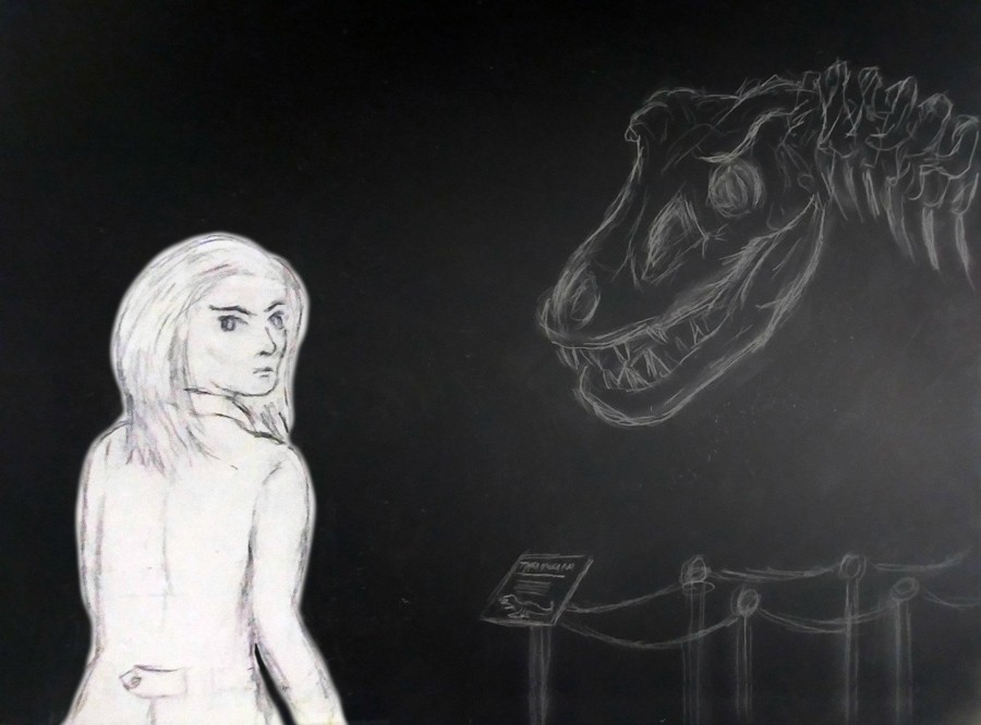
The previously reviewed piece had a very murky background, this one has none at all. This can be a stylistic decision, so I won’t dock too many points for it.
The lady’s expression is gripping, and her appearance has an unsettling oddness to it. Future physiology or sloppy anatomy? Again, I’ll be charitable. The ghostly T-rex skull is striking as well, though it should likely give more of an appearance of being lit from above.
Overall, a solid piece that will earn a high place on my slate.
Pic mini-reviews!
It's damning with faint praise to say that this one is topping my slate basically by default, so let me find something affirmatively good to say. First, I think that the amount of work here is easy to underestimate. The black-on-white figure on the white-on-black background involves a little photomanipulation to unite the two parts cleanly, and the work there is unobtrusive in a good way. The composition is also well thought out, and the way the background gradient draws attention to the two main elements is exemplary in its subtlety. And while it's sketchy, the roughness of the lines in its own way contributes -- the attention to detail is reserved (as it should be) for the most major elements, giving the eye reason to linger.
In other words, the composition here is top-notch. As such, I think this would be fighting for a high place in my ballot even in a round with significantly more art entries. Good job, artist!
I like how the girl looks, except perhaps for her eyes. It doesn't look like you had a particular vision (huehuehue) for how they would look (huehuehue), and so they seem a little bit "filled in at random" instead.
I also wish that the T-rex and his info-stand had a little colour to them that was different from the background, so that they could look more like solid objects.
But still, the figures themselves and the eerie B/W feel are done very well, so well done, artist!
I also wish that the T-rex and his info-stand had a little colour to them that was different from the background, so that they could look more like solid objects.
But still, the figures themselves and the eerie B/W feel are done very well, so well done, artist!
There's a surprising amount of detail shoved into that T-Rex skeleton, despite having a very 'sketchy' overall appearance. It works really well with the black background thing going on, I don't know what that paper/process is called exactly. Sakura being done up in black-on-white makes for a nice contrast that sort of echoes how she stood out from a crowd in the story, too.
