Hey! It looks like you're new here. You might want to check out the introduction.
Show rules for this event
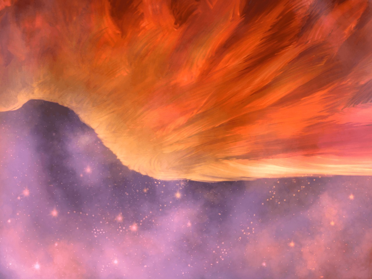
Ooh! A orange (phoenix?) wing against a starry purple sky? nice!
If I had a complaint, it would be that there isn't much in the way of light vs dark here; the sky is very lightly colored as well, so this is just light vs light. It could have had stronger contrast than it does.
I do like how the negative space looks like a mountain.
If I had a complaint, it would be that there isn't much in the way of light vs dark here; the sky is very lightly colored as well, so this is just light vs light. It could have had stronger contrast than it does.
I do like how the negative space looks like a mountain.
The colours are indeed pretty pretty. I'm a bit disappointed that, with such a title, the movement of falling isn't visible. The angle you chose is very interesting and great but doesn't really connect with the 'falling'.
A solid piece nonetheless.
A solid piece nonetheless.

I like this one. I agree with TD that it could use better contrast between foreground and background.
Pretty, but my first impression was actually of a spectacular sunset over shadowed mountains.
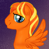
I'm kinda confused by the perspective here. This is looking past the elbow of an outstreched limb with viewpoint-"up" opposite body-up; it's clearly not the perspective of the individual who owns the limb (try it yourself). But if that's implying a second character of the viewer, that's disrupting all my interpretations; and if we're getting a disembodied third person view I'm struggling to understand what the significance is of this particular angle-slash-focus. Not to mention the blank I'm drawing on prompt interpretation, especially since I keep wanting to read toward-the-stars as up rather than down.
That said, this is gorgeous, especially the feathers. Agreed that it could be higher-contrast; I think you could do that while sticking to your red-heavy color scheme, just make it a contrast of brightness rather than tone. I think that would also improve your composition by giving you something of a yin-yang effect that right now is only weakly hinted. As it is, you've got this sort of circular pattern in the stellar nebulae and a sort of stripeyspotty thing going on with the feather highlights, and the lack of tonal/color contrast means that the pattern contrast dominates, and that feels clashy (as pattern-contrast does).
That said, this is still gorgeous, and on that alone it's going to rise fairly far in my slate.
>>horizon I interpret it as the feathered character being off visual top-left, descending toward visual bottom-left which is also physically-down, for what it's worth; I don't read the starry section as being physically-up at all. I don't think the perspective there has to have any particular significance except that it makes the angle obvious without being too detached, and results in the nice curve/separation between the two halves of the image (which I agree could be significantly improved with more lightness contrast).

What >>Ratlab said. I would never have seen this as a wing unless I read the comments, and even then I had trouble seeing it.
>>TitaniumDragon
This was super last minute entry on my part so I actually did this piece in 3 in the morning when I realized the cut off date was on May 26. I thought I would have time on Friday to work on it, but apparently not. The low light on my screen made it looked darker to me so I just thought it looked fine at the time. However, I do agree to give it a more light vs dark contrast later when I edit and actually post this.
>>Fenton
I can see your point. I don't exactly remember what my sleep deprived mind was thinking at the time, but I assume I was going for the wing angle so it wouldn't look like a specific winged bird or creature. It could be a phoenix, a red bird, a griffin, a winged person, or anything the writer would see. Heck, it even looks like a sunset/sunrise.
Oh and a little known fact about me, I am completely horrid at coming up with names. Drawing and painting stuff, yep, but when naming something I’m at a lost. I suggest focusing more on the art piece rather than the title for your interpretations.
Thank you for your review regardless. ^-^
>>GroaningGreyAgony
Thanks! And I’ll think about that when I edit this in the final product.
>>Ratlab
I actually never noticed that before, but I could definitely see what you mean. If taking out of context, I could see the sun catching the clouds lighting the sky like fire. At the same time, the cool mist blowing against the mountaintop. I absolutely love unintentionally art, they open up so many interpretations and perceptions.
>>horizon
For this piece, I was going for a third person point of view. I wrote about this on another reply with a similar comment about the angle:
The close up angle simply allows me to open up to those interpretations. Both in a literal and in a symbolic sense. Though, as you suggest, I think I could've executed this attempt a little better.
Another thing that led me to do the wings in this angle was of a diving bird on a steep incline if my memory serves me correctly. It's just something that hit me due to the limited amount of time I had to come up with before the cut off time. I actually thought I would have the time to work on my submission on Friday, which I found I didn't have.
And yes I agree with everything about contrast. I responded about this too:
Combined with a sleep addled mindset and a low lit room while running on pure determination to submit something didn't help. This was definitely another rushed piece that I felt a bit disappointed on when I saw it again that morning. Though, by this point I feel like I’m just making excuses since I know I am capable of fixing these issues. But yes, I’m aware that contrast and tone are some of the factors of an aesthetically pleasing art. I will definitely work on that.
Overall, I appreciate your detailed critiques and review. They're something to keep in mind whenever I work on future art pieces.
This was super last minute entry on my part so I actually did this piece in 3 in the morning when I realized the cut off date was on May 26. I thought I would have time on Friday to work on it, but apparently not. The low light on my screen made it looked darker to me so I just thought it looked fine at the time. However, I do agree to give it a more light vs dark contrast later when I edit and actually post this.
>>Fenton
I can see your point. I don't exactly remember what my sleep deprived mind was thinking at the time, but I assume I was going for the wing angle so it wouldn't look like a specific winged bird or creature. It could be a phoenix, a red bird, a griffin, a winged person, or anything the writer would see. Heck, it even looks like a sunset/sunrise.
Oh and a little known fact about me, I am completely horrid at coming up with names. Drawing and painting stuff, yep, but when naming something I’m at a lost. I suggest focusing more on the art piece rather than the title for your interpretations.
Thank you for your review regardless. ^-^
>>GroaningGreyAgony
Thanks! And I’ll think about that when I edit this in the final product.
>>Ratlab
I actually never noticed that before, but I could definitely see what you mean. If taking out of context, I could see the sun catching the clouds lighting the sky like fire. At the same time, the cool mist blowing against the mountaintop. I absolutely love unintentionally art, they open up so many interpretations and perceptions.
>>horizon
For this piece, I was going for a third person point of view. I wrote about this on another reply with a similar comment about the angle:
“I was going for the wing angle so it wouldn't look like a specific winged bird or creature. It could be a phoenix, a red bird, a griffin, a winged person, or anything the writer would see.”
The close up angle simply allows me to open up to those interpretations. Both in a literal and in a symbolic sense. Though, as you suggest, I think I could've executed this attempt a little better.
Another thing that led me to do the wings in this angle was of a diving bird on a steep incline if my memory serves me correctly. It's just something that hit me due to the limited amount of time I had to come up with before the cut off time. I actually thought I would have the time to work on my submission on Friday, which I found I didn't have.
And yes I agree with everything about contrast. I responded about this too:
“This was super last minute entry on my part so I actually did this piece in 3 in the morning when I realized the cut off date was on May 26. I thought I would have time on Friday to work on it, but apparently not. The low light on my screen made it looked darker to me so I just thought it looked fine at the time. However, I do agree to give it a more light vs dark contrast later when I edit and actually post this.”
Combined with a sleep addled mindset and a low lit room while running on pure determination to submit something didn't help. This was definitely another rushed piece that I felt a bit disappointed on when I saw it again that morning. Though, by this point I feel like I’m just making excuses since I know I am capable of fixing these issues. But yes, I’m aware that contrast and tone are some of the factors of an aesthetically pleasing art. I will definitely work on that.
Overall, I appreciate your detailed critiques and review. They're something to keep in mind whenever I work on future art pieces.