Hey! It looks like you're new here. You might want to check out the introduction.
Show rules for this event
I agree with >>Haze, this is very cute and feels very 'Dixit' (French game, HA!).
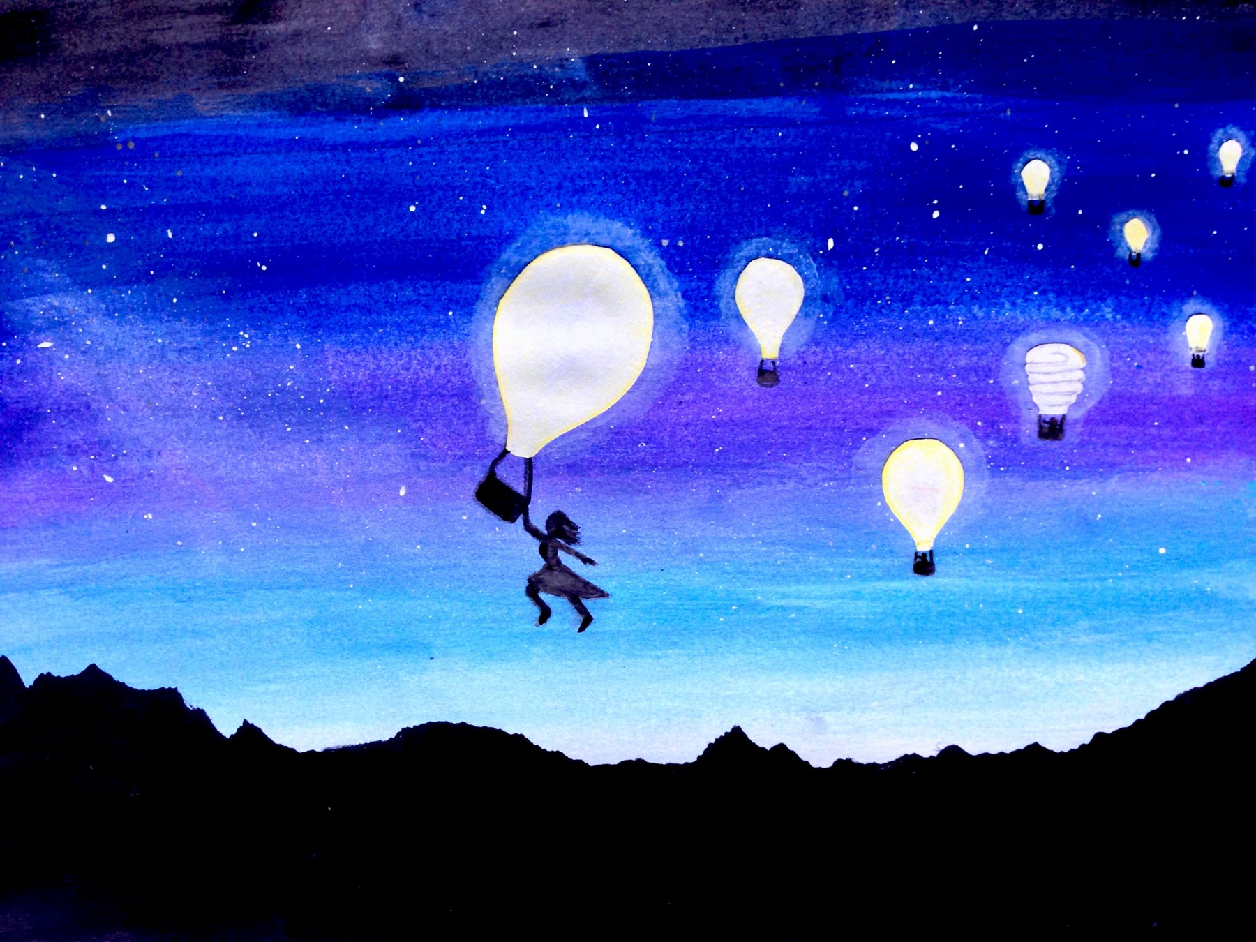
I really like the colors you chose, all these shades of blue with a bit of purple.
I wonder what the different lightbulb could mean.
If I were playing Dixit, I would say 'running out of ideas'.
Thank you for this, it will probably end up very high.
I really like the colors you chose, all these shades of blue with a bit of purple.
I wonder what the different lightbulb could mean.
If I were playing Dixit, I would say 'running out of ideas'.
Thank you for this, it will probably end up very high.
>>Haze
Indeed!
This is a nice little abstract piece, and it makes good use of contrast. My only real complaint is that some of the bulbs seem rather uneven and it is setting off my inner Symmetra.
Indeed!
This is a nice little abstract piece, and it makes good use of contrast. My only real complaint is that some of the bulbs seem rather uneven and it is setting off my inner Symmetra.
I want to like this one more than I do, but the persons pose keeps throwing me off. It looks like they're either jumping impossibly high, or defying physics in some manner, or... I dunno. Something odd.
The rest is so well done, though... Especially the inclusion of the coiled bulb! That's a wonderful visual marker that tips attention in the right direction without being blatant. Excellent design.
The rest is so well done, though... Especially the inclusion of the coiled bulb! That's a wonderful visual marker that tips attention in the right direction without being blatant. Excellent design.
I, too, am a fan of the compact fluorescent bulb. The general aesthetic of the piece is nice. The sunset/sunrise/stars are evocative and it gets a lot across with the few details in its silhouettes.
The woman in the lead doesn't look to me like she's falling, which throws me perhaps more than it should. And I don't think the ... clouds? ... at the top work for me. But the piece is compositionally well-balanced and draws the eye to the right places.
The woman in the lead doesn't look to me like she's falling, which throws me perhaps more than it should. And I don't think the ... clouds? ... at the top work for me. But the piece is compositionally well-balanced and draws the eye to the right places.
