Hey! It looks like you're new here. You might want to check out the introduction.
Show rules for this event
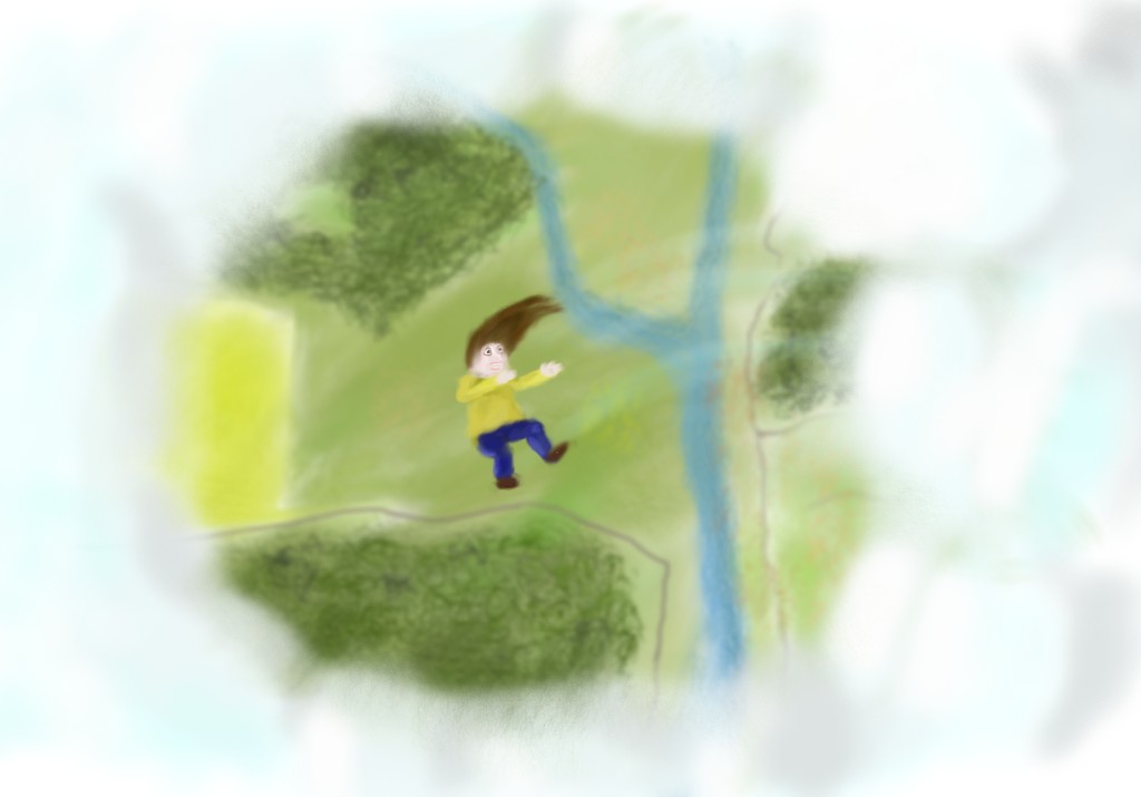
Looking down at the world from above the clouds, it is amazing how small it is.
My biggest problem with this is the human figure; it is very evident in the middle of the drawing, but she doesn't look quite right proportionally.
My biggest problem with this is the human figure; it is very evident in the middle of the drawing, but she doesn't look quite right proportionally.
This one just doesn't work with me. The human is wrong proportionally, and look too crayon-drawn.
I am wondering why this person seems to be smiling on the (I presume) way down.
As others stated, the landscape is passable but the human figure needs work.
As others stated, the landscape is passable but the human figure needs work.
I think the biggest problem with the human figure is that it's got something of a Lego head: large relative to body, no neck, shoulders up at jaw level.
The curvature of the motion lines implies the figure is being thrown rather than simply falling. I might be reading too much into that, but if that was your intention, artist, then kudos on a nice bit of storytelling by implication.
Effective framing, and as others have said, everything but the figure feels aesthetically fine. Thank you for sharing.
