Hey! It looks like you're new here. You might want to check out the introduction.
Show rules for this event
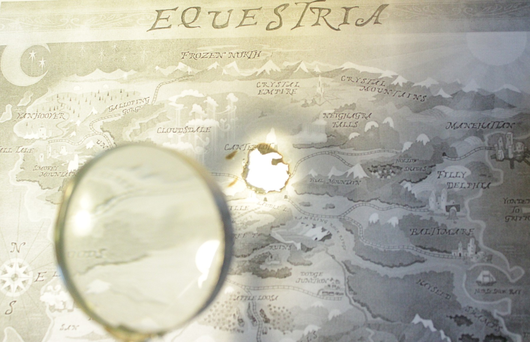

Out of all the entries, this one took me the longest to figure out. Possibly because I'm a blind bat, but also maybe because the magnifying glass is really out of focus. I know it was probably a tradeoff you had to take, photographing items on two different focal planes so close to the camera, but it unfortunately took my brain a long time to recognize it. At first, I thought it was a sun, or a drop of water, or something. Maybe showing a bit more of the handle will present a more recognizable silhouette to the viewer? Thanks for entering!

Personally, I took no time realizing what this was. I think this is a very well photoshopped piece. (or so I hope. RIP the entirety of equestria)
The out of piece magnifying glass is very well blurred- not too much or too little. I often have trouble with blurring things. :/
Love it!
The out of piece magnifying glass is very well blurred- not too much or too little. I often have trouble with blurring things. :/
Love it!
Not much for me to say about this piece, but I do like it a lot. The idea is cool, and functions as a very believable followup to source material too. Artistically, frankly, it looks pretty much flawless - but that is very much coming from a position of "Photoshop? Yeah there's one just up the road!", sooo take it with a pinch of salt.
The depth of field works for me; so does the lighting. The use of the stock background is appropriate to the story (which was mine; I'm glad it inspired someone!), and the magnifying glass is a lot easier to represent as a stock trope than the original story element.
Which I guess relates to the big downside of this pic, for me. In terms of total surface impressions, I'd be more likely to use something like this for (for instance) a story cover image than something like Snap, but I still ranked Snap higher than this because I think it pushed the boundaries more and is more to the purpose of a workshop. I have some idea that even basic-looking compositions like this are harder than they look, but this is a bit too cheap for me to rank it highly in its own right, even if the result coheres—especially since it leans so heavily on its source image.
I'm still glad you put something in, though!
Slate: 4th of 4.
Gonna comment on this one real quick-like. You did a really good job with this piece. I immediately recognized it for what it was, and have no complaint about it at all. Like, honestly, you did a wonderful job. I could only ever dream of having the skill to pull this off. So don't take the 4th place as a sign of failure. It's just this medium didn't work out so well this round.