Hey! It looks like you're new here. You might want to check out the introduction.
Show rules for this event
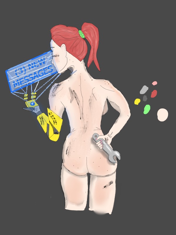
Drawing naked people, as it turns out, is very hard. It's almost like there's a whole subset of art dedicated to capturing the nude human form in painting or sculpture or what have you. This is an admirable effort, although it does get kind of shaky in the bottom half. Got an idea or two from this one. I like it.
Our one and only actually R-rated entry! *Streamers*
This one really does look good at a glance (especially from the thumbnail), but I think some of the details have trouble coalescing when you take a closer look. Like Raisin mentions, there's a bit of some uncanny valley proportions going on, with her hand looking a little small and her legs looking oddly spaced. But I still like the idea of this one, and I do think that the colors feel nice together.
Thanks for submitting!
Good on you, Artist, for attempting a human figure. The toning and the torso are decent; the right arm is way too small. Also, you can achieve more realistic dimensional bulges on human forms by not drawing a full line of separation. Partial lines where the buttocks meet the legs would look more natural.
Points for concept. I encourage you to practice human proportions; this knowledge is what you need to make a piece like this 'something more.'
Points for concept. I encourage you to practice human proportions; this knowledge is what you need to make a piece like this 'something more.'
Retro: The Butt, the Whole Butt, and Nothing But the Butt
Okay, so this one's got a little bit of a funny story. Originally, I had planned on having her wear a pair of rolled-down overalls, to reinforce that gritty mechanic vibe. But I ended up only having about a night and a half worth of drawing time, so after I kinda sketched her silhouette, I kinda realized I didn't have the time to design and draw the toolbelt and overalls I had in mind. And I just said "screw it, she'll be naked."
For the linework, I basically stared at every drawing and photograph of people's backs that I could find via Google images. Interestingly, I sketched her head and her torso separately, with several options for her head position. I ended up choosing this one, mostly because I didn't need to show her eyes.
For the colors, I tried something new and played around with Krita's blending/blurring tools. Did the skin tones, grease smears, hair, and blue glow like that. Decently satisfied with how they came out, for a first try.
>>Anon Y Mous
Yes, butt. :P
>>No_Raisin
Yeah, I should pay more attention to proportions next time. Interestingly, I looked up a LOT of proportion references for her facial features (and my pencil-on-paper sketches have reference lines for her eyes/nose/ears/etc), but I guess I didn't need to pay as much attention to her legs. My mistake. :P
>>GroaningGreyAgony
Yeah, now looking at it, this is pretty obvious. Hindsight is 20/20. (Pun completely intended)
Thanks for your feedback on what does and doesn't work. It's surprisingly easy to miss really obvious things when you've spent a lot of time focused on minutia.
Thanks for the silver!
I have to say, I'm having a lot of fun learning how to art. Thanks for being a place where I can barf these things out at ya'll. :P
Okay, so this one's got a little bit of a funny story. Originally, I had planned on having her wear a pair of rolled-down overalls, to reinforce that gritty mechanic vibe. But I ended up only having about a night and a half worth of drawing time, so after I kinda sketched her silhouette, I kinda realized I didn't have the time to design and draw the toolbelt and overalls I had in mind. And I just said "screw it, she'll be naked."
For the linework, I basically stared at every drawing and photograph of people's backs that I could find via Google images. Interestingly, I sketched her head and her torso separately, with several options for her head position. I ended up choosing this one, mostly because I didn't need to show her eyes.
For the colors, I tried something new and played around with Krita's blending/blurring tools. Did the skin tones, grease smears, hair, and blue glow like that. Decently satisfied with how they came out, for a first try.
>>Anon Y Mous
Yes, butt. :P
>>No_Raisin
Yeah, I should pay more attention to proportions next time. Interestingly, I looked up a LOT of proportion references for her facial features (and my pencil-on-paper sketches have reference lines for her eyes/nose/ears/etc), but I guess I didn't need to pay as much attention to her legs. My mistake. :P
>>GroaningGreyAgony
Partial lines where the buttocks meet the legs would look more natural.
Yeah, now looking at it, this is pretty obvious. Hindsight is 20/20. (Pun completely intended)
Thanks for your feedback on what does and doesn't work. It's surprisingly easy to miss really obvious things when you've spent a lot of time focused on minutia.
Thanks for the silver!
I have to say, I'm having a lot of fun learning how to art. Thanks for being a place where I can barf these things out at ya'll. :P
