Hey! It looks like you're new here. You might want to check out the introduction.
Show rules for this event
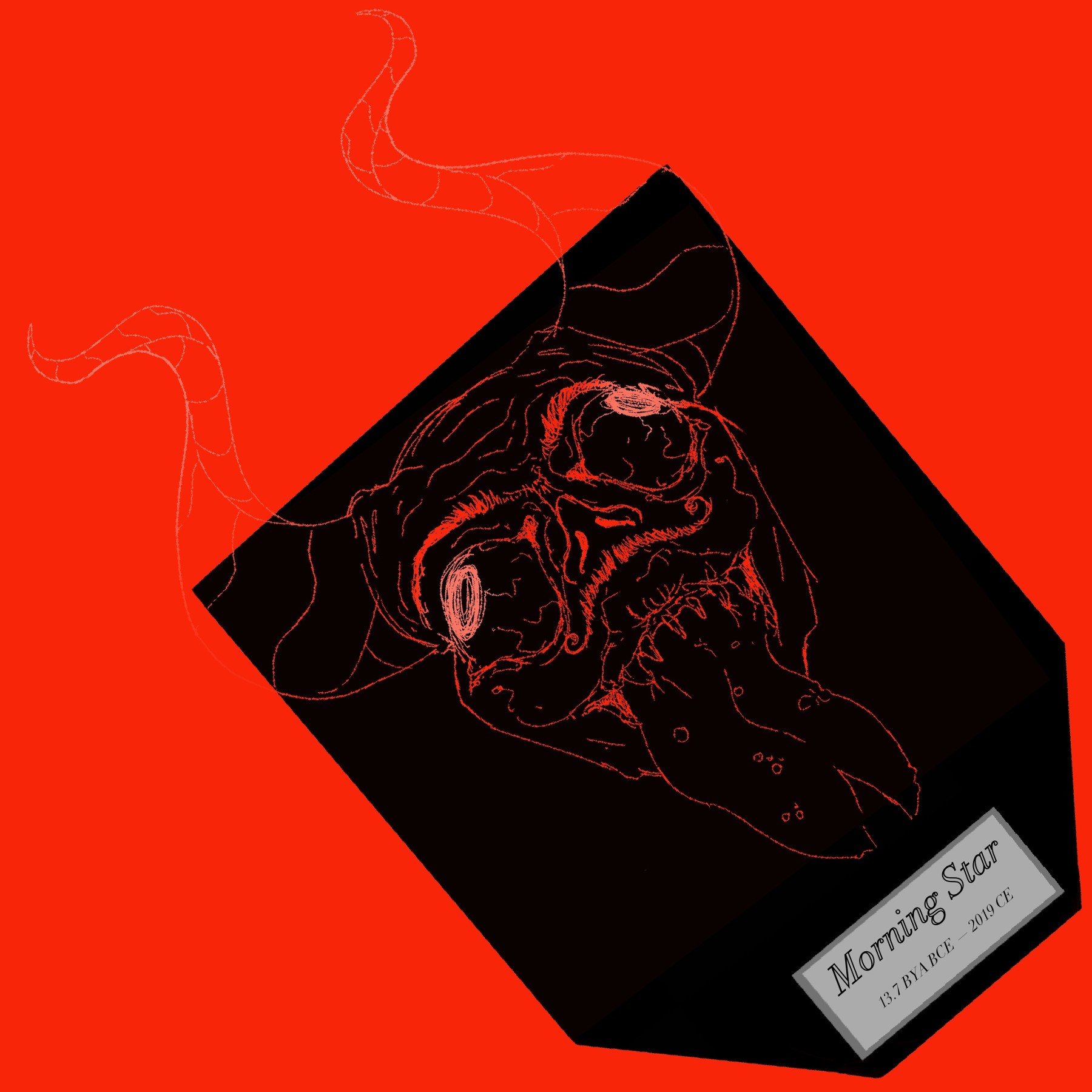
The linework here is straight-up gorgeous. Really love the amount of detail, and the overall design of the facial features being a mix of distinctly human and distinctly in-human. I'm a little confused about the overall composition (Why the tilt? Is this some kind of tombstone?), but that doesn't detract from how much I enjoyed the art itself.
Thank you for arting!
Thank you for arting!
I think I see where you were going with this, Artist, and I wish you'd gotten all the way there. As it stands, It looks to me as if you're rendering a plaque with a demon's head mounted on it. The line work is detailed and gives a feeling of dimension, a good basis on which to build your rendering and shading.
(Unless you meant this to be a glass demon head or something. If so, you still need to do more to sell the viewer on the idea.)
Anyway, despite its incompleteness, this is still an upper tier effort. Thanks for creating it, Artist!
(Unless you meant this to be a glass demon head or something. If so, you still need to do more to sell the viewer on the idea.)
Anyway, despite its incompleteness, this is still an upper tier effort. Thanks for creating it, Artist!
>>No_Raisin
>>Bachiavellian
>>GroaningGreyAgony
Thanks for gold!
Legit the only reason this was crooked is because I didn’t want to make the devil any smaller.
Also, I kind of liked just the line art as it was, but I can wholeheartedly see how you want more meat to the picture. ;3
>>Bachiavellian
>>GroaningGreyAgony
Thanks for gold!
Legit the only reason this was crooked is because I didn’t want to make the devil any smaller.
Also, I kind of liked just the line art as it was, but I can wholeheartedly see how you want more meat to the picture. ;3
