Hey! It looks like you're new here. You might want to check out the introduction.
Show rules for this event
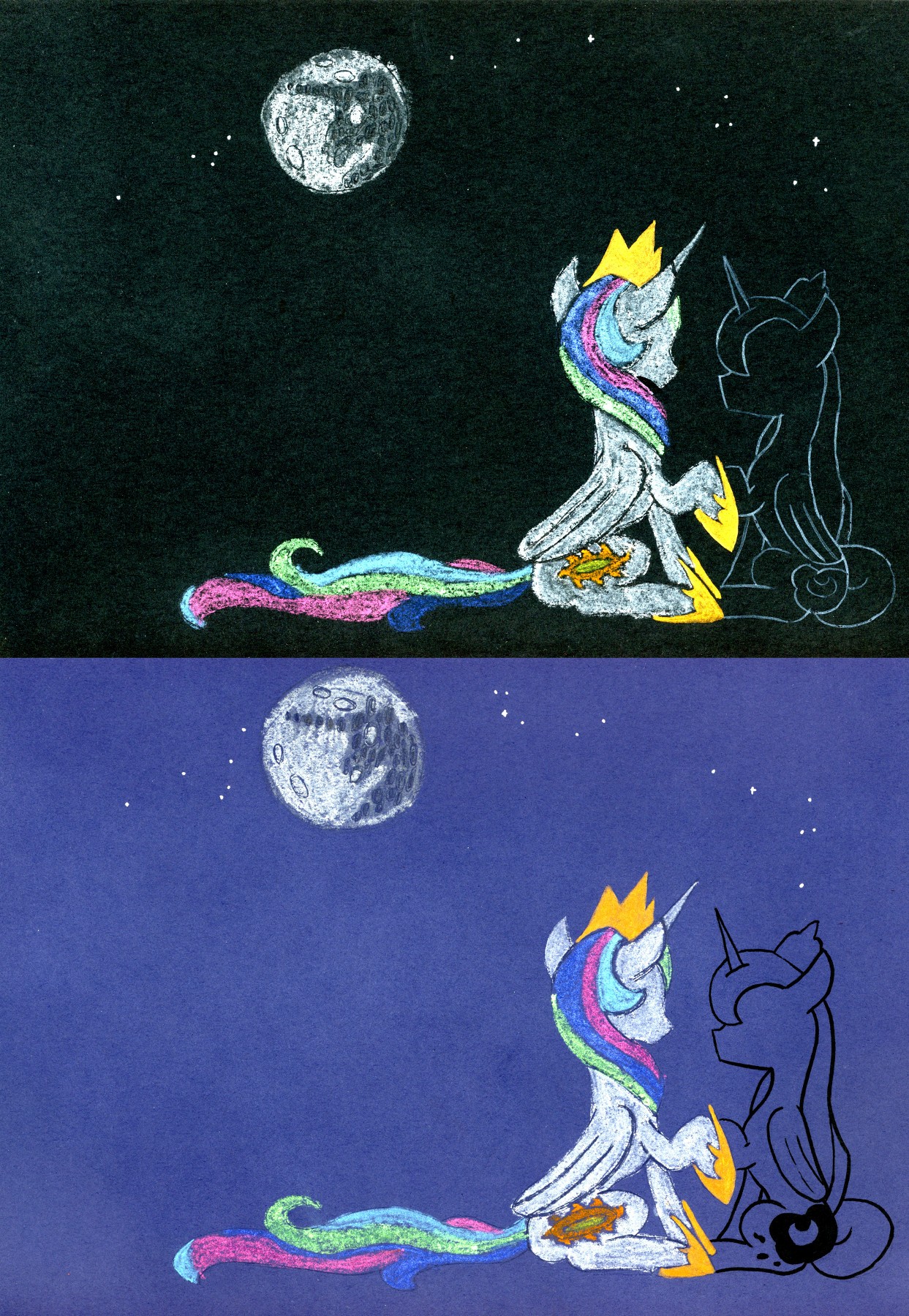
Review—
Prompt relevance: high
Style: pastels, surprisingly clean for pastel drawings
Background: phenomenal how closely the two images are mirrored.
Story potential: low
Result: mid tier
The image is very nice, a fantastic use of the medium, but the only vibe I can get from it is Celestia mourning the loss of her sister and pretending she’s not gone.
Beautifully still in the night, I ask myself, would this make for a decent wallpaper on my desktop?
Seriously, it's well done and successfully brings back the sympathy I have for the olden princess. I'm not entirely sure if the art would've been done better if it were a solid color cutout style, but the crayon nicely brings a dream-like state to the scene, so all is good. Now all I hope for is that the person adapting this is fully capable of transferring, yet not copying, the same set of emotions this holds.
Seriously, it's well done and successfully brings back the sympathy I have for the olden princess. I'm not entirely sure if the art would've been done better if it were a solid color cutout style, but the crayon nicely brings a dream-like state to the scene, so all is good. Now all I hope for is that the person adapting this is fully capable of transferring, yet not copying, the same set of emotions this holds.
(Art) Genre: The Stars Will Aid Her Outline
(Art) Thoughts: I lack the art thingie to offer a lot of detailed analysis here. But it's darn pretty! I'm guessing the Artist probably started with a single sketch, then traced it to make a copy of the lines and star positions, then just ran with it from there? It's a cool idea! It's well done, too.
Something something, art vote yes!
(Art Tier): High


>>Moosetasm
You called mid-tier pretty accurately!
Yes, those are pastels, and I did sharpen them regularly to get lines that sharp! I sketched the bodies and detail lines heavily with a 2H pencil first - the pencil lead kept the pastels from sticking on the detail lines and the craters of the moon. Then, I went over the bodies and the moon with a blending stump after the first round of pastels, then did another layer on top of that. The hair I left with a single, unblended layer so there was more contrast between the strokes and the background, with the hope that it would look more like hair.
>>Kritten
I will put the high-resolution version on DeviantArt. I'm going to matte the original and sell it at the BronyCon art show!
>>CoffeeMinion
I did indeed start with a single pencil sketch! I made a photocopy, then cut it out to trace on the colored paper so I could get the same(ish) outline. The stars and moon were freehand.
>>GroaningGreyAgony
You're the only one who noticed that! You've got a good eye.