Hey! It looks like you're new here. You might want to check out the introduction.
Show rules for this event
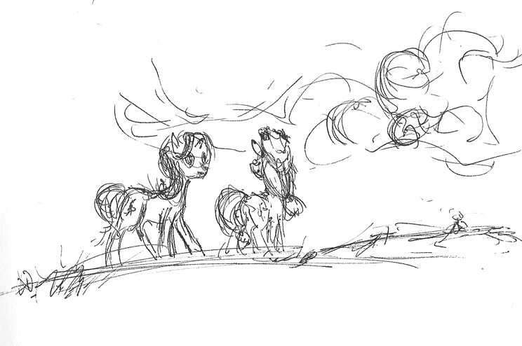

The poses are really strong here, and manage to convey who the characters are beyond AJ's hat and Starlight's mane. I really like the open spaces as well—the whitespace really gives the piece room to breathe and conveys an entirely different sense of tone. This is probably the piece I most wish you had time to make a finished work out of, because it has so much to gain from having a fleshed out sky and background. Nevertheless, you pull off a heck of a lot with what you've got here.

The sketchy style here's nice, but I think it hinders the mood as well as the form.
I like the cloud shape.
Applejack is specifically difficult to understand because it's hard to see her form. There's no negative space around her limbs that help me quickly discern what she looks like. The medium here looks like BIC pen, so I understand what can and cannot be done. It's nice to have a free and loose drawing session, though.
